
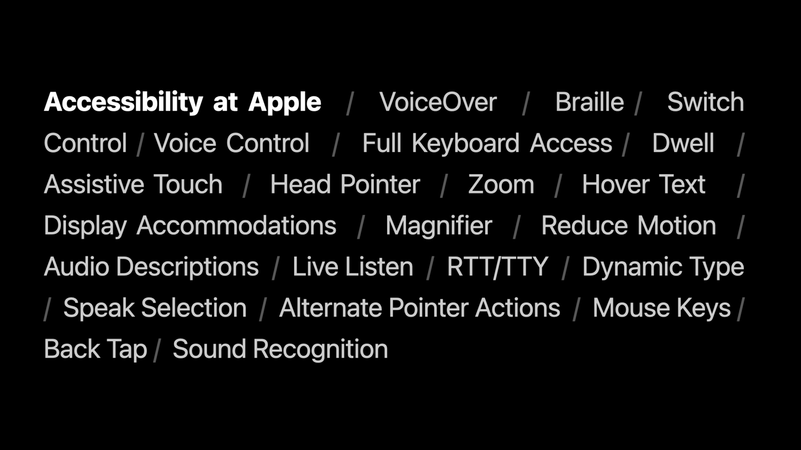
ハイライト
Apple が SwiftUI にアクセシビリティ プレビューを追加
accessibilityRepresentation、カスタム ローター、アクセシビリティ フォーカス API を使用すると、開発者は、VoiceOver などの支援技術のナビゲーション エクスペリエンスを検査、修正、強化できます。
主な内容
Nathan Tannar 氏は講演の中で、Wallet Pal と呼ばれる財務管理アプリケーションのプロトタイプを作成しました。インターフェイスは洗練されているように見え、初期のテストユーザーはそれを気に入っています。しかし、VoiceOver ユーザーは、アプリの操作が難しく、一部の部分にアクセスできないと報告しました。
この問題は、色、アニメーション、タイポグラフィを超えて発生します。 VoiceOver は、一連のアクセシビリティ インターフェイス (要素の順序、ラベル、特性、値、実行可能なアクション) を読み取ります。カスタム コントロールがシステムにセマンティクスを伝えずに形状を描画するだけの場合、支援テクノロジはそれを正しく操作できません。
SwiftUI は元々、多くのアクセシビリティ情報を自動的に生成します。Textラベル付きの静的テキストになり、SF シンボルにはデフォルトのラベルが付きます。標準Slider調整可能な値があります。しかし、アプリケーションを使用すると、Canvas、カスタム ジェスチャ、オーバーレイ ボタン、および複雑なリストの場合、デフォルトの推論では十分ではありません。
Apple は WWDC21 で SwiftUI にいくつかの機能を追加しました。 Xcode 13 のアクセシビリティ プレビューを使用すると、プレビューで要素を直接検査できます。accessibilityRepresentationカスタム コントロールに標準コントロールのセマンティクスを借用させることができます。accessibilityChildren描画されたグラフィックスに構造を追加できます。accessibilityElement(children:)そしてaccessibilitySortPriorityナビゲーションの順序を整理できます。accessibilityRotorそしてAccessibilityFocusStateこれにより、複雑なインターフェイスに高速な VoiceOver パスが提供されます。
これらの API の共通の目標は明確です。ビジュアル インターフェイスは製品のニーズに合わせてカスタマイズされ続け、アクセシビリティ インターフェイスはセマンティクスとナビゲーション ルールを個別に補完します。開発者はカスタム UI を放棄する必要はなく、VoiceOver ユーザーに無意味な要素の間を前後にスワイプさせる必要もありません。
##詳細
アクセシビリティ プレビュー: 最初にアクセシビリティ ツリーを参照してください
(02:00)
Xcode 13 では、SwiftUI プレビューにアクセシビリティ プレビューが追加されています。現在のビューによって生成された、ラベル、特性、並べ替えなどのアクセシビリティ要素が表示されます。簡単なスピーチを使用するVStackはこれを示しています。
struct ContentView: View {
    var body: some View {
        VStack {
            Text("WWDC 2021")
                .accessibilityAddTraits(.isHeader)

            Text("SwiftUI Accessibility")
            Text("Beyond the Basics")

            Image(systemName: "checkmark.seal.fill")
        }
    }
}
キーポイント:
VStack全員がText自動的にアクセシビリティ要素になります。 -Text("WWDC 2021")元々は固定テキストでしたが、.accessibilityAddTraits(.isHeader)タイトルのセマンティクスを付けます。 -Image(systemName: "checkmark.seal.fill")SF シンボルを使用すると、システムはそのデフォルトのラベルを自動的に生成します。音声におけるこのシンボルのデフォルトのラベルは次のとおりです。Verified。- アクセシビリティ プレビューでは、完全なアプリを実行しなくても、これらの変更がリアルタイムで表示されます。
このツールは、最初の段階の問題を解決します。まず、VoiceOver が実際に何を認識しているのかを知り、次にどのセマンティクスを追加するかを決定します。
accessibilityRepresentation: カスタム コントロールに標準のコントロール セマンティクスを借用させます
(05:50)
Wallet Pal には予算スライダーがあります。カスタム形状とドラッグ ジェスチャを使用して描画され、視覚的にはスライダーのように見えますが、VoiceOver はそれが調整可能であることを認識しません。 SwiftUI が提供するaccessibilityRepresentation、このカスタム スライダーがアクセシビリティの標準として動作するようにします。Slider。
struct BudgetSlider: View {
    @Binding var value: Double
    var label: String

    var body: some View {
        VStack(alignment: .leading) {
            HStack {
                Text(label)
                Text(value.toDollars()).bold()
            }
            SliderShape(value: value)
                .gesture(DragGesture().onChanged(handle))
                .accessibilityRepresentation {
                    Slider(value: $value, in: 0...1) {
                        Text(label)
                    }
                    .accessibilityValue(value.toDollars())
                }
        }
    }
}

struct SliderShape: View {
    var value: Double

    private struct BackgroundTrack: View {
        var cornerRadius: CGFloat
        var body: some View {
            RoundedRectangle(
                cornerRadius: cornerRadius,
                style: .continuous
            )
            .foregroundColor(Color(white: 0.2))
        }
    }

    private struct OverlayTrack: View {
        var cornerRadius: CGFloat
        var body: some View {
            RoundedRectangle(
                cornerRadius: cornerRadius,
                style: .continuous
            )
            .foregroundColor(Color(white: 0.95))
        }
    }

    private struct Knob: View {
        var cornerRadius: CGFloat
        var body: some View {
            RoundedRectangle(
                cornerRadius: cornerRadius,
                style: .continuous
            )
            .strokeBorder(Color(white: 0.7), lineWidth: 1)
            .shadow(radius: 3)
        }
    }

    var body: some View {
        GeometryReader { geometry in
            ZStack(alignment: .leading) {
                BackgroundTrack(cornerRadius: geometry.size.height / 2)

                OverlayTrack(cornerRadius: geometry.size.height / 2)
                    .frame(
                        width: max(geometry.size.height, geometry.size.width * CGFloat(value) + geometry.size.height / 2),
                        height: geometry.size.height)

                Knob(cornerRadius: geometry.size.height / 2)
                    .frame(
                        width: geometry.size.height,
                        height: geometry.size.height)
                    .offset(x: max(0, geometry.size.width * CGFloat(value) - geometry.size.height / 2), y: 0)
            }
        }
    }
}

extension Double {
    func toDollars() -> String {
        return "$\(Int(self))"
    }
}
キーポイント:
BudgetSlider元の視覚構造を維持します。上にラベルと値、下にカスタム スライダー形状を置きます。 -SliderShape(value: value)トラック、進行状況、ノブの描画を担当します。 -.gesture(DragGesture().onChanged(handle))ビジュアル コントロールのドラッグ アンド ドロップ操作を引き続き処理します。 -.accessibilityRepresentationビジュアル UI は変更されず、アクセシビリティによって公開されるセマンティクスが置き換えられるだけです。- 閉鎖中
Slider(value: $value, in: 0...1)支援技術で標準のスライダーと同様に扱えるようにします。 -.accessibilityValue(value.toDollars())内部値をユーザーが理解できる金額に変換します。
この API はカスタム コントロールに適しています。すでにビジュアル コントロールがあり、それがどの標準コントロールに対応するかがわかっている場合は、その標準コントロールを補助関数の表現として使用します。
accessibilityChildren: Canvas グラフィックスの構造を補完します。
(09:40)
Wallet Pal には予算履歴グラフもあります。チャート用Canvasヒストグラムを描きます。 VoiceOver にとって、描画領域には自然な構造がありません。 SwiftUI が提供するaccessibilityChildrenにより、開発者はアクセス可能な子要素でグラフィックスを補完できるようになります。
struct Budget: Identifiable {
    var month: String
    var amount: Double

    var id: String { month }
}

struct BudgetHistoryGraph: View {
    var budgets: [Budget]

    var body: some View {
        GeometryReader { proxy in
            VStack {
                Canvas { ctx, size in
                    let inset: CGFloat = 25
                    let insetSize = CGSize(width: size.width, height: size.height - inset * 2)
                    let width = insetSize.width / CGFloat(budgets.count)
                    let max = budgets.map(\.amount).max() ?? 0
                    for n in budgets.indices {
                        let x = width * CGFloat(n)
                        let height = (CGFloat(budgets[n].amount) / CGFloat(max)) * insetSize.height
                        let y = insetSize.height - height
                        let p = Path(
                            roundedRect: CGRect(
                                x: x + 2.5,
                                y: y + inset,
                                width: width - 5,
                                height: height),
                            cornerRadius: 4)
                        ctx.fill(p, with: .color(Color.green))

                        ctx.draw(Text(budgets[n].amount.toDollars()), at: CGPoint(x: x + width / 2, y: y + inset / 2))

                        ctx.draw(Text(budgets[n].month), at: CGPoint(x: x + width / 2, y: y + height + 1.5*inset))
                    }
                }
                .accessibilityLabel("Budget History Graph")
                .accessibilityChildren {
                    HStack {
                        ForEach(budgets) { budget in
                            Rectangle()
                                .accessibilityLabel(budget.month)
                                .accessibilityValue(budget.amount.toDollars())

                        }
                    }
                }

            }
        }
        .padding()
        .background(
            RoundedRectangle(cornerRadius: 16)
                .foregroundColor(Color(white: 0.9)))
        .padding(.horizontal)
    }
}
キーポイント:
Canvas毎月の予算額をヒストグラムに描画します。 -.accessibilityLabel("Budget History Graph")画像全体に名前を付けます。 -.accessibilityChildren画面上の描画結果に影響を与えない一連のアクセシビリティ サブ要素を提供します。 -ForEach(budgets)毎月 1 つ生成しますRectangleセマンティックプレースホルダーとして。 -.accessibilityLabel(budget.month)VoiceOver で月を読み上げます。 -.accessibilityValue(budget.amount.toDollars())VoiceOver に月額金額を読み上げてもらいます。
グラフが支援技術に伝える中心となる情報は、各データ ポイントです。accessibilityChildrenこれらのデータ ポイントを支援技術に渡します。
accessibilityElement: 複雑なセルのナビゲーション メソッドを整理する
(15:10)
複雑なリストでよくある問題: セルには画像、名前、ボタン、クリック ジェスチャが含まれています。 VoiceOver は各内部要素に 1 つずつステップインするため、ユーザーは行を越えるまでに何度もスワイプする必要があります。 SwiftUIを使用するaccessibilityElement(children:)親要素と子要素のレンダリング方法を制御します。
struct User: Identifiable {
    var id: Int
    var name: String
    var photo: String
}

struct FriendCellView: View {
    var user: User

    var body: some View {
        ZStack(alignment: .topLeading) {
            VStack(alignment: .center) {
                Image(user.photo)
                Text(user.name)
            }

            Button("Send Challenge", action: { /* ... */ })
                .buttonStyle(
                    SymbolButtonStyle(
                        systemName: "gamecontroller.fill"))
        }
    }
}

struct FriendsView: View {
    var users: [User]

    var body: some View {
        ScrollView(.horizontal, showsIndicators: false) {
            HStack {
                ForEach(users) { user in
                    FriendCellView(user: user)
                         .accessibilityElement(children: .contain)
                        .onTapGesture { /* ... */ }
                }

                AddFriendButton()

                Spacer()
            }
        }
    }
}

struct AddFriendButton: View {
    var body: some View {
        Button(action: { /* ... */ }) {
            Circle()
                .foregroundColor(Color(white: 0.9))
                .frame(width: 50, height: 50)
                .overlay(
                    Image(systemName: "plus")
                        .resizable()
                        .foregroundColor(Color(white: 0.5))
                        .padding(15)
                )
        }
        .buttonStyle(PlainButtonStyle())
    }
}

struct SymbolButtonStyle: ButtonStyle {
    let systemName: String

    func makeBody(configuration: Configuration) -> some View {
        Image(systemName: systemName)
            .accessibilityRepresentation { configuration.label }
    }
}
キーポイント:
FriendCellViewアバター、名前、チャレンジボタンもあります。 -ForEach(users)横スクロール領域にフレンドセルのグループを生成します。 -.accessibilityElement(children: .contain)セルをコンテナに変え、内部要素を保持します。 -.onTapGestureセルにバインドされたままで、友人の詳細を入力したり、主な操作を実行したりするために使用されます。 -SymbolButtonStyle使用accessibilityRepresentationアイコンのみのボタンをテキスト ラベル付きのボタンに戻します。
(16:20)
内部要素の順序がユーザーの操作習慣に従わない場合は、次のようにすることができます。accessibilitySortPriority順序を調整します。スピーチでは、チャレンジボタンの優先順位を-1、名前の後に来るようにします。
struct FriendCellView: View {
    var user: User

    var body: some View {
        ZStack(alignment: .topLeading) {
            VStack(alignment: .center) {
                Image(user.photo)
                Text(user.name)
            }

            Button("Send Challenge", action: { /* ... */ })
                .buttonStyle(
                    SymbolButtonStyle(
                        systemName: "gamecontroller.fill"))
                .accessibilitySortPriority(-1)
        }
    }
}
キーポイント:
Button("Send Challenge")実行可能なアクションです。 -.buttonStyle(SymbolButtonStyle(...))アイコンボタンとして視覚的に表示します。 -.accessibilitySortPriority(-1)アクセシビリティ ナビゲーションでこのボタンの順序を調整します。- この修飾子は、視覚的な階層を変更せずにローカルの並べ替え問題を解決するのに適しています。
(16:55)
セルの内部詳細が項目ごとのナビゲーションを保証しない場合は、サブ要素を 1 つの要素に結合できます。
ForEach(users) { user in
    FriendCellView(user: user)
        .accessibilityElement(children: .combine)
        .onTapGesture { /* ... */ }
}
キーポイント:
.combine意思FriendCellViewの子要素は 1 つのアクセシビリティ要素にマージされます。- ユーザーは、アバター、名前、ボタンの詳細を入力することなく、1 回のスワイプで友達を追い越すことができます。
-
.onTapGestureセルの主な動作を維持します。 - コンテンツのプレビューに適したセルを結合します。個別の操作が必要なボタンの組み合わせには注意が必要です。
アクセシビリティローター: VoiceOver にクイック チャンネルを追加する
(20:30)
VoiceOver ローターはナビゲーション ツールです。ユーザーはカテゴリを選択して、一致の間をすばやく移動できます。 SwiftUIaccessibilityRotorアプリケーションが独自のコンテンツのローターを定義できるようにします。
struct Alert: Identifiable {
    var id: Int
    var isUnread: Bool
    var isFlagged: Bool
    var subject: String
    var content: String
}

struct AlertsView: View {
    var alerts: [Alert]

    var body: some View {
        VStack {
            ForEach(alerts) { alert in
                AlertCellView(alert: alert)
                    .accessibilityElement(children: .combine)
            }
        }
        .accessibilityElement(children: .contain)
        .accessibilityRotor("Warnings") {
            ForEach(alerts) { alert in
                if alert.isWarning {
                    AccessibilityRotorEntry(alert.title, id: alert.id)
                }
            }
        }
    }
}
キーポイント:
AlertsView一連の通知または警告を表示します。- それぞれ
AlertCellView使用.combineナビゲート可能な要素を作成します。 - 外層
VStack使用.containコレクション構造を保持します。 -.accessibilityRotor("Warnings")という名前のファイルを作成しますWarningsローターの。 -AccessibilityRotorEntry(alert.title, id: alert.id)条件に合ったアラートをローターに入れます。
(21:50)
ローター エントリが実際のフォーカス可能な要素と同じレベルにない場合、名前空間を使用してエントリをターゲットに明示的に関連付けることができます。
struct AlertsView: View {
    var alerts: [Alert]
    @Namespace var namespace

    var body: some View {
        VStack {
            ForEach(alerts) { alert in
                VStack {
                    AlertCellView(alert: alert)
                        .accessibilityElement(children: .combine)
                        .accessibilityRotorEntry(id: alert.id, in: namespace)
                    AlertActionsView(alert: alert)
                }
            }
        }
        .accessibilityElement(children: .contain)
        .accessibilityRotor("Warnings") {
            ForEach(alerts) { alert in
                if alert.isWarning {
                    AccessibilityRotorEntry(alert.title, id: alert.id, in: namespace)
                }
            }
        }
    }
}
キーポイント:
@Namespace var namespaceマッチした空間を創り出します。 -.accessibilityRotorEntry(id: alert.id, in: namespace)実際のジャンプターゲットをマークします。 -AccessibilityRotorEntry(..., id: alert.id, in: namespace)ローター内の同じターゲットを参照します。 -AlertActionsView(alert:)セルと一緒に配置できますが、ローターはセル自体にジャンプします。
(22:20)
テキストエディタでもローターを使用できます。トークでは、電子メール、リンク、電話番号によってテキスト範囲間を移動する様子が示されています。
struct ContentView: View {
    @State var note: Note

    var body: some View {
        TextEditor($text.content)
            .accessibilityRotor("Email Addresses", textRanges: note.addressRanges)
            .accessibilityRotor("Links", textRanges: note.linkRanges)
            .accessibilityRotor("Phone Numbers", textRanges: note.phoneNumberRanges)
    }
}
キーポイント:
TextEditor本文の編集を担当します。 -textRanges:テキスト範囲のコレクションを受け取ります。 -note.addressRanges対応する電子メール アドレスの範囲。 -note.linkRanges対応するリンク範囲。 -note.phoneNumberRanges対応する電話番号の範囲。
この設計は、情報集約型のインターフェイスに適しています。ユーザーは最初から全文を読む必要はなく、興味のある内容に直接ジャンプできます。
AccessibilityFocusState: 重要な通知に焦点を当てる
(24:45)
最後の段落では集中力について説明します。アプリが通知をポップアップ表示するときに、優先度の低いコンテンツをアナウンスを使用して読み上げることができます。優先度の高いコンテンツは、アクセシビリティの焦点を直接受け取る必要があります。 SwiftUI が提供する@AccessibilityFocusStateそして.accessibilityFocused。
struct Notification: Equatable {
    enum Priority {
        case low, high
    }
    var content: String
    var priority: Priority
}

struct AlertNotificationView<Content: View>: View {
    @ViewBuilder var content: Content
    @Binding var notification: Notification?
    @AccessibilityFocusState var isNotificationFocused: Bool

    var body: some View {
        ZStack(alignment: .top) {
            content

            if let notification = $notification {
                NotificationBanner(notification: notification)
                    .accessibilityFocused($isNotificationFocused)
            }
        }
        .onChange(of: notification) { notification in
            if notification?.priority == .high {
                isNotificationFocused = true
            } else {
                postAccessibilityNotification()
            }
        }
    }

    func postAccessibilityNotification() {
        guard let announcement = notification?.content else {
            return
        }
        #if os(macOS)
        NSAccessibility.post(
            element: NSApp.accessibilityWindow(),
            notification: .announcementRequested,
            userInfo: [.announcement: announcement])
        #else
        UIAccessibility.post(notification: .announcement, argument: announcement)
        #endif
    }
}

struct NotificationBanner: View {
    @Binding var notification: Notification?
    @State var timer: Timer?
    @AccessibilityFocusState var isNotificationFocused: Bool

    var body: some View {
        if let notification = notification {
            Text(notification.content)
                .accessibilityFocused($isNotificationFocused)
                .onAppear { startTimer() }
                .onDisappear { stopTimer() }
        } else {
            EmptyView()
        }
    }

    func startTimer() {
        timer = Timer.scheduledTimer(
            withTimeInterval: 3,
            repeats: true) { _ in
            if !isNotificationFocused {
                notification = nil
            }
        }
    }

    func stopTimer() {
        timer?.invalidate()
    }
}
キーポイント:
@AccessibilityFocusState var isNotificationFocusedアクセシビリティ フォーカス状態を保存します。 -.accessibilityFocused($isNotificationFocused)フォーカス状態を通知バナーにバインドします。 -.onChange(of: notification)通知が変化した場合に判定を行います。 -notification?.priority == .highいつ、置くisNotificationFocusedに設定trueにより、優先度の高い通知に焦点を当てることができます。- 優先度の低い通知は廃止されます
postAccessibilityNotification()、合格NSAccessibility.postまたはUIAccessibility.post発表をします。 -NotificationBannerタイマーを使用して通知を自動的に非表示にしますが、isNotificationFocusedtrue の場合、バナーを保持します。
このモードは、支払い失敗、接続切断、権限エラーなど、すぐに処理する必要があるメッセージに適しています。通常のプロンプトを読み上げたり、主要なプロンプトにフォーカスしたりすることができます。
重要なポイント
-
何をすべきか: カスタム価格スライダー、評価コントロール、および進行状況コントロールにアクセシビリティ表現を追加します。 実行する価値がある理由:
accessibilityRepresentation自己描画コントロールで標準コントロールの VoiceOver 動作を再利用できます。 開始方法: まず、アクセシビリティ プレビューを使用してコントロールが調整可能かどうかを確認し、次に使用しますSlider、StepperまたはToggle代表として。 -
何をすべきか: 項目別の測定値をチャートに追加します。 実行する価値がある理由:
Canvas描画された棒グラフと折れ線グラフには、自然なセマンティクスはありません。accessibilityChildrenデータ ポイントを VoiceOver に渡すことができます。 開始方法: チャート データ モデルを作成するIdentifiable、存在するaccessibilityChildren内部で使用ForEachラベルと値を生成します。 -
内容: 水平方向のカード リストの VoiceOver スワイプの数を最適化します。 実行する価値がある理由:
.contain、.combineそしてaccessibilitySortPriorityナビゲーション レベルとセルの順序を制御できます。 開始方法: アクセシビリティ プレビューを開き、ユーザーがカードをスライドする必要がある回数を数え、子要素を保持するか、子要素を 1 つの要素に結合するかを決定します。 -
対処方法: カスタム ローターを電子メール、アラート、注文リストに追加します。 実行する価値がある理由:
accessibilityRotorVoiceOver ユーザーは、未読、警告、失敗した注文などの重要な項目に直接ジャンプできます。 開始方法: 最初にフィルター条件を定義してから、AccessibilityRotorEntry認定モデルをローターに追加します。 -
内容: 優先度の高いバナーに自動的にアクセシビリティのフォーカスを設定します。 実行する価値がある理由:
AccessibilityFocusState通常のアナウンスと、すぐに対処する必要があるプロンプトを区別できます。 開始方法: 通知モデルに優先度フィールドを追加、高優先度バインディング.accessibilityFocused、優先度の低い通話UIAccessibility.postまたはNSAccessibility.post。
関連セッション
- データが豊富なアプリで VoiceOver エクスペリエンスを調整する — VoiceOver が複雑なデータをどのように表示するかについて詳しく説明し、カスタム ローターおよびチャート セマンティクスと合わせて表示するのに適しています。
- アプリにグラフへのアクセシビリティを導入する — グラフのアクセシビリティ、拡張機能について具体的に言えば、
accessibilityChildrenその背後にあるデータ表現の問題。 - iOS アプリでフル キーボード アクセスをサポート — キーボード ナビゲーションに注意してください。これは、VoiceOver ナビゲーションと同様に、アクセシビリティ対応のインタラクション品質の問題です。
- SwiftUI でフォーカスを直接反映する — SwiftUI フォーカス システムについて話すと理解を補うことができます
AccessibilityFocusState使用シナリオ。 - watchOS のアクセシビリティ対応エクスペリエンスを作成する - watchOS シナリオでのアクセシビリティについて説明します。これは、クロスプラットフォームの SwiftUI アプリケーションを作成する際の参考に適しています。
コメント
GitHub Issues · utterances