
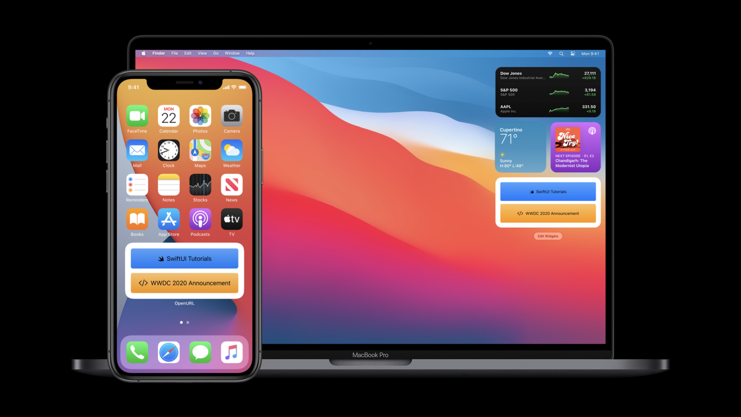
ハイライト
SwiftUI 2020 は、
App、Scene、DocumentGroup、Widget、List(children:)、LazyVGrid、ToolbarItem、matchedGeometryEffect、Link、openURL、UTType、およびSignInWithAppleButtonを追加します 同じ宣言型モデルのセットに接続することで、アプリケーション portals, windows, documents, widgets, complex lists, toolbars, animations, and system services can all be implemented directly using SwiftUI.
主要内容
SwiftUI の初年度の焦点は View でした。開発者は宣言型インターフェイスを作成できますが、完成したアプリはポータル、ウィンドウ、メニュー、ドキュメント、リスト機能、ツールバー、アクセシビリティ、およびシステム サービスも処理します。 The task of this session is to take these daily tasks back into SwiftUI’s declarative model.
(01:14) 最初に、完全なアプリが指定されています。@main が入り口をマークし、App の body が Scene を返し、WindowGroup がビューをホストします。システムは、プラットフォームのルールに従って、このステートメントを iOS の全画面ウィンドウ、iPadOS のマルチウィンドウ、macOS のマルチウィンドウおよびメニュー コマンドにマッピングします。
(09:18) The second problem is content scale. Ordinary lists and handwritten navigation will soon encounter hierarchical data, grid content, and scrolling performance. SwiftUI 2020 では、アウトライン、遅延グリッド、遅延スタックが追加されているため、ギャラリー、サイドバー、再帰リストを引き続きデータ駆動型の記述で表現できます。
(12:19) 最後の部分はプラットフォーム エクスペリエンスに戻ります。 SwiftUI のエントリには、ツールバー、ラベル、ヘルプ ヒント、キーボード ショートカット、進行状況コントロール、ゲージ、一致したジオメトリ、動的フォント スケーリング、リンク、openURL、Uniform Type Identifiers、および Apple でサインインがあります。 Developers can access these system capabilities without leaving SwiftUI.
##詳細
1. App and Scene become the entrance to SwiftUI
(01:26) The first clip officially displayed is a complete App. The App protocol and WindowGroup write the application entry into a declarative structure similar to View.
@main
struct HelloWorld: App {
    var body: some Scene {
        WindowGroup {
            Text("Hello, world!").padding()
        }
    }
}
キーポイント:
@mainmarks the application entry, replacing the manual life cycle entry in traditional templates.HelloWorldcomplies withApp, andbodyreturnsScene.WindowGroupはここではシーンです。 the transcript indicates that it will provide corresponding window behavior on different platforms.Text("Hello, world!").padding()is the SwiftUI View in the window.
(04:46) It is also possible to combine Settings Scenes on macOS. The system sets up the standard preference menu and gives the window the correct style.
@main
struct BookClubApp: App {
    @StateObject private var store = ReadingListStore()

    @SceneBuilder var body: some Scene {
        WindowGroup {
            ReadingListViewer(store: store)
        }

    #if os(macOS)
        Settings {
            BookClubSettingsView()
        }
    #endif
    }
}

struct BookClubSettingsView: View {
    var body: some View {
        Text("Add your settings UI here.")
            .padding()
    }
}
キーポイント:
@StateObjectはリーディング リストをアプリ層に保存し、ウィンドウ内のビューによって監視されます。@SceneBuilderを使用すると、アプリで複数のシーンを宣言できます。WindowGroupはメイン ウィンドウを担当します。- 「設定」は macOS 上でのみコンパイルされ、環境設定ウィンドウを担当します。
2. DocumentGroup がドキュメントのオープン、編集、保存を引き継ぎます。
(05:10) ドキュメントベースのアプリは「DocumentGroup」を使用します。トランスクリプトは、ドキュメントのオープン、編集、保存のシナリオを自動的に管理し、iOS、iPadOS、macOS で利用できると説明しています。
import SwiftUI
import UniformTypeIdentifiers

@main
struct ShapeEditApp: App {
    var body: some Scene {
        DocumentGroup(newDocument: ShapeDocument()) { file in
            DocumentView(document: file.$document)
        }
    }
}

struct DocumentView: View {
    @Binding var document: ShapeDocument

    var body: some View {
        Text(document.title)
            .frame(width: 300, height: 200)
    }
}

struct ShapeDocument: Codable {
    var title: String = "Untitled"
}

extension UTType {
    static let shapeEditDocument =
        UTType(exportedAs: "com.example.ShapeEdit.shapes")
}

extension ShapeDocument: FileDocument {
    static var readableContentTypes: [UTType] { [.shapeEditDocument] }

    init(fileWrapper: FileWrapper, contentType: UTType) throws {
        let data = fileWrapper.regularFileContents!
        self = try JSONDecoder().decode(Self.self, from: data)
    }

    func write(to fileWrapper: inout FileWrapper, contentType: UTType) throws {
        let data = try JSONEncoder().encode(self)
        fileWrapper = FileWrapper(regularFileWithContents: data)
    }
}
キーポイント:
DocumentGroup(newDocument:)は新しいドキュメントのデフォルトを定義します。file.$documentは、ドキュメントのコンテンツをバインディングとしてDocumentViewに渡します。UTType(exportedAs:)はアプリケーション独自のファイル タイプを宣言します。FileDocumentのinitとwriteはドキュメント データの読み取りと書き込みを担当します。
(05:49) Document App ではメニュー コマンドを追加することもできます。 commands はプラットフォームの適切な場所にカスタム メニューを配置し、keyboardShortcut はショートカット キーを表示します。
DocumentGroup(newDocument: ShapeDocument()) { file in
    DocumentView(document: file.$document)
}
.commands {
    CommandMenu("Shapes") {
        Button("Add Shape...", action: addShape)
            .keyboardShortcut("N")
        Button("Add Text", action: addText)
            .keyboardShortcut("T")
    }
}
キーポイント:
- 「コマンド」は単一のビューではなくシーンにハングされます。
CommandMenu("Shapes")はカスタム メニューを作成します。- 2 つの
Buttonはそれぞれアクションにバインドされています。 keyboardShortcutは、メニュー項目のキーボード ショートカットを宣言します。
3. リスト、グリッド、遅延スタックは大量のコンテンツを処理します
(09:22) リストには、再帰的な階層データを直接表示できる新しい子キー パスが追加されます。この機能により、コンテンツベースのアプリで頻繁に行われるプッシュ アンド ポップ ナビゲーションが軽減されます。
struct OutlineContentView: View {
    var graphics: [Graphic]

    var body: some View {
        List(graphics, children: \.children) { graphic in
            GraphicRow(graphic)
        }
        .listStyle(SidebarListStyle())
    }
}

struct Graphic: Identifiable {
    var id: String
    var name: String
    var icon: Image
    var children: [Graphic]?
}
キーポイント:
List(graphics, Children: \.children)は、各ノードの子を読み取ります。Graphicのchildrenは、展開可能なノードまたはリーフ ノードに対応するオプションの配列です。SidebarListStyle()はサイドバー スタイルを使用します。- 各ノードは引き続き通常の SwiftUI View でレンダリングされます。
(10:09) グリッドは遅延読み込みレイアウトを使用します。 GridItem(.adaptive(minimum: 176)) は列数を利用可能な幅に調整します。
struct ContentView: View {
    var items: [Item]

    var body: some View {
        ScrollView {
            LazyVGrid(columns: [GridItem(.adaptive(minimum: 176))]) {
                ForEach(items) { item in
                    ItemView(item: item)
                }
            }
            .padding()
        }
    }
}
キーポイント:
ScrollViewはスクロール コンテナを提供します。LazyVGridは、オンデマンドでグリッド コンテンツのみを読み込みます。GridItem(.adaptive(minimum: 176))は、列の数を空間の変化に追従させます。ForEach(items)はデータ配列をセルにマップします。
(10:58) カスタムの長いリストは「LazyVStack」で使用できます。公式ギャラリーの例では、ビュー ビルダーが同じスタック内の複数のレイアウトを切り替えることができる「switch」をサポートしていることも示しています。
struct WildlifeList: View {
    var rows: [ImageRow]

    var body: some View {
        ScrollView {
            LazyVStack(spacing: 2) {
                ForEach(rows) { row in
                    switch row.content {
                    case let .singleImage(image):
                        SingleImageLayout(image: image)
                    case let .imageGroup(images):
                        ImageGroupLayout(images: images)
                    case let .imageRow(images):
                        ImageRowLayout(images: images)
                    }
                }
            }
        }
    }
}
キーポイント:
- カスタムスクロールレイアウトに適した「LazyVStack」。
switch row.contentは、データ型ごとに異なるビューを選択します。SingleImageLayout、ImageGroupLayout、およびImageRowLayoutが一緒になって不規則なギャラリーを形成します。- トランスクリプトには、これらのコンテンツが結合されてシームレスなギャラリーを形成していることが明確に記載されています。
4. ツールバー、ラベル、ヘルプ プロンプト、および新しいコントロールによりプラットフォームの相互作用が統合されます
(12:24) SwiftUI に新しい「ツールバー」修飾子が追加されました。ツールバー項目は通常のビューにすることができ、デフォルトでプラットフォームの優先場所に配置されます。
struct ContentView: View {
    var body: some View {
        List {
            Text("Book List")
        }
        .toolbar {
            Button(action: recordProgress) {
                Label("Record Progress", systemImage: "book.circle")
            }
        }
    }

    private func recordProgress() {}
}
キーポイント:
toolbarはビューにハングされ、ツールバーのコンテンツはその中に配置されます。Buttonは通常の SwiftUI コントロールです。Labelはタイトルとアイコンの両方を提供します。- トランスクリプトの説明ツールバーは、プラットフォームのデフォルトの場所に表示されます。
(12:40) 位置を制御する必要がある場合は、「ToolbarItem」を使用します。主な操作、確認操作、キャンセル操作、主な位置などのセマンティック配置を宣言できます。
struct ContentView: View {
    var body: some View {
        List {
            Text("Book List")
        }
        .toolbar {
            ToolbarItem(placement: .primaryAction) {
                Button(action: recordProgress) {
                    Label("Record Progress", systemImage: "book.circle")
                }
            }
        }
    }

    private func recordProgress() {}
}
キーポイント:
ToolbarItemはツールバー コントロールをラップします。.primaryActionはコントロールの役割を記述します。- SwiftUI はプラットフォームに基づいて特定の場所を決定します。
Labelはデフォルトでツールバーにアイコンを表示し、タイトルはアクセシビリティのために使用されます。
(15:28) 「help」修飾子は macOS ではツールチップになり、アクセシビリティのヒントも提供します。
struct ContentView: View {
    var body: some View {
        Button(action: recordProgress) {
            Label("Progress", systemImage: "book.circle")
        }
        .help("Record new progress entry")
    }

    private func recordProgress() {}
}
キーポイント:
helpでは制御効果について説明します。- macOS はこれをツールチップとして表示します。
- トランスクリプト 説明 すべてのプラットフォームで VoiceOver ヒントも提供します。
(17:08) 新しいコントロールは、進行状況と容量の表現をカバーします。 「ProgressView」は明確または不確実な進捗状況を表し、「Gauge」は容量に対する特定の値の位置を表します。
struct ContentView: View {
    var percentComplete: Double

    var body: some View {
        ProgressView("Downloading Photo", value: percentComplete)
    }
}
キーポイント:
percentCompleteは決定された進行状況の値です。ProgressViewはタイトルと進行状況の両方を受け取ります。- トランスクリプトは、直線と円形の 2 つのスタイルがあると説明しています。
5. アニメーション、応答性の高いビジュアル、およびシステム サービスには直接 SwiftUI API があります
(19:17) matchedGeometryEffect は 2 つの領域の同じ要素を接続します。この例では、アルバムがグリッドから選択された行に移動すると、SwiftUI はフレームを補間して連続トランジションを形成します。
struct ContentView: View {
    @Namespace private var namespace
    @State private var selectedAlbumIDs: Set<Album.ID> = []

    var body: some View {
        VStack(spacing: 0) {
            ScrollView {
                albumGrid.padding(.horizontal)
            }

            Divider().zIndex(-1)

            selectedAlbumRow
                .frame(height: AlbumCell.albumSize)
                .padding(.top, 8)
        }
        .buttonStyle(PlainButtonStyle())
    }

    private var albumGrid: some View {
        LazyVGrid(columns: [GridItem(.adaptive(minimum: AlbumCell.albumSize))], spacing: 8) {
           ForEach(unselectedAlbums) { album in
              Button(action: { select(album) }) {
                 AlbumCell(album)
              }
              .matchedGeometryEffect(id: album.id, in: namespace)
           }
        }
    }

    private var selectedAlbumRow: some View {
        HStack {
            ForEach(selectedAlbums) { album in
                AlbumCell(album)
                .matchedGeometryEffect(id: album.id, in: namespace)
            }
        }
    }
}
キーポイント:
@Namespaceは、幾何学的マッチングのための名前空間を提供します。- 2 つの
matchedGeometryEffectは同じalbum.idを使用します。 - グリッドと選択された行は、同じ識別子のセットを共有します。
withAnimation(.spring(response: 0.5))は公式の完全なフラグメントに表示され、選択アニメーションをトリガーするために使用されます。
(20:34) レスポンシブ タイポグラフィも強化されました。カスタム フォントはダイナミック タイプでスケールされ、非テキスト メトリクスは @ScaledMetric を使用できます。
struct ContentView: View {
    var album: Album
    @ScaledMetric private var padding: CGFloat = 10

    var body: some View {
        VStack {
            Text(album.name)
                .font(.custom("AvenirNext-Bold", size: 30))

            Text("\(Image(systemName: "music.mic")) \(album.artist)")
                .font(.custom("AvenirNext-Bold", size: 17))

        }
        .padding(padding)
        .background(RoundedRectangle(cornerRadius: 16, style: .continuous).fill(Color.purple))
    }
}
キーポイント:
@ScaledMetricは、paddingを Dynamic Type に従います。- カスタム フォントは引き続き
.font(.custom(...))を使用します。 Image(systemName:)はTextに埋め込むことができ、テキストの一部としてフォント サイズの変更に応答します。
(23:15) システム統合パートでは、まず「Link」と「openURL」について説明します。 「Link」は URL またはユニバーサル リンクを開きます。「openURL」は、View 環境のコードから開くことをトリガーするために使用されます。
let customPublisher = NotificationCenter.default.publisher(for: .init("CustomURLRequestNotification"))
let apple = URL(string: "https://developer.apple.com/tutorials/swiftui/")!

struct ContentView: View {
    @Environment(\.openURL) private var openURL

    var body: some View {
        Text("OpenURL Environment Action")
            .onReceive(customPublisher) { output in
                if output.userInfo!["shouldOpenURL"] as! Bool {
                    openURL(apple)
                }
            }
    }
}
キーポイント:
@Environment(\.openURL)は、環境内の URL を開くアクションを読み取ります。onReceiveはパブリッシャーをリッスンします。- 条件が満たされた後、
openURL(apple)を呼び出します。 - トランスクリプト 説明 SwiftUI は、それを含むウィンドウに関連する URL を開きます。
(25:16) Apple でのサインインには SwiftUI コントロールもあります。 AuthenticationServicesとSwiftUIの両方をインポートするだけで使用できます。
import AuthenticationServices
import SwiftUI

struct ContentView: View {
    var body: some View {
        SignInWithAppleButton(
            .signUp,
            onRequest: handleRequest,
            onCompletion: handleCompletion
        )
        .signInWithAppleButtonStyle(.black)
    }

    private func handleRequest(request: ASAuthorizationAppleIDRequest) {}
    private func handleCompletion(result: Result<ASAuthorization, Error>) {}
}
キーポイント:
- AuthenticationServices と SwiftUI の組み合わせからの
SignInWithAppleButton。 .signUpはボタンの目的を指定します。onRequestとonCompletionは認可リクエストと結果を処理します。.signInWithAppleButtonStyle(.black)は正式なスタイルを設定します。
重要ポイント
- マルチウィンドウの読み取りまたはデータ管理アプリを作成する:
App、WindowGroup、および@StateObjectを使用して共有モデルを配置し、同じ SwiftUI 入口セットで iPhone、iPad、Mac、Apple Watch、Apple TV をカバーできるようにします。まず、BookClub の構造に従ってエントリを構築し、「設定」シーンを macOS に追加します。 - 単純なドキュメント エディタを作成します:
DocumentGroupを使用して開く、編集および保存を管理し、FileDocumentを使用してモデルを読み書きし、UTType(exportedAs:)を使用してファイル タイプを宣言します。最初のバージョンでは、タイトル フィールドとDocumentViewのみが必要で、その後、commandsを使用してメニュー アクションを追加します。 - 大量のコンテンツを保持できるギャラリーを作成します:
LazyVGridを使用してアダプティブ グリッドを作成し、LazyVStackを使用して不規則な長いリストを処理し、matchedGeometryEffectを使用してアイテムの動きに連続アニメーションを追加します。まず、公式のアルバム セレクター構造を再利用し、データを画像またはビデオのサムネイルに置き換えることができます。 - 運用アプリの完全なプラットフォーム操作の詳細: 「toolbar」、「ToolbarItem」、「Label」、「help」、および「keyboardShortcut」を使用して、共通の操作をプラットフォーム上の適切な場所に配置します。詳細ページから開始して、保存、キャンセル、共有、および主な操作を対応するプレースメントにマップします。
- システム機能を SwiftUI ページに統合:
Linkを使用してアプリ内のチュートリアル、ニュース、またはユニバーサル リンクを処理し、openURLを使用して非同期イベントに応答し、SignInWithAppleButtonを使用してログイン プロセスを組み込みます。最初のステップは、外部リンクとログイン ボタンを独立した SwiftUI ビューに作成し、それらを既存のページに埋め込むことです。
関連セッション
- SwiftUI のアプリの要点 — 引き続き、アプリ、シーン、ビュー、ウィンドウグループ、設定、アプリケーション エントリの構造について説明します。
- SwiftUI でドキュメントベースのアプリを構築する —
DocumentGroup、FileDocument、およびドキュメントベースのアプリ管理について詳しく説明します。 - SwiftUI のスタック、グリッド、アウトライン — このセッションで言及されているアウトライン、遅延グリッド、遅延スタックを展開します。
- ウィジェット用の SwiftUI ビューの構築 — WidgetKit で SwiftUI ウィジェット ビューを構築する方法を補足します。
- SwiftUI でコンプリケーションを構築する — Apple Watch コンプリケーションの SwiftUI カスタム ビューを引き続き使用します。
コメント
GitHub Issues · utterances