
ハイライト
このセッションは Starstruck の例で、Button Shapes、色の区別、Bold Text、Reduce Motion、Cross-fade、Reduce Transparency の
UIAccessibilityチェックポイントを示し、App の色、文字サイズ、動き、透明背景をユーザーの視覚的嗜好に合わせて調整する方法を紹介します。
主要内容
多くの App は色から視覚的階層を作ります。赤はエラー、青はタップ可能、薄い背景の上に半透明のぼかし。視力が正常な人には自然ですが、色弱、低視力、光過敏、動き過敏のユーザーには同じ UI で重要な情報が失われることがあります。
このセッションは星座 App Starstruck を手がかりに、問題を3つに分けます。色と形状、文字の読みやすさ、表示設定。講者は無障害を最後にラベルを足す作業とせず、ボタン、Tab、リスト cell、画像、アニメーション、blur といった日常 UI から、デフォルト設計がどこで破綻するかを順に確認します。
Apple のやり方も明快です。システム色、SF Symbols、Asset Catalog の高コントラストリソースで手作業の適応を減らし、UIAccessibility でユーザー設定を読み取り、デフォルト設計が満たせないときは通知を監視してより明確な表現に切り替えます。同じ UI でブランド視覚を保ちつつ、システムで既に示された視覚ニーズを尊重できます。
詳細
色と形状:意味を色だけに頼らない
(03:14) iOS 14 は Button Shapes 用の新しい UIAccessibility API を提供します。講者の助言は、デフォルト設計にボタン外形がなければ、この設定がオンのとき代替表現を用意することです。
func observeButtonShapesNotification() {
    // Make buttons more visible by using shapes.
    // If your default design does not include button shapes, observe this notification to make visual changes.
    NotificationCenter.default.addObserver(self, selector: #selector(updateButtonShapes), name: UIAccessibility.buttonShapesEnabledStatusDidChangeNotification, object: nil)
}

@objc func updateButtonShapes() {
    if UIAccessibility.buttonShapesEnabled {
        // Use extra visualizations for buttons.
    } else {
        // Use default design for buttons.
    }
}
キーポイント:
buttonShapesEnabledStatusDidChangeNotificationで設定変更時に UI を即座に更新できます。UIAccessibility.buttonShapesEnabledは現在の状態で、更新メソッドで分岐に使います。- 代替表現は枠線、背景などでボタらしさを強めます。
(03:31) Differentiate Without Color はより一般的な問題に対応します。状態 icon、色付き文字、リストの分類表示は色だけで意味を伝えられません。講者は SF Symbols から始めることを勧めます。シンボルは文字サイズとウェイトに追従します。
func observeDifferentiateWithoutColorNotification() {
    // Use symbols or shapes to convey meaning instead of relying on color alone.
    // If your default design does not differentiate without color, observe this notification to make visual changes.
    NotificationCenter.default.addObserver(self, selector: #selector(updateColorAndSymbols), name: NSNotification.Name(UIAccessibility.differentiateWithoutColorDidChangeNotification), object: nil)
}

@objc func updateColorAndSymbols() {
    if UIAccessibility.shouldDifferentiateWithoutColor {
        // Use symbols or shapes to convey meaning.
    } else {
        // Use default design.
    }
}
キーポイント:
shouldDifferentiateWithoutColorがオンのとき、色に加えてシンボル、形状、文字を付けます。- エラー状態、選択状態、色で区別していた分類ラベルに適用します。
- transcript の Starstruck 例は各星座を色のみから色+シンボルに変え、色弱ユーザーが分類情報を失わないようにします。
コントラストと Smart Invert:システム設定に外観変更を任せる
(05:17) 色は使えますがコントラストを確認します。講者は Xcode Accessibility Inspector の Color Contrast Calculator をデモします。通常外観では白シンボルと紫背景が 4.5:1、高コントラストリソースで背景を暗くすると 7.5:1。Asset Catalog で同じ symbol に High Contrast 外観を用意でき、Increase Contrast で自動切り替えします。
(07:47) Smart Invert Colors は UI に反転効果をかけますが、写真、動画、App icon は通常そのままにします。UIKit の入口は UIView.accessibilityIgnoresInvertColors です。
extension UIView {
    @available(iOS 11.0, tvOS 11.0)
    var accessibilityIgnoresInvertColors: Bool { get set }
}
キーポイント:
- 任意の
UIViewサブクラスに設定します。 - 写真、動画、App icon など反転すべきでないコンテンツに使います。
- transcript は Smart Invert と Dark Mode を区別します。Smart Invert はシステム設定で任意の App UI を上書きします。
大きな文字:レイアウトはコンテンツサイズに追従する
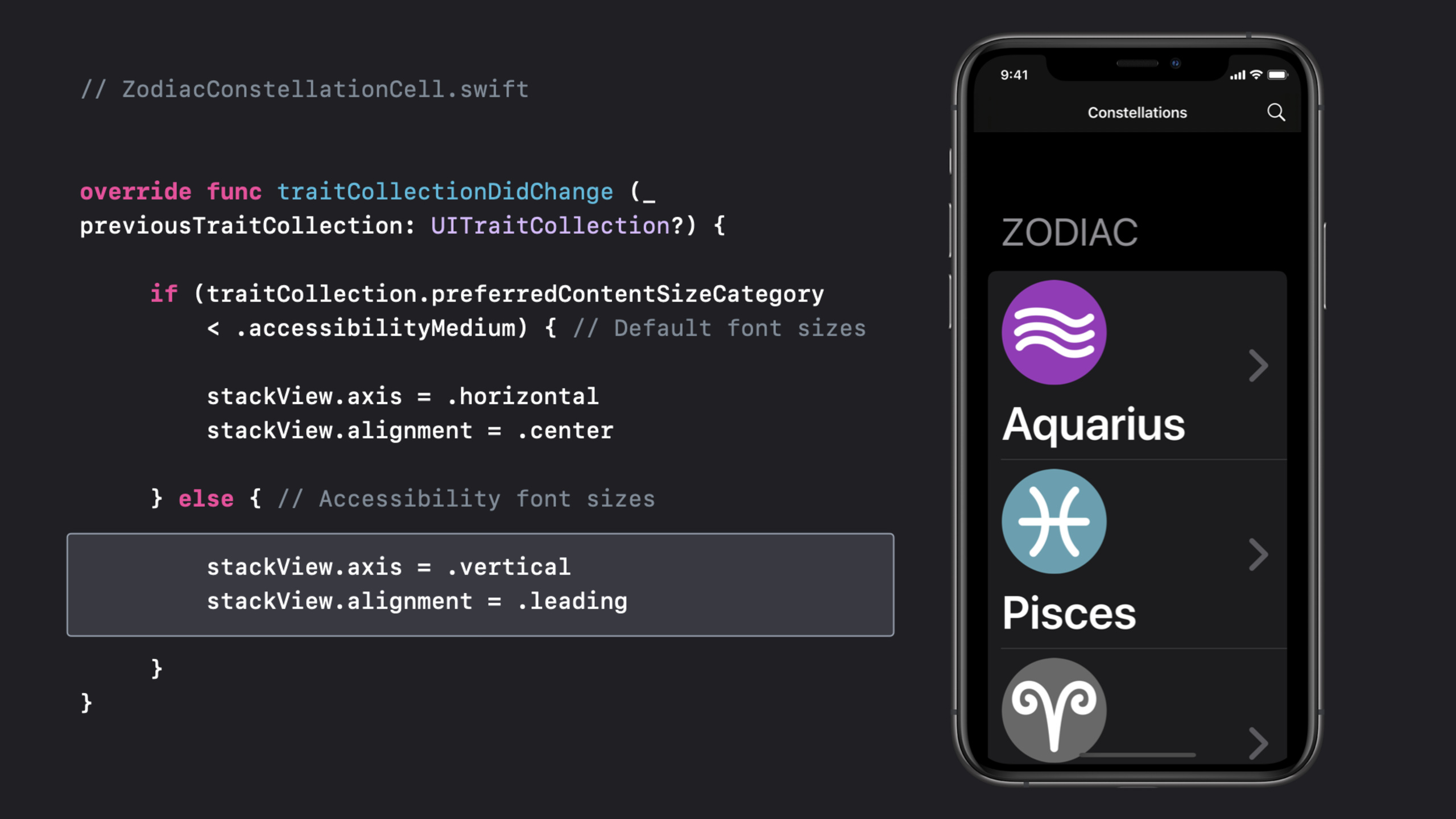
(09:57) Dynamic Type の核心はフォントを大きくするだけではありません。accessibility サイズでは横並びの icon と文字が押し合います。Starstruck は traitCollectionDidChange で preferredContentSizeCategory を読み、cell を横から縦レイアウトに切り替えます。
// ZodiacConstellationCell.swift


override func traitCollectionDidChange (_ previousTraitCollection: UITraitCollection?) {

     if (traitCollection.preferredContentSizeCategory
         < .accessibilityMedium) { // Default font sizes

         stackView.axis = .horizontal
         stackView.alignment = .center

     } else { // Accessibility font sizes

         stackView.axis = .vertical
         stackView.alignment = .leading

     }
}
キーポイント:
traitCollectionDidChangeは表示特性の変化時に呼ばれます。preferredContentSizeCategory < .accessibilityMediumで通常と accessibility 字号を区別します。- 通常字号では横レイアウトで密度を保ちます。
- accessibility 字号では縦にして label に全幅を使います。
- transcript は label の line count を
0にし、長文が折り返せることも強調します。
Bold Text:システムフォントは自動、カスタムフォントは自分で対応
(11:33) システム font style を使えば Bold Text はシステムが処理します。カスタムフォントやウェイトは UIAccessibility.isBoldTextEnabled を読み、対応する通知を監視する必要があります。
func observeBoldTextNotification() {
    // Update labels to use bold or heavy font styles.
    // If you aren't using system font styles, observe this notification to make visual changes.
    NotificationCenter.default.addObserver(self, selector: #selector(updateLabelWeight), name: UIAccessibility.boldTextStatusDidChangeNotification, object: nil)
}

@objc func updateLabelWeight() {
    if UIAccessibility.isBoldTextEnabled {
        // Use bold or heavy font weight
    } else {
        // Use font weight that is default to your design.
    }
}
キーポイント:
boldTextStatusDidChangeNotificationで設定変化にリアルタイム対応します。isBoldTextEnabledがオンのとき、カスタムフォントは bold や heavy に切り替えます。- transcript の用法では title と detail label の視覚的区別を明確にします。
動きと透明度:動きと背景の複雑さに対するユーザー選択を尊重
(13:08) Starstruck は UIMotionEffect で星の前景と宇宙背景に奥行きを持たせる視差効果があります。動き過敏の人には不快になり得ます。Reduce Motion がオンのとき、頻繁で強い装飾的な動きを減らすか除去します。
func observeReduceMotionNotification() {
    // Observe this notification to reduce or remove the frequency and intensity of motion effects.
    NotificationCenter.default.addObserver(self, selector: #selector(updateMotionEffects), name: UIAccessibility.reduceMotionStatusDidChangeNotification, object: nil)
}

@objc func updateMotionEffects() {
    if UIAccessibility.isReduceMotionEnabled {
        // Reduce or remove extraneous motion effects.
    } else {
        // Use default motion effects.
    }
}
キーポイント:
- 強い動き効果の前に
isReduceMotionEnabledを確認します。 reduceMotionStatusDidChangeNotificationで開いている画面も調整できます。- 代替対象には idle animation、parallax、自動再生動画、GIF、スライド遷移があります。
(13:51) iOS 14 は Prefer Cross-Fade Transitions API も追加しました。UINavigationController のデフォルトスライド遷移はシステムが処理します。カスタムスライド遷移は設定を確認する必要があります。
func observeCrossFadeTransitionsNotification() {
    // Reduce or remove sliding animations for transitioning views.
    // If you aren't using system-provided navigation, observe this notification to make visual changes.
    NotificationCenter.default.addObserver(self, selector: #selector(updateTransitionEffects), name: UIAccessibility.prefersCrossFadeTransitionsStatusDidChange, object: nil)
}

@objc func updateTransitionEffects() {
    if UIAccessibility.prefersCrossFadeTransitions {
        // Replace sliding transitions with cross-fade animations.
    } else {
        // Use default sliding transitions.
    }
}
キーポイント:
prefersCrossFadeTransitionsがオンのとき、スライドを cross-fade に置き換えます。- デフォルト UIKit navigation は一般的な経路をカバーします。
- カスタム遷移、ゲームメニュー、全画面フローは明示的な処理が必要です。
(15:07) Reduced Transparency は blur と vibrancy を不透明な効果に調整します。システム visual effect は自動適応します。カスタム透明背景は UIAccessibility.isReduceTransparencyEnabled を確認する必要があります。
func observeReduceTransparencyNotification() {
    // Reduce or remove transparency by adjusting these effects to be completely opaque.
    // If you aren't using system-provided visual effects for blurs or vibrancy, observe this notification to make visual changes.
    NotificationCenter.default.addObserver(self, selector: #selector(updateTransparencyEffects), name: UIAccessibility.reduceTransparencyStatusDidChangeNotification, object: nil)
}

@objc func updateTransparencyEffects() {
    if UIAccessibility.isReduceTransparencyEnabled {
        // Make transparency effects opaque.
    } else {
        // Use default transparency.
    }
}
キーポイント:
- blur 背景は背景に応じて文字コントラストが変わり、低視力ユーザーには読みにくくなります。
reduceTransparencyStatusDidChangeNotificationはカスタム背景素材の切り替えに適しています。- 透明度を切っても階層は失われません。単色、枠線、余白で情報構造を維持できます。
重要ポイント
-
無障害状態コンポーネントライブラリを作る。 何をするか:エラー、成功、警告、選択状態を色+シンボル+文字の組み合わせに統一する。なぜ価値があるか:セッションは色だけで意味を伝えないよう明示し、SF Symbols は文字サイズとウェイトに追従する。始め方:
differentiateWithoutColorDidChangeNotificationを監視し、shouldDifferentiateWithoutColorがオンのときシンボルや形状を表示する。 -
リスト cell に大字号レイアウトを追加する。 何をするか:メッセージリスト、注文リスト、健康データリスト用に accessibility サイズレイアウトを用意する。なぜ価値があるか:transcript の Starstruck は icon と label を横から縦に変え、文字に全幅を与える。始め方:cell の
traitCollectionDidChangeでpreferredContentSizeCategoryを比較し、.accessibilityMediumを超えたら stack view の axis と alignment を調整する。 -
表示設定テストパネルを作る。 何をするか:debug メニューに Button Shapes、Bold Text、Reduce Motion、Reduce Transparency 有効時の期待 UI を列挙する。なぜ価値があるか:セッション締めで開発者にこれらの設定を開き、うまくいっている領域と修正が必要な領域を見つけるよう勧める。始め方:各
UIAccessibility状態を読み取り専用チェックにし、対応ページの視覚チェックリストにリンクする。 -
高リスクな動き効果を置き換える。 何をするか:視差、スライド遷移、自動再生アニメーションの低動き版を用意する。なぜ価値があるか:parallax、idle animation、GIF、スライド遷移は動き過敏ユーザーに影響し得る。始め方:アニメーション前に
isReduceMotionEnabledとprefersCrossFadeTransitionsを確認し、装飾的な動きをフェードや静止状態に置き換える。 -
blur 背景を降格可能にする。 何をするか:情報カード、ボトムシート、半透明ナビバーに不透明背景を提供する。なぜ価値があるか:Reduced Transparency はシステム blur を単色にし、カスタム blur は自分で処理が必要。始め方:
reduceTransparencyStatusDidChangeNotificationを監視し、isReduceTransparencyEnabledがオンのとき単色背景に切り替え、文字コントラストを再確認する。
関連セッション
- App accessibility for Switch Control — 補助機能の観点からインタラクション構造を引き続き確認し、Switch Control ユーザーが UI 要素をスキャンして起動する方法に焦点を当てる。
- VoiceOver efficiency with custom rotors — custom rotors で VoiceOver ユーザーが複雑な UI をより速くナビゲートする方法を説明する。
- Accessibility design for Mac Catalyst — iPad App を Mac に持ち込む際、キーボード、マウス、要素グループ化、Accessibility Inspector テストを補う。
- The details of UI typography — 文字の読みやすさを深掘りし、システムフォント、Dynamic Type、カスタムフォント、タイポグラフィの詳細を補う。
- SF Symbols 2 — シンボルシステムの設計とコード利用法を補い、Differentiate Without Color の状態表現改造に適する。
コメント
GitHub Issues · utterances