
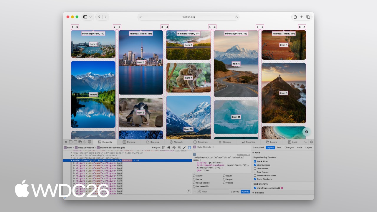
Highlight
Safari 26.4 introduces
display: grid-lanes, replacing JavaScript masonry libraries with three lines of CSS and using theflow-toleranceproperty to address keyboard-focus jumps caused by mismatches between DOM order and visual order.
Core Content
The masonry-layout problem
Anyone who has built an image wall or card stream has faced this situation: images have uneven heights, Flexbox leaves large blank gaps, and CSS Grid forces every image into equal-height cells. The usual compromises are all unsatisfying: stretching distorts images, scaling causes overflow, and cropping loses content. Most teams eventually bring in a JavaScript library that calculates each image height on the client and positions items dynamically. That approach works, but it adds script size and runtime cost, especially while scrolling on mobile.
(00:57)
What Grid Lanes is for
The existing CSS layout modes answer the same question in two different ways: where should elements go, and how much space should they occupy? Flexbox controls one axis. Content flows along a single track and continues in the same direction when it wraps. Grid controls two axes, placing elements into cells at row and column intersections. Grid Lanes sits between them: one axis is locked, while the other axis is left entirely to the content’s natural size.
(01:13)
The result is that elements are distributed into multiple lanes, and each lane computes its own height. The browser places each new element into the currently shortest column, and subsequent elements fill the gaps below. This “shortest first” algorithm naturally creates a tight layout while preserving each element’s natural proportions.
(03:07)
From masonry to brick wall by changing one property
Grid Lanes supports two visual forms. The default is masonry: define column tracks, then content fills columns from top to bottom. Replace grid-template-columns with grid-template-rows, and the layout immediately becomes a horizontal brick wall where elements flow row by row from left to right. Both modes share the same syntax, so switching between them is cheap.
(04:31)
flow-tolerance solves an accessibility pain point
Grid Lanes appears in the Accessibility & Inclusion track because of the flow-tolerance property. Traditional “shortest first” algorithms have a side effect: when adjacent columns are close in height, the next item may jump to the shorter column on the right, causing visual order to diverge from DOM order. When keyboard users press Tab, focus jumps left and right on screen, and screen readers read content in a confusing order.
The default value of flow-tolerance is 1em. The rule is: if the height difference between a taller column and the shortest column is within the tolerance, the browser prioritizes the column earlier in DOM order instead of chasing the absolutely shortest column. This tiny visual compromise preserves a linear reading order and stable focus path.
(07:15)
Details
Create a Grid Lanes container
(03:58)
The minimal declaration needs only one property:
.container {
  display: grid-lanes;
}
Add columns and spacing:
.container {
  display: grid-lanes;
  grid-template-columns: repeat(3, 1fr);
  gap: 10px;
}
Key points:
display: grid-lanesenables the new layout mode, parallel todisplay: gridrepeat(3, 1fr)divides the container width into three equal parts, andfrmeans fractional unitgap: 10pxworks exactly like CSS Grid- You can define either
grid-template-columnsorgrid-template-rows, but not both at the same time
Brick-wall variant
(04:33)
Replace the column definition with a row definition, and masonry becomes a brick wall:
.container {
  display: grid-lanes;
  grid-template-rows: repeat(3, 1fr);
  gap: 10px;
}
Key points:
grid-template-rowsreplacesgrid-template-columns- Elements flow along the row direction, forming a horizontal arrangement
- Choose one direction; the two cannot be mixed
Responsive column width
(05:10)
Let the browser decide how many columns fit:
.container {
  display: grid-lanes;
  grid-template-columns:
    repeat(auto-fill, minmax(200px, 1fr));
  gap: 10px;
}
A more complex repeated pattern:
.container {
  display: grid-lanes;
  grid-template-columns:
    repeat(auto-fill,
      minmax(8rem, 1fr)
      minmax(14rem, 2fr));
  gap: 10px;
}
Key points:
auto-fillcreates as many columns as possible based on container widthminmax(200px, 1fr)guarantees each column is at least 200px and evenly shares remaining space- You can define a repeating pattern of narrow and wide columns
Control individual elements
(05:45)
Make an element span two columns:
.container {
  display: grid-lanes;
  grid-template-columns: 1fr 1fr 1fr;
  gap: 10px;
}

.item {
  grid-column: span 2;
}
Specify an exact starting position:
.item {
  grid-column: 2 / span 2;
}
Key points:
grid-column: span 2spans two cells along the column directiongrid-column: 2 / span 2starts at column 2 and spans two columns- You can control column placement, while row placement is calculated automatically by Grid Lanes
Integrate with Subgrid
(06:22)
A card that spans two columns, with internal elements aligned to the parent grid:
.container {
  display: grid-lanes;
  grid-template-columns: 1fr 1fr 1fr;
  gap: 10px;
}

.item {
  display: grid-lanes;
  grid-template-columns: subgrid;
  grid-column: span 2;
}
You can also nest a regular Grid:
.item {
  display: grid;
  grid-template-columns: subgrid;
  grid-column: span 2;
}
Key points:
subgridlets child elements inherit the parent’s column-track definition- An image can occupy one column while text occupies another, with each adapting to its content
- Grid Lanes and regular Grid can be nested inside each other
Tune flow-tolerance
(08:37)
Default behavior:
.container {
  display: grid-lanes;
  grid-template-columns: 1fr 1fr;
  gap: 10px;
  flow-tolerance: normal;
}
Custom tolerance:
.container {
  display: grid-lanes;
  grid-template-columns: 1fr 1fr;
  gap: 10px;
  flow-tolerance: 2.1em;
}
Key points:
- The default value is
1em - The browser compares column heights; if the height difference is within the tolerance, it fills in DOM order first
- A larger tolerance makes visual order closer to DOM order, but column-height differences may become more visible
- Safari Web Inspector provides a Grid Lanes-specific overlay that shows column lines, element order numbers, and gaps
Key Ideas
-
What to build: Move an app’s image masonry layout from a JavaScript library to native CSS Why it is worth building: Reduce script size, remove runtime height calculations, and make scrolling smoother inside WKWebView How to start: Use
@supports (display: grid-lanes)for progressive enhancement: supported browsers use the native path, unsupported browsers keep the old implementation -
What to build: Add a brick-wall timeline layout to a content site Why it is worth building: Grid Lanes’ horizontal flow mode is naturally suited to timelines and step-by-step flows How to start: Replace
grid-template-columnswithgrid-template-rows, then usespanto control featured cards -
What to build: Use
flow-toleranceto fix accessibility issues in existing masonry layouts Why it is worth building: Many third-party masonry libraries have mismatches between DOM order and visual order How to start: Addflow-tolerance: 1emto the Grid Lanes container, then inspect the Tab focus path with Safari Web Inspector’s overlay -
What to build: Align image and text in cross-column cards with
subgridWhy it is worth building: Large image-plus-copy cards often need their internal grid to line up with the outer grid How to start: Addgrid-column: span 2andgrid-template-columns: subgridto the card, with the image and text occupying one column each
Related Sessions
- What’s new in WebKit for Safari 27 - A full overview of Safari 27 features; Grid Lanes is one part of the release
- Design principles for spatial user interfaces - Spatial interface design principles that connect with the ideas behind responsive layout
- SwiftUI essentials - SwiftUI’s LazyVGrid and Grid Lanes solve a similar class of problems, so the two platform approaches are useful to compare
Comments
GitHub Issues · utterances