
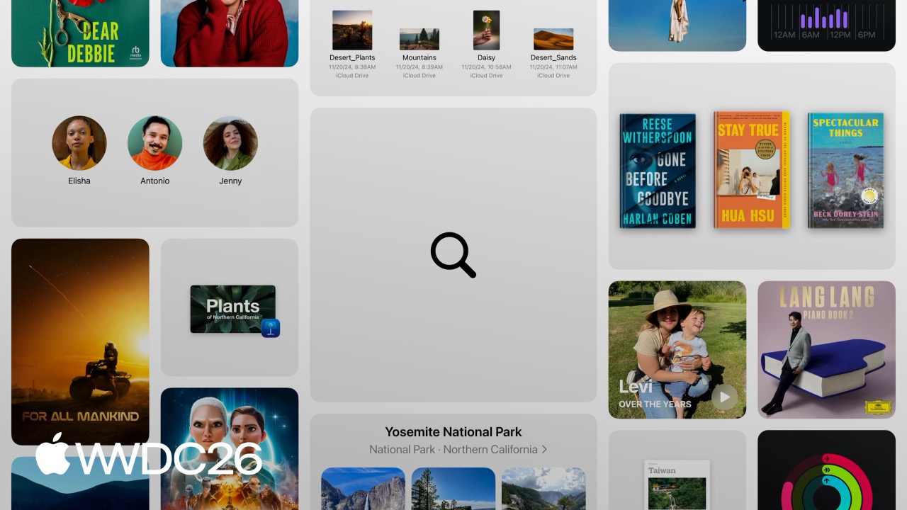
Highlight
Apple unifies the Search Field component across iOS, iPadOS, and macOS, and provides clear placement guidance for different navigation models such as toolbar, tab bar, and sidebar. Developers can apply these patterns directly to reduce the cognitive load users face when finding content.
Core Content
Search is often the first place users go
Users look for documents in Pages, movies in Apple TV, and new artists in Apple Music. Search is often the first thing they do after opening an app. A poor search experience means users get stuck at the front door.
This year Apple reworked the behavioral guidelines for search components under the Liquid Glass design language. A Search Field automatically contains four core elements: the magnifying glass icon on the left, placeholder text, the clear button that appears after input, and the Cancel button shown on iOS when the field is focused. The placement and interactions of these elements are fixed, and developers should not change them just to create “brand differentiation.”
Where search belongs depends on two things
(03:41)
The first question is: how do users navigate your app? The second is: how broad is the search scope?
Together, these two questions determine whether search belongs in the toolbar, tab bar, or content area.
Take Mail as an example. Mail’s primary navigation happens in the message list, while the bottom toolbar holds the main actions. Putting search in the bottom toolbar is the most ergonomic choice because users can reach it with one hand, and it sits next to other frequently used buttons. When search gains focus, the field automatically moves above the keyboard so it is not covered.
The Stocks app is different. Its bottom area is occupied by a sheet, leaving no room for a toolbar. In this case, placing search in the top toolbar is reasonable, and it also moves above the keyboard when focused.
Tab bar apps: global search versus local search
(05:22)
For apps that use a tab bar, Apple recommends two kinds of Search tab.
The first is a regular tab. Tapping it opens a search landing page with the search field at the top and recommendations or categories below. Apple TV uses this pattern: before searching, users see different movie and show categories and are in an exploratory mindset.
The second is a prominent tab. Tapping it immediately brings up the keyboard and enters search state, without an intermediate page. The Phone app’s Search tab is designed this way because users usually know what they want and just want to get back to a contact or call record quickly.
In addition to a global Search tab, you can also place local search inside a specific tab. In Apple Music’s Library tab, the search field sits below the title, and the placeholder explicitly says “Search Library.” This makes it clear that the search scope is limited to the user’s own music collection, not the entire Apple Music catalog.
iPad and Mac: three placement options
(07:47)
iPad and Mac have wider screens and similar navigation models, so their search experiences should stay as consistent as possible.
Apple recommends three placements:
- Trailing side of the toolbar: Best for split view apps such as Mail. Users browse search results on the left while the detail view on the right remains visible. Notes and Files both use this pattern.
- Top of the sidebar: Best when search filters navigation items inside the sidebar. Settings places search at the top of the sidebar and only shows matching settings after input.
- Dedicated Search tab or section: Best for content-rich apps with multiple sections, such as Apple Music. This provides more room for search results.
Search fields in the toolbar automatically resize or collapse into a button depending on available space. Once activated, they expand to a width suitable for typing, and overflowing toolbar items automatically move into a menu.
Details
Use search suggestions to reduce typing
(10:36)
When users open search, it often means they did not find what they wanted while browsing. At that point, the experience should minimize the number of steps they need to take.
Recent searches: On iOS, recent searches appear directly below the search field after it gains focus. On iPad and Mac, if the search field is in the toolbar or sidebar, recent searches appear as a menu; if the app has a Search tab, they appear together with recommended content on the page. Only show results the user actually viewed or interacted with, and provide actions to delete individual items and clear all items.
Predictive suggestions: After users start typing, show completion suggestions that match their input in real time. Visually distinguish the part the user typed from the predicted part. Keep the number of suggestions under control so search results remain the visual focus.
Use scope bars and tokens to filter results
(12:38)
Filtering becomes important when search results come from multiple locations, categories, or accounts.
Scope Bar: A lightweight filtering control. Mail uses it to switch between “All Mailboxes” and “Current Mailbox.” This filtering style is direct, and users can immediately see where they are searching.
Search Token: When users type specific keywords, tokens appear as highlighted text inside the search field. Users can keep adding tokens to combine filters. In Photos, they can combine the tokens “Joshua Tree” and “2021” to quickly find photos from a specific time and place.
The drawback of tokens is discoverability, so they should not replace visible filtering UI. The best practice is to pair tokens with a scope bar or other filter controls.
Empty states when there are no results
(14:41)
When search returns no results, do not show a blank page. Apple provides Content Unavailable View, which automatically displays a search icon, title, and subtitle when configured for search. Apple recommends showing the user’s current search text in the empty state so they can quickly spot spelling mistakes.
Search implementation in SwiftUI
The session does not provide specific code snippets, but the implementation direction can be inferred from the session description and platform guidelines.
In SwiftUI, add search with the .searchable modifier:
// Toolbar search (bottom on iOS, top on iPad/Mac)
ContentView()
    .searchable(text: $searchText, placement: .navigationBarDrawer)

// Search with a Scope Bar
ContentView()
    .searchable(text: $searchText)
    .searchScopes($searchScope) {
        Text("All Mailboxes").tag(Mailbox.all)
        Text("Current Mailbox").tag(Mailbox.current)
    }

// Search with tokens
ContentView()
    .searchable(text: $searchText, tokens: $searchTokens) { token in
        Text(token.name)
    }
Key points:
.searchableautomatically handles search field styling, the clear button, and the Cancel button.- The
placementparameter controls where the search field appears. The system chooses the best presentation based on platform and context. .searchScopesadds a Scope Bar so users can switch scopes by tapping.- Tokens are bound through the
tokensparameter. The system can generate tokens when users type specific keywords. - Search suggestions are provided through the
.searchSuggestionsmodifier and support recent searches and predictive completions.
Key Takeaways
-
Move search from the top to the bottom toolbar
- What to do: Move the search field in your iOS app from the navigation bar to the bottom toolbar.
- Why: One-handed use feels more natural, and the field moves above the keyboard when focused instead of covering content.
- How to start: In SwiftUI, use
.searchable(placement: .toolbar). In UIKit, pairUISearchControllerwith a bottom toolbar.
-
Add a prominent Search tab to tab bar apps
- What to do: Make search a dedicated tab that immediately enters search state when tapped.
- Why: Users do not need to enter another page before searching. Global content is always one tap away.
- How to start: Configure a tab with a search icon in
TabView, then automatically focus the search field when the page loads.
-
Use recent searches to reduce repeated input
- What to do: Record search results the user actually tapped, then show them when the search field gains focus.
- Why: Many searches are repeat actions, and users want to return to content they viewed before.
- How to start: Store recent searches with
UserDefaultsor Core Data, then show them through.searchSuggestions.
-
Use tokens for natural-language filtering
- What to do: When users type “photos from Joshua Tree in 2021,” automatically extract “2021” and “Joshua Tree” as filter tokens.
- Why: This is more flexible than traditional filters, because users can combine arbitrary conditions.
- How to start: Implement token initialization, listen for search text changes, and generate tokens when text matches predefined keywords.
-
Design a meaningful empty state for no results
- What to do: Show the current search term and suggest next actions when search has no results.
- Why: A blank page leaves users unsure whether the issue is the network or truly no matches.
- How to start: Use
ContentUnavailableView.search(text: searchText)to get the standard search empty state automatically.
Related Sessions
- Design principles (250) - The core principles of the Liquid Glass design language, which underpin the visual style of search fields
- SwiftUI (269) - Detailed usage of APIs such as
.searchable,.searchScopes, and.searchSuggestions - SwiftUI + AppKit/UIKit (272) - Implementing a consistent cross-platform search experience
- UIKit modernization (278) - Modern improvements to search controllers in UIKit
- AppKit modernization (289) - Updates to AppKit search field implementation on macOS
Comments
GitHub Issues · utterances