
Highlight
Apple UX Writers Liv and Jennifer outline four writing improvements: cut fillers, remove repetition, lead with the why, build a word list.
Core Content
I rented a car abroad and parked in a garage that required an app to pay. I opened the app and saw “Simply enter your license plate number to quickly pay for parking.” The problem was I didn’t know the rental car’s plate number. I had to walk back to the car, check the plate, then walk back to the exit to find signal and download the app. The words “simply” and “quickly” didn’t help—they made the product seem dishonest.
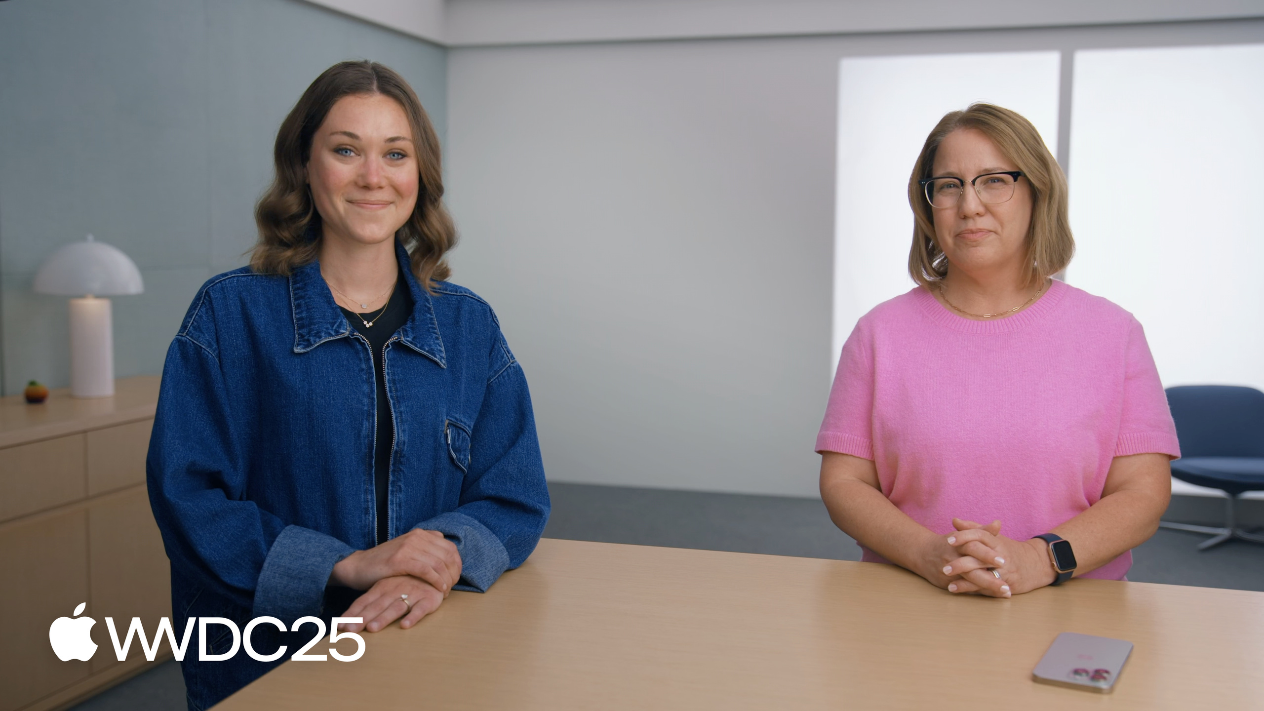
Liv Huntley and Jennifer Bush are UX Writers at Apple. They make a simple point in this session: apps have no minimum word count. Write less. Apple’s new design system is rolling out across platforms. This is the time to review your app’s copy (00:20). They offer four concrete changes: cut fillers, remove repetition, lead with the why, build a word list. None require architecture changes. A full pass takes one to two hours.
Details
Cut fillers (01:15). Liv lists four common filler types: adverbs (easily, quickly), adjectives (fast, simple), interjections (uh oh, oops, hooray), pleasantries (sorry, please, thank you). The test: delete the word. Does meaning change? The parking app example becomes “Enter your license plate number to pay for parking.” after removing simply and quickly. No information is lost (02:48).
- Key point: Don’t treat descriptive adjectives as default decoration.
- Key point: The exception is when an adjective carries critical functional information. In a pet feeder app’s “Feed your pets automatically when you’re away,” automatically explains the core feature—scheduled feeding. Keep it (03:14).
- Key point: Error messages with “uh oh,” “oops,” “oh no” make the product seem flippant about problems. Push notifications with “We’re sorry,” “10 short minutes!” use apologies and exclamation marks as filler, diluting the main message (04:35).
Remove repetition (06:11). Repetition isn’t just saying the same thing twice. It’s using three phrases to express one idea. A late delivery notification had: title “We’re running late,” body “Your delivery driver won’t make it on time,” followed by “in 10 minutes”—three places saying “late.” Liv merged it to “Delivery delayed 10 minutes.” One sentence conveys both “delayed” and “how long” (06:43).
- Key point: UX writing is the economy of language. White space need not be filled.
- Key point: The merge standard is information density. If the new sentence carries the same information as the old, keep the new one.
Lead with the why (07:13). Jennifer’s formula is “To [get benefit], do [action].” The Apple News+ Puzzles notification “Keep your streak going by solving today’s crossword” works because the why (maintain streak) comes first (07:38). The restaurant app example is clearer: original “Enter your phone number to get reservation updates” becomes “To get reservation updates, enter your phone number.” Same word count, but the benefit hits first (08:57).
- Key point: Apply to error messages, push notifications, onboarding flows—any copy requiring user action.
- Key point: A user’s first reaction to a notification is “What does this have to do with me?” Put that answer first.
Build a word list (09:23). This is the only action that happens outside the app. Jennifer recommends a three-column table: word to use / word not to use / definition. In a game, player nickenames are alias, not handle, user name, or title. Player health is health, not lives, hearts, energy, or stamina (10:45). The word list lets anyone on the team look it up. Copy stays consistent in settings, search, and notifications.
- Key point: Don’t try to write the complete list at once. Add one word at a time as you encounter it.
- Key point: Start with the Apple Style Guide.
Liv’s most practical tip: read your writing aloud. Speaking reveals words that “looked fine when written but sound redundant.”
Key Takeaways
-
What to do: Block 1-2 hours before your next release for a copy pass.
- Why: Copy optimization costs almost nothing technically, but users notice immediately. One action improves usability, brand perception, and error handling.
- How: List all user-facing text in your app (buttons, empty states, error messages, push notifications). Run each through the four principles.
-
What to do: Delete all “oops,” “uh oh,” “sorry” from error messages.
- Why: These words make the product seem dismissive when things go wrong. State what happened and what the user should do. That shows respect.
- How: grep your codebase for “oops,” “Sorry,” “uh oh.” Rewrite each one.
-
What to do: Rewrite all push notifications to “lead with the why.”
- Why: Push captures the shallowest user attention. The first five words determine whether they tap.
- How: Take an existing “Do X to get Y” notification and restructure to “To get Y, do X.” A/B test the open rate.
-
What to do: Build a product word list, starting with the 5 most common terms.
- Why: Inconsistent terminology makes users wonder if the same team built the product. Consistency is trust on the cheap.
- How: Create a shared document with three columns: “Use / Don’t use / Definition.” Start with the most easily confused terms: alias/username, avatar, account, subscription.
Related Sessions
- Design foundations from idea to interface — Design fundamentals from idea to interface; copy is a key piece.
- Build a SwiftUI app with the new design — Liquid Glass reshapes app visuals; pair with copy optimization for better results.
- Build a UIKit app with the new design — Adapt your UIKit app to the new design system and rewrite interface copy.
- Meet Liquid Glass — The material foundation of the new design language; a good time for UI refactoring.
Comments
GitHub Issues · utterances