
Highlight
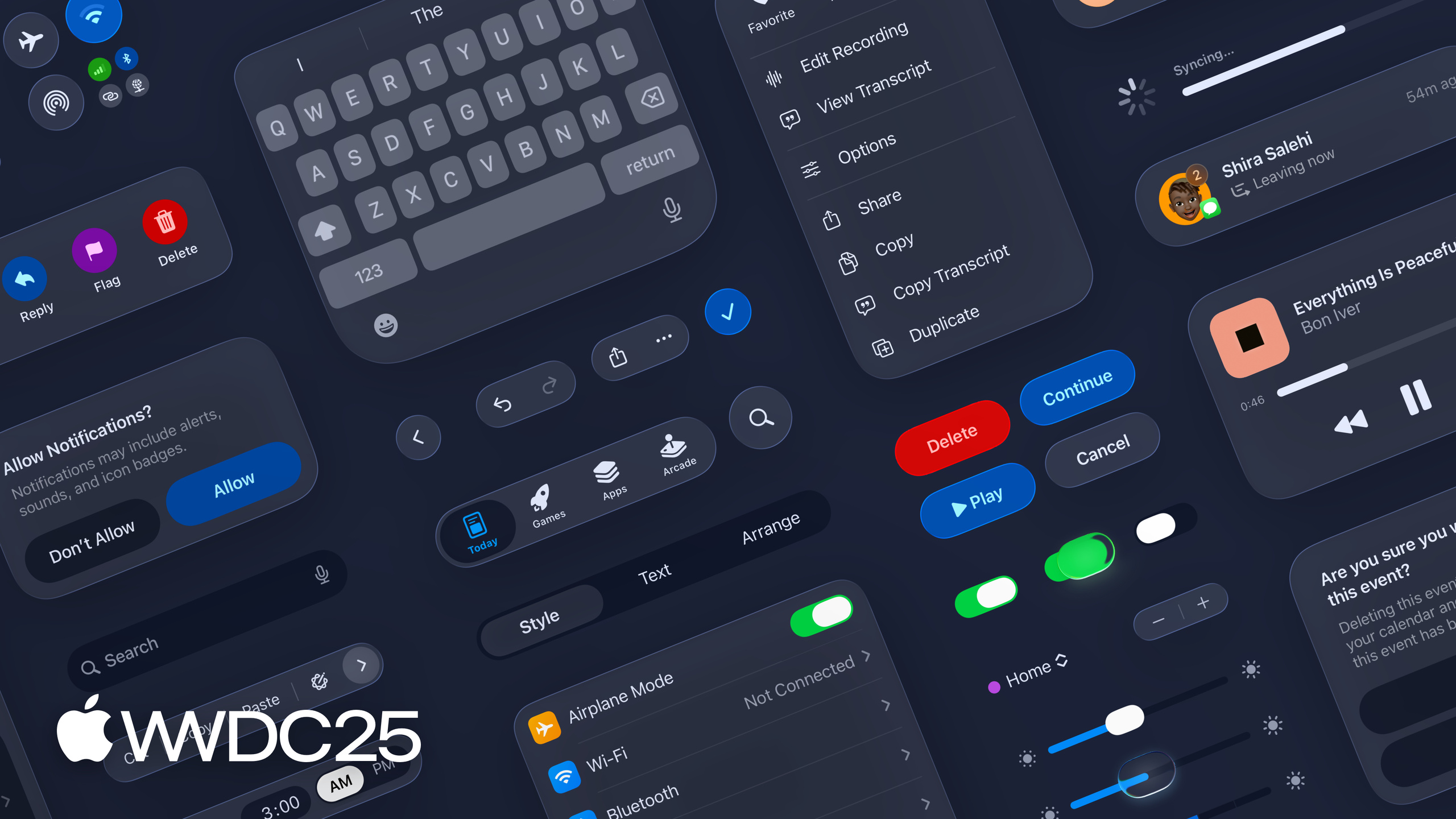
WWDC 2025 establishes Liquid Glass as a cross-platform material system, bringing navigation bars, toolbars, and control highlights under a unified standard.
Core Content
After each WWDC, developers fear one thing: “The design language changed, and my app looks like it’s from the last era.” This feeling has compounded over the past few years: iOS 7’s flat design, iOS 15’s material refresh, then visionOS’s spatial design. Each time, developers learn a new set of rules, yet worry that acting too late means falling behind peers.
WWDC 2025 raises the complexity another level: Liquid Glass is a unified material system spanning iOS, iPadOS, and macOS. It’s not just adding highlights to icons—it establishes new standards for navigation bars, toolbars, control feedback, and typography. This session builds global understanding first; developers then watch platform-specific sessions (323 SwiftUI, 284 UIKit, 310 AppKit) to control migration costs.
The point is “content first.” Liquid Glass gives UI elements glass-like optical behavior—edge highlights, environmental reflection, subtle depth—but the material always serves content, never distracts from it.
Detail
This session is a cross-platform overview; technical details live in companion sessions. Developers implementing this typically follow three paths:
-
Understand material hierarchy: Navigation bars, toolbars, sheets, and controls each use different intensities of Liquid Glass material. The system provides standard Materials—just call them.
-
Test six appearance modes: Light / Dark / Increased Contrast / Reduce Transparency / Tinted / Clear. Each may expose old assumptions that relied on background opacity.
-
Watch scroll content below navigation bars: New design makes navigation bars more transparent. List and scroll view content shows through beneath the navigation bar. Ensure the combined result remains readable.
Platform session index
| Platform | Session | Notes |
|---|---|---|
| SwiftUI | 323 — Build a SwiftUI app with the new design | Impact of new materials on components and layouts |
| UIKit | 284 — Build a UIKit app with the new design | Key changes to Tab, Split View, toolbars |
| AppKit | 310 — Build an AppKit app with the new design | Corresponding changes on macOS |
| Design principles | 356 — Get to know the new design system | Visual, information architecture, core system updates |
| The material itself | 219 — Meet Liquid Glass | Introduction to Liquid Glass concepts |
Writing and icon updates
Beyond Liquid Glass implementation, two related tracks deserve attention:
-
404 — Make a big impact with small writing changes: New materials change text-background contrast, creating new standards for UI copy clarity.
-
361 — Create icons with Icon Composer: Export icon resources adapted to the new design.
Key Takeaways
-
What to do: Audit all “custom frosted glass” implementations in your app.
- Why: Handwritten Core Animation blur layers may conflict with system materials on iOS 26, causing layer confusion or performance drops.
- How: Search your codebase for
UIBlurEffect,.ultraThinMaterial,backdrop-filter—compare each against system-provided standard Materials, replace what you can.
-
What to do: Add six appearance modes to your regression test list.
- Why: Tinted and Clear modes break many designs that relied on background opacity. Manual testing easily misses these.
- How: In SwiftUI Preview or UIKit Snapshot Test, cover all six modes: Light / Dark / Increased Contrast / Reduce Transparency / Tinted / Clear.
-
What to do: Check visual conflicts between navigation bars and scroll content.
- Why: New navigation bars are more transparent. Lists originally “paved at the top” now mix with navigation bar colors, hurting readability.
- How: On all major list screens, capture the combined effect of navigation bar and first screen of list content. Compare iOS 25 vs iOS 26 differences.
-
What to do: Balance brand identity with system materials.
- Why: Blind following loses app distinctiveness; total refusal looks dated.
- How: List “system areas” (navigation/toolbar/Sheet) vs “brand areas” (custom home hero, marketing cards). Use system Liquid Glass for the former, keep custom visuals for the latter.
Related Sessions
- Get to know the new design system — System-level overview of design language updates. Watch this first to build global understanding.
- Meet Liquid Glass — Introduction to Liquid Glass material concepts.
- Build a SwiftUI app with the new design — Hands-on implementation of new materials in SwiftUI.
- Build a UIKit app with the new design — UIKit-side navigation, Tab, and toolbar updates.
- Build an AppKit app with the new design — Corresponding updates for macOS AppKit.
Comments
GitHub Issues · utterances