
Highlight
Apple rebuilt the icon system across iOS, iPadOS, macOS, and watchOS with the Liquid Glass material, introducing six appearance modes: Default, Dark, Clear (light/dark), and Tinted (light/dark), and unified canvas sizes to 1024px (1088px for watchOS).
Core Content
In past years, app icon design was a chore that gave developers headaches. The same app needed a rounded rectangle for iPhone, an irregular shape with shadow for macOS, and a circular version for Apple Watch. Each platform had its own unwritten rules for grids, padding, and contrast—adding a dark mode meant redoing the whole set. Designer Marie opened the session by stating the goal of this update: let one design work across devices directly, and let the system handle material rendering.
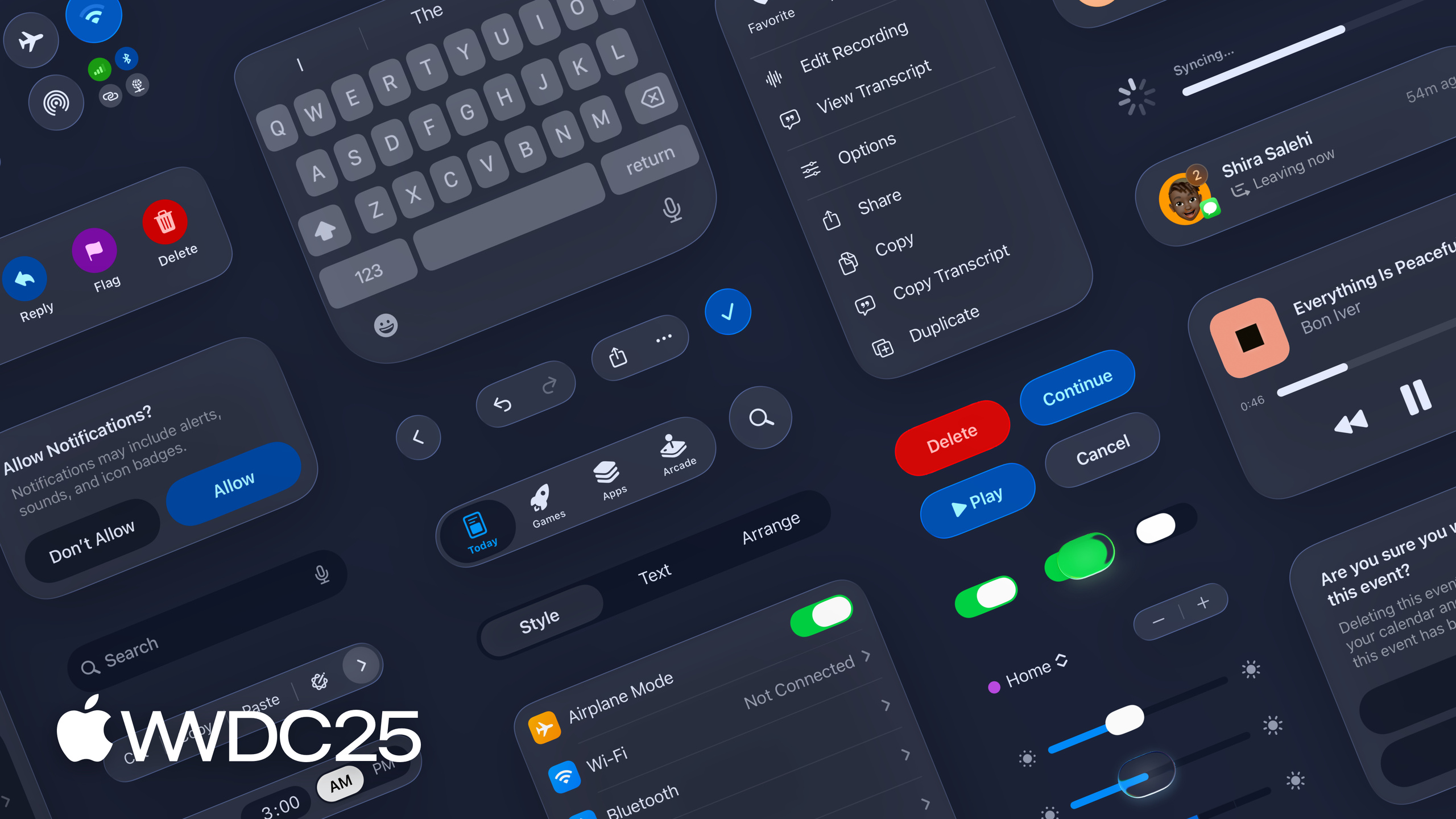
WWDC25 replaced the design language behind icons with Liquid Glass. This material draws from visionOS layered icons and the optical properties of real glass—through edge highlights, frosted layers, and translucent overlays, icons look like glass sheets glowing from within. On the iPhone home screen, icon edge reflections move with the device based on gyroscope input (01:23). Beyond light and dark, the system added four appearances: monochrome glass in light/dark, and tinted dark/tinted light that dye the foreground or inject color into the glass itself. All appearances are consistent across iPhone, iPad, and Mac, while watchOS gains the new light appearance (02:06).
Details
The new design language revolves around several specific rules.
Unified grid and canvas. Icons used to be drawn per device, causing the same app to look different across platforms. Now Apple places rounded rectangles and circles in one unified grid, with larger corner radii so icon curves align more concentrically with system UI and hardware frames (02:44). Rounded rectangles still use a 1024-pixel canvas; circular icons have dedicated inner frames with more padding. The watchOS circular grid canvas is 1088 pixels, deliberately larger than the rectangular canvas to make cross-platform translation easier (04:31).
Automatic macOS icon masking. The old macOS Contacts icon had tabs protruding from the main shape; under the new rules, the canvas shape acts as a mask to cut off these extrusions. The system automatically masks or stretches old icons and applies the new glass material—developers get the new look without changing files. But Apple recommends redrawing icons to better use the full canvas (03:21).
Layering is core to the new design language. The simplest icon is one background layer plus one foreground, like Messages (05:46). Foregrounds can split into multiple stacked layers; Podcasts separates concentric circles and portraits into different layers, giving flat graphics real depth (06:17).
Illustration style yields to material. Realistic 3D perspective fights with glass highlights for visual attention. The old Chess icon was changed to a front-facing, flat view (06:46). The Preview magnifying glass deliberately keeps perspective because it serves a functional purpose—it emphasizes the focal area.
Translucency and blur are almost free. Translucent overlays look good in light, dark, and Clear modes; in Clear mode, the background is directly the wallpaper (07:32).
Less is more. The Photos icon reduced petal overlap areas, letting the material’s reflection edges work at intersections. The Home icon removed baked-in shadows and chamfers, using a rounder shape and letting the glass material render (07:58 → 09:03). Apple explicitly advises: stop baking shadows, bevels, and other static effects into source files—the material recipe handles it.
Details avoid being too sharp or thin. The Settings gear was changed to rounded corners so light flows smoothly along edges. Elements needing material treatment use thicker stroke widths to preserve detail at small sizes (09:42).
Backgrounds use gradients, not solid colors. Apple provides System Light and System Dark gradients and recommends them over pure white or black to ensure contrast and give material effects an ideal canvas. It also suggests using more color backgrounds to make switching between light and dark modes more distinct (10:14).
Template files are now in Apple Design Resources, available in Figma, Sketch, Photoshop, and Illustrator formats (05:11).
Key Takeaways
-
What to do: Redraw app icons to unify all platforms on the new grid.
- Why it’s worth doing: Apple’s auto-masking and stretching for old icons is just a safety net—you won’t get full canvas utilization without redrawing.
- How to start: Download Figma/Sketch templates from developer.apple.com, draft on the 1024px rounded-rectangle canvas; watch circular canvas references 1088px.
-
What to do: Delete baked-in shadows, chamfers, and 3D perspective from source files.
- Why it’s worth doing: Liquid Glass automatically adds edge highlights, shadows, and specular reflections—static effects in source art will clash with the material and turn muddy.
- How to start: Turn off all layer effects (drop shadow, bevel, inner glow) in existing PSD/AI files, then preview in Icon Composer.
-
What to do: Review all six appearance modes individually (Default, Dark, Clear light/dark, Tinted light/dark).
- Why it’s worth doing: Auto conversion often loses foreground/background hierarchy in mono and tinted modes, causing key elements to disappear.
- How to start: Switch appearance modes one by one in Icon Composer and manually adjust opacity or move layers where contrast and hierarchy break.
-
What to do: Split icons into clearer multi-layer structures (background + multiple foregrounds).
- Why it’s worth doing: Layering is prerequisite for material effects to work—flat single-layer art can’t show Liquid Glass depth.
- How to start: Define one background layer, then split the main graphic into 2–3 semantically clear foreground layers stacked together; refer to Podcasts layering.
Related Sessions
- Create icons with Icon Composer — hands-on Icon Composer tutorial, the tool companion to this design philosophy.
- Meet Liquid Glass — introduces the design philosophy of the Liquid Glass material itself; understanding the material makes icons clearer.
- Build a UIKit app with the new design — how to adopt the new design language on the UIKit side.
- Build a SwiftUI app with the new design — companion practices on the SwiftUI side.
Comments
GitHub Issues · utterances