
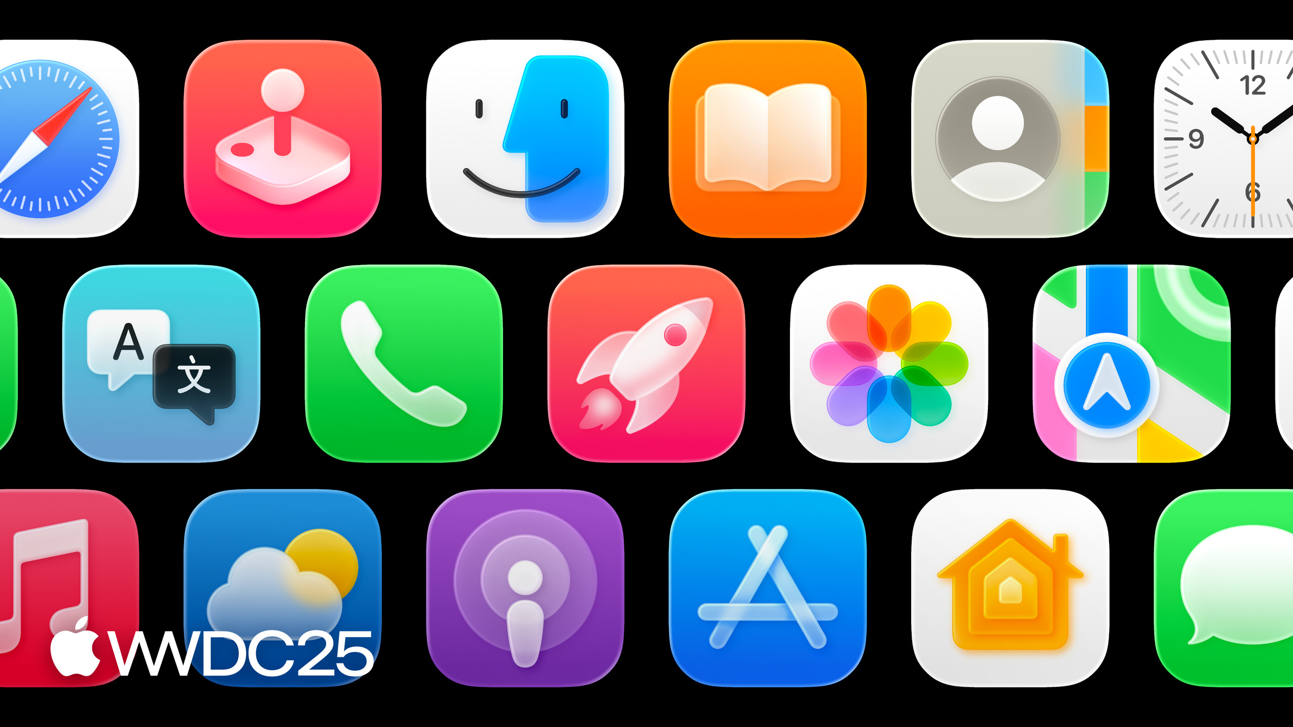
Highlight
Icon Composer is a standalone design tool launched in 2025 alongside Liquid Glass. It takes a single layered source file and outputs a
.iconfile that covers all four platforms—iPhone, iPad, Mac, and Watch—and six appearances: Default, Dark, Clear light, Clear dark, Tinted light, and Tinted dark.
Core Content
Before 2025, Mac app icons had to be drawn separately at multiple sizes. Then iOS came along with 2x and 3x variants, and watchOS required yet another set (01:01). Later the system added automatic scaling, so one image per platform was enough. But this year Dark and Tinted modes continued expanding on iOS, macOS adopted them fully, and Watch got a new appearance—so the number of icon combinations an app must deliver has ballooned again (01:42).
Apple’s response is Icon Composer, a standalone tool that turns a single layered source file into a unified .icon package, which then derives outputs for four platforms and six appearances (02:00). It works with existing design tools: draw your layers in Figma, Sketch, Illustrator, or Photoshop, export SVG or PNG, drag them into Icon Composer to see real-time previews of each appearance, then save to Xcode (03:32). Apple used this same tool to produce its entire icon set this year, keeping migration costs minimal.
If your original art is highly illustrative, the old Xcode single-image upload still works—the system will automatically add a specular highlight at the edges (02:13). But for anything graphically oriented, Icon Composer gives you full access to Liquid Glass’s dynamic properties.
Details
The workflow has four steps: draw a layered draft in your design tool, export layers in Z-order, tune glass and appearances in Icon Composer, then save .icon for Xcode (03:37).
Canvas size is now unified: iPhone, iPad, and Mac share a 1024px rounded-rectangle canvas. Watch uses a 1088px circular canvas—intentionally larger so shapes transfer between the two (04:20). Templates are available on Apple Design Resources.
Layering rules: Each layer represents a Z-depth. A simple icon like Messages only needs foreground + background; a complex composition like Home needs more layers. One easy-to-miss technique is splitting by color—in the Translate icon, the two bubbles and text are separated into different layers, so adapting to Dark mode just means changing a fill (05:29).
Source files should contain only graphic essentials: flat, opaque, without effects. Blur, shadows, specular highlights, opacity, translucency are all dynamic properties of Liquid Glass—adjust them in Icon Composer, not in your design tool (06:00).
Export: Vector layers become SVG, numbered by Z-order so they auto-position. Text must be converted to outlines since SVG doesn’t preserve fonts (06:42). Export PNG for anything SVG can’t represent—custom gradients, bitmaps—keeping a transparent background. Background colors and simple gradients should be set directly in Icon Composer, not exported.
Important detail: Don’t include rounded-rectangle or circular masks when exporting. Icon Composer automatically applies the correct crop for each platform (07:06). Illustrator users can download Apple’s layer-to-SVG script to batch-export in one click.
Once inside Icon Composer, the UI has three sections: a left sidebar listing canvas, groups, and layers; a center preview panel (07:29); and a right inspector for appearance properties and document settings. Dragged layers automatically sort into a group, with up to four groups available. The group is the unit that carries glass effects—Home uses four groups so each layer becomes its own glass sheet (08:42).
Appearance system: This year the old light/dark/tinted labels were renamed to default, dark, mono. Clear and Tinted final effects derive from mono (09:01). At the layer level, you can toggle Liquid Glass and adjust color and composition. Full glass properties live at the group level. Opacity, blend mode, and fill are configured per appearance by default; the rest are shared across appearances, with a hover-plus button to create independent variants where needed (10:15).
Common pitfall when tuning glass: in the Calendar icon, date numbers look too “pillowy” at narrow stroke widths. Fix it by turning off specular on the group, or disable Liquid Glass directly on the layer (10:30). Watch’s circular canvas needs a separate check—if elements touch the edge, either scale up and restroke, or leave bleed in the source file.
Key Takeaways
-
Leave dynamic properties to Icon Composer: Blur, shadows, specular highlights, translucency—effects you used to fake by hand in design mocks are now computed in real-time by the tool using Liquid Glass.
- Why: Six appearances times four platforms equals 24 combinations. Baking them manually into bitmaps can’t stay aligned; tool derivation is the only way to keep things consistent.
- How: Strip all shadows, blur, and highlight layers from your existing icon source. Keep only flat fills. Export SVG and drag into Icon Composer, then tune Liquid Glass properties per group.
-
Split layers by color, not visual element: Plan for Dark/Mono modes in your source file to avoid maintaining two icon sets later.
- Why: One fill change completes a Dark adaptation. Halves the work compared to maintaining multiple exports.
- How: Start with icons like Translate that have clear color blocks. Make each color an independent layer. After export, create Dark variants directly in the layer-level color control in Icon Composer.
-
Establish version control for
.icon: Commit.iconfiles to your repo and review them alongside code.- Why:
.iconis a single deliverable. It can be diffed in a PR and updated by designers without developers re-exporting multiple bitmaps. - How: Replace
Assets.xcassets/AppIcon.appiconsetwith.iconand point to it in Xcode Project Editor. Add a CLI validation step in CI using Icon Composer.
- Why:
-
Unify on 1024px canvas: iPhone/iPad/Mac share one source file. Watch uses a 1088px circular version derived in sync.
- Why: Reduces the cost of maintaining multiple templates. New team members only learn one grid.
- How: Download new templates from Apple Design Resources. When migrating existing icons, align all platform versions to the 1024px grid, then separately check if the Watch circular canvas needs bleed.
Related Sessions
- Say hello to the new look of app icons — Overview of the 2025 icon language updates. Design prerequisite for this session.
- Build an AppKit app with the new design — Migrate AppKit apps to the new design system. Icons are one piece.
- Elevate the design of your iPad app — How iPadOS design and icons work with Liquid Glass.
- Get to know the new design system — Liquid Glass design principles. Understanding these makes tuning glass properties easier.
- Meet Liquid Glass — The Liquid Glass material itself. Understand where specular, translucency, and other properties come from.
Comments
GitHub Issues · utterances