
Highlight
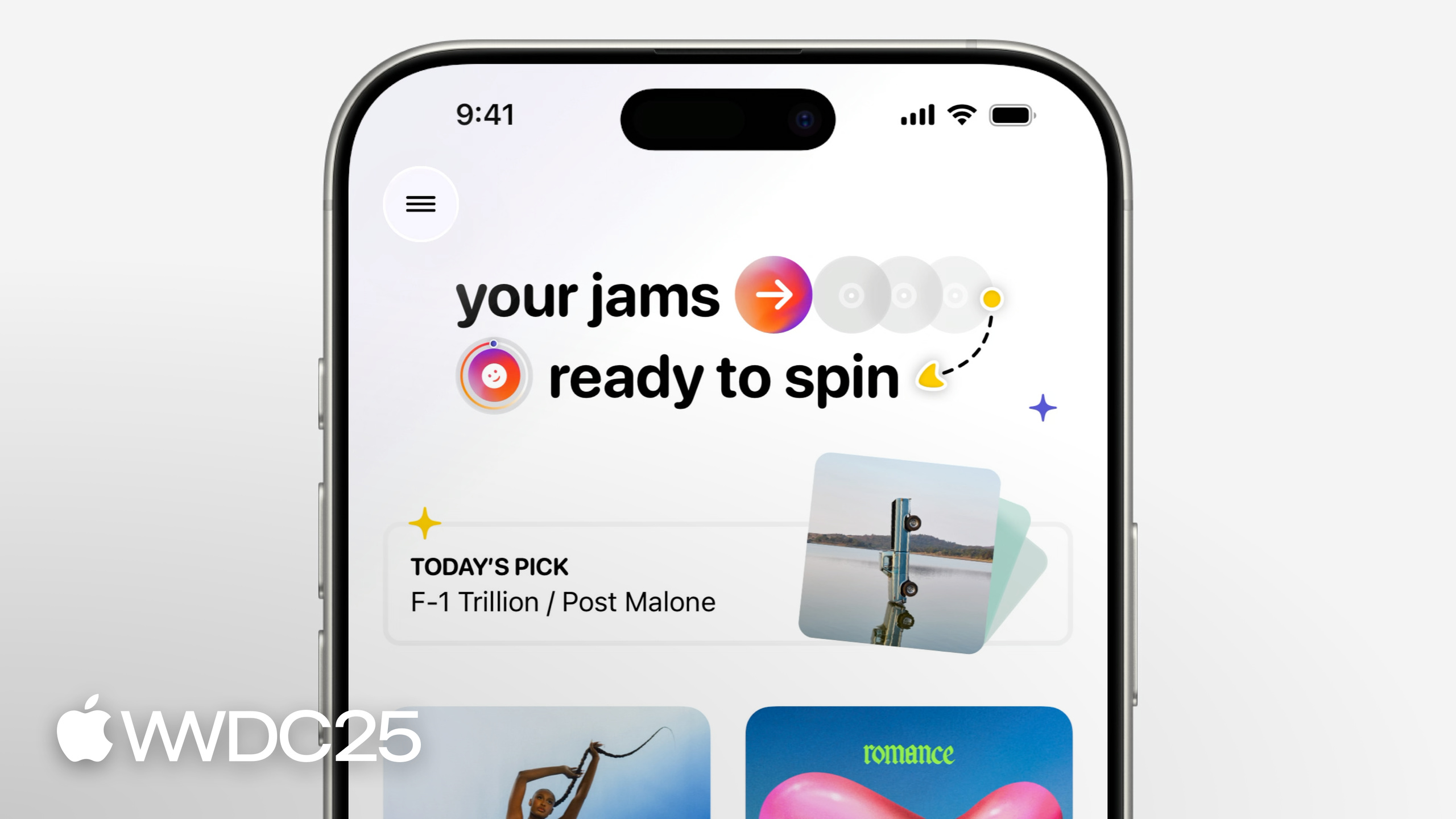
Majo uses a fictional vinyl record collection app as a case study. From the Design Evangelism team’s perspective, she demonstrates how to polish an app from scratch across four layers:
Core content
Open an app and you might not know where you are, what you can do, or where to go next. This is why users hesitate, get confused, or delete the app outright. Majo uses a fictional vinyl record collection app to show this state: it looks decent, but actually gets stuck. At the top sits a vague menu, the title looks like a brand logo, scrolling down reveals a pile of album covers with no interaction, and only at the very bottom do you see the tab named Records—only then do you realize “oh, this is the Records page” (02:49). The screen doesn’t guide her. She has to piece it together herself.
Apple breaks the process into four steps: Structure, Navigation, Content, Visual Design. Each step answers three plain user questions—where am I, what can I do, where can I go (01:56). Start with information architecture: write down features, imagine use cases, delete non-essentials. Use Tab bar for navigation. The HIG defines tabs as navigation, not action (06:01). Use toolbar to answer both “where am I” and “what can I do.” For content, use progressive disclosure and group by time/progress/pattern. For visuals, use system text styles plus semantic colors to let text and colors automatically adapt to Dynamic Type, dark mode, and contrast. Each step swaps vague design intuition for checkable questions. Judgments become grounded.
Detail
Structure: Information architecture first, interface later
Majo’s process is mechanical. Write down everything the app can do—features, flows, even nice-to-haves—without judging. Imagine when and how others would use it. Then start cleaning—delete non-essentials, rename labels for clarity, merge items that naturally belong together (04:02). Her conclusion is blunt: if you can’t clearly say what’s essential, you can’t make it clear in the app.
Navigation: Tab bar is for navigation, not actions
The initial tab bar had five items: Records, Crates, Add, Swaps, Saves. Crates is just “a page that groups Records,” so merge it. Add is the primary action, but the HIG explicitly states “tabs are for navigation, not actions,” so move it inside Records (06:06). The remaining three tabs use SF Symbols with clear labels—don’t draw your own icons, because “I also find designing icons hard” (06:42). Each extra tab adds decision cost for the user.
Toolbar solves two problems: the title tells you “where you are,” action buttons tell you “what you can do” (07:23). Space is limited. Put only the most common actions there. All use SF Symbols.
Content: Progressive disclosure plus four grouping strategies
Separating Groups and Records is step one. But showing everything at once overwhelms users with information. Progressive disclosure shows a few groups first, hides the rest behind a disclosure control next to the title, and expands when needed (09:01).
Layout choice matters. A grid with two items feels too sparse and doesn’t handle long text well. Switch to List—structured information scans better, vertical space usage is higher (10:22). Apple Design Resources list templates work out of the box. No need to draw from scratch. Collections work for lots of images—consistent spacing, minimal text—suited for photos, videos, products, scrolling scenarios.
Four grouping strategies, ordered by usage frequency:
- By time (Recent files, Continue Watching, seasonal content like “records for summer”)
- By progress (draft emails, unfinished courses, full collections)
- By pattern (related recommendations, styles, genres)
- By event (grouping themes start at 11:33)
Visual Design: Squint test plus system styles plus semantic colors
The simplest check for visual hierarchy is the squint test—squint at the screen, what you notice first should be the most important content (13:55). If decorative elements catch your eye first, the hierarchy is backwards.
The fix is to enlarge featured content and add contrast to create visual anchors. But manual font size can’t hold up—text might get longer, languages might switch, users might increase text size. Switch to system text styles: a full set from title to caption that automatically supports Dynamic Type (15:20).
When text overlays images, busy or high-contrast images hurt readability. The simple fix is a gradient or blurred background—clarity comes before aesthetics (15:40).
Colors fall into two types: palette colors (four chosen colors plus retro shapes, mixed for style) and semantic colors (named by use, not appearance—label, secondarySystemBackground—automatically adapting to light/dark mode and contrast settings, 17:00). Use accent color sparingly—only on buttons, controls, selected states where it carries meaning. Avoid affecting dynamic switching, readability, and user comfort.
Key takeaways
-
What to do: Audit every screen with three questions: “Where am I / What can I do / Where can I go”
- Why it’s worth it: These are the actual questions users’ brains ask upon entering a screen, not what designers want to ask
- How to start: Open your app, run a 5-second test on each screen—can you answer these three within 5 seconds? If not, it’s a structure problem, not an aesthetic problem
-
What to do: Cut tab bar to 3-4 items, move actions out of the tab bar
- Why it’s worth it: Each extra tab adds decision cost; action buttons in tabs violate HIG and make the app look more complex than it is
- How to start: List all current tabs, ask “what happens if we merge this one”; list all non-navigation elements in the tab bar (Add, Favorite, etc.), move them to the toolbar of the corresponding content page
-
What to do: Replace all custom font sizes and colors with system text styles plus semantic colors
- Why it’s worth it: Get Dynamic Type, dark mode, contrast adaptation for free, no need to maintain multiple style sets
- How to start: Search code for all
.font(.system(size:))and hardcoded color hex values, replace with semantic styles like.font(.title)and semantic colors likeColor(.label)
-
What to do: When content overflows one screen, use progressive disclosure instead of infinite scroll
- Why it’s worth it: Showing all content upfront overwhelms users; reveal key items plus “show more” is the standard pattern for handling large amounts of content
- How to start: Show only 3-5 items per group, add disclosure control next to the title; secondary pages maintain visual continuity with the previous screen, so it feels like “expanding” not “navigating away”
-
What to do: After finishing each screen, use the squint test as the final gate
- Why it’s worth it: This is the cheapest way to check visual hierarchy—5 seconds to judge whether the focus is actually the focus
- How to start: Shrink screenshot to 1/4 size or squint at it, note the first elements you notice, check against the “most important content” list—if they don’t match, adjust
Related sessions
- Discover machine learning & AI frameworks on Apple platforms — Overview of Apple platform ML/AI framework updates, another foundations-level intro session alongside design
- Keynote — WWDC25 keynote, includes overall direction for this year’s new design system
- New things on the way from Apple — WWDC25 new features overview, includes design-related announcements
Comments
GitHub Issues · utterances