
Highlight
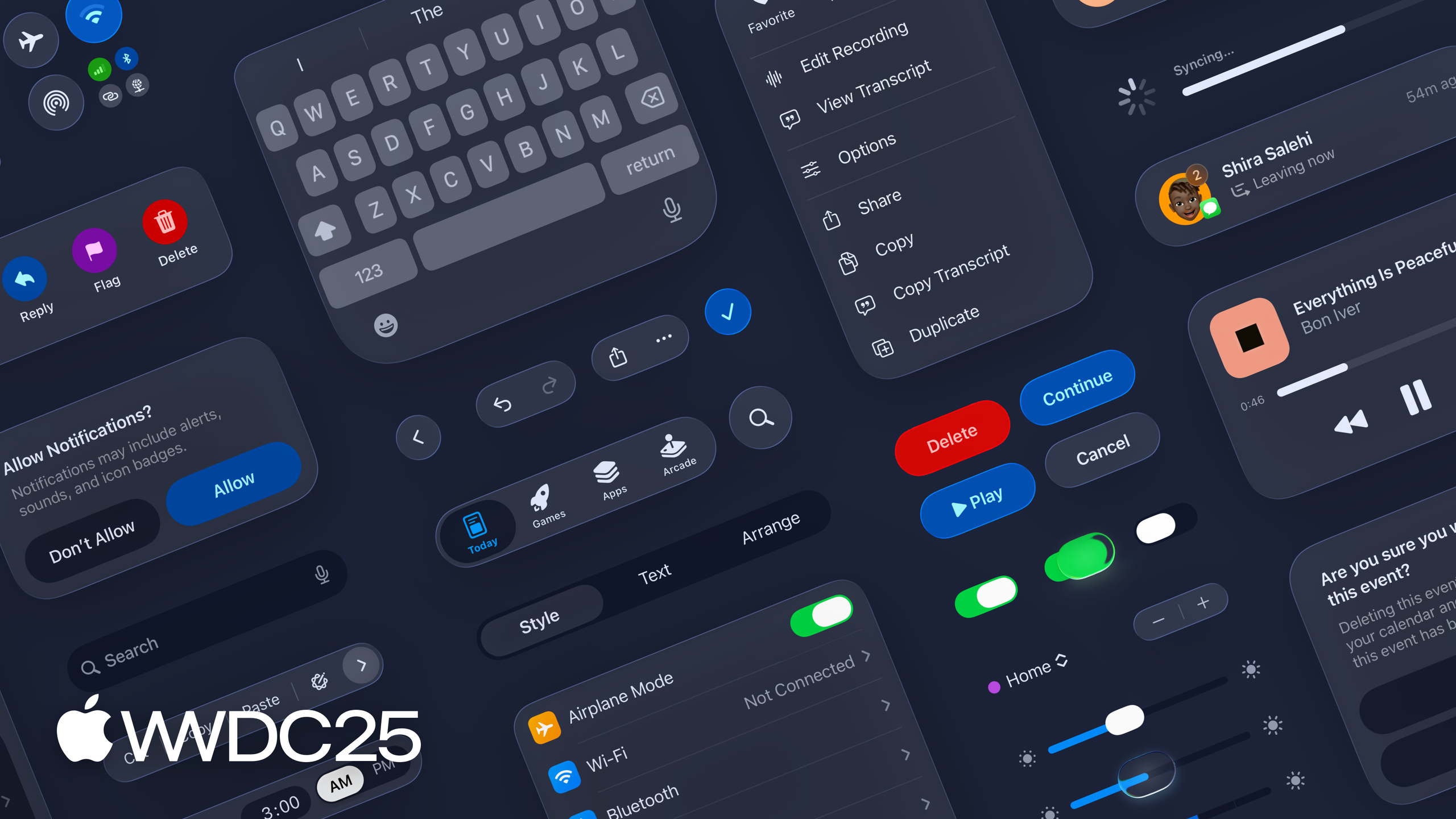
Maria breaks the new design system into three things: visual language (color, type, shape), structure (Liquid Glass floats above content), and continuity (how the same design expresses itself across iPhone / iPad / Mac).
Core Content
Many apps feel “off” after upgrading to iOS 26: button corners are too sharp, cover images nested in cards bulge too much, bar buttons are cramped together, scroll edges show a hard divider line. The code has no bugs. The problem is the hand-added backgrounds, shadows, and fixed corner radii left over from the old design system—these suddenly look out of place next to the new Liquid Glass material. Maria calls this feeling “two instruments in different keys playing together.” To make apps sing with the system again, you have to redo from the bottom: the visual language.
Apple realigns the entire design system around three dimensions. First is visual language: system colors are tweaked in Light / Dark / Increased Contrast modes so hue stays distinguishable on Liquid Glass; type is bolder and left-aligned for better readability in critical moments like alerts and onboarding; the biggest change is shape—all UI corner radii follow one principle: “concentricity.” Second is structure: Liquid Glass is a functional layer that floats above content. Action Sheets “grow” from the button that triggered them. Sheets become more opaque and larger when pulled up. Scroll edge effect replaces hard dividers. Sidebars become inset and allow content to extend behind them. Third is continuity: the same component should share anatomy across iPhone (narrow, portrait), iPad (the bridge), and Mac (wide canvas). Differences are expressed through platform variants like capsule vs rounded rect, compact vs regular—not by redrawing from scratch.
Details
Three shape types form the geometric foundation of the entire system (03:42). Maria gives a clear three-way rule:
- fixed: Corner radius is fixed. Good for high-density desktop layouts like Mini / Small / Medium controls on macOS.
- capsule: Corner radius equals half the container height. Naturally supports concentric nesting, so it’s used on sliders, switches, bars, buttons, and grouped table views. On macOS, Large and the new X-Large controls also switch to capsule.
- concentric: Corner radius is calculated as “parent container radius - padding,” ensuring visual consistency of curvature between nested layers.
If a cover image inside a card feels “too sharp” or “too bulgy,” the answer is almost always: make it concentric to the parent container (05:19). Maria also offers a practical tip: when a component needs to nest inside a container AND appear standalone, use concentric with a fallback radius—use the concentric value when nested, the fallback when standalone.
Cleaning up bars is the first step of the upgrade (08:33). In the old system, everyone manually added backgrounds, borders, and shadows to buttons because you needed these decorations to say “this is tappable.” In the new system, emphasis is handled automatically by Liquid Glass. These decorations should all be removed. Then use the correct grouping API to group bar items by “function + frequency.” The system automatically makes buttons in the same group share a background. Don’t mix symbols and text in one group—Maria’s counterexample is “Select” placed right next to a share icon, which gets misread as one button. Primary actions like Done need their own slot with tint—blue checkmark on iOS / iPadOS, prominent text button on macOS.
Action Sheets appear in a new place (06:54). Before, Action Sheets always popped up from the bottom regardless of where you tapped. Now they grow from the button that triggered them. If you build custom controls, apply the material directly to the control itself, not its internal views—otherwise the system can’t identify the “source” to “target” relationship. Sheet state changes also follow the same language: modal tasks use Liquid Glass + dimming layer to signal interrupting the main flow; parallel tasks use Liquid Glass alone without dimming, because they shouldn’t steal focus in the first place. When users pull up a sheet, it becomes more opaque and larger, hinting at “deeper engagement.”
Scroll edge effect replaces hard dividers (11:18). It has soft and hard variants: iOS / iPadOS default to soft for a gentle transition; macOS uses hard more often for places like pinned table headers that need a crisp boundary. Don’t mix them, don’t stack them. One view uses one scroll edge effect. If a screen has no floating UI elements, don’t add scroll edge effect—it’s not decoration.
Sidebars are now inset (12:34). The new sidebar is built with Liquid Glass; content can “flow” behind it. backgroundExtensionEffect lets hero images, tinted backgrounds, and other large color blocks extend behind the sidebar while keeping visual focus on the main content area. Text and controls should sit in higher layers to avoid distortion from sidebar blur. Scroll views also extend under the sidebar by default, letting carousels slide naturally.
Continuity means “design anatomy once” (13:34). The same component across platforms should share the same structure (selection indicator, icon, label, accessory). iOS context menus and macOS popup menus look different, but the skeleton is the same. Tab bars, segmented controls, and sidebars should give the same selection / navigation / state feedback across platforms. When you need search, iOS now has a dedicated Search tab at the bottom—stop hiding it in toolbars. Tab bars can also host accessory views like a playback control that persists across pages—but don’t put page-specific buttons like checkout in there; they belong to the content itself.
Key Takeaways
-
Do: Align your design system with the three shape types.
- Why it matters: On Liquid Glass, the geometric relationship of corner radii creates “harmony.” Mixing arbitrary radius values makes apps look jarring next to iOS 26 system components.
- How to start: Audit all corner radius values in your existing app. Classify each component into fixed / capsule / concentric. Make nested containers concentric. Prefer capsule for buttons and touch targets. Keep fixed for high-density inspectors on macOS.
-
Do: Clean up all custom bar styles.
- Why it matters: Old apps usually added backgrounds, borders, and shadows to bar buttons by hand. These decorations are redundant and conflicting in the new system, making toolbars look “messy.”
- How to start: Remove all hand-written backgrounds, borders, and shadows from toolbars / navigation bars. Use official grouping APIs to group by “function + frequency.” Give primary actions (Done, Save) their own group with tint. Move extra secondary buttons into the More menu.
-
Do: Replace hard dividers with scroll edge effect.
- Why it matters: Hard dividers are from the old era and look stiff on Liquid Glass. Scroll edge effect is the system-level “content boundary hint.”
- How to start: Use soft on iOS / iPadOS. Use hard for pinned headers / text controls on macOS. One view, one effect. If there are no floating UI elements, don’t add it.
-
Do: Let sheets grow from their trigger source.
- Why it matters: Spatial relationships reduce cognitive cost—the user taps somewhere, feedback comes from that same place.
- How to start: Check all Action Sheet / popover sources. Confirm they anchor to a concrete source view. Apply material directly to custom controls, not internal views.
-
Do: Share anatomy across platforms, use platform variation for differences.
- Why it matters: Cuts duplicate design work and builds stable muscle memory as users switch between iPhone / iPad / Mac.
- How to start: Extract common anatomy from existing components (selection indicator, icon, label, accessory). Let differences be handled by platform-level variants like capsule vs rounded rect, compact vs regular, context menu vs popup menu.
Related Sessions
- Meet Liquid Glass — Principles and behavior of Liquid Glass, the prerequisite for this session
- Build an AppKit app with the new design — Implement the same design language in AppKit apps
- Create icons with Icon Composer — Generate consistent cross-platform icons with Icon Composer
- Elevate the design of your iPad app — Layout and sidebar practices on iPad
Comments
GitHub Issues · utterances