
Highlight
Swift Charts on iOS 26, macOS 26, and visionOS 26 adds
Chart3DandSurfacePlot. Add azaxis toPointMarkand you get a rotatable 3D scatter plot.
Core Content
The penguin dataset has three dimensions: beak length, flipper length, and weight. To see how three species (Chinstrap, Gentoo, and Adélie) differ, you had to draw three 2D scatter plots: one of flipper length vs. weight, one of beak length vs. weight, and one of beak length vs. flipper length. Each plot only shows the relationship between two attributes. The developer has to mentally stitch the three plots together to get a full picture. This split-screen analysis costs a lot. When the data itself is three-dimensional, a 2D projection loses the true shape of the clusters.
iOS 26, macOS 26, and visionOS 26 add 3D support to Swift Charts. Swap Chart for Chart3D, add a Z value to PointMark, and the three 2D plots collapse into one rotatable 3D scatter plot. The three species split into three distinct clusters at once. Rotate to the side and you fall back to any pairwise 2D relationship. The new SurfacePlot is the 3D version of LinePlot. It takes a (Double, Double) -> Double closure and samples the XZ plane to generate a continuous surface. You can overlay it on the scatter points to do linear regression.
Detailed Content
Going from 2D to 3D takes only three API changes: swap Chart for Chart3D, add a z parameter to PointMark, and add a chartZAxisLabel for the axis label (03:28):
struct PenguinChart: View {
  var body: some View {
    Chart3D(penguins) { penguin in
      PointMark(
        x: .value("Flipper Length", penguin.flipperLength),
        y: .value("Weight", penguin.weight),
        z: .value("Beak Length", penguin.beakLength)
      )
      .foregroundStyle(by: .value("Species", penguin.species))
    }
    .chartXAxisLabel("Flipper Length (mm)")
    .chartYAxisLabel("Weight (kg)")
    .chartZAxisLabel("Beak Length (mm)")
    .chartXScale(domain: 160...240, range: -0.5...0.5)
    .chartYScale(domain: 2...7, range: -0.5...0.5)
    .chartZScale(domain: 30...60, range: -0.5...0.5)
  }
}
Key points:
Chart3Dis a direct drop-in replacement forChart. The initializer signature is the same, so migration cost is low.PointMarkgets a third parameterz. The type is stillPlottableValue. Pair it withforegroundStyle(by:)and Swift Charts picks colors by species automatically.chartXScale/chartYScale/chartZScaleall takedomainandrange:domainis the data range,rangeis the normalized chart coordinate (here-0.5...0.5for all three). This keeps the geometric proportions of all three axes equal.
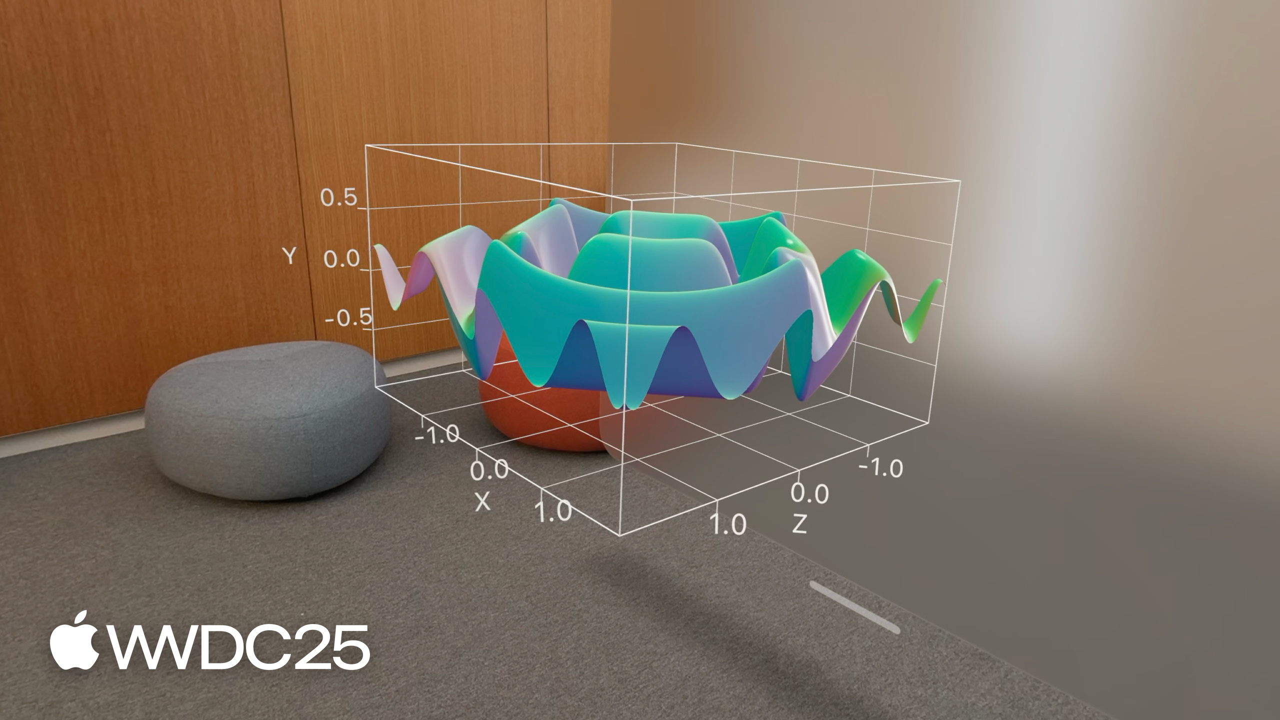
SurfacePlot is a mark unique to 3D. Its signature looks like SurfacePlot(x:y:z:_). The closure is (Double, Double) -> Double. For each (x, z) it computes a y (05:19):
Chart3D {
  SurfacePlot(x: "X", y: "Y", z: "Z") { x, z in
    (sin(5 * x) + sin(5 * z)) / 2
  }
}
Key points:
- The three string parameters
"X"/"Y"/"Z"are axis identifiers. They map tochartXScaleand related modifiers. - The closure returns a single Double. Swift Charts samples the X-Z plane automatically and builds a continuous surface.
- Drop any math expression into the closure and you get a surface plot. No manual grid construction needed.
To overlay the surface on data for fitting, train an MLLinearRegressor first, then wrap it in the same (Double, Double) -> Double closure (06:19):
let linearRegression = LinearRegression(
  penguins,
  x: \.flipperLength,
  y: \.weight,
  z: \.beakLength
)

Chart3D {
  ForEach(penguins) { penguin in
    PointMark(
      x: .value("Flipper Length", penguin.flipperLength),
      y: .value("Weight", penguin.weight),
      z: .value("Beak Length", penguin.beakLength)
    )
    .foregroundStyle(by: .value("Species", penguin.species))
  }

  SurfacePlot(x: "Flipper Length", y: "Weight", z: "Beak Length") { flipperLength, beakLength in
    linearRegression(flipperLength, beakLength)
  }
  .foregroundStyle(.gray)
}
Key points:
Chart3Dsupports mixingForEachwith multiple marks inside. Scatter points and surfaces coexist.LinearRegressionusescallAsFunctionto wrap model predictions into a plain closure, which feeds intoSurfacePlot.- The surface uses
.foregroundStyle(.gray)to contrast with the colored scatter points and avoid hiding the data.
View angle and projection are controlled by Chart3DPose (08:09). azimuth controls horizontal rotation, inclination controls pitch:
@State var pose = Chart3DPose(
  azimuth: .degrees(20),
  inclination: .degrees(7)
)

Chart3D(penguins) { penguin in
  // ...
}
.chart3DPose($pose)
.chart3DCameraProjection(.perspective)
Key points:
Chart3DPoseaccepts preset values (.default,.front) or custom angles.chart3DPose($pose)takes a Binding, so it updates easily with interaction.chart3DCameraProjectionhas two modes:.orthographic(default, no near-far difference, good for falling back to a 2D side view) and.perspective(objects look smaller farther away, stronger sense of depth).
SurfacePlot also gets dedicated semantic styles (09:38, 09:47): .foregroundStyle(.heightBased) colors by surface height, .foregroundStyle(.normalBased) colors by surface normal direction. You can also pass a LinearGradient or EllipticalGradient.
Key Takeaways
-
What to do: Use
Chart3Dto merge multiple 2D scatter plots into one rotatable chart.- Why it matters: Users used to stitch multiple 2D plots in their heads. 3D rotation lets them see the true shape of clusters directly. This matters most for data that is naturally three-dimensional: biology, physics, sensors.
- How to start: Change your existing
CharttoChart3D, addztoPointMark, setdomainand a normalizedrange(e.g.-0.5...0.5) for all three axes. Look at the default pose first, then usechart3DPoseto fine-tune the best viewing angle for your dataset.
-
What to do: Use
SurfacePlotto visualize model predictions as a continuous surface.- Why it matters: Linear regression, neural networks, and physics simulations all output
(Double, Double) -> Double. A surface plot lets users see the gap between model and data at a glance. - How to start: Wrap your model as
callAsFunction(_ x: Double, _ z: Double) -> Double, pass it to theSurfacePlotclosure, then use.foregroundStyle(.gray)and stack it with coloredPointMarkinsideChart3D.
- Why it matters: Linear regression, neural networks, and physics simulations all output
-
What to do: Prioritize 3D charts in visionOS apps.
- Why it matters: Vision Pro is a spatial display device by nature. A 2D chart looks flat in space. Swift Charts 3D supports gesture rotation natively on Vision Pro.
- How to start: Use
Chart3Ddirectly in a visionOS SwiftUI view. Set the projection to.perspectiveso near-far relationships help the user sense depth.
-
What to do: Choose
.orthographicor.perspectivebased on the use case.- Why it matters: Orthographic projection makes side-by-side size comparison easy (near and far are the same size). Perspective projection gives depth cues. Mixing them confuses users.
- How to start: Pick
.orthographicfor dashboards and charts that need to fall back to a readable 2D side view. Pick.perspectivefor presentations that need immersion and spatial relationships. Switch withchart3DCameraProjection.
Related Sessions
- Build an AppKit app with the new design — Practical guide for adapting the Liquid Glass design system in AppKit apps.
- Create icons with Icon Composer — Use Icon Composer to make unified-style icons for iOS, iPadOS, and macOS.
- Elevate the design of your iPad app — Design and interaction best practices for making your app look great on iPadOS.
- Enhance your app’s multilingual experience — Localization methods for building a seamless experience for multilingual users.
Comments
GitHub Issues · utterances