
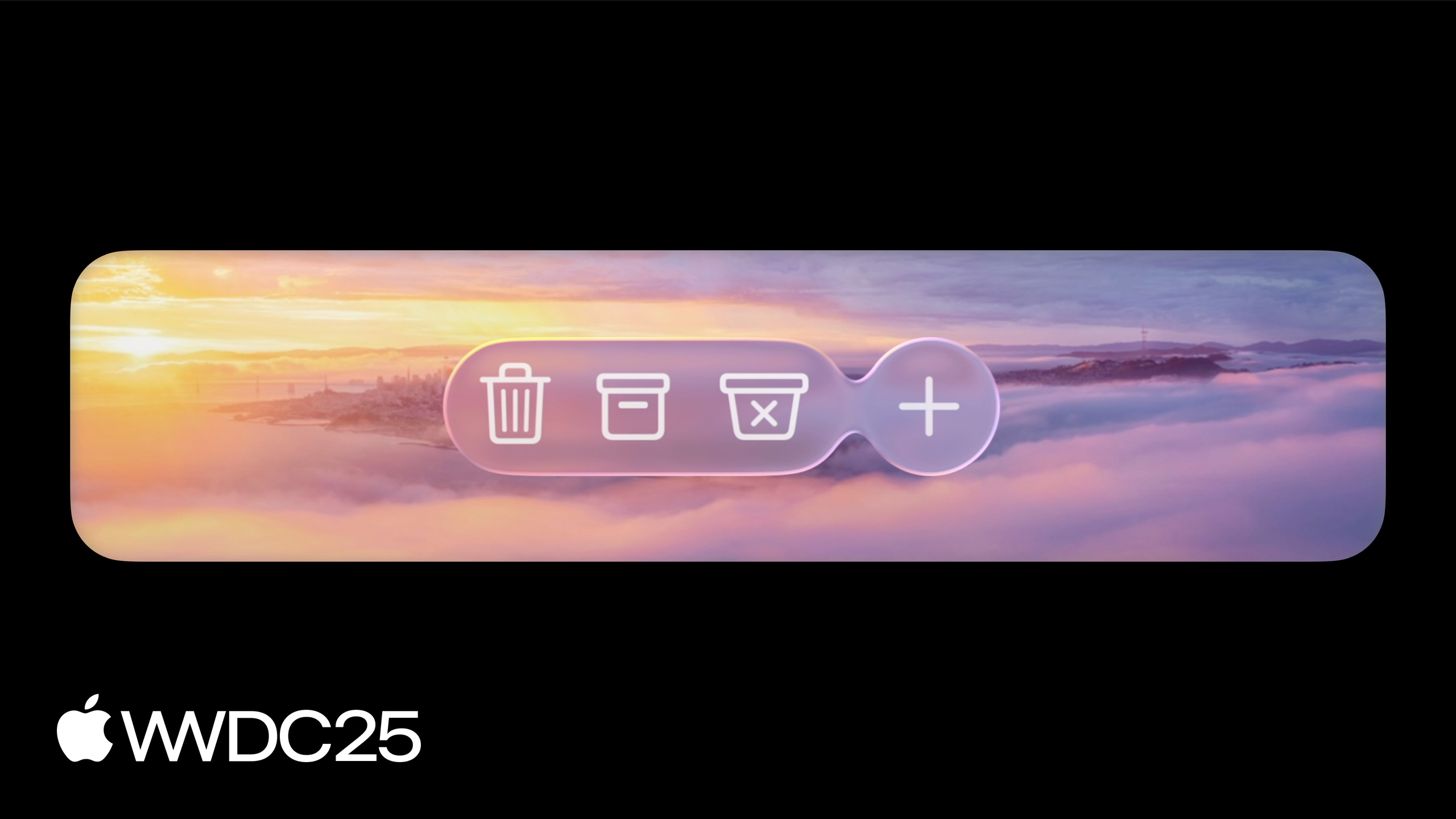
Highlight
macOS Tahoe brings Liquid Glass material, floating toolbar and sidebar, new window corners and control sizes to AppKit. Most effects kick in after a rebuild with Xcode 26; the rest is handled through new APIs such as
NSGlassEffectView,NSBackgroundExtensionView, andNSView.LayoutRegion.
Core Content
The most common headache when running an older AppKit app on macOS Tahoe is visual misalignment. The sidebar packs an NSVisualEffectView that blocks the new glass material entirely. Status text on the toolbar gets wrapped in a glass background automatically and looks like a fake button. The larger window corners clip a corner of the “New Folder” button sitting nearby. A dense inspector falls apart because controls grew taller overall. This is the migration reality Apple laid out at the start of the session.
Apple splits the changes from outside in into four parts (00:52): app structure (toolbar, sidebar, window corners), scroll edge effect (how scrolling content overlaps with glass elements), controls (new sizes, new shapes, prominence, glass bezel), and Liquid Glass customization (NSGlassEffectView / NSGlassEffectContainerView). Most effects take effect automatically after a rebuild in Xcode 26 — the toolbar groups itself onto glass, the sidebar floats, and controls adopt the new look. Where manual intervention is needed, each spot maps to a concrete API. There is no “rewrite the whole view” solution anywhere.
Detailed Content
The toolbar glass is applied automatically by NSToolbar (02:53). Like buttons merge into one glass piece; different types such as segmented, pop-up, and search are separated. The problem is that non-interactive content like status text and custom titles also gets glass, making them look like buttons. The fix is to turn off bordered:
// Removing toolbar item glass

toolbarItem.isBordered = false
Key points:
isBordered = falsemakesNSToolbarItemshow no glass background. This suits status text in the Photos toolbar (03:11).- Conversely, to stress a state or important action, set
style = .prominenton a toolbar item; the glass is tinted with the accent color. You can also usebackgroundTintColorto specify a color (03:30). - To express “has unread” or “has new notification”, use
NSItemBadge.count(_:),NSItemBadge.text(_:), orNSItemBadge.indicator(03:58).
The sidebar floats above content in the new design (04:12). If you want horizontally scrolling content, maps, posters, or other rich content to extend underneath the sidebar, flip one switch:
// Content under the sidebar

splitViewItem.automaticallyAdjustsSafeAreaInsets = true
Key points:
- Set this property on the content side that is covered by the sidebar, not on the sidebar itself (05:25).
NSSplitViewstretches the frame underneath the sidebar, then uses the safe area layout guide so content lays out only in the uncovered region.- For artwork that has no built-in negative space, use
NSBackgroundExtensionView: fill the split item with it, give it a contentView, and AppKit automatically mirrors and blurs the extension beyond the safe area (06:24). - Do not forget to remove the old
NSVisualEffectViewfrom the sidebar, or it will block the new glass material (04:46).
Window corners grow larger, and buttons can hit the edge (07:07). Windows with a toolbar get larger corners that are concentric with the glass toolbar. Controls near the corner need the new layout region API:
// Avoiding a window corner


func updateConstraints() {
    guard !installedButtonConstraints else { return }

    let safeArea = layoutGuide(for: .safeArea(cornerAdaptation: .horizontal))

    NSLayoutConstraint.activate([
        safeArea.leadingAnchor.constraint(equalTo: button.leadingAnchor),
        safeArea.trailingAnchor.constraint(greaterThanOrEqualTo: button.trailingAnchor),
        safeArea.bottomAnchor.constraint(equalTo: button.bottomAnchor)
    ])
    installedButtonConstraints = true
}
Key points:
layoutGuide(for: .safeArea(cornerAdaptation: .horizontal))returns a guide that adds a horizontal inset beyond the normal safe area, used to avoid the rounded corner (08:47).cornerAdaptationcan be.horizontalor.vertical, indicating which direction to yield to the rounded corner.- You can also read edge insets or the current rect directly from the layout region, for non-Auto Layout scenarios (08:17).
Scroll Edge Effect does not need to be turned on manually (09:27). NSScrollView adjusts the effect size automatically based on floating elements above it: soft-edge gradient blur, hard-edge more opaque. To hook a custom floating control into this system, use NSSplitViewItemAccessoryViewController with top/bottom aligned accessory; it affects both the scroll edge effect shape and the content safe area.
Controls gain an extra large size (11:54). There are five steps from mini to extra large. Mini, small, and medium are slightly taller than before, so do not hard-code control heights — use Auto Layout. For dense scenes (inspector, popover), set prefersCompactControlSizeMetrics = true on NSView; it inherits down the view hierarchy and controls fall back to the old height (12:56).
Control shapes: mini through medium are rounded rectangles; large and extra large are capsules. For concentric needs, override borderShape on buttons, pop-up, and segmented control (13:52). For a glass button, use the new glass bezel style and tint it with bezelColor.
Tint prominence controls tint intensity (15:31):
// Create buttons with varying levels of prominence

// Prefer a "secondary" tinted appearance for the shuffle and enqueue buttons
shuffleButton.tintProminence = .secondary
playNextButton.tintProminence = .secondary

// The "play" will automatically use primary prominence because it is the default button
playButton.keyEquivalent = "\r"
Key points:
tintProminencehas four levels:.automatic,.none,.secondary, and.primary.- Secondary actions like shuffle and enqueue use
.secondaryto weaken the tint so they do not steal focus from the main button. - Mark the play button as the default button with
keyEquivalent = "\r"to get primary prominence automatically. - This also works on sliders:
tintProminence = .noneleaves the track unfilled. The newneutralValuelets you anchor the fill anywhere on the track, for example 1x for playback speed (16:20).
Liquid Glass adoption is two steps (18:13). First, wrap the elements that should turn to glass in NSGlassEffectView:
// Adopting NSGlassEffectView

let userInfoView = UserInfoView()
let activityPickerView = ActivityPickerView()

let userInfoGlass = NSGlassEffectView()
userInfoGlass.contentView = userInfoView

let activityPickerGlass = NSGlassEffectView()
activityPickerGlass.contentView = activityPickerView

let stack = NSStackView(views: [userInfoGlass,
                                activityPickerGlass])
stack.orientation = .horizontal
Key points:
- Set the view to be “glassed” to
contentView; AppKit automatically binds the glass geometry to the content with Auto Layout and applies readability-preserving visual treatment (18:42). - Do not place
NSGlassEffectViewas a sibling behind the content; it must wrap the content from outside. cornerRadiusand tint color are adjustable onNSGlassEffectView.
Adjacent glass elements must be grouped with NSGlassEffectContainerView:
// Adopting NSGlassEffectContainerView

let userInfoView = UserInfoView()
let activityPickerView = ActivityPickerView()

let userInfoGlass = NSGlassEffectView()
userInfoGlass.contentView = userInfoView
userInfoGlass.cornerRadius = 999

let activityPickerGlass = NSGlassEffectView()
activityPickerGlass.contentView = activityPickerView
activityPickerGlass.cornerRadius = 999

let stack = NSStackView(views: [userInfoGlass,
                                activityPickerGlass])
stack.orientation = .horizontal

let glassContainer = NSGlassEffectContainerView()
glassContainer.contentView = stack
Key points:
NSGlassEffectContainerViewmerges multiple glass pieces into one render pass; when close, the glass can fuse liquid-like (19:35).- The
spacingproperty controls the fusion distance threshold. - The glass material samples the surroundings to generate refraction, but glass cannot sample another piece of glass — ungrouped pieces show color inconsistency; grouping lets multiple glass pieces share one sample (20:23).
- The container binds to contentView with Auto Layout just the same, so it can replace an existing layout node in place (21:03).
Core Takeaways
1. Rebuild with Xcode 26 first, observe default behavior, then decide what to change
Why it matters: the toolbar groups onto glass automatically, the sidebar floats automatically, and controls resize automatically. Most visual updates are free. Spot what breaks first, then fix it surgically — far cheaper than rewriting every screen upfront.
How to start: switch to Xcode 26, build the current project, launch, and screenshot each window. Compare against the old screenshots and mark spots that “changed automatically but changed wrong.”
2. Audit hard-coded control heights and switch them all to Auto Layout
Why it matters: mini, small, and medium controls all grew taller, and extra large is new. Hard-coded heightAnchor.constraint(equalToConstant:) is the densest source of breakage in this migration. Inspector, popover, and menu item layouts are all affected.
How to start: grep the project for heightAnchor.constraint(equalToConstant, frame.size.height =, and bounds.height =. Replace all control-related ones. For old screens that must stay dense, set prefersCompactControlSizeMetrics = true on the parent view.
3. Add symbol icons to menu items and clean out NSVisualEffectView from the sidebar
Why it matters: the new design encourages symbols throughout menus, which directly speeds up scanning. Residual visual effect views in the sidebar block the new glass material and are the most common culprit behind “this does not look like a Tahoe app.”
How to start: list all menu items, check off those that have a matching SF Symbol, and fill the rest. Search for NSVisualEffectView in the view debugger and confirm all instances inside the sidebar are removed.
4. Use Liquid Glass only for top-level controls, and group them with Container
Why it matters: glass marks the layer of “controls and navigation floating above content.” Apple explicitly recommends limiting its use. Large or isolated glass areas suffer color inconsistency from sampling conflicts and cost more performance.
How to start: find the toolbars and editing controls that float above content in the current UI and wrap them in NSGlassEffectView. Whenever a second glass piece sits nearby, wrap the whole set in NSGlassEffectContainerView and tune spacing to the right fusion distance.
5. Use NSBackgroundExtensionView as a fallback when rich content extends under the sidebar
Why it matters: posters, maps, and similar artwork have no negative space for the sidebar. Forcing the extension cuts off key information. Background Extension View automatically mirrors and blurs the extended area, so the real content inside the safe area stays unchanged.
How to start: first turn on splitViewItem.automaticallyAdjustsSafeAreaInsets = true. For assets without negative space, wrap them in NSBackgroundExtensionView, put only the real image in contentView, and let the system generate the extension.
Related Sessions
- Build a SwiftUI app with the new design — the SwiftUI counterpart to this AppKit adaptation guide; read both together
- Get to know the new design system — overview of Liquid Glass and the new design system, cited repeatedly in this session
- Elevate the design of your iPad app — how the same design language lands on iPadOS
- Create icons with Icon Composer — the matching icon tool for sourcing symbols for menus and toolbars
- Bring Swift Charts to the third dimension — content-side updates that pair with the new design
Comments
GitHub Issues · utterances