
Highlight
The session covers three eye-tracking-based interaction mechanisms on visionOS: Custom Hover Effects, Look to Scroll, and Persistent Controls.
Core Content
Picture a common pain point: you are building a video player on visionOS, and the controls auto-hide a few seconds after they appear. The trouble is — the user is staring at the scrubber to read the time, and the controls vanish. Or take the Safari tab grid: you want it to look clean, so you hide the close button until the user looks at the tab — but the user’s eye instinctively jumps to the button that just appeared, and the finger pinches the wrong tab. Both examples come from a new rule of spatial interaction: the user’s gaze itself is an input signal.
This WWDC25 session lays out Apple’s answer: split the act of “looking” into three tiers of feedback strength — hover animation, scroll driving, and control persistence. The premise is the privacy architecture of visionOS: the system does not tell the app where the user is looking (03:00). It renders hover effects outside the app process. The app only declares the “standard” and “hover” looks of a view, and the system interpolates between them when the user looks at or away from the view. One direct corollary: hover can only drive animation, never trigger an action (03:21) — a download button can use hover to show the file size, but the actual download must wait for a pinch gesture.
Detailed Content
Ground rules of eye input (00:35). Place important content directly in front of the user. Prefer rounded shapes for interactive elements (circles, capsules, rounded rectangles); the eye is drawn to the center of a shape. Reserve at least 60 points around each element — the element itself can be smaller, but the effective gaze area must be large enough. A 3D object at 1 meter spans about 4.4 cm at 60 points. Every interactive element needs a highlight effect. Standard components such as menus highlight automatically; custom components need a manual highlight, and the highlight shape should hug the content shape.
Three animation curves for custom hover (04:01):
- Instant: fires the moment the user looks. Mindfulness shows an arrow icon on a button as soon as it is looked at; the standard video player’s playhead shows the timestamp the moment it is looked at. Good for lightweight, contextual, non-interactive bits of information.
- Delayed: fires after a delay. Tooltips are the canonical example — the delay stops them from popping up everywhere as the user scans around; only sustained gaze reveals the title. Safari’s profile button uses the same pattern.
- Ramp: progressive trigger. The Home View environment icons are the model (05:04) — a slow zoom starts the moment the user looks (a hint that “look a bit longer and it will open”), and after sustained gaze a spring snaps it to the final state. The recommended curve is a slow ease-in at the start and a fast spring at the end (05:43). It fits the “expand to reveal more content” pattern.
Design principles for custom hover (05:53). Provide an anchor: keep part of the content (such as the title) in place to give the user context. Hover must be triggered from a visible element — hidden elements should appear only when the user looks at an adjacent visible element, like the resize control in a window corner (06:42). High-frequency elements (toolbar buttons, list rows) work fine with the standard highlight; custom scaling becomes a distraction with frequent interaction. Keep effects small. Avoid custom effects on large views like a full photo, and avoid washing out colors — for images and 3D objects, highlight first and then fade out to reveal the real color is the better approach (07:55).
Look to Scroll (09:38). The user looks at the edge of a scroll view to scroll — vertical views respond to the top and bottom, horizontal views respond to the left and right. This capability is off by default; the app opts in per view. The judgment call: views for reading and browsing (long Safari articles, TV recommendations) should opt in; views packed with UI controls (settings panes, the left list in Notes) should not, because the user scans around there rather than reads in order. The view should fill the full width or height of the window so the user has a clear edge to look at; for embedded views, give them clear boundary cues (11:34). Pages with parallax or custom scroll speed do not suit Look to Scroll — they break predictability.
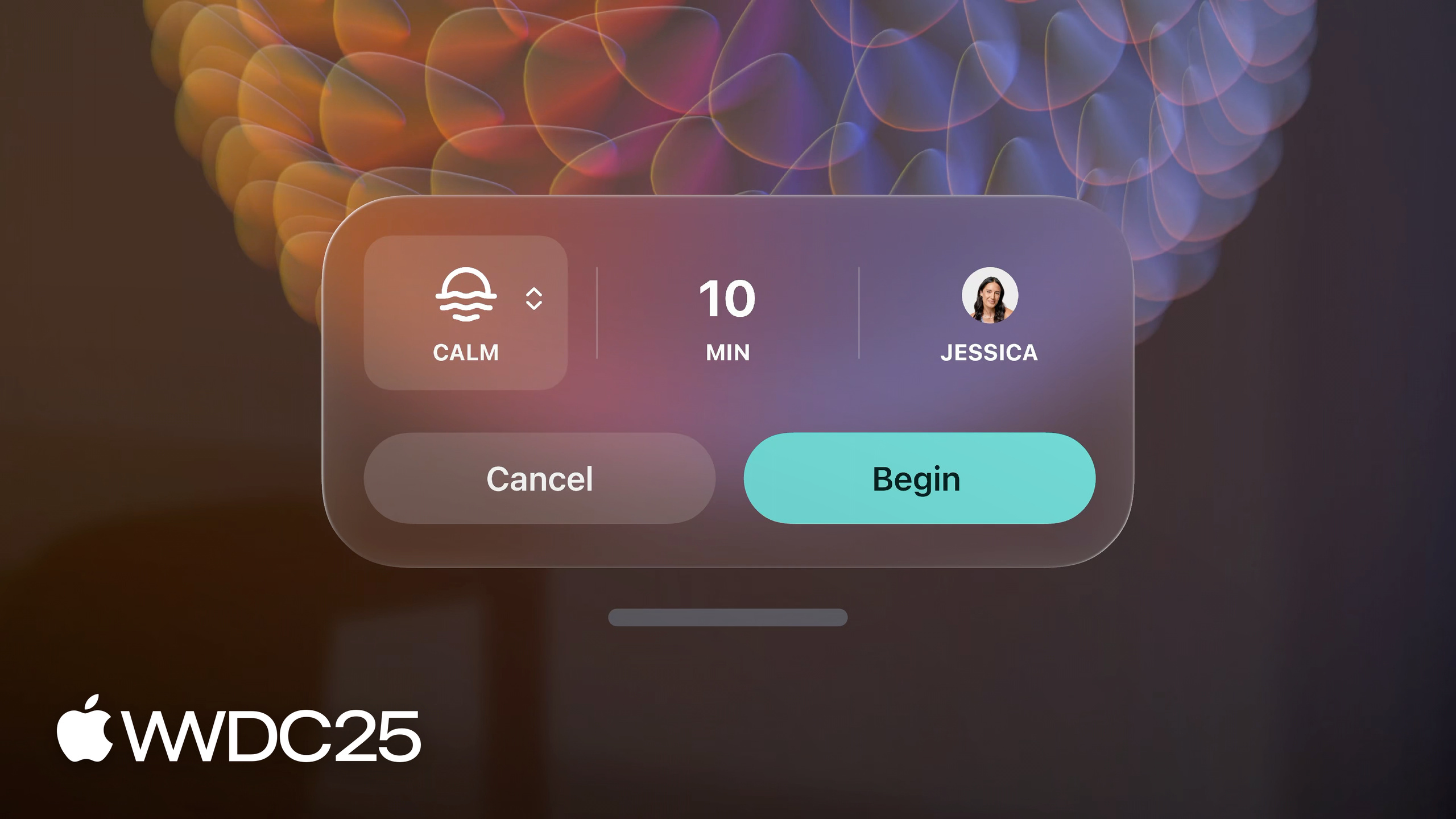
Persistent Controls (12:18). The rule is plain: surfaced UI auto-hides on a delay, but as long as the user is looking at it, it stays visible; once the gaze moves away (back to the video itself, for example), it hides. The standard video player (inline, windowed, and immersive forms) gets this behavior automatically. Apps with custom video controls have to enable it by hand. The FaceTime call controls and the Mindfulness session controls both use this mechanism — any UI that auto-hides on a delay should opt into persistence (13:13).
Device debugging (09:01). The Simulator cannot simulate eye tracking, and watching a video does not convey the effect either. Hover design must be iterated on Vision Pro itself.
Key Takeaways
-
What to do: wire your video and media app’s custom controls into Persistent Controls behavior.
- Why it is worth doing: this is the cheapest item to ship with the strongest user-perceived effect — flip the flag and you eliminate the frequent frustration of “I am looking at the controls, and the controls disappeared.”
- How to start: list every “auto-hide on a delay” UI in the app (video controls, the play queue, the exit button of an immersive experience, etc.) and decide one by one whether to make it persistent. Pages using the standard video player get the behavior for free; custom controls follow the docs to enable it.
-
What to do: enable Look to Scroll on the main content scroll views in the app, and keep UI lists on manual scroll.
- Why it is worth doing: in long-form reading and media browsing, eye-driven scrolling makes “the page drifts down as I finish a paragraph” feel invisible. Forcing it on Settings-style lists slows the user down.
- How to start: classify the scroll views in the app into “reading and browsing” versus “control operation,” and opt in only on the former. Make sure the opted-in scroll view fills the window’s width or height, and avoid parallax or non-linear scrolling.
-
What to do: use the Ramp animation as the default curve for custom hover.
- Why it is worth doing: Instant tends to pop up everywhere during a quick scan, and Delayed lacks immediate feedback. Ramp’s “slow first, then snap” gives feedback without interrupting the scan, and it is the mainstream choice in visionOS system UI.
- How to start: reverse-engineer the curve from Apple system examples like the Home View environment icons — a slow ease-in zoom up front as a hint, then a fast spring to the final state. Try it first on patterns like card expansion and buttons that reveal more information.
-
What to do: use hover to show information and tap to trigger actions, never mix the two.
- Why it is worth doing: this is a hard constraint imposed by the visionOS privacy architecture. Violating it makes the app fail silently on certain OS versions.
- How to start: audit every “execute on look” interaction in the app (auto-close, auto-play, auto-navigate) and move the action onto a pinch gesture. Use hover only for animation feedback and information reveal.
Related Sessions
- Design widgets for visionOS — design guidelines for widgets on visionOS 26. Shares the same eye-input vocabulary as hover feedback.
- What’s new for the spatial web — spatial capabilities for the web on visionOS 26, including hover adaptation at the page level.
- Design for spatial input — the 2023 primer on eye and hand input. This session cites it repeatedly as prerequisite reading.
- Build immersive web experiences with WebXR — WebXR’s immersive implementation on visionOS, related to the Persistent Controls idea.
Comments
GitHub Issues · utterances