
Highlight
Snippets are the compact views that App Intents pop up in Siri, Spotlight, and Shortcuts. This year they gain buttons, in-place updates, and a confirmation flow.
Core content
In the past, an App Intent snippet was a read-only card. The user asked Siri, the snippet showed the result, and that was it. To add a “one more cup” button, or to let the user confirm an order inside the snippet, the developer had to send them back to the app. That broke the whole point of a snippet — glance, act, move on. The user is on Siri, on Spotlight, on Apple Watch, with very little attention to spare. Every jump back to the app is a user lost.
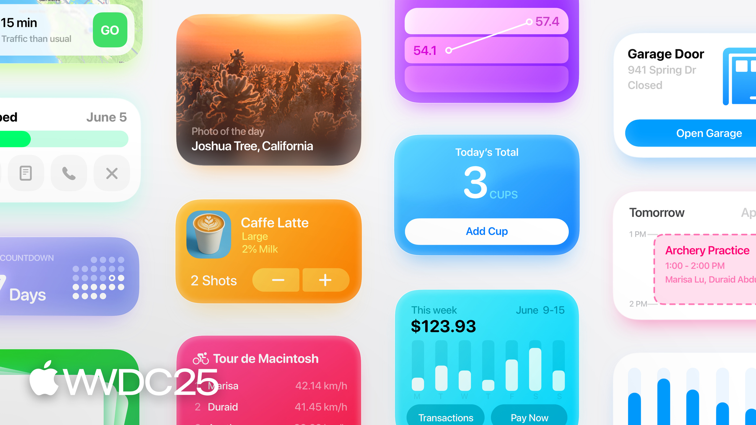
WWDC 2025 makes snippets interactive. You can now place buttons in a snippet and bind them to existing App Intents. Data inside the snippet updates in place; you do not need to fire the intent again. Snippets also split into two kinds. A Result Snippet shows the final result and only carries a “Done” button. A Confirmation Snippet covers the “confirm before running” case, and its bottom button can read like an action verb — “Order”, “Send”, “Search”. The whole design keeps light, habitual actions inside the snippet, so an App Intent is no longer a one-shot card that disappears once it has shown something.
Details
Layout and typography (01:13). Snippet text is deliberately larger than the system default, so the key information lands at first glance. Leave enough space between elements, and use a single padding value across the card. Apple recommends the ContainerRelativeShape API so margins adapt to platform and screen size. Height has a hard guideline: anything taller than 340 points needs to scroll, and scrolling kills the “read at a glance” promise. If the data is bigger, put a button in the snippet that sends the user to the full view in the app.
Contrast (02:46). A snippet floats over other content, so you can give it a vivid gradient background that matches your app’s visual identity. But snippets are often read from a distance — phone on the desk, StandBy mode — and the standard contrast ratio is not enough. The session asks you to go past the usual contrast threshold, darkening the foreground or muting the background as needed.
Interaction and state (03:28). Take a water-tracking app. Put a ”+” button in the snippet; pressing it bumps the count in place, paired with a scale-and-blur animation for feedback. This loop — button fires, data writes back — builds the user’s trust in the App Intent. A snippet can carry several buttons and several updating values at once, like an equalizer preset that shows current audio parameters next to a few preset choices. Even with no interaction, a snippet can slide in fresh data with animation.
Two snippet types (04:48). Result is for things that are already done and need no follow-up — checking an order status, with a “Done” button at the bottom. Confirmation is for things the user must approve before they run. Ordering coffee is a good example: the snippet lets the user dial in espresso shots, but the order only goes out when they hit “Order”. The confirmation verb supports a few presets (Order / Send / Search and so on) and is also customizable. Once confirmation completes, follow it with a Result Snippet to close the loop — “I started an intent, I saw it finish.”
Dialog and snippet (06:07). The dialog is the line Siri speaks aloud. It is essential when the user is on AirPods with no screen. The session offers a counter-intuitive rule: a snippet must stand on its own. Even if the dialog never plays or is not heard, the user should still understand what the intent is doing. Do not repeat the same information in dialog and snippet — when both are visible, that feels redundant.
Takeaways
-
What to do: Find the “high-frequency, habitual actions” in your App Intents and turn them into Confirmation Snippets.
- Why it pays off: Letting the user place an order or log an entry inside Siri or Spotlight is an order of magnitude faster than bouncing back to the app, and it lifts intent reuse sharply.
- Where to start: List the top five actions your users do every day or every week. Pick one with few parameters that needs a confirmation step (place order, submit log, send message). Build it as a Confirmation type with an action-verb button.
-
What to do: Add in-place update animations to data-display snippets.
- Why it pays off: Scale-and-blur is the feedback combo Apple calls out by name. It says “the data changed” more directly than a fade, so the user knows the button really did something.
- Where to start: Update state inside the button action and wrap it in contentTransition — the same pattern as interactive widgets. Do not invent a separate animation language for snippets.
-
What to do: Audit every dialog string in the app and make sure each snippet stands without it.
- Why it pays off: AirPods users only hear the dialog; Spotlight users only see the snippet. Both sides must explain the intent on their own, without repeating each other.
- Where to start: Mute the snippet screenshot and ask, “Can I tell what happened from the picture alone?” Then read the dialog out loud and ask, “Is this enough on its own?” Cut the overlap from the dialog side.
-
What to do: Treat 340 points as a hard ceiling for snippet height.
- Why it pays off: Past that height the snippet must scroll, and the “read at a glance” value collapses. The user is more likely to swipe it away.
- Where to start: Draw a 340pt line across your design mockup. Anything above it either gets cut, or becomes a link button into the app. Do not make the snippet carry a full list on its own.
Related sessions
- Develop for Shortcuts and Spotlight with App Intents — engineering side of wiring App Intents into Shortcuts and Spotlight
- Explore new advances in App Intents — overview of this year’s App Intents updates
- Code-along: Bring on-device AI to your app using the Foundation Models framework — a hands-on tutorial for adding on-device generative AI to a SwiftUI app
- Deep dive into the Foundation Models framework — guided generation and tool use details for Foundation Models
Comments
GitHub Issues · utterances