
Highlight
The WWDC25 widget update does three things: it expands widgets to visionOS and CarPlay, brings Relevance Widgets to watchOS so they appear during the right time window, and lets APNs push refresh widgets directly.
Core Content
For the past few years, widgets have been stuck on two problems. First, platform coverage was thin: visionOS had no native widgets, and CarPlay could only watch from the sidelines. Second, the only refresh mechanism was Timeline. Developers had to predict data hours ahead, or wait for the system to give them a turn under throttling. When the server had new data, there was no way to tell the widget directly.
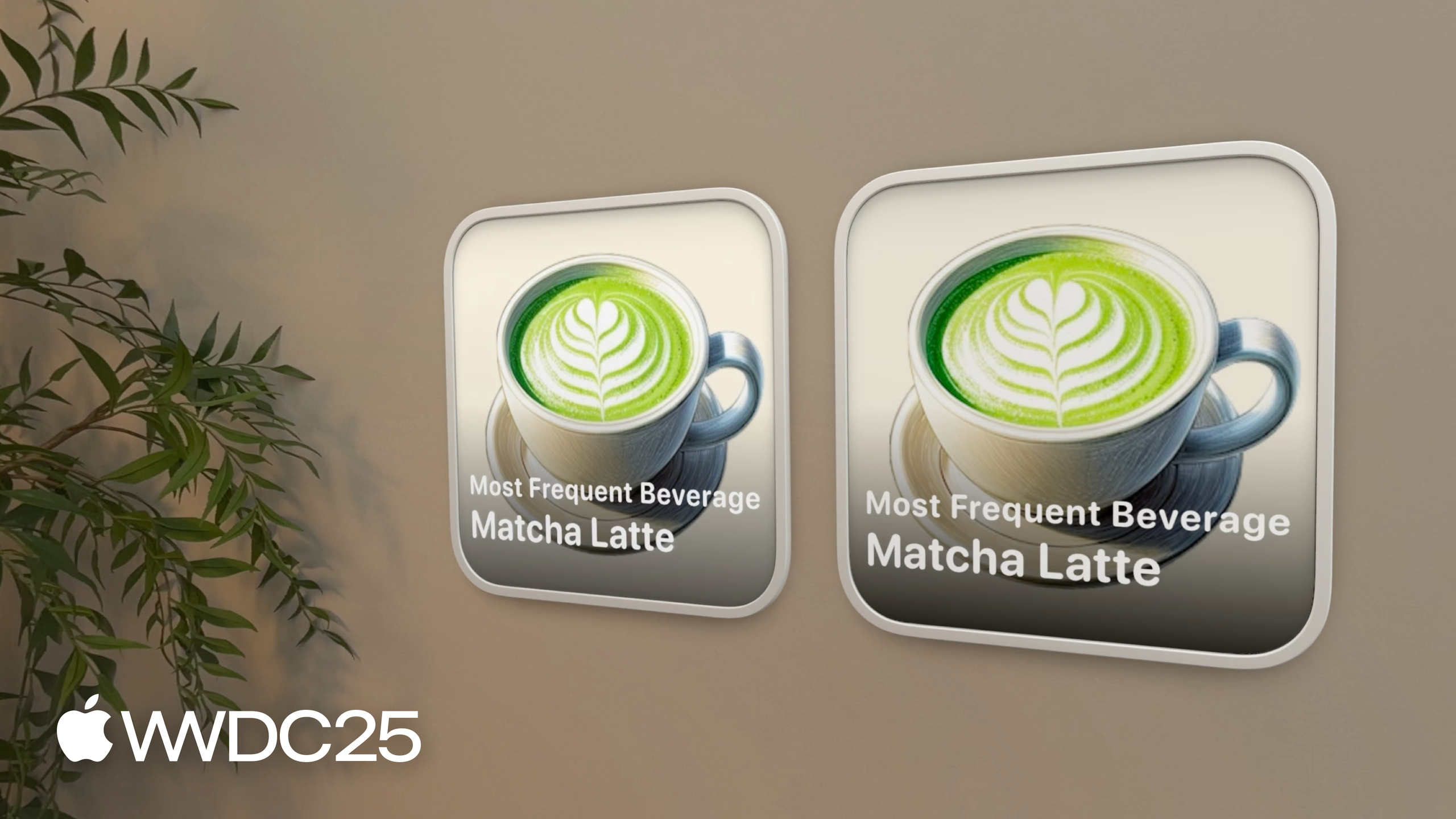
WWDC25 tackles both problems together. Widgets, Live Activities, and Controls all land on visionOS 26, CarPlay, and the macOS Tahoe menu bar at once. Widgets on visionOS can stick to a wall or sit recessed in a wooden desk, and they switch to a simplified layout when viewed from across the room. CarPlay places widgets to the left of the dashboard in StandBy style. watchOS 26 adds the Relevance Widget — it declares “I’m only relevant during happy hour, 17:00–19:00,” and once that window passes it disappears from the Smart Stack. The biggest change is WidgetKit Push Notifications: the server sends a silent push with content-changed: true, and the widget refreshes immediately, no longer bound by the Timeline schedule.
Detailed Content
Accented Rendering Mode
The iOS 26 Home Screen adds clear glass and monochrome tint themes. The system first renders widget content in accented rendering mode (everything tinted white), then strips the background and replaces it with glass or a solid color. Plain widgets need no changes, but widgets that use photos or brand colors break — the image turns entirely white and becomes unreadable.
Apple’s answer is to watch the widgetRenderingMode environment value and branch the layout based on the current mode (02:44):
struct MostFrequentBeverageWidgetView: View {
    @Environment(\.widgetRenderingMode) var renderingMode

    var entry: Entry

    var body: some View {
        ZStack {
            if renderingMode == .fullColor {
                Image(entry.beverageImage)
                    .resizable()
                    .aspectRatio(contentMode: .fill)

                LinearGradient(gradient: Gradient(colors: [.clear, .clear, .black.opacity(0.8)]), startPoint: .top, endPoint: .bottom)
            }

            VStack {
                if renderingMode == .accented {
                    Image(entry.beverageImage)
                        .resizable()
                        .widgetAccentedRenderingMode(.desaturated)
                        .aspectRatio(contentMode: .fill)
                }

                BeverageTextView()
            }
        }
    }
}
Key points:
@Environment(\.widgetRenderingMode): reads which rendering mode the system is using, either.fullColoror.accented.if renderingMode == .fullColor: in full-color mode, show the large image with a gradient overlay.if renderingMode == .accented: in accented mode, switch layouts and put the image back above the text..widgetAccentedRenderingMode(.desaturated): keeps the grayscale detail of the image in accented mode instead of tinting it solid white. The modifier also accepts.accented,.accentedDesaturated,.fullColor, andnil. Use.fullColorfor album art or book covers.
visionOS Widget Configuration
On visionOS 26, widgets can pin to walls or recess into desks (06:08):
struct CaffeineTrackerWidget: Widget {
    var body: some WidgetConfiguration {
        StaticConfiguration(
            kind: "BaristaWidget",
            provider: Provider()
        ) { entry in
            CaffeineTrackerWidgetView(entry: entry)
        }
        .configurationDisplayName("Caffeine Tracker")
        .description("A widget tracking your caffeine intake during the day.")
        .supportedMountingStyles([.elevated])
        .widgetTexture(.paper)
        .supportedFamilies([.systemExtraLargePortrait])
    }
}
Key points:
.supportedMountingStyles([.elevated]): declares that only the “raised off the wall” mounting style is supported. The other option is.recessed(set into a wooden desk). The modifier also works on iOS..widgetTexture(.paper): visionOS only. Replaces the default glass material with a poster-paper texture..supportedFamilies([.systemExtraLargePortrait]): a new portrait extra-large size on visionOS 26. The originalsystemExtraLargeis the landscape version.
Level of Detail: Auto-Simplify at Distance
A visionOS widget can sit on the far wall of a room, where text gets small and buttons hard to tap. The new levelOfDetail environment value handles this (08:56):
struct CaffeineTrackerWidgetView : View {
    @Environment(\.levelOfDetail) var levelOfDetail

    var entry: CaffeineLogEntry

    var body: some View {
        VStack(alignment: .leading) {
            TotalCaffeineView(entry: entry)

            if let log = entry.log {
                LastDrinkView(log: log)
            }

            if levelOfDetail == .default {
                LogDrinkView()
            }
        }
    }
}
Key points:
levelOfDetailis either.defaultor.simplified, switched automatically by the system based on distance.- At a distance, hide
LogDrinkView— buttons are hard to tap from far away, so drop them first. - Pair the distance switch with a larger font for
TotalCaffeineView(see the next snippet) so the core “total caffeine” number stays readable. - Level-of-detail transitions get an animation, following the same rules as Timeline transitions.
struct TotalCaffeineView: View {
    @Environment(\.levelOfDetail) var levelOfDetail

    let entry: CaffeineLogEntry

    var body: some View {
        VStack {
            Text("Total Caffeine")
                .font(.caption)

            Text(totalCaffeine.formatted())
                .font(caffeineFont)
        }
    }

    var caffeineFont: Font {
        if levelOfDetail == .simplified {
            .largeTitle
        } else {
            .title
        }
    }

    var totalCaffeine: Measurement<UnitMass> {
        entry.totalCaffeine
    }
}
Key points:
- The
caffeineFontcomputed property returns a different size based onlevelOfDetail—.largeTitlein simplified mode,.titlein default mode. - “Switch layout by distance, not by size” is the central idea behind visionOS widget design.
Live Activity on CarPlay
A Live Activity has to opt in to appear on the CarPlay Home Screen (11:49):
struct ShopOrderLiveActivity: Widget {
    var body: some WidgetConfiguration {
        ActivityConfiguration(for: Attributes.self) { context in
            ActivityView(context: context)
        } dynamicIsland: { context in
            DynamicIsland {
                DynamicIslandExpandedRegion(.leading) {
                    ExpandedView(context: context)
                }
            } compactLeading: {
                LeadingView(context: context)
            } compactTrailing: {
                TrailingView(context: context)
            } minimal: {
                MinimalView(context: context)
            }
        }
        .supplementalActivityFamilies([.small])
    }
}
Key points:
.supplementalActivityFamilies([.small]): declares that this Live Activity also supports the.smallsupplemental family. CarPlay Home Screen and Apple Watch render this family.- Along with this line, branch on
@Environment(\.activityFamily)in the view layer and write a separate, stripped-down view for.small.
Relevance Widget: Show Up at the Right Time
watchOS 26 introduces RelevanceKit. Unlike a Timeline Widget, a Relevance Widget declares “I’m relevant during this window,” and the system shows it in the Smart Stack only then (16:20):
struct HappyHourRelevanceWidget: Widget {
    var body: some WidgetConfiguration {
        RelevanceConfiguration(
            kind: "HappyHour",
            provider: Provider()
        ) { entry in
            WidgetView(entry: entry)
        }
    }
}
Key points:
RelevanceConfigurationis the third widget configuration type, alongsideStaticConfigurationandAppIntentConfiguration.- The provider conforms to
RelevanceEntriesProviderand returns aWidgetRelevancefromrelevance(), telling the system which “relevant windows” exist right now. - Multiple attributes can be returned at once — for example, the happy hours of three coffee shops can show up as three instances in the Smart Stack at the same time.
WidgetKit Push: Server-Driven Refresh
The biggest engineering change. The widget registers a WidgetPushHandler, gets a push token, and sends it back to the server (21:13):
struct CaffeineTrackerPushHandler: WidgetPushHandler {
    func pushTokenDidChange(_ pushInfo: WidgetPushInfo, widgets: [WidgetInfo]) {
        // Send push token and subscription info to server
    }
}
Key points:
WidgetPushHandleris a new protocol made for widgets — its push token is separate from the app’s own.pushTokenDidChangefires whenever the token changes. Its arguments include every place where the widget is currently installed (Home Screen, Lock Screen, Smart Stack, and so on).- Once the app has the token, it sends it to the server and stores it.
The server-side payload is minimal (22:29):
{
    "aps": {
        "content-changed": true
    }
}
Key points:
content-changed: trueis a WidgetKit-specific field that tells the system “the data changed, go fetch a new timeline.”- The push itself carries no data. It triggers the next timeline request from the provider — the server only signals “time to refresh,” it doesn’t ship content.
- Pushes have a budget and share the system’s throttling policy with Timeline scheduling. Don’t use push for data that changes every second; use Timeline’s built-in periodic refresh instead.
Key Takeaways
-
Add accented mode support to existing widgets: when a user switches to the clear glass theme, an unadapted widget turns into a white blob. Why it’s worth doing: Home Screen customization on iOS 26 is a feature for all users and adoption will move fast. How to start: tag the widget’s image assets with
.widgetAccentedRenderingMode(.desaturated), then branch on@Environment(\.widgetRenderingMode)to hide gradients and decorations you don’t need. Preview accented mode directly in the simulator. -
Switch high-frequency server events to Push Widget Updates: flight status, order status, sports scores — data with sparse change points that need to be visible right away. Why it’s worth doing: Timeline scheduling has a minimum interval, so until now you had to predict ahead, and the screen always lagged behind real events. How to start: implement
WidgetPushHandler, send the token to your existing APNs service, and fire a silentcontent-changed: truepush at the moment of each event. The payload takes almost no code. -
Wire up a Relevance Widget for any business-hours app: restaurant happy hour, gym class times, movie showtimes. Why it’s worth doing: the user doesn’t have to add the widget by hand. The system pushes it onto the Smart Stack watch face during the relevant window. How to start: replace
StaticConfigurationwithRelevanceConfiguration, return aWidgetRelevancewith the time window fromRelevanceEntriesProvider.relevance(). Multiple business locations can coexist as multiple attributes. -
Reuse iPad widgets on visionOS: the lowest-cost expansion. Why it’s worth doing: visionOS 26 picks up iPad widgets automatically, so you get a foothold on a spatial device with zero code. How to start: run the existing widget in the visionOS simulator first; only the screens that need distance support need
@Environment(\.levelOfDetail). For photo or poster content, turn on.widgetTexture(.paper)and the look changes immediately. -
Add one line —
.supplementalActivityFamilies(.small)— to your Live Activity: why it’s worth doing: one line of code gets you a slot on both the CarPlay Home Screen and Apple Watch. How to start: append the modifier afterActivityConfiguration, then in the view layer branch on@Environment(\.activityFamily)and write a stripped-down view for.small— large text, few icons, no buttons.
Related Sessions
- Bring Swift Charts to the third dimension — Swift Charts gains 3D charts, which together with visionOS widgets form the visualization stack for spatial computing.
- Build an AppKit app with the new design — the new design language of macOS Tahoe, the source of the widget and menu bar Control look.
- Create icons with Icon Composer — making icons under the Liquid Glass design system, the same root as widget accented mode.
- Elevate the design of your iPad app — design guide for iPad apps, an important reference for how widgets present on the iPad’s larger screen.
Comments
GitHub Issues · utterances