
Highlight
Widgets on visionOS 26 are defined by four principles: Persistence, Fixed Size, Customization, and Proximity Awareness.
Core Content
A widget on iPad is a rectangle on the screen, an extension of the app. A widget on Vision Pro is different. It is an object in the room. Place it on a wall and it hangs like a picture; place it on a desk and it sits like a photo frame. Power the device off and on, and it stays where you left it (01:22).
The pain point is concrete: developers are used to writing UI inside a screen. When designing widgets for Vision Pro, old habits warp the result — font sizes shrink to phone proportions, backgrounds follow app brand colors, and from a few meters away nothing reads. Apple’s answer is to design widgets as real objects: sizes map to centimeters in the physical world, materials respond to ambient light in the room, and distance decides which information shows.
The session is split between two presenters, Jonathan and Moritz: the first half covers Persistence and Fixed Size, the second covers Customization and Proximity Awareness. If your app already has an iPad widget, turning on compatibility mode brings it across as-is. To get visionOS-native sizes and materials, build a Native Widget.
Detailed Content
Persistence: once placed, it stays put (02:14)
The user drags a widget out of the Widgets app, and it first floats next to the library window. To become persistent, it must attach to a physical surface: a horizontal one (desk, shelf) or a vertical one (wall).
A widget on a horizontal surface tilts slightly toward the user and casts a shadow to reinforce the sense of “sitting on” the surface. On a wall, the widget sits flush with the surface and projects a shadow like a hung picture. Widgets always render behind all virtual content, which strengthens the feeling that they belong to the room. The same widget supports multiple instances; several copies on a wall snap into a grid automatically.
Fixed Size: sizes map to the real world (06:41)
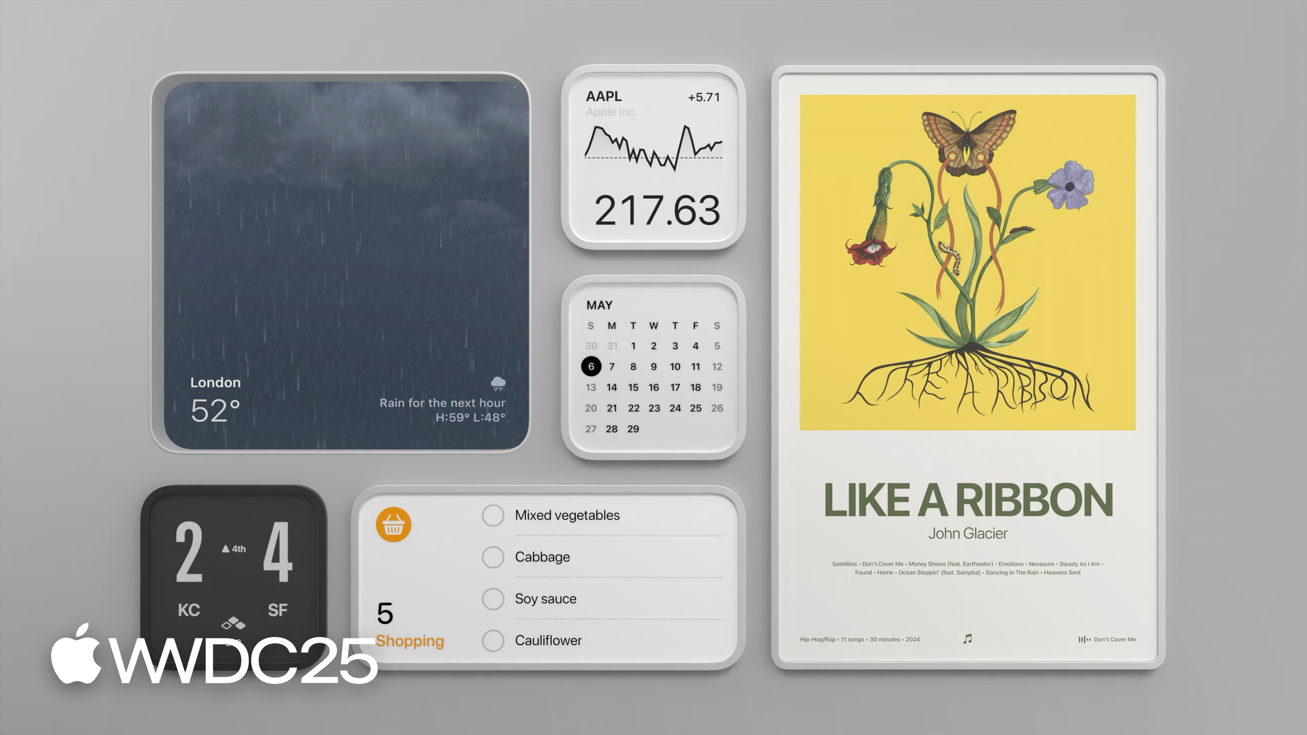
Template sizes have fixed physical meaning. The Music Poster widget uses extra-large, the size of a framed poster. A to-do list uses small, so it can sit next to a Mac Virtual Display without blocking the view.
The user can scale a widget between 75% and 125% with the corner affordance, but layout proportions are preserved. Because the user may walk up close, every asset must use high-resolution resources (08:39).
Paper vs Glass: two materials (09:21)
Paper style lets the whole widget respond to ambient light. It suits content that should feel like a physical object — album covers, posters. It is built from three layers: a system-provided Frame, developer-controlled Content, and a unifying Coating Layer that handles reflection.
Glass style emphasizes contrast. Foreground content keeps its original color and is unaffected by ambient light, while the background can opt in or out. The News widget uses Glass: an editorial image blends softly into the room as background, while the headline stays crisp in the foreground. Glass has more layers — Frame, Backplate, UI Duplicate Layer (sits behind the main content to give it depth), UI Layer (text and icons), and Coating Layer.
Customization: palettes and mounting (12:34)
The system provides 14 palettes (7 light + 7 dark). By default a widget is untinted and shows its original colors; once the user picks a tint, the whole widget takes that color. Developers can opt the background out of tinting (to preserve a photo or an illustration), but the Frame always participates and cannot be excluded.
There are two mounting styles: Elevated (sits on the wall surface, like a picture frame) and Recessed (set into the wall, like a window). Recessed is only available on vertical surfaces — there is no “set into” effect on a desk. The Weather widget defaults to Recessed, like a window onto the weather. Developers can choose Elevated only, Recessed only, or both, but Recessed-only loses the ability to place the widget on horizontal surfaces.
Border width has 5 levels and is independent of template size. Under Recessed style the border width is fixed.
Proximity Awareness: distance-aware layouts (17:15)
The system gives a widget two thresholds: Default (a detailed layout for close range) and Simplified (a stripped-down layout for distance). The Sports widget shows only the score from across the room and unfolds match details when the user walks up.
Apple frames this as responsive design extended into space: the responsive dimension is angular size, which changes with the distance between the user and the widget. When designing the two layouts, keep shared elements where possible so the scaling transition feels natural.
If the widget contains interaction (buttons and so on), proximity affects hit-target size so the widget is easy to tap from any distance. For widgets without interaction, tapping launches the app from nearby.
Core Takeaways
-
Design the widget as “an object in the room,” not “a window into the app”: why it matters — visionOS widgets are anchored to physical space, so the design axis shifts from screen coordinates to the context of the room. How to start — before drawing anything, decide where the widget will live: kitchen, living room, or desk? That setting drives the template size, material choice (Paper or Glass), and information density.
-
Run the design through all 14 system palettes: why it matters — the Frame always participates in tinting and the user can switch palettes freely, so an untested palette can produce a contrast disaster. How to start — overlay screenshots of the widget on each of the 7 light and 7 dark tints; wherever text becomes unreadable or colors clash, decide whether to opt the backplate out of tinting.
-
Design a Simplified layout for distance: why it matters — visionOS widgets often hang on walls, and readability from 3 meters away decides whether they get used. How to start — view the Default layout from 3 meters out, pick out the elements that are unreadable at that distance, and build a stripped-down Simplified layout that keeps shared elements so the transition stays smooth.
-
Prefer Elevated, and use Recessed only when the window metaphor holds: why it matters — Recessed loses placement on horizontal surfaces, so it is only worth the trade-off when the content has a “looking out at something” quality (weather, scenery). How to start — ask yourself whether the widget content has any “view” semantics; if not, stay with Elevated.
-
Ship every asset at high resolution; do not export at iPad sizes: why it matters — users can scale between 75% and 125% and walk right up to the widget, so blurry assets get spotted immediately. How to start — export at 2x the actual display size of the extra-large template, and verify on a real visionOS device.
Related Sessions
- Design hover interactions for visionOS — design guidelines for hover, look-at, and other spatial interactions on visionOS.
- What’s new for the spatial web — spatial capabilities added to the Web on visionOS 26.
- Design great widgets — cross-platform widget design guidelines, referenced repeatedly here as the foundation.
- What’s new in WidgetKit — the matching technical session, which shows how to translate these design principles into code.
Comments
GitHub Issues · utterances