
Highlight
Speaker Max Martynov uses a fictional fitness app called “Exercise” to walk through a full overhaul of App Analytics: 100+ new metrics, a cohort analysis view, peer group benchmarks, and two subscription reports. The shift moves the analytical lens from totals to “when do users pay, and do they stay after they pay.”
Core Content
When many developers open Analytics in App Store Connect, what they see are totals: how many downloads today, how much revenue this month, how many active subscribers. These numbers tell you “how things are right now,” but not “why they are good” or “why they are bad.” A developer of a running app might spend on traffic, ship a custom product page, and launch a subscription, only to end up staring at a single revenue line that wobbles up and down, unable to tell whether the problem lies in acquisition, conversion, or retention.
This WWDC25 session pulls the answer apart. Apple has moved App Analytics into a new Analytics entry inside the Apps tab, reorganized navigation around the customer journey (acquisition → monetization → subscription → offer), added 100+ metrics, and made the cohort view a first-class citizen. Speaker Max Martynov (00:07) uses a fictional app, “Exercise”—it sells one-on-one running and cycling training as In-App Purchases, with two custom product pages, one for runners and one for cyclists—and turns data questions into data answers step by step. Runners download plenty, but Download-to-Paid Conversion is only 1.3% (07:38), well below the 3% average (05:44). Yet once they subscribe, runners stick around longer than average (11:08). The conclusion is clear: acquisition for runners is fine, conversion is the bottleneck, and an intro offer is the right move.
Detailed Content
New home and filter capabilities (01:15). Analytics moves into the Apps tab. The left sidebar splits metrics into sections: acquisition, monetization, subscription, offer, and more. The Metrics page now lets you stack 7 filters at once (up from 3), and each filter accepts multiple values. For example, you can filter by “US + Canada × iPhone + iPad × iOS 18 × a specific custom product page” in one shot, then see which referrer source converts best inside that combination (02:31).
Monetization section (04:08). Apps with IAP get a new Monetization section. The top of the Sales view shows the familiar proceeds, paying users, and total IAPs. Below them sit two cohort metrics, which are the focus of this release:
- Download-to-Paid Conversion: how long it takes a user to make a first purchase after downloading.
- Average Proceeds per Download: cumulative revenue per download, broken out day by day.
Both metrics ship with a peer group benchmark, with the 25th, 50th, and 75th percentiles drawn alongside your own curve. The Exercise app’s 35-day conversion is 3%, between the 25th and 50th percentiles—“slightly below average” (05:44). But Average Proceeds per Download keeps growing and stays above benchmark, which means the users who do pay spend a lot. The problem is in the conversion funnel, not in ARPPU.
Cohorts page (05:07). Click Cohorts to enter a matrix view: rows are download months, columns are days, and each cell is the cumulative paid ratio for that cohort N days later. Of the 58,000 downloads in September, 2.9% paid within 7 days (06:45). The top row shows the overall average for each day count, and the color gradient makes “when people pay” obvious at a glance. Stack a “Running custom product page” filter on top, and the 35-day conversion drops to 1.3% (07:38). The diagnosis is done.
Subscription section (08:23). 50+ new subscription metrics, in two groups:
- State metrics: a snapshot at a moment in time—how many plans are in an offer, how many pay full price, how many have a billing issue, how many have churned (09:42).
- Event metrics: state transitions on a given day, week, or month—activation, reactivation, voluntary churn, involuntary churn (10:10).
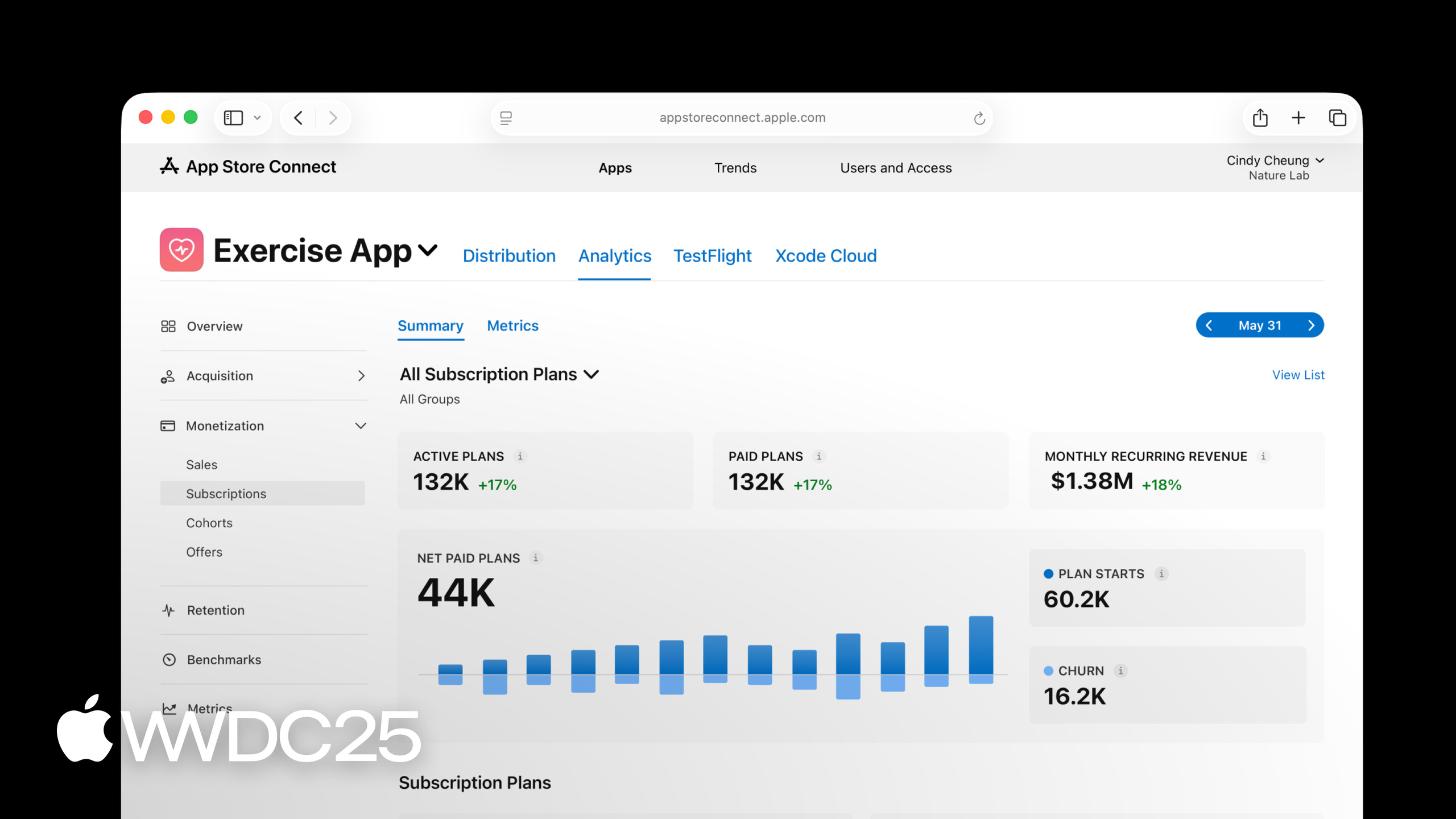
The Net Paid Plans chart draws plan starts (activations + reactivations) and churn (voluntary + involuntary) on a single graph, so you can see at a glance whether net growth comes from acquisition or from better retention. Subscription Retention also plugs into the Cohorts view: the 6-month overall average is 73% (10:41), and you can break it down by custom product page the same way.
Offers section (11:46). After the Exercise app launches a 1-month free trial offer for runners, the Offers summary shows curves for active offers, new offers, and conversion-to-paid right away. In Cohorts, pick “Subscription Retention by offer start”: the left column is offer-to-paid conversion, and the top row is later retention. The free trial gets 67% conversion to paid, 78% retention at 3 months, and 73% at 6 months (12:59). Now you have concrete numbers to decide whether the offer is worth keeping.
Reports API (13:31). The Analytics Reports API now covers 8 report categories. New this year are the subscription state report and the subscription event report, which will gradually replace the older Sales and Trends subscription reports and link download sources to subscription performance in a privacy-friendly way (14:19). To subscribe to these two new reports, send a request to the App Store Connect API’s analyticsReportRequests endpoint:
# Create an ONGOING analytics report request that refreshes daily
curl -X POST \
  -H "Authorization: Bearer $JWT" \
  -H "Content-Type: application/json" \
  "https://api.appstoreconnect.apple.com/v1/analyticsReportRequests" \
  -d '{
    "data": {
      "type": "analyticsReportRequests",
      "attributes": { "accessType": "ONGOING" },
      "relationships": {
        "app": { "data": { "type": "apps", "id": "1234567890" } }
      }
    }
  }'
Key points:
Authorization: Bearer $JWT: the App Store Connect API uses ES256-based JWT auth.$JWTis signed using the private key issued in the developer portal, paired with theiss,kid, andexpclaims.accessType: "ONGOING": declares this as a continuously refreshed report subscription, producing a fresh batch of instances each day. The other value isONE_TIME_SNAPSHOT, used to backfill history.relationships.app.data.id: binds the request to a specific app. The id is the Apple ID shown in App Store Connect.- Once the request is created, it returns an
analyticsReportRequestid. From there, call/v1/analyticsReports?filter[category]=APP_USAGEto list available reports, then call/v1/analyticsReportInstances/{id}/segmentsto get a CSV download link. The new subscription state and event reports show up in the category list.
For full field definitions, see the Analytics Reports documentation.
Key Takeaways
-
What to do: make Download-to-Paid Conversion a fixed metric in your weekly product report.
- Why it’s worth doing: the peer group benchmark gives an objective baseline. Falling below the 25th percentile means more acquisition spend won’t fix things—the problem is in the conversion funnel.
- How to start: pick Download-to-Paid Conversion on the Cohorts page, record where you sit relative to the 25th / 50th / 75th percentile, and check it against the same benchmark each week. That is more stable than tracking absolute values.
-
What to do: treat custom product pages as cohort filters, not as landing-page A/B tests.
- Why it’s worth doing: a custom product page is not just creative—it is effectively a user-source tag. The 1.3% for runners versus the 3% average in this session comes straight from using product pages to back out channel differences.
- How to start: assign a custom product page to each major acquisition channel. When you analyze, stack the product page filter and Subscription Retention together in Cohorts, and see which channel brings the highest lifetime value.
-
What to do: build a subscription dashboard from State and Event metrics.
- Why it’s worth doing: a single subscriber count hides the danger of “fast in, fast out.” State shows the cross-section, Event shows the flow, and you need both to know where net growth comes from.
- How to start: pick plans in offer / paying full price / billing issue / churned for State, and activations / reactivations / voluntary churn / involuntary churn for Event. Refresh weekly.
-
What to do: validate the bottleneck in Cohorts before launching an intro offer.
- Why it’s worth doing: an offer fixes “want to buy but hesitant,” not “don’t want to buy.” If Subscription Retention is already below benchmark, the problem is the product, not the price. An offer will only attract bargain hunters.
- How to start: use the Subscription Retention cohort to check whether your 6-month retention is above the peer group. If it is, ship the intro offer. If it isn’t, fix onboarding first.
-
What to do: pull the subscription state and event reports for offline analysis.
- Why it’s worth doing: the web dashboard works for routine checks, but cross-analysis with your in-app behavior data (levels, content consumption, push response) has to live in your own BI.
- How to start: pull these two new reports through the Analytics Reports API, join them on subscription ID with your own event stream, and find which in-app behaviors best predict renewal.
Related Sessions
- What’s new in StoreKit and In-App Purchase — the latest StoreKit and IAP API enhancements, paired with the offer and subscription metrics from this session.
- What’s new in App Store Connect — overall App Store Connect updates, including the new web UI for build management.
- Automate your development process with the App Store Connect API — use the new webhook API to receive App Store Connect notifications in real time, making it easy to wire Analytics into your own systems.
- What’s new in AdAttributionKit — new AdAttributionKit features that align ad attribution data with App Analytics acquisition metrics.
Comments
GitHub Issues · utterances