
Highlight
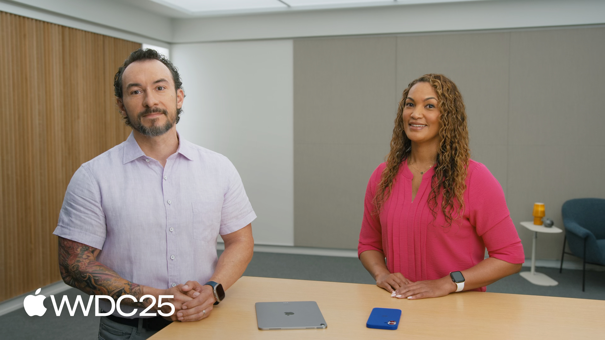
James (engineer) and Lisa (designer, legally blind) walk through the full evaluation flow for Accessibility Nutrition Labels by jointly evaluating the Landmarks app.
Core Content
The App Store hosts a huge number of apps, but users with low vision, color blindness, or those who need 310% larger text often download an app only to find it unusable. Lisa is legally blind and relies on the largest text size for daily reading and work. In the past she had no way to know before downloading whether an app supported VoiceOver, Larger Text, or Dark Interface.
In 2025 Apple introduced Accessibility Nutrition Labels, which surface the accessibility features an app supports right on the App Store product page. Developers declare them in App Store Connect, and users see them before they download. Nine features can be labeled: Sufficient Contrast, Dark Interface, Larger Text, Differentiate Without Color Alone, Reduced Motion, Voice Control, VoiceOver, Captions, and Audio Descriptions.
The evaluation method is a common tasks matrix. First list the app’s core features, then add common flows like first launch, sign-in, purchase, and settings. Then test every common task against every accessibility feature. If a single common task fails for a feature, you cannot label that feature. In this session James and Lisa actually evaluated their Landmarks app and found that Larger Text testing truncated collection descriptions and that text boxes did not grow with font size, so they decided to fix the bugs before labeling. They ended up labeling six features as supported and leaving two as not applicable (the app has no audio or video, so Captions and Audio Descriptions are blank).
Detailed Content
Evaluation starts with a list of common tasks. James stresses at (01:24) that to label a feature, users must be able to complete every common task in the app with that feature. Common tasks = the app’s main features + the four general flows of first launch, sign-in, purchase, and settings.
Sufficient Contrast (05:10): foreground and background must have enough contrast. If the default colors fall short, they must pass once Increase Contrast is on. Landmarks uses high-contrast colors by default, and the few that do not meet the bar swap to backup colors when Increase Contrast is enabled. Both light and dark modes must be tested.
Dark Interface (06:06): besides Dark Mode support, test that Smart Invert does not wrongly invert colors — images, videos, and other media should keep their original colors.
Larger Text (07:00): on iOS, text must scale to at least 200%. Use Dynamic Type. The layout must fit the larger text without clipping or overlap. Lisa personally needs 310%, so try to support beyond 200%. While testing Landmarks at 235%, they found collection descriptions clipped and the text box in the editing screen not growing with the font size, so they decided to fix it before labeling.
Differentiate Without Color Alone (10:24): pair color with shape, icon, or text so colorblind users do not miss information. The example is a delete button: red plus a trash can icon.
Reduced Motion (11:26): motion that can trigger vertigo includes zoom or slide transitions, flashing, autoplay animations, and parallax. When Reduced Motion is on, replace these animations rather than simply drop them.
Voice Control and VoiceOver share the same accessibility API (14:18). Voice Control depends on metadata for every interactive element — the button’s name, the search field’s label, and so on. The most common pattern is to add accessibilityLabel to icon-only buttons:
// Add an accessibility label

import SwiftUI

struct LandmarkDetailView: View {
  @Environment(ModelData.self) var modelData
  let landmark: Landmark

  var body: some View {
    @Bindable var modelData = modelData
    DetailContentView()
      .toolbar {
        ToolbarItemGroup {
          Button {
          } label: {
            Image(systemName: "square.arrow.up")
          }
					.accessibilityLabel("Share")
        }
      }
   }
}
Key points:
Image(systemName: "square.arrow.up"): the button shows only a share icon, with no visible text..accessibilityLabel("Share"): set the button’s accessibility name to Share. The modifier attaches to the Button, not the Image.- A Voice Control user says “Tap Share”, and a VoiceOver user hears “Share” when focusing the button — one declaration, both assistive technologies benefit.
- When evaluating Voice Control, you may use only voice commands; no touch or cursor fallback (13:58).
VoiceOver testing (14:53): turn on VoiceOver via the Accessibility Shortcut and complete every common task using gestures or keyboard commands alone. Lisa demoed the full flow on stage: swiping through the collection, double-tapping to activate, and adding a landmark.
Do not label features that do not apply (02:25): Landmarks has no audio or video, so Captions and Audio Descriptions stay blank rather than getting labeled for the sake of “coverage”. Accuracy beats coverage.
Key Takeaways
-
What to do: list the common tasks for your existing app right now.
- Why it matters: this is the entry point for Accessibility Nutrition Labels and the smallest unit of accessibility evaluation. Without the list, later testing is unfocused.
- How to start: write down 3–5 core reasons users download the app, then add the four common flows of first launch, sign-in, purchase, and settings. Store it in a Markdown table, with the nine accessibility features as columns and common tasks as rows.
-
What to do: add 235% / 310% larger text to the QA checklist.
- Why it matters: users like Lisa who depend on larger text expose the hardest layout bugs — text boxes that do not grow with font size, descriptions that get clipped. These bugs are invisible at the default size.
- How to start: on a test device go to Settings > Accessibility > Display & Text Size > Larger Text, scale to 235%, and run the core tasks. Check that every TextField wraps to multiple lines and every list cell grows with the font size.
-
What to do: add
.accessibilityLabelto every icon-only button.- Why it matters: this is the minimum metadata both Voice Control and VoiceOver depend on. One line of code lights up two assistive technologies.
- How to start: search the project for
Image(systemName:insideButton, and add.accessibilityLabel("...")to each one. Use a verb or an object name, such as “Share”, “Delete”, or “Add Landmark”.
-
What to do: add Smart Invert to your Dark Mode acceptance test.
- Why it matters: many apps think they support Dark Mode, but when Smart Invert is on, images, videos, and brand colors get wrongly inverted and the experience breaks.
- How to start: turn on Settings > Accessibility > Display & Text Size > Smart Invert and run the app. For all display images, use a mechanism like
.accessibilityIgnoresInvertColors(true)to block inversion.
-
What to do: test with real users with disabilities, not just internal QA.
- Why it matters: Lisa repeats “Nothing about us without us” throughout the session. Internal testing cannot tell you which animations cause vertigo or which font size is large enough — only real users can.
- How to start: through user research channels, recruit 1–2 VoiceOver users and 1 low-vision user who needs larger text for remote testing. Treat the bugs they find as release blockers, not P3 backlog.
Related Sessions
- Customize your app for Assistive Access — a focused iOS experience tailored for users with cognitive disabilities, another accessibility track beyond Accessibility Nutrition Labels.
- Make your Mac app more accessible to everyone — accessibility API practice on the Mac, a useful counterpart to this session’s iOS evaluation method.
- Principles of inclusive app design — accessibility from the design stage, answering the “why”; this session answers the “how to label”.
Comments
GitHub Issues · utterances