
Highlight
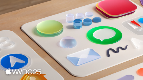
Apple fuses the layered icon language of visionOS with the optical traits of real glass into a new material called liquid glass. The same design grid now covers iOS, iPadOS, macOS, and watchOS, and four translucent appearances join the lineup: light and dark glass, light tint, and dark tint.
Core Content
For years, maintaining app icons has been a chore. iOS, macOS, and watchOS each had their own canvas size and corner radius, so a single icon needed a separate version per platform. On macOS, some icons let secondary elements (like the index page in Contacts) spill outside the main shape, which looked neither uniform nor elegant. Add dark mode and tinted mode on top of that, and the asset count kept growing.
WWDC 2025 throws the whole design language out and starts over. Apple drew on the layered icons of visionOS, studied how real glass reflects, refracts, and frosts, and built a material called liquid glass (00:54). The material stacks edge highlights, frost, and translucent layers so an icon looks lit from inside. On the iOS Home Screen, gyroscope input lets light flow along the edges, as if the icon were reflecting the room around it (01:23).
At the system level, every platform shares one grid. The rounded-rectangle canvas is 1024 pixels; the watchOS circular canvas is 1088 pixels and is deliberately a touch larger than the rectangle so the visual weight stays consistent across platforms (04:38). Appearance modes grow from two to six: light, dark, mono glass (light and dark variants), dark tint (color applied to the foreground), and light tint (color injected into the glass itself). All six work on iPhone, iPad, Mac, and Apple Watch (02:06).
Detailed Content
The heart of the new material is layering. The simplest icon has a background and one foreground layer, like the bubble in Messages (05:47). But the foreground can hold many layers. The old Podcasts icon used a mask to hint at depth; the new version treats the concentric circles and the figure as real stacked layers, and depth follows naturally (06:17).
Illustration goes flat. The old Chess icon used 3D pieces in perspective; the depth fought with the glass material. The new version switches to a head-on flat view and lets the material render the depth (06:46). The Preview icon keeps the magnifying glass in perspective, but only because the icon needs to call out a focus area. 3D shapes should serve a function (07:13).
Use translucency sparingly. The old Photos icon already had overlapping translucent petals. The new version cuts the overlap so the material’s edge highlights have room to breathe (08:05). The Home icon is more aggressive: drop shadow gone, bevel gone, fewer layers, rounder shapes, and the system glass material handles the rest (08:52). The rule: stop baking shadows and bevels into the source. The system material generates them on the fly.
Avoid sharp corners and thin lines. Round corners let light flow smoothly along the edge, which is why the Settings gear has rounder teeth (09:42). Details that must stay need a heavier stroke, otherwise they vanish at small sizes.
Backgrounds prefer soft gradients. Pure white and pure black are both off the table. Apple ships two official gradients, System Light and System Dark, tuned for contrast and material response (10:24). Since dark mode is now mainstream, color backgrounds are recommended so the gap between light and dark modes feels stronger (10:42).
The macOS migration plan is clever. Old icons that already look like rounded rectangles are masked or stretched into the new template and pick up the new material automatically (03:46). Old icons with odd shapes have their drop shadow stripped and are scaled into the rounded-rectangle canvas (04:00), but Apple recommends redrawing by hand. Photo Booth, for example, was redrawn from scratch.
The official templates cover Figma, Sketch, Photoshop, and Illustrator, and ship from the Apple Design Resources page on developer.apple.com (05:11).
The whole talk boils down to one runnable checklist. Follow it and you can redraw an icon in the new material:
1. Download the template: developer.apple.com → Apple Design Resources →
   pick the new icon template for Figma / Sketch / Photoshop / Illustrator
2. Choose the canvas: 1024 × 1024 px rounded rectangle, 1088 × 1088 px circle (watchOS)
3. Split the layers: 1 background layer + several foreground layers
   (Messages has a single foreground; Podcasts splits the concentric circles and the figure into separate layers)
4. Strip static effects: delete drop shadow / bevel / inner glow from the source
   (the system material generates them dynamically)
5. Simplify illustration: switch 3D perspective to a head-on view, cut overlapping translucent shapes
   (see the Chess and Photos updates)
6. Handle the details: replace sharp corners with rounded ones, thicken thin lines, give the gear fewer and rounder teeth (Settings icon)
7. Set the background: use the System Light / System Dark gradients instead of pure white or black, lean toward color
8. Export to Icon Composer and cycle through all six appearance modes:
   Light → Dark → Mono Light Glass → Mono Dark Glass → Dark Tint → Light Tint
9. Validate on five surfaces: iPhone / iPad / Mac / Apple Watch / App Store product page
Key points:
- Layering is the root of the material: one background layer plus several foreground layers. The glass material builds depth from the gaps between layers, and a single flat layer throws away most of the visual information.
- Delete baked effects: drop shadows, bevels, and inner glows in the source file fight the system’s dynamic highlights. Strip them at the source.
- Walk through all six appearance modes: Light, Dark, Mono Light/Dark Glass, Dark Tint (color on the foreground), and Light Tint (color inside the glass). If one mode breaks, the whole set breaks.
- Canvas sizes are hard constraints: 1024 px for the rounded rectangle and 1088 px for the watchOS circle. The 1088 is a deliberate overshoot, and cross-platform consistency rests on those two numbers.
- Switch backgrounds to colored gradients: System Light and System Dark are Apple’s contrast-tuned gradients. Pure white and pure black flatten the glass.
Core Takeaways
-
What to do: redraw your icon with the official template instead of slapping a filter on it.
- Why it pays off: the system material generates highlights, shadows, and reflections at runtime. Shadows and bevels baked into the source fight the material and dirty the icon.
- How to start: download the new Figma or Sketch template from Apple Design Resources, redo your layer structure on the new grid, and delete every drop shadow, bevel, and inner glow.
-
What to do: split a single-layer icon into multiple layers so the glass material can build depth between them.
- Why it pays off: cases like Podcasts and Home show that a layered structure keeps the icon dimensional across appearance modes. A flat single layer loses most of the visual information.
- How to start: cut the foreground by meaning (subject, decoration, accent on separate layers), and hand each one to Icon Composer at export time.
-
What to do: design the icon so it stays recognizable in all six appearance modes.
- Why it pays off: the new dark tint, light tint, and mono glass modes give users much more room to customize the Home Screen. An icon that only shines in the default mode will lose ground on a personalized home page.
- How to start: cycle through all six modes in Icon Composer. Pay extra attention to legibility under light tint (color inside the glass) and mono glass.
-
What to do: switch the background to a soft gradient with a colored base.
- Why it pays off: the System Light and System Dark gradients are contrast-tuned by Apple. Pure white and pure black flatten the glass material. A colored background also makes the light/dark switch feel more distinct.
- How to start: replace solid backgrounds with the official System Light and System Dark gradients. Lean toward warm or cool colors for the main hue, and avoid large fields of neutral gray.
Related Sessions
- Create icons with Icon Composer — use Icon Composer to ship the new icons as publishable assets
- Elevate the design of your iPad app — visual and interaction upgrades on iPadOS that match the new design system
- Build an AppKit app with the new design — how an AppKit app adopts the new macOS design language
- Bring Swift Charts to the third dimension — design and implementation details for upgrading Swift Charts to 3D
Comments
GitHub Issues · utterances