
Highlight
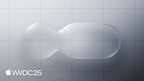
Liquid Glass is Apple’s new material layer, shipping in unison across iOS, iPadOS, macOS, tvOS, and visionOS. It bends light in real time through Lensing, and switches its tint, shadow, and refraction strength on the fly as size and background change. It is meant for floating layers — navigation and controls.
Core Content
Over the past few years Apple stacked up several visual languages across its platforms: macOS still carried traces of Aqua, iOS 7 brought real-time blur, iPhone X pushed fluid transitions, the Dynamic Island was yet another elastic shape, and visionOS went fully immersive. The result was that developers had to learn a new design system on every platform, and users felt the seams when moving between devices. The designer Chan calls this out in the opening (00:21): Liquid Glass is a rewrite that folds those years of experience into one place.
Liquid Glass does not imitate any real-world physical material. It is defined as a digital meta-material. It has only two core traits: it bends light in real time (Lensing), and it responds to touch and app state changes like a liquid (00:43). The first trait solves the old problem of staying transparent while still showing clear control edges. The second solves the old problem of transitions between controls always feeling like a hard cut.
The scope is much wider than the previous Material. On iPad and Mac, Liquid Glass lets the sidebar and Tab Bar float over the content, and the surrounding content tints the glass — colorful pixels nearby spill faintly onto the glass surface (08:09). Developers get this behavior for free as long as they use the system’s standard navigation containers. No custom code needed.
Detailed Content
Liquid Glass is built from several layers, and each layer reacts to the background in real time (06:21).
Lensing: the previous material scattered the background light. Liquid Glass instead bends and focuses it in real time (02:32). This lets controls become very light and very transparent while still standing out from the background. Fade in and out no longer use alpha ramps either. They materialize in and out by gradually tuning how much the light is bent (02:55).
Highlights layer: Liquid Glass lives in a simulated environment with light sources. Those lights cast highlights on the material, and the highlights move as the device tilts (11:04). System-level animations like lock and unlock show light sliding along the outline of an element.
Shadow layer: shadows know about the background. When an element sits over text, the shadow gets darker. When it sits over a bright solid background, the shadow gets lighter (11:43). This is built in. Use a system control and you get it.
Scroll Edge Effect: works with Liquid Glass and is meant to keep floating layers readable over scrolling content (08:55).
- Default: as content scrolls under the glass, the edge fades into the background so the title stays clear.
- Dark: when dark content scrolls in and the glass switches to its dark style, the effect changes to a faint dimming to keep contrast (09:28).
- Hard Style: used when there is a pinned accessory view (such as a table header) under the toolbar. The effect is applied evenly across both the toolbar and the accessory view rather than as a gradient (09:46).
Variants: there are only two — Regular and Clear. Do not mix them (13:51).
- Regular: the general-purpose variant. It has the full set of adaptive behaviors and works at any size, on any background.
- Clear: permanently more transparent, with no adaptive behavior. It needs a dimming layer underneath to keep icons and text readable. Use Clear only when three conditions all hold: the layer beneath is rich media, the content layer will not be affected by dimming, and the content above the layer is itself bright and bold (14:54).
Tinting: Liquid Glass introduces a new way to tint (16:08). Pick a color and the system generates a tone map based on background luminance, simulating real tinted glass. Bruno gives one bad example and one good example (17:03): a button with a solid fill is fully opaque and breaks the material; switch to the new tinting and it becomes translucent again. The rule: only use tinting to highlight the primary action.
219 is a design session and does not show code. The matching SwiftUI session 323 “Build a SwiftUI app with the new design” gives the corresponding API:
// Add the Regular variant and green tinting to a Label
Label("Desert", systemImage: "sun.max.fill")
    .padding()
    .glassEffect(.regular.tint(.green))

// Use glassProminent for the primary action button, and .glass for regular buttons
Button("Get Started") { }
    .buttonStyle(.glassProminent)

// Wrap multiple glass elements in GlassEffectContainer when they need to merge with each other
GlassEffectContainer {
    BadgeLabel(badge: badge)
        .glassEffect()
}
Key points:
.glassEffect(.regular.tint(.green))matches “Regular variant plus new Tinting” from the talk — the color is mapped against background luminance and never becomes an opaque slab..buttonStyle(.glassProminent)matches the rule “only the primary action gets a tint.” Other buttons use.buttonStyle(.glass)and stay transparent.GlassEffectContainermatches the talk’s idea of keeping a singular floating plane as controls change shape — multiple.glassEffect()elements inside one container can fuse during a transition instead of cutting in and out on their own.
Don’ts:
- Do not turn the content layer (such as a TableView) into Liquid Glass too. It will fight with the navigation layer for attention and break the hierarchy (13:14).
- Avoid glass-on-glass stacking (13:28). For elements that sit on top of Liquid Glass, use fill, transparency, and vibrancy so they look like a thin overlay on the material.
Accessibility: Reduce Transparency makes the glass more frosted, Increase Contrast switches it to black and white with an outline, and Reduce Motion turns off the elastic motion (18:15). All of this kicks in automatically when you use the system material.
Key Takeaways
-
What to do: switch your app’s navigation and toolbar to the system’s standard Liquid Glass containers. Do not write a custom background.
- Why it is worth it: Lensing, adaptive shadows, light/dark flipping, and accessibility modifiers are all free. A custom background loses all of them.
- How to start: remove custom backgrounds from your navigation, toolbar, and tab bar so the default system material kicks in. Then add a tint only to the primary action button that truly needs the emphasis.
-
What to do: audit every glass-on-glass stack in your app and replace the top layer with fill, transparency, and vibrancy.
- Why it is worth it: Bruno calls out glass-on-glass by name as a source of clutter (13:28). A semi-transparent fill on top reads like a sticker on the material, with a clearer hierarchy.
- How to start: make a search list. Find every custom
UIVisualEffectView, or every double-stackedMaterialin SwiftUI. Replace them on your two or three most-used screens first and compare screenshots.
-
What to do: decide whether to use the Clear variant. In most cases, do not.
- Why it is worth it: Clear has no adaptive behavior. It only fits over rich media. Use it in the wrong place and readability will visibly drop.
- How to start: list every screen that combines full-screen rich media with floating controls (video player, full-screen photo, map). Use Clear only on those screens and add localized dimming.
-
What to do: do a Scroll Edge Effect readability pass on your main list and detail screens.
- Why it is worth it: scrolling is your app’s highest-frequency interaction. If a floating title does not switch to dimming when dark content scrolls past, it will instantly turn into a smear.
- How to start: scroll dark content (a black background image, a dark photo) from bottom to top and watch whether the title and buttons stay clear. Where they do not, check whether you used the system’s standard navigation or toolbar. Switch to Hard Style if needed.
Related Sessions
- Build an AppKit app with the new design — how AppKit apps adopt the new design system in practice
- Create icons with Icon Composer — use Icon Composer to make new icons that work across platforms
- Elevate the design of your iPad app — layout and interaction upgrades for iPad apps under the new design language
- Bring Swift Charts to the third dimension — Swift Charts gains Chart3D and renders 3D content alongside Liquid Glass
Comments
GitHub Issues · utterances