
Highlight
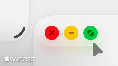
iPadOS 26 gives every iPad app a menu bar, a freely resizable window, a new pointer, and window controls in the top-left corner of the toolbar. Developers need to wrap the toolbar layout around the window controls to avoid an extra safe area.
Core Content
The iPad has always sat between the iPhone and the Mac. The screen is big enough for multitasking, but the interaction model is touch-first. Developers either stretch the iPhone version or bolt on a Mac-style window manager. The result: many iPad apps feel like enlarged phone apps — wasted space, awkward multitasking, no real use of keyboard or pointer.
iPadOS 26 ships a set of building blocks to fix this directly (00:54). Every app now has a menu bar. You reveal it by pushing the pointer to the top edge of the screen, or by swiping down from the top (10:40). A handle appears in the bottom-right corner of the window. Drag it and a full-screen app shrinks into a window floating on the desktop (05:15). The new window controls sit in the top-left corner. Click them and three actions enlarge; long press and layout shortcuts unfold (05:23). The pointer has been redesigned to track input precisely with a 1:1 mapping, and no longer snaps to targets (09:01). Together, these four pieces lift the iPad from “big iPhone” to a device that can actually multitask.
Detailed Content
Navigation: prefer the tab bar; convert between tab bar and sidebar. Apple’s advice is clear — when in doubt, start with a tab bar (02:52). The tab bar takes less space, makes content more immersive, and morphs smoothly into a sidebar (and back). The Music app shows this off: the sidebar has a button shaped like a tab bar; tap it and the entire sidebar fluidly turns into a tab bar (02:17). Navigation must adapt to width changes. Floating windows and orientation changes are all “the width changed” problems and should be handled the same way (03:23). The key point: layout changes from size changes must not be destructive — shrink, then grow, and the state should return as close to the start as possible (03:55).
Wrap the toolbar around the window controls. Do not give them their own top safe area. This is the easiest mistake to make in this round of changes (06:00). For apps that have not adopted iPadOS 26, the system adds a permanent safe area above the toolbar to hold the window controls, and the content area is permanently squeezed. The right approach is to lay out the toolbar so it wraps around the window controls and they sit on the same row (06:25).
Multiple documents should open new windows, not replace the current one. The old “Open in Place” behavior — clearing the current context when a new document opens — is no longer recommended (07:23). The new rule: every document opens in its own window, and the window stays until it is closed (07:29). Windows pile up, so the app menu now has a list of every open window (07:58). For that list to be useful, every window needs a descriptive name — the document title, not the app name (08:09).
Pointer: new shape plus Liquid Glass highlight. The old pointer was a circle, made to mimic a finger (08:48). The new pointer has a different shape and follows input 1:1, no longer snapping to buttons (10:05). The hover effect has changed too. The pointer used to morph into the highlight itself; now a Liquid Glass tray appears above the button and refracts the elements underneath to mark the target (09:21). When the pointer moves between Liquid Glass controls, the highlight quickly catches up (09:50). Any app with a custom pointer interaction needs to be retested with the new pointer (10:13).
Menu bar: organize it, and never hide it. The order for organizing a custom menu: include every related action, sort by frequency of use (not alphabetically), group by relevance, push secondary actions into submenus when the menu gets long, give each item an SF Symbol, and give the most common ones a keyboard shortcut (11:06 onward). The View menu is provided by the system, but you fill the contents — add tabs with shortcuts, add the sidebar toggle (12:30). The most important rule: never hide menu items or whole menus based on context (12:44). Unavailable items should be dimmed, not removed. The reason is spatial memory — if the contents keep changing, people have to scan from scratch every time, and the menu bar’s value as a predictable interface is gone (13:14).
Key Takeaways
-
What to do: Change the toolbar from “fills the top” to “wraps around the window controls.”
- Why it is worth doing: If you do not, the system forces a permanent top safe area for the window controls, and your content area is permanently shaved. This is the most direct payoff in adopting iPadOS 26.
- How to start: Run the existing app on iPadOS 26 and compare screenshots of the toolbar area. Then use SwiftUI’s
toolbarplacement to free up the left side of the toolbar so the window controls and toolbar buttons share the same row.
-
What to do: Make “open new document” create a new window instead of replacing the current one.
- Why it is worth doing: The iPadOS 26 multitasking model assumes windows persist. The old Open in Place behavior loses user context in multi-window workflows. Each window also needs a descriptive name to be findable in the app menu’s window list.
- How to start: Audit every
openURLand document-open entry point, and route them all through a new scene. Set each scene’suserActivity.titleto the document title. Verify by checking that the window list in the app menu lets you tell windows apart at a glance.
-
What to do: Give the app a menu bar that does not change.
- Why it is worth doing: Every iPad app now ships with a menu bar. Its core value is predictability — it is the map a power user uses to learn your app, and the entry point for keyboard shortcut discovery.
- How to start: List every user-initiated action in the app, group them into menus by relevance, and give each item an SF Symbol and a shortcut. When something is unavailable, disable it — do not hide it. The menu itself never disappears.
-
What to do: Retest every custom hover interaction with the new pointer.
- Why it is worth doing: The new pointer no longer snaps or rubber-bands to targets. Any old code that relied on snapping for hit testing will misbehave. The Liquid Glass highlight also replaces the old hover deformation effect.
- How to start: On the iPadOS 26 simulator, attach an external trackpad and walk through toolbars, control groups, and custom buttons one by one. Watch whether the highlight tracks the pointer well as it moves between control groups.
Related Sessions
- Build an AppKit app with the new design — A hands-on guide to upgrading an AppKit app to the new design system.
- Create icons with Icon Composer — Use Icon Composer to build unified icons for iOS, iPadOS, and macOS.
- Enhance your app’s multilingual experience — Build a seamless localized experience for multilingual users.
- Bring Swift Charts to the third dimension — Swift Charts adds Chart3D, extending 2D charts into three dimensions.
Comments
GitHub Issues · utterances