
Highlight
WWDC25 ships the Liquid Glass material, the Icon Composer layered icon pipeline, and the SF Symbols 7 Draw animation system, unifying the visual language across iOS, iPadOS, and macOS.
Core content
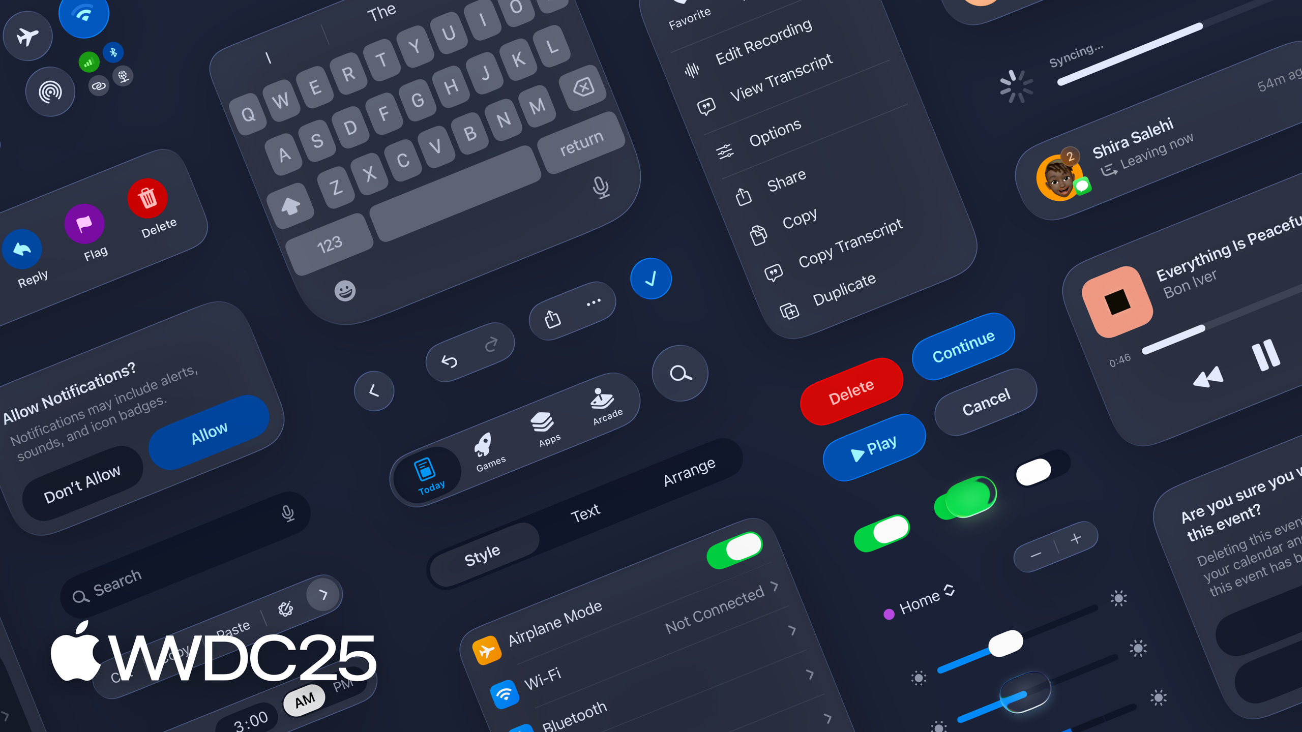
In iOS 7, Apple dropped skeuomorphism and switched to flat design. Ten years later, the cost of flat design has become clear: weak hierarchy, no physical relationship between controls, and translucent materials that still feel like a sheet of paper laid on top. WWDC25 answers with Liquid Glass. It is a material that refracts the content beneath it: a cool sheen on light backgrounds, a warmer cast on dark ones, and controls that react in real time as content scrolls. Every custom translucent control developers have hand-rolled deserves another look — chances are the system material handles it more carefully than your own code.
The icon system follows new rules. The old flow was to ship a 1024x1024 image and call it done. The new flow asks for structure: foreground, background, and highlight layers go to Icon Composer, and the system composes the final look across light, dark, tinted, and Liquid Glass modes. SF Symbols 7 adds a Draw animation system, so symbols can use color changes to express progress, state, and connection flow. Micro-interactions that used to require Lottie can now be done with system symbols, and they share a visual language with the surrounding controls by default. The goal of the whole change is one thing: let apps update along with the system, instead of forcing developers to catch up by hand every time the system changes.
Detailed content
This session is a design overview. There are no code snippets. It focuses on three things: the material (Liquid Glass), the icon pipeline (Icon Composer), and symbols (SF Symbols 7).
The physics of Liquid Glass. It is an optical material that responds to the pixels beneath it, not a static translucent layer. Apple explains its refraction, specular reflection, and lighting math in Meet Liquid Glass. Developers do not need to write shaders. The system controls in SwiftUI, UIKit, and AppKit already use the new material by default — upgrade Xcode, recompile, and the change shows up.
The new icon pipeline. Icon Composer is the desktop tool that ships with the new icon system. The input is a layered source file. The output is a .icon bundle that holds every appearance variant. The old workflow of exporting multiple sets of PNGs is replaced by “design once, render many ways.” See Create icons with Icon Composer for the details.
SF Symbols 7 Draw animation. SF Symbols 7 breaks symbol strokes apart so they can animate along their paths, and so colors can change with state. The download icon can show progress with a gradient. The Wi-Fi icon can show the connection process with layer-by-layer coloring. The full API is covered in What’s new in SF Symbols 7.
The end of the session reminds developers to upgrade Xcode and recompile first, then look at what the system controls turn into. Most of it will look fine at first glance. Then a few custom controls will stand out as off-key — those are the ones to fix first.
Takeaways
-
Recompile once with Xcode 26 and flag the controls that clash: why it matters — the new material and new shapes already apply to system controls by default, so the fastest progress check is to spot what looks out of place. How to start — open the project in the latest Xcode, walk through the main flows and take screenshots, put custom controls next to system controls, and write down the fix list.
-
Audit hand-rolled materials such as
.ultraThinMaterial: why it matters — many custom materials were written because system controls were not flexible enough. Now that system controls are stronger, the custom versions are the fragile ones. How to start — search the codebase forMaterial,UIVisualEffectView, andNSVisualEffectView, and check each one to see if it can fall back to the system default. -
You can delay the icon migration, but prepare layered source files now: why it matters — redoing an icon costs real time, but the cheapest moment to do it is when the app is shipping a new version anyway. How to start — have the designer keep source files structured the way Icon Composer expects, and export the new format with Icon Composer at release time, so there is no rush at the last minute.
-
Do not try to disable Liquid Glass to keep the old look: why it matters — once users upgrade, every native app uses the new style, and an app that keeps the old style stands out for the wrong reason. How to start — drop “preserve the old visuals” from the product backlog, and spend that effort on adapting the custom controls instead.
Related sessions
- Meet Liquid Glass — the physics, optical behavior, and use cases of Liquid Glass.
- Get to know the new design system — the new design system’s overall changes in information architecture, components, and cross-device consistency.
- Say hello to the new look of app icons — the design and rules for the new icon looks (light, dark, tinted, clear).
- What’s new in SF Symbols 7 — the SF Symbols 7 Draw animation system and new symbols.
- Create icons with Icon Composer — how to use Icon Composer and how the export flow works.
Comments
GitHub Issues · utterances