
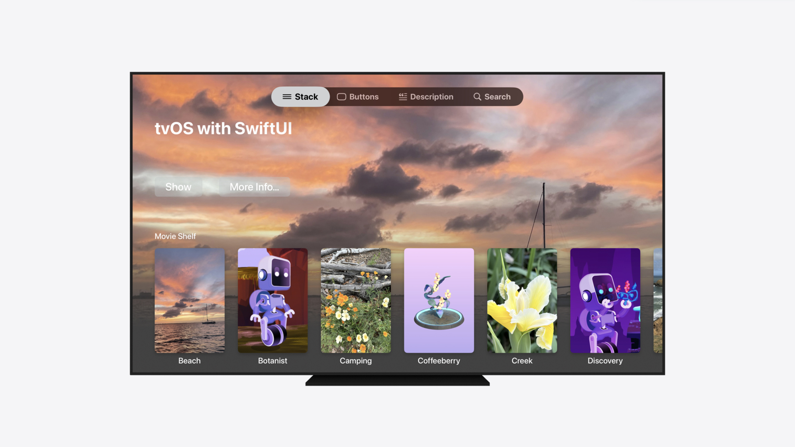
Highlight
tvOS 18 officially deprecates TVMLKit; SwiftUI now covers all of its capabilities—a single
.tabViewStyle(.sidebarAdaptable)turns the tab bar into a floating sidebar.
Core Content
When Apple launched tvOS in 2015, most streaming apps were web-based. Teams focused their stack and talent on the web, and native development had a high barrier. TVMLKit was Apple’s bridge for those teams—describe UI with an HTML-like template language (TVML), drive logic with JavaScript, and run on Apple TV.
Nine years later, the streaming ecosystem looks very different. Users consume content through native apps on iPhone, iPad, Mac, and Vision Pro, and SwiftUI is the unified way to build native UI across platforms. Apple officially deprecates TVMLKit in tvOS 18—it still works, but won’t receive new features. If your app still depends on TVMLKit, now is the time to migrate.
SwiftUI on tvOS 18 covers everything TVMLKit could do, with new features every year. You write Swift, the language shared across Apple platforms; you build views with SwiftUI, and the same components run on iOS, iPadOS, and tvOS. The session starts from a typical tvOS media app and step by step shows how to rebuild content lockups, horizontal shelves, home promo layouts, search, and the new floating sidebar in SwiftUI—what TVMLKit used to do, now done better in SwiftUI.
Detailed Content
Content lockup: borderless buttonStyle
The most common lockup on tvOS places an image above text with rounded corners; on focus it lifts, tilts, and shows a highlight while text shifts down to avoid overlap. SwiftUI achieves all of this with a single .borderless buttonStyle (04:18).
Button {} label: {
    Image("discovery_landscape")
        .resizable()
        .frame(width: 250, height: 375)
    Text("Borderless Portrait")
}
.buttonStyle(.borderless)
Key points:
- Wrap image and text in
Button; tvOS default buttonStyle is.bordered(with background tray)—.borderlesslets the image float freely - On focus, the image lifts, tilts, and shows a specular highlight; text moves down to avoid overlap—all handled by the system
- This code runs on iOS/iPadOS too, with interaction adapted per platform
Horizontal shelf: containerRelativeFrame
Content shelves need horizontal scrolling, safe-area alignment, and peek of the next item. The core is the containerRelativeFrame modifier (05:38).
ScrollView(.horizontal) {
    LazyHStack(spacing: 40) {
        ForEach(Asset.allCases) { asset in
            Button {} label: {
                asset.portraitImage
                    .resizable()
                    .aspectRatio(250/375, contentMode: .fit)
                    .containerRelativeFrame(.horizontal, count: 6, spacing: 40)
                Text(asset.title)
            }
        }
    }
}
.scrollClipDisabled()
.buttonStyle(.borderless)
Key points:
LazyHStackwithScrollView(.horizontal)for horizontal scrolling;spacing: 40controls item gapaspectRatioreplaces fixed size so SwiftUI adjusts to screen widthcontainerRelativeFrame(.horizontal, count: 6, spacing: 40)fits 6 items per row, aligns to safe area, and peeks off-screen contentspacing: 40must matchLazyHStack’sspacing: 40or alignment breaks.scrollClipDisabled()is required—focus lift makes buttons exceed bounds and get clipped by ScrollView otherwise
Card buttonStyle: higher-density lockups
Search results and similar scenes need more text; .card buttonStyle gives a lockup with a rounded background tray and subtler lift (08:19).
Button {} label: {
    HStack(alignment: .top, spacing: 10) {
        asset.landscapeImage
            .resizable()
            .aspectRatio(contentMode: .fit)
            .clipShape(RoundedRectangle(cornerRadius: 12))
        VStack(alignment: .leading) {
            Text(asset.title)
                .font(.body)
            Text("Subtitle text goes here, limited to two lines")
                .font(.caption2)
                .foregroundStyle(.secondary)
                .lineLimit(2)
            Spacer(minLength: 0)
            HStack(spacing: 4) {
                ForEach(1..<4) { _ in
                    Image(systemName: "ellipsis.rectangle.fill")
                }
            }
            .foregroundStyle(.secondary)
        }
    }
    .padding([.leading, .top, .bottom], 12)
    .padding(.trailing, 20)
    .frame(maxWidth: .infinity)
}
.containerRelativeFrame(.horizontal, count: 3, spacing: 48)
.buttonStyle(.card)
Key points:
.cardbuttonStyle provides a rounded background tray with gentler lift and movement—good for dense layoutsHStackwith image left, text right; round the left image withclipShape- Right
VStackstacks title, subtitle, icon row;.lineLimit(2)on subtitle containerRelativeFramewithcount: 3shows 3 cards per row;spacing: 48matches outer spacing
Home promo layout and onScrollVisibilityChange
The home top needs a full-width hero image as promo background that fades as you scroll down. tvOS 18 adds onScrollVisibilityChange (08:39).
ScrollView(.vertical) {
    LazyVStack(alignment: .leading, spacing: 26) {
        VStack(alignment: .leading) {
            Text("tvOS with SwiftUI")
                .font(.largeTitle).bold()
            Spacer(minLength: 300)
            HStack {
                Button("Show") {}
                Button("More Info…") {}
                Spacer()
            }
            .padding(.bottom, 100)
            Spacer()
        }
        .onScrollVisibilityChange { visible in
            withAnimation {
                belowFold = !visible
            }
        }
        Section("Movie Shelf") { MovieShelf() }
        Section("TV and Music Shelf") { TVMusicShelf() }
        Section("Content Cards") { CardShelf() }
    }
    .scrollTargetLayout()
}
.scrollClipDisabled()
.background(alignment: .top) {
    if !belowFold {
        Image("beach_landscape")
            .resizable()
            .aspectRatio(contentMode: .fill)
            .ignoresSafeArea()
            .mask {
                LinearGradient(stops: [
                    .init(color: .black, location: 0.0),
                    .init(color: .black, location: 0.45),
                    .init(color: .black.opacity(0), location: 0.8)
                ], startPoint: .top, endPoint: .bottom)
            }
    }
}
.scrollTargetBehavior(.viewAligned)
Key points:
.onScrollVisibilityChangeis new in tvOS 18; fires when the header scrolls out of viewbelowFoldcontrols background image visibility;withAnimationfor smooth transition- Background
Imageuses.ignoresSafeArea()full bleed;LinearGradientmask fades the bottom .scrollTargetBehavior(.viewAligned)snaps scroll to view boundaries for cleaner transitions
Search: searchable + searchSuggestions
Search is essential for streaming apps. SwiftUI needs only two modifiers for a complete search experience (11:50).
@State var searchTerm: String = ""

let columns: [GridItem] = Array(repeating: .init(.flexible(), spacing: 40), count: 4)

ScrollView(.vertical) {
    LazyVGrid(columns: columns) {
        ForEach(sortedMatchingAssets) { asset in
            Button {} label: {
                asset.landscapeImage
                    .resizable()
                    .aspectRatio(16 / 9, contentMode: .fit)
                Text(asset.title)
            }
        }
    }
}
.scrollClipDisabled()
.buttonStyle(.borderless)
.searchable(text: $searchTerm)
.searchSuggestions {
    ForEach(suggestedSearchTerms, id: \.self) { suggestion in
        Text(suggestion)
    }
}
Key points:
@State var searchTermbound to.searchable(text: $searchTerm)keeps input in sync- Filter
ForEachdata withsearchTermto show results .searchSuggestionsprovides completions; selection fills the search field- Four-column
LazyVGridfits more horizontally—good for search result density
Sidebar: one-line switch
tvOS 18 introduces a system floating sidebar like the TV app. If you already use TabView, one line switches to it (14:59).
TabView {
    Tab("Stack", systemImage: "line.3.horizontal") {
        StackView()
    }
    Tab("Search", systemImage: "magnifyingglass") {
        SearchView()
    }
}
.tabViewStyle(.sidebarAdaptable)
Key points:
.tabViewStyle(.sidebarAdaptable)turns the tab bar into a floating sidebar with translucent blur; collapsed it becomes a compact indicator- tvOS 18’s new
Tabsyntax replaces oldTabView+.tabItem; type-safe and extensible - The same modifier on iPadOS 18 lets users switch between tab bar and sidebar
Core Takeaways
- What to do: Migrate existing TVMLKit apps to SwiftUI. Why: TVMLKit is officially deprecated and won’t get new features; SwiftUI gets platform updates every year. How to start: Begin with the simplest page—rebuild lockups with
.borderlessbuttonStyle, shelves withcontainerRelativeFrame, and replace incrementally. - What to do: Reuse cross-platform code for tvOS. Why: The same SwiftUI views run on iOS, iPadOS, and tvOS—invest once, cover multiple platforms. How to start: Extract platform-agnostic view components (lockups, shelves) and adapt screen size via conditional compilation or layout parameters.
- What to do: Adopt
.tabViewStyle(.sidebarAdaptable)instead of a custom sidebar. Why: System floating sidebar gives consistent interaction, translucent blur, and compact indicator—and shares APIs with iPadOS 18 tab bar. How to start: Add.tabViewStyle(.sidebarAdaptable)to your existingTabViewand verify on each platform. - What to do: Implement search with
.searchable+.searchSuggestions. Why: Two modifiers cover search field, keyboard, and suggestions—far less code than hand-rolling. How to start: Add@Statefor the search term, bind to.searchable, filter data, and use.searchSuggestionsfor completions.
Related Sessions
- Demystify SwiftUI containers — Deep dive into new ScrollView container modifiers in tvOS 18
- What’s new in SwiftUI — Overview of SwiftUI updates across tvOS 18 and aligned releases
- Elevate your tab and sidebar experience in iPadOS — New tab bar and sidebar APIs, including sidebarAdaptable style
- SwiftUI essentials — SwiftUI fundamentals and cross-platform building blocks
Comments
GitHub Issues · utterances