
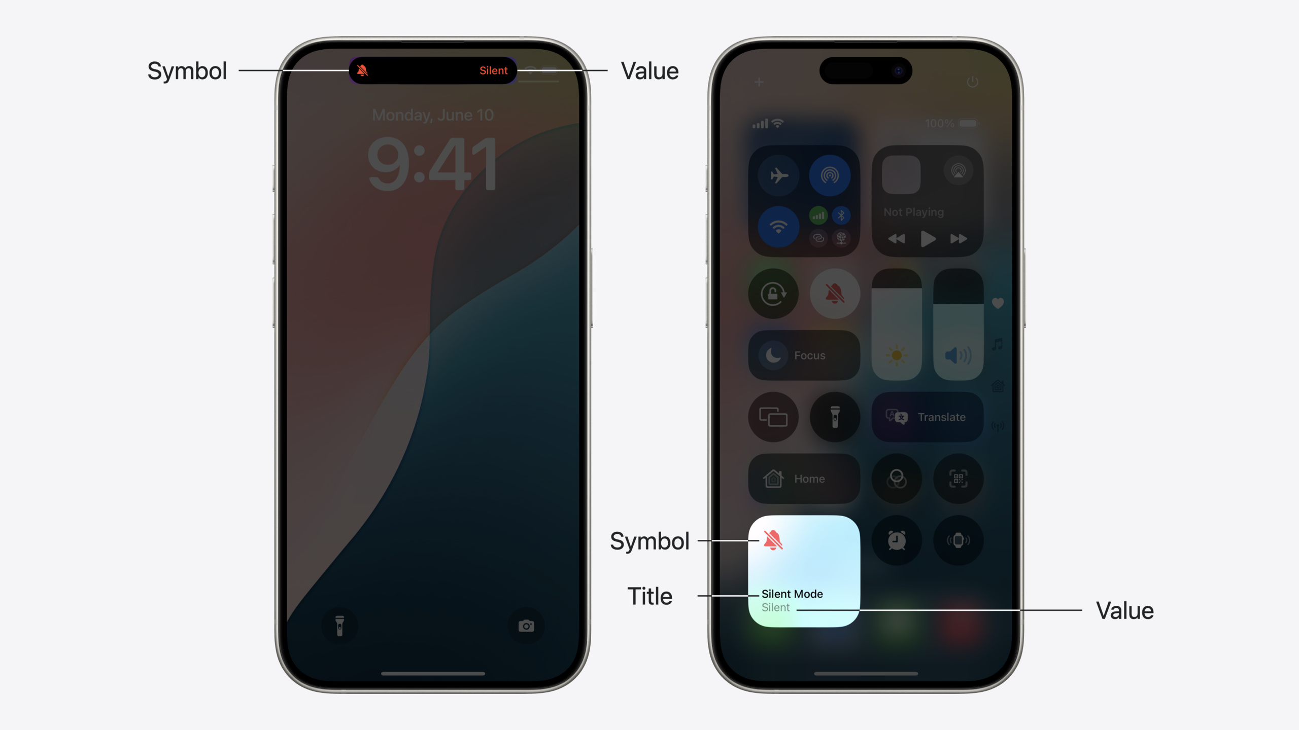
Highlight
iOS 18 adds a Control widget type to WidgetKit, supporting Button and Toggle forms in Control Center, the Lock Screen, and the iPhone 15 Pro Action button.
Core Content
WidgetKit in iOS 14 let apps display rich information like weather or calendar events. iOS 18 extends the framework with a new Control widget type. Controls focus on quick actions—turning on a flashlight or deep-linking to the Clock app.
Controls come in two types: Button for one-time actions (including launching the app), and Toggle for boolean state (e.g., toggling a feature). Like interactive widgets, Controls use App Intents to perform actions. Your app provides symbol, title, tint color, and other visual info; the system decides final appearance based on placement.
Presenter Cliff walks through building Controls with a “productivity timer” example—start on the Lock Screen, stop in Control Center, toggle via Action button—same code, three entry points. Control state management: the system auto-triggers reload after App Intent completion; apps can also request refresh via the ControlCenter API, or trigger reload via push notification for cross-device sync.
Detailed Content
Basic Control construction
First step: add the Control to your existing Widget Bundle (03:13):
@main
struct ProductivityExtensionBundle: WidgetBundle {

    var body: some Widget {
        ChecklistWidget()
        TaskCounterWidget()
        TimerToggle()
    }

}
Key points:
TimerToggle()is the new Control entry, sharing the Widget Bundle with existing widgets- WidgetKit architecture lets Controls coexist with Widgets in the same extension
Next, define the Control itself (03:29):
struct TimerToggle: ControlWidget {
    var body: some ControlWidgetConfiguration {
        StaticControlConfiguration(
            kind: "com.apple.Productivity.TimerToggle"
        ) {
            ControlWidgetToggle(
                "Work Timer",
                isOn: TimerManager.shared.isRunning,
                action: ToggleTimerIntent()
            ) { _ in
                Image(systemName:
                      "hourglass.bottomhalf.filled")
            }
        }
    }
}
Key points:
ControlWidgetis the protocol Controls conform toStaticControlConfigurationis for non-configurable Controlskindis the Control’s unique identifier in reverse-DNS styleControlWidgetToggledefines a Toggle-type controlisOnbinds to TimerManager’s running stateToggleTimerIntent()is the App Intent executed on tap- The closure’s
Imagedefines the Control’s symbol
Stateful visual design
Controls can show different symbols based on state (04:41):
struct TimerToggle: ControlWidget {
    var body: some ControlWidgetConfiguration {
        StaticControlConfiguration(
            kind: "com.apple.Productivity.TimerToggle"
        ) {
            ControlWidgetToggle(
                "Work Timer",
                isOn: TimerManager.shared.isRunning,
                action: ToggleTimerIntent()
            ) { isOn in
                Image(systemName: isOn
                      ? "hourglass"
                      : "hourglass.bottomhalf.filled")
            }
        }
    }
}
Key points:
- Closure parameter
isOnlets you return different visuals per state - Running shows flowing hourglass; stopped shows half-filled hourglass
- System re-evaluates closure return value on state changes
Further customize value text and tint (05:21):
struct TimerToggle: ControlWidget {
    var body: some ControlWidgetConfiguration {
        StaticControlConfiguration(
            kind: "com.apple.Productivity.TimerToggle"
        ) {
            ControlWidgetToggle(
                "Work Timer",
                isOn: TimerManager.shared.isRunning,
                action: ToggleTimerIntent()
            ) { isOn in
                Label(isOn ? "Running" : "Stopped",
                      systemImage: isOn
                      ? "hourglass"
                      : "hourglass.bottomhalf.filled")
            }
            .tint(.purple)
        }
    }
}
Key points:
LabelreplacesImageto show text and symbol togetherisOn ? "Running" : "Stopped"customizes state text instead of default “on/off”.tint(.purple)sets on-state color instead of default systemBlue- Value text is hidden on Lock Screen and small Control Center size—symbol only
App Intent implementation
Control actions run via App Intent (08:14):
struct ToggleTimerIntent: SetValueIntent, LiveActivityIntent {
    static let title: LocalizedStringResource = "Productivity Timer"

    @Parameter(title: "Running")
    var value: Bool  // The timer's running state

    func perform() throws -> some IntentResult {
        TimerManager.shared.setTimerRunning(value)
        return .result()
    }
}
Key points:
SetValueIntentprotocol means this Intent sets a valueLiveActivityIntentprotocol means it modifies a Live Activity@Parametervalueis auto-filled by the system from current stateperform()must complete all state updates before returning- System auto-reloads Control after
perform()returns
Proactive Control refresh
When in-app state changes, proactively request Control refresh (08:54):
func timerManager(_ manager: TimerManager,
                  timerDidChange timer: ProductivityTimer) {
    ControlCenter.shared.reloadControls(
        ofKind: "com.apple.Productivity.TimerToggle"
    )
}
Key points:
ControlCenter.shared.reloadControls(ofKind:)requests refresh for a specific Control- Use when in-app state changes need to sync to the Control
- Enable WidgetKit Developer Mode during development to bypass system refresh policy
Async state fetching
When state must be fetched asynchronously from server or database, use ControlValueProvider (10:03):
struct TimerValueProvider: ControlValueProvider {

    func currentValue() async throws -> Bool {
        try await TimerManager.shared.fetchRunningState()
    }

    let previewValue: Bool = false
}
Key points:
currentValue()is async—fetch from database or server- Can throw to indicate state temporarily unavailable
previewValueis for control preview (gallery, Lock Screen customization)—should return quickly and represent off state
Control initialization with ValueProvider (11:00):
struct TimerToggle: ControlWidget {
    var body: some ControlWidgetConfiguration {
        StaticControlConfiguration(
            kind: "com.apple.Productivity.TimerToggle",
            provider: TimerValueProvider()
        ) { isRunning in
            ControlWidgetToggle(
                "Work Timer",
                isOn: isRunning,
                action: ToggleTimerIntent()
            ) { isOn in
                Label(isOn ? "Running" : "Stopped",
                      systemImage: isOn
                      ? "hourglass"
                      : "hourglass.bottomhalf.filled")
            }
            .tint(.purple)
        }
    }
}
Key points:
providerparameter passes a ValueProvider instance- Async-fetched value passed via closure parameter
isRunning - System runs ValueProvider first, then generates Control content from return value
Configurable Controls
For user-configurable Controls, use AppIntentControlValueProvider (13:06):
struct ConfigurableTimerValueProvider: AppIntentControlValueProvider {
    func currentValue(configuration: SelectTimerIntent) async throws -> TimerState {
        let timer = configuration.timer
        let isRunning = try await TimerManager.shared.fetchTimerRunning(timer: timer)
        return TimerState(timer: timer, isRunning: isRunning)
    }

    func previewValue(configuration: SelectTimerIntent) -> TimerState {
        return TimerState(timer: configuration.timer, isRunning: false)
    }
}
Key points:
AppIntentControlValueProvidermakes values depend on Intent configurationSelectTimerIntentlets users choose which timer to control- Returned
TimerStateis a custom struct with timer and running state
Corresponding Control configuration (13:40):
struct TimerToggle: ControlWidget {
    var body: some ControlWidgetConfiguration {
        AppIntentControlConfiguration(
            kind: "com.apple.Productivity.TimerToggle",
            provider: ConfigurableTimerValueProvider()
        ) { timerState in
            ControlWidgetToggle(
                timerState.timer.name,
                isOn: timerState.isRunning,
                action: ToggleTimerIntent(timer: timerState.timer)
            ) { isOn in
                Label(isOn ? "Running" : "Stopped",
                      systemImage: isOn
                      ? "hourglass"
                      : "hourglass.bottomhalf.filled")
            }
            .tint(.purple)
        }
    }
}
Key points:
AppIntentControlConfigurationis for configurable ControlstimerStateis a custom struct with richer state info- Control title and action target change dynamically based on configuration
Force user configuration (14:26):
struct SomeControl: ControlWidget {
    var body: some ControlWidgetConfiguration {
        AppIntentControlConfiguration(
            // ...
        )
        .promptsForUserConfiguration()
    }
}
Key points:
promptsForUserConfiguration()auto-shows configuration UI when adding the Control- For Controls that require configuration to work
UI fine-tuning
Customize Action Button action hint (15:42):
struct TimerToggle: ControlWidget {
    var body: some ControlWidgetConfiguration {
        AppIntentControlConfiguration(
            kind: "com.apple.Productivity.TimerToggle",
            provider: ConfigurableTimerValueProvider()
        ) { timerState in
            ControlWidgetToggle(
                timerState.timer.name,
                isOn: timerState.isRunning,
                action: ToggleTimerIntent(timer: timerState.timer)
            ) { isOn in
                Label(isOn ? "Running" : "Stopped",
                      systemImage: isOn
                      ? "hourglass"
                      : "hourglass.bottomhalf.filled")
                .controlWidgetActionHint(isOn ?
                                         "Start" : "Stop")
            }
            .tint(.purple)
        }
    }
}
Key points:
controlWidgetActionHintcustomizes Action Button hint text- Hint should start with a verb; system adds “Hold to” prefix
isOn ? "Start" : "Stop"becomes “Hold to Start” and “Hold to Stop”
Set display name and description (16:56):
struct TimerToggle: ControlWidget {
    var body: some ControlWidgetConfiguration {
        AppIntentControlConfiguration(
            kind: "com.apple.Productivity.TimerToggle",
            provider: ConfigurableTimerValueProvider()
        ) { timerState in
            ControlWidgetToggle(
                timerState.timer.name,
                isOn: timerState.isRunning,
                action: ToggleTimerIntent(timer: timerState.timer)
            ) { isOn in
                Label(isOn ? "Running" : "Stopped",
                      systemImage: isOn
                      ? "hourglass"
                      : "hourglass.bottomhalf.filled")
                .controlWidgetActionHint(isOn ?
                                         "Start" : "Stop")
            }
            .tint(.purple)
        }
        .displayName("Productivity Timer")
        .description("Start and stop a productivity timer.")
    }
}
Key points:
displayNamesets Control display name instead of default app namedescriptionshows in configuration UI to help users understand the Control- Every Control should set a specific displayName
Core Takeaways
-
Add Control entry points for high-frequency actions: Identify one or two actions users perform most (start focus, toggle whitelist, quick log) and create Toggle or Button Controls. Don’t cram entire app functionality in—Controls should be single-feature quick entry points.
-
Start with a non-configurable Toggle: Build the simplest Toggle Control with
StaticControlConfigurationfirst to validate core functionality. ConsiderAppIntentControlConfigurationfor multiple user-configurable instances only after the baseline works—avoid introducing too much complexity at once. -
Design symbols for small sizes: Controls show only a circular icon on Lock Screen and symbol-only space in small Control Center. Ensure SF Symbols remain recognizable at tiny sizes; don’t rely on text. Tint colors need sufficient contrast in light and dark modes.
-
Use ValueProvider for async state: If state comes from network or database, use
ControlValueProviderinstead of synchronous fetch inbody. previewValue should be fixed and fast—usually the Control’s off state. -
Proactively refresh to keep state in sync: When users change state inside the app, use
ControlCenter.shared.reloadControls(ofKind:)to refresh Controls. For cross-device scenarios, configure push notifications to auto-reload on state change pushes.
Related Sessions
- Bring expression to your app with Genmoji — Discover how to bring Genmoji to life in your app
- Catch up on accessibility in SwiftUI — SwiftUI makes it easy to build accessible experiences for everyone
- Demystify SwiftUI containers — Learn about SwiftUI container view capabilities and build a mental model
- Evolve your document launch experience — Make your document-based app stand out with a unique identity
Comments
GitHub Issues · utterances