
Highlight
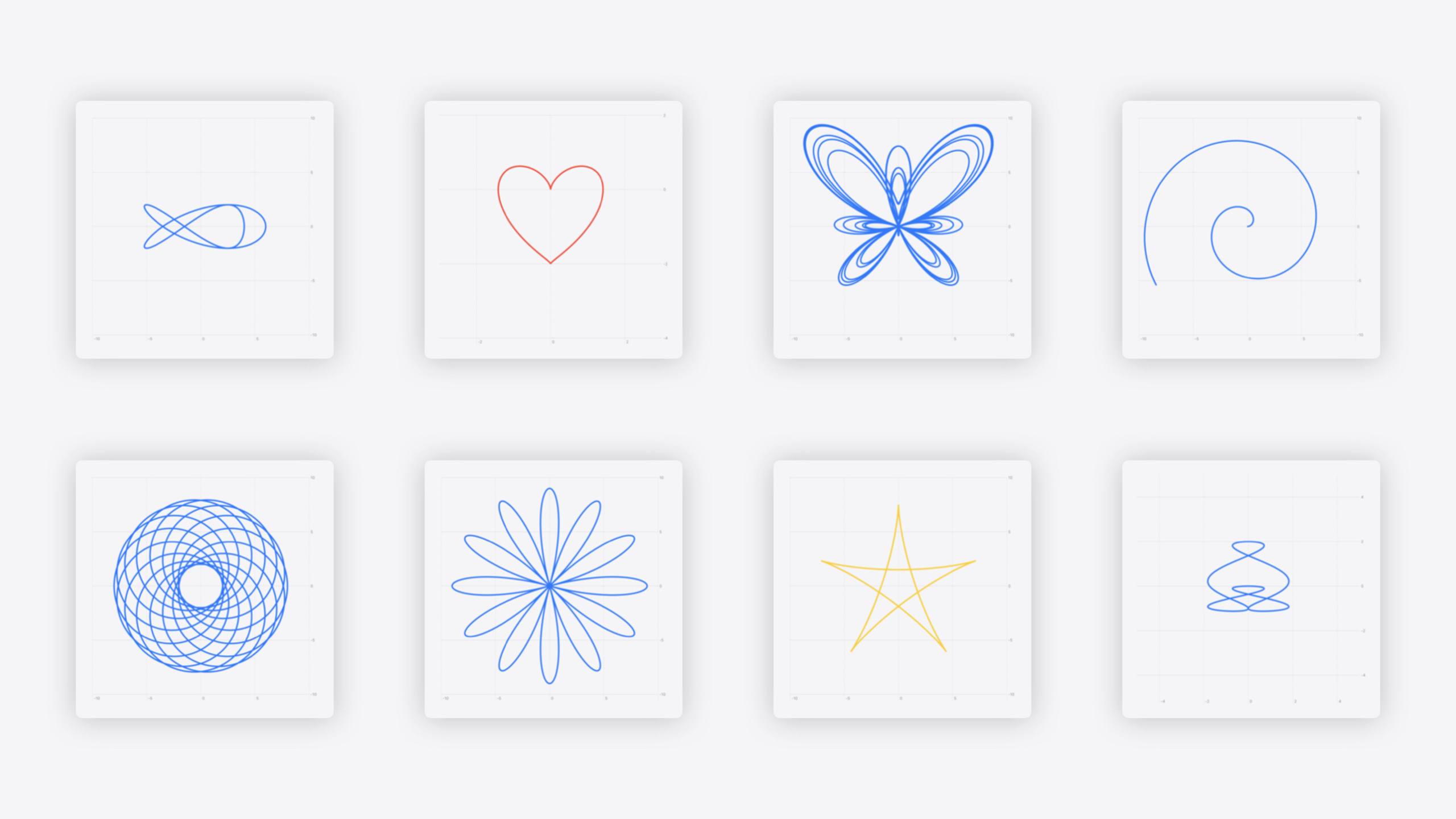
Swift Charts adds function plotting and vectorized plotting APIs—the former draws mathematical function curves directly; the latter efficiently renders large datasets.
Core Content
When Swift Charts launched in iOS 16, it positioned charting the SwiftUI way: developers iterate data with ForEach and build visualizations with BarMark, PointMark, and other mark types. The API is flexible—each data point can be styled individually.
In practice, many charts share a uniform visual style—same symbol size, same color mapping rules. ForEach per point is overkill. A bigger gap is scientific computing: normal distributions, parametric equations—these are continuous domains that discrete data points can’t express precisely.
This year’s updates target both scenarios: LinePlot and AreaPlot for mathematical functions; vectorized Plot APIs (PointPlot, RectanglePlot, etc.) for large datasets. Both share the same design philosophy—treat the “whole” as one entity, not a per-element loop.
Detailed Content
Function plots
LinePlot and AreaPlot are new APIs accepting a closure that takes x and returns y (or returns an x, y tuple). Any math function can run inside the closure:
Chart {
  LinePlot(
    x: "Capacity density", y: "Probability"
  ) { x in
    normalDistribution(
      x,
      mean: mean,
      standardDeviation: standardDeviation
    )
  }
}
Key points:
LinePlotaccepts x and y labels; closure signature is(Double) -> DoublenormalDistributionis a custom function with precomputed mean and standard deviation- Swift Charts automatically samples the function to generate the curve
To fill the area under the curve, use AreaPlot instead (03:57):
Chart {
  AreaPlot(
    x: "Capacity density", y: "Probability"
  ) { x in
    normalDistribution(x, ...)
  }
  .foregroundStyle(.gray)
  .opacity(0.2)
}
Key points:
AreaPlotfills the area below the curve- Use
foregroundStylefor fill color - Adjust
opacityfor readability
AreaPlot also supports areas between two curves—the closure returns yStart and yEnd (04:21):
Chart {
  AreaPlot(
    x: "x", yStart: "cos(x)", yEnd: "sin(x)"
  ) { x in
    (yStart: cos(x / 180 * .pi),
     yEnd: sin(x / 180 * .pi))
  }
}
Key points:
- Closure returns
(yStart: Double, yEnd: Double)tuple - Convert degrees to radians:
x / 180 * .pi - Visualize difference or integral regions between two functions
Function domain is inferred by Swift Charts by default, or specified manually (04:59):
Chart {
  AreaPlot(...)
}
.chartXScale(domain: -315...225)
.chartYScale(domain: -5...5)
Key points:
.chartXScaleand.chartYScaleset axis ranges- Zoom into or out of specific function regions
To plot only a segment, specify sampling domain on the Plot (05:18):
Chart {
  AreaPlot(
    x: "x", yStart: "cos(x)", yEnd: "sin(x)",
    domain: -135...45
  ) { x in
    (yStart: cos(x / 180 * .pi),
     yEnd: sin(x / 180 * .pi))
  }
}
Key points:
domainparameter limits function sampling range- Separate from
.chartXScale: former constrains sampling, latter controls display range
Swift Charts supports parametric equations—both x and y expressed in a third variable t (05:55):
Chart {
  LinePlot(
    x: "x", y: "y", t: "t", domain: -.pi ... .pi
  ) { t in
    let x = sqrt(2) * pow(sin(t), 3)
    let y = cos(t) * (2 - cos(t) - pow(cos(t), 2))
    return (x, y)
  }
}
.chartXScale(domain: -3...3)
.chartYScale(domain: -4...2)
Key points:
LinePlotaddstparameter anddomain- Closure accepts
t, returns(x, y)tuple - For cardioids, spirals, and other parametric curves
For piecewise functions undefined at some inputs, return .nan (06:40):
Chart {
  LinePlot(x: "x", y: "1 / x") { x in
    guard x != 0 else {
      return .nan
    }
    return 1 / x
  }
}
Key points:
.nanmeans no y value for that x- Handles division by zero, log of negatives, illegal inputs
- Swift Charts skips these points and breaks the line
Vectorized plots
Vectorized Plot APIs handle large datasets. The traditional approach is ForEach + Mark, processing each point independently (07:43):
Chart {
  ForEach(model.data) {
    RectangleMark(
      x: .value("Longitude", $0.x),
      y: .value("Latitude", $0.y)
    )
    .foregroundStyle(by: .value("Axis type", $0.panelAxisType))
    .opacity($0.capacityDensity)
  }
}
Key points:
ForEachiterates each data point- Each Mark sets style properties independently
- Good when per-point customization is needed
If all points share uniform style, use RectanglePlot with KeyPaths to process the whole collection at once (08:23):
Chart {
  RectanglePlot(
    model.data,
    x: .value("Longitude", \.x),
    y: .value("Latitude", \.y)
  )
  .foregroundStyle(by: .value("Axis type", \.panelAxisType))
  .opacity(\.capacityDensity)
}
Key points:
RectanglePlotaccepts the entire data collection\.xand\.yare KeyPaths to stored propertiesforegroundStyleandopacityalso use KeyPaths for batch styling
PointPlot works the same for scatter plots (09:42):
Chart {
  PointPlot(
    model.data,
    x: .value("Longitude", \.x),
    y: .value("Latitude", \.y)
  )
}
Key points:
PointPlotis the vectorized scatter plot version- x and y parameters accept KeyPaths, not closures
Vectorized Plot modifiers also support KeyPaths (10:26):
Chart {
  PointPlot(
    model.data,
    x: .value("Longitude", \.x),
    y: .value("Latitude", \.y)
  )
  .symbolSize(by: .value("Capacity", \.capacity))
  .foregroundStyle(by: .value("Axis type", \.panelAxisType))
}
Key points:
symbolSizemaps to point size via KeyPathforegroundStylemaps to color via KeyPath- Batch style application without iteration
Vectorized plotting requires stored properties, not computed properties—computed properties recompute on every access; stored properties use fixed memory offsets (09:14).
Swift Charts accessibility applies to function plots by default. Audio Graph auto-generates audio descriptions of function curves; VoiceOver reads axis and series information (03:00).
Core Takeaways
1. Use function visualization for data comparison
When analyzing data and suspecting a statistical distribution, overlay a theoretical curve with LinePlot to visually compare actual vs theoretical. Start by defining the distribution function, calling LinePlot, and distinguishing with color or opacity.
2. Use vectorized APIs for large datasets
For scatter or heat maps with 100+ points, prefer vectorized Plot APIs. Replace ForEach loops with PointPlot or RectanglePlot, specify properties via KeyPaths—rendering efficiency improves noticeably. Convert computed properties to stored properties.
3. Handle undefined points in piecewise functions with .nan
When plotting domain-limited functions, return .nan in undefined intervals. Division by zero, log of negatives, and gaps in piecewise functions—all handled this way; Swift Charts automatically breaks the line.
Related Sessions
- Catch up on accessibility in SwiftUI — SwiftUI makes it easy to build accessible experiences for everyone
- Bring your Live Activity to Apple Watch — Bring Live Activities to the Smart Stack on Apple Watch
- Bring context to today’s weather — Get detailed weather forecast data with WeatherKit
- Get started with HealthKit in visionOS — Create HealthKit experiences on the spatial canvas
Comments
GitHub Issues · utterances