
Highlight
visionOS 2 introduces the Custom Hover Effect API so views respond when users look at them, bring a finger close, or hover with a mouse—effects are applied outside the app process to protect privacy.
Core Content
On visionOS, when users look at interactive elements, the system automatically applies highlight effects. These hover effects make apps feel responsive and signal which element will be triggered. Standard highlights work for most cases, but some views need custom effects—a slider showing a knob to guide interaction, a back button expanding to show the previous page name, a tab bar popping out labels, or Safari’s navigation bar expanding to show tabs.
The Custom Hover Effect API in visionOS 2 was designed with privacy from the start. Effects are applied by the system outside the app process—no extra entitlements or extensions required. Custom effects can be applied anywhere in SwiftUI views, including ornaments and RealityView attachments. Triggers include not only eye tracking but also finger proximity and mouse hover.
The API’s core concepts span four layers: Content Effect (basic appearance changes—scale, clip, opacity), Effect Group (coordinated activation of multiple effects), Delayed Effect (timing control), and the CustomHoverEffect protocol (reusable effects that respect accessibility preferences).
Detailed Content
Content Effect: basic appearance changes
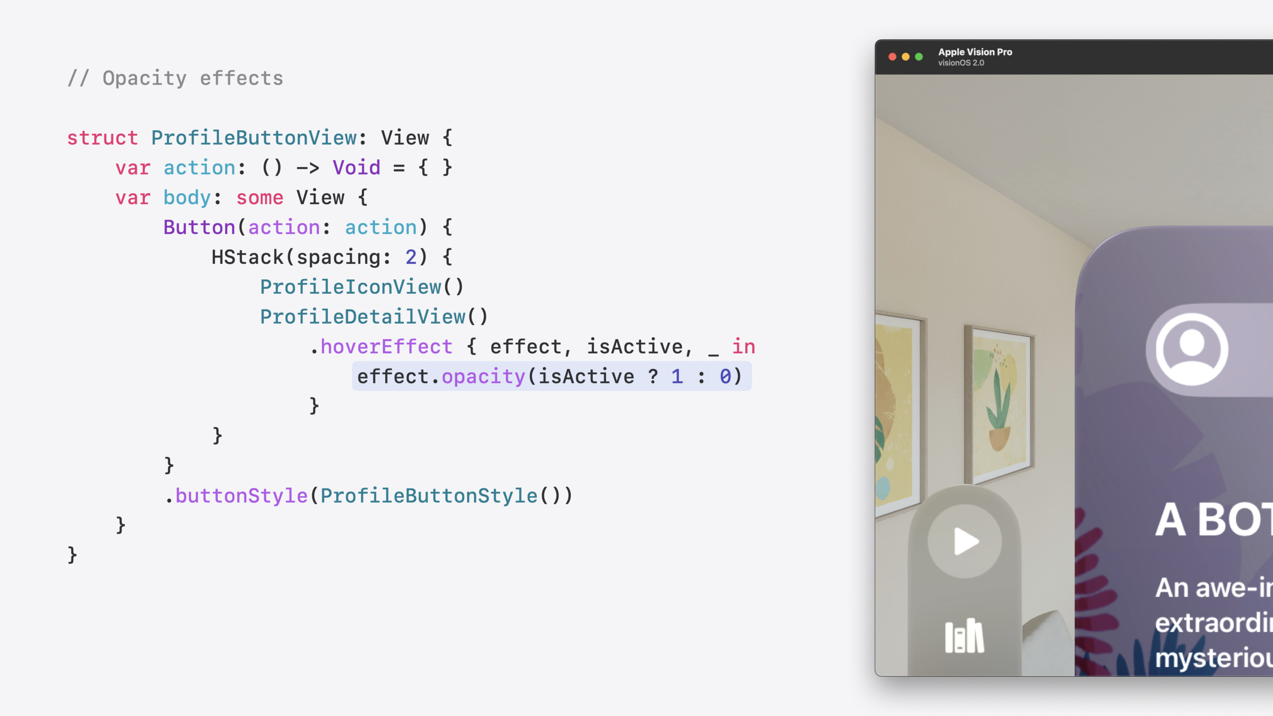
Content Effect is the foundation for changing view appearance, supporting scale (scaleEffect), clip (clipShape), and opacity. These effects change visual presentation only—not layout.
The simplest is scale. Use the hoverEffect modifier in a ButtonStyle:
// Button with Scale Effect([04:06](https://developer.apple.com/videos/play/wwdc2024/10152/?time=246))
ButtonStyle {
    configuration
        .hoverEffect(.highlight) // Standard highlight
        .hoverEffect(isActive: isActive in
            configuration.label
                .scaleEffect(isActive ? 1.05 : 1.0) // Scale up 5% when active
        )
}
Key points:
- The
hoverEffectblock is called twice—withisActivetrue and false—to define active and inactive states - The system pre-invokes these blocks to generate effects, not at gaze time
- 5% scale is a validated comfortable amount
Clip Effect hides and reveals content by changing clipShape size:
// Button with Clip and Scale Effects([05:37](https://developer.apple.com/videos/play/wwdc2024/10152/?time=337))
ButtonStyle {
    configuration
        .hoverEffect(.highlight)
        .hoverEffect(isActive: isActive, proxy: proxy in
            configuration.label
                .clipShape(
                    Capsule()
                        .size(
                            width: isActive ? proxy.size.width : proxy.size.height,
                            height: proxy.size.height
                        )
                        .anchor(isActive ? .center : .leading) // Align left and show only the icon when inactive
                )
                .scaleEffect(isActive ? 1.05 : 1.0)
        )
}
Key points:
- The
proxyparameter provides view geometry - When active, clipShape spans full button width; inactive it becomes square showing only the icon
anchorcontrols clipShape alignment
Effect Group: coordinating multiple effects
When multiple effects must activate together, use an Effect Group. By default, effects activate only when the user looks at that view. Applying scale and clip to the whole button but opacity only to detail text causes a problem—text fades in only when gazing at it.
Use an Effect Group so all effects activate together. Two approaches:
Explicit grouping (most flexible):
// Expanding Button with Explicit Group([08:19](https://developer.apple.com/videos/play/wwdc2024/10152/?time=499))
@Namespace private var profileButtonGroup
@State private var group = HoverEffectGroup()

var body: some View {
    Button { ... } label: {
        Label("Profile", systemImage: "person.circle")
    }
    .buttonStyle(ProfileButtonStyle(group: group))
}

struct ProfileButtonStyle: ButtonStyle {
    var group: HoverEffectGroup

    func makeBody(configuration: Configuration) -> some View {
        configuration.label
            .hoverEffect(.highlight)
            .hoverEffect(isActive: ..., in: group) // Add the effect to the group
    }
}
Implicit grouping (most convenient):
// Expanding Button with Implicit Group([09:13](https://developer.apple.com/videos/play/wwdc2024/10152/?time=553))
Button { ... } label: {
    Label("Profile", systemImage: "person.circle")
}
.hoverEffectGroup() // Automatically add effects from all child views to the group
Key points:
- Explicit grouping requires a
HoverEffectGroupand Namespace - Implicit grouping adds
hoverEffectGroup()on the parent view - When any effect in the group triggers, all group effects activate
Delayed Effect: timing control
By default, hover effects trigger immediately—but that can be distracting as users browse. Appropriate delay prevents flicker.
Effects that reveal extra content (like expanding buttons) need longer delay. Immediate feedback effects (like scale) should respond instantly.
// Expanding Button with Delay([10:53](https://developer.apple.com/videos/play/wwdc2024/10152/?time=653))
.hoverEffect(isActive: isActive in
    configuration.label
        .scaleEffect(isActive ? 1.05 : 1.0) // Scale responds immediately
        .clipShape(...)
        .opacity(isActive ? 1 : 0)
        .animation(
            isActive ? .default.delay(0.3) : .default.delay(0.1),
            value: isActive
        )
)
Key points:
- Longer delay on activation (0.3s), shorter on deactivation (0.1s)
- Scale needs no delay—it provides immediate feedback
- Test delay values on device for a comfortable feel
CustomHoverEffect protocol: respecting accessibility
For users sensitive to motion, dynamic effects can be uncomfortable. The CustomHoverEffect protocol lets you adjust effects based on accessibility settings.
// Cross-fade effect for reduced motion([12:37](https://developer.apple.com/videos/play/wwdc2024/10152/?time=757))
struct AccessibilityHoverEffect: CustomHoverEffect {
    func body(content: Content, configuration: Configuration) -> some View {
        @Environment(\.accessibilityReduceMotion) var reduceMotion

        if reduceMotion {
            // Use a fade effect
            content.opacity(configuration.isActive ? 1 : 0)
        } else {
            // Use the full expansion effect
            content
                .scaleEffect(configuration.isActive ? 1.05 : 1.0)
                .clipShape(...)
        }
    }
}
Key points:
CustomHoverEffectrequires implementingbody(content:configuration:)accessibilityReduceMotionindicates whether Reduce Motion is enabled- Provide alternative effects for motion-sensitive users
Animation support
Hover Effects support common SwiftUI animations: linear, easeOut, spring, and custom timing curves. CustomAnimation types are not supported because they cannot be applied outside the app process.
Core Takeaways
1. Add delayed expand effects for revelatory content
In spatial computing UIs, extra content stays hidden until gaze expands it—reducing visual noise while keeping information accessible. Good for: detailed settings options, extended list item info, navigation sub-items.
2. Choose delay strategy by content type
Immediate feedback effects (scale, highlight) should trigger instantly so users know elements are interactive. Revelatory effects (expand, fade-in) need 200–300ms delay to avoid triggering while browsing.
3. Provide alternatives for motion-sensitive users
Check accessibilityReduceMotion and disable or simplify dynamic effects. Use cross-fade instead of expand/collapse, or remove effects and keep static highlight. All motion-heavy UI should do this.
Related Sessions
- Create custom visual effects with SwiftUI — Stunning visual effects in SwiftUI; builds on the same visual effects foundation
- What’s new in RealityKit — RealityKit powers visionOS visuals; latest capabilities and enhancements
- Elevate your windowed app for spatial computing — Take existing windowed apps further with spatial computing features
- Bring spatial computing to your web content — Bring websites to life on Apple Vision Pro with immersive web experiences
- Meet SwiftUI for spatial computing — How SwiftUI makes it easy to build great spatial computing experiences
Comments
GitHub Issues · utterances