
Highlight
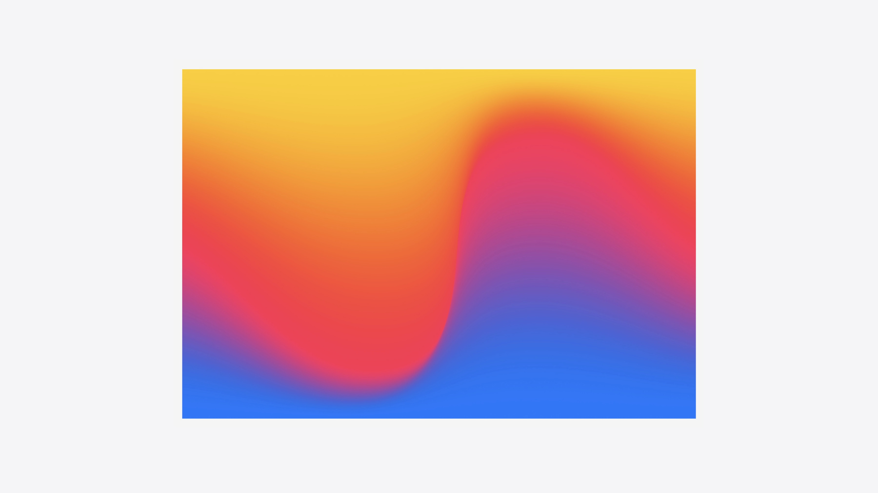
SwiftUI in iOS 18 adds MeshGradient, TextRenderer, a custom Transition protocol, and Metal shader integration—turning visual effects from “built-in modifiers only” into pixel-level customization.
Core Content
When building SwiftUI apps, visual effects often hit two walls: built-in modifiers aren’t enough—for example, scrollTransition only handles rotation and scale, so hue shifts require hand-rolled GeometryReader; or you want per-glyph text animation, but Text is an indivisible black box with no access to individual glyph positions.
Apple introduced five new tools to fill these gaps. The scrollTransition and visualEffect modifiers cover position-based and geometry-based visual adjustments in scroll scenarios. MeshGradient interpolates colors across a grid of control points—far more flexible than linear or radial gradients, with animatable control point positions. The custom Transition protocol uses TransitionPhase to distinguish willAppear from didDisappear for directional transitions. The TextRenderer protocol exposes Text.Layout’s lines, runs, and runSlices; paired with TextAttribute to mark key text, you can animate glyph by glyph with spring animations. Finally, Metal shaders integrate directly into the SwiftUI view tree via ShaderLibrary and layerEffect, computing per-pixel on the GPU with performance far beyond CPU approaches.
The session’s core idea: visual effects need iterative tuning, so every API is designed to be declarative, composable, and previewable—reducing the delay from idea to visible result.
Detailed Content
Custom scroll effects
scrollTransition exposes a phase parameter with values leading / center / trailing, plus phase.value (a floating offset) and phase.isIdentity (whether the view is centered). For parallax, offset only the image content—not the clipping container—to create a “window perspective” effect (03:14).
visualEffect uses GeometryProxy to provide global position and size, enabling coordinate-based hue rotation, blur, scale, and more (04:41):
RoundedRectangle(cornerRadius: 24)
    .fill(.purple)
    .visualEffect({ content, proxy in
        content
            .hueRotation(Angle(degrees: proxy.frame(in: .global).origin.y / 10))
    })
Key points:
- The
proxyclosure parameter is aGeometryProxy; read frame, safeAreaInsets, and other geometry - The return must be
some View, using only visual modifiers (opacity, blur, hueRotation, etc.)—no layout changes - Because it doesn’t trigger a layout pass, performance beats GeometryReader plus state-driven updates
Mesh Gradient
MeshGradient defines a grid with width × height; each control point specifies SIMD2 coordinates and a color, and SwiftUI interpolates between points (07:30):
MeshGradient(
    width: 3,
    height: 3,
    points: [
        [0.0, 0.0], [0.5, 0.0], [1.0, 0.0],
        [0.0, 0.5], [0.9, 0.3], [1.0, 0.5],
        [0.0, 1.0], [0.5, 1.0], [1.0, 1.0]
    ],
    colors: [
        .black,.black,.black,
        .blue, .blue, .blue,
        .green, .green, .green
    ]
)
Key points:
- The
pointsarray length must equalwidth * height; each item is[Float, Float]in the range 0–1 - Center point
[0.9, 0.3]is off-center, shifting the blue region up and right—that’s the core of Mesh Gradient: control point positions define color distribution - Control point positions can bind to
@Stateand animate withwithAnimationfor flowing colors
Custom Transition
iOS 18 adds the Transition protocol; TransitionPhase distinguishes willAppear, identity, and didDisappear (10:36):
struct Twirl: Transition {
    func body(content: Content, phase: TransitionPhase) -> some View {
        content
            .scaleEffect(phase.isIdentity ? 1 : 0.5)
            .opacity(phase.isIdentity ? 1 : 0)
            .blur(radius: phase.isIdentity ? 0 : 10)
            .rotationEffect(
                .degrees(
                    phase == .willAppear ? 360 :
                        phase == .didDisappear ? -360 : .zero
                )
            )
            .brightness(phase == .willAppear ? 1 : 0)
    }
}
Key points:
- When
phase.isIdentityis true, the view is fully visible; otherwise usephase.valuefor continuous interpolation phase == .willAppearandphase == .didDisappearallow opposite rotation directions on enter vs exitbrightnessadds 1 only on enter, giving a flash of highlight to draw attention
TextRenderer
The core method of the TextRenderer protocol is draw(layout:in:). Text.Layout provides lines → runs → runSlices hierarchically; the smallest runSlice corresponds to a single glyph (13:29). To drive animation, the renderer conforms to Animatable with animatableData pointing to elapsedTime. With TextAttribute, mark specific text ranges so the renderer animates only marked portions glyph by glyph while the rest fades in quickly (14:01).
Metal shader integration
Metal shader functions are marked with [[ stitchable ]], and SwiftUI calls them by name via ShaderLibrary.Ripple(...). Layer Effect receives each pixel’s position and the original layer content for GPU-level distortion, chromatic aberration, and more (22:55):
[[ stitchable ]]
half4 Ripple(
    float2 position,
    SwiftUI::Layer layer,
    float2 origin,
    float time,
    float amplitude,
    float frequency,
    float decay,
    float speed
) {
    float distance = length(position - origin);
    float delay = distance / speed;
    time -= delay;
    time = max(0.0, time);
    float rippleAmount = amplitude * sin(frequency * time) * exp(-decay * time);
    float2 n = normalize(position - origin);
    float2 newPosition = position + rippleAmount * n;
    half4 color = layer.sample(newPosition);
    color.rgb += 0.3 * (rippleAmount / amplitude) * color.a;
    return color;
}
Key points:
positionis the current pixel coordinate;layeris the view’s layer content—sample withlayer.sample(at:)- Ripples propagate outward from
origin;distance / speedcomputes delay so farther pixels start later sin(frequency * time) * exp(-decay * time)is a damped sine wave—amplitude decreases over timecolor.rgb += 0.3 * ...brightens at wave peaks, simulating light refraction
On the SwiftUI side, RippleEffect ViewModifier wraps keyframeAnimator, animating elapsedTime from 0 to duration and passing each frame to RippleModifier, which calls the shader via visualEffect + layerEffect (23:36).
Core Takeaways
-
What to do: Use
visualEffectfor scroll-position-driven hue/blur gradient lists. Why it’s worth it: Monochrome lists look flat; driving hueRotation withproxy.frame(in: .global).origin.yadds color depth with zero layout code. How to start: Add.visualEffect { content, proxy in content.hueRotation(...) }to each item in aLazyVStackand tune the y divisor until the gradient feels natural. -
What to do: Replace static brand page backgrounds with MeshGradient. Why it’s worth it: MeshGradient control points animate—more flexible than CAGradientLayer, purely declarative with no Core Animation code. How to start: Define a 3×3 MeshGradient, bind center point coordinates to
@State, and usewithAnimation(.easeInOut(duration: 2))to toggle coordinate values and watch colors flow. -
What to do: Use TextRenderer + TextAttribute for per-glyph entrance animation on key information. Why it’s worth it: Plain opacity transitions show all text at once with no emphasis; per-glyph spring animation highlights keywords in titles and draws the eye. How to start: Define
EmphasisAttribute: TextAttribute, mark keywords with.customAttribute(EmphasisAttribute())in Text, and in the renderer check run attributes to choose per-glyph animation vs quick fade-in. -
What to do: Add Metal shader ripple effects to image interactions. Why it’s worth it: Pure scale feedback lacks direction; ripples spreading from the touch point clearly signal “I tapped here.” How to start: Write a
[[ stitchable ]]Ripple function in a .metal file, drive elapsedTime withkeyframeAnimatoron the SwiftUI side, and apply the shader vialayerEffect.
Related Sessions
- What’s new in SwiftUI — Overview of iOS 18 SwiftUI updates, including the first appearance of MeshGradient and other new APIs
- Enhance your UI animations and transitions — Deep dive into zoom transition in navigation and presentations; complements this session’s custom Transition work
- Create custom hover effects in visionOS — Custom hover effects on visionOS, also built on SwiftUI’s visual effects system
- SwiftUI essentials — SwiftUI fundamentals review; good prep before this session’s advanced effects
- What’s new in SF Symbols 6 — New SF Symbols animation capabilities; pairs with TextRenderer for icon + text coordinated effects
Comments
GitHub Issues · utterances