
Highlight
This is a foundational session for SwiftUI beginners to intermediate developers. The presenter uses a “pet trick leaderboard” app as a running example, covering everything from basic View concepts through List, Navigation, custom components, state management, and integration with other frameworks.
Core Content
This is a foundational session for SwiftUI beginners to intermediate developers. The presenter uses a “pet trick leaderboard” app as a running example, covering everything from basic View concepts through List, Navigation, custom components, state management, and integration with other frameworks.
The core content spans three layers. The first is the nature of Views: SwiftUI Views are declarative descriptions, not long-lived object instances. When state changes, SwiftUI re-evaluates the View body, generates a new description, and efficiently updates rendering. The second is composition: simple views are combined into complex interfaces through container views (HStack, VStack, List) and View Modifiers. The third is state-driven UI: property wrappers like @State, @Bindable, and @Environment declare data dependencies, and SwiftUI handles UI updates automatically (00:07).
The session also spends considerable time on how SwiftUI coexists with other frameworks — UIKit interoperability, SwiftData persistence, Widget extensions — emphasizing that SwiftUI natively supports incremental adoption without rewriting the entire app (21:08).
Detailed Content
The Nature of Declarative Views
SwiftUI Views are value types (structs), not long-lived object instances. When state changes, SwiftUI re-evaluates the View body, generates a new description, and efficiently updates rendering. This means you do not need to manually manage view lifecycles — just describe what the UI should look like (00:09).
// Basic View declaration
HStack {
    Label("Pet Tricks", systemImage: "pawprint")
    Spacer()
    Text("Rank")
}
Key points:
HStackis a container view that arranges subviews horizontallyLabelcombines an icon and text — a built-in composite control in SwiftUISpacerautomatically fills remaining space for layout alignment
Combining List and ForEach
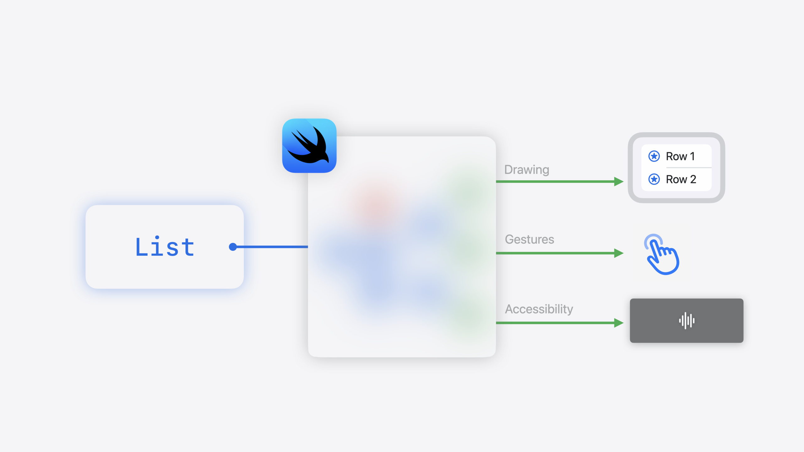
List is one of the most commonly used container views. It accepts a collection parameter and automatically creates ForEach views to generate a row for each element. You do not need to manually manage reuse and scroll performance (02:56).
// List automatically creates a row for each element in the collection
List(pets) { pet in
    HStack {
        Text(pet.name)
        Text(pet.trick)
    }
}
Key points:
- List’s collection parameter automatically creates
ForEachviews - Each element corresponds to an
HStackrow view - SwiftUI automatically handles scroll performance and view reuse
Chaining View Modifiers
View Modifiers are another core SwiftUI pattern. They “modify” a base view and return a new modified view. Multiple modifiers can be chained, forming a clear hierarchy of effects (06:17).
// Chaining View Modifiers
Image("whiskers")
    .clipShape(Circle())
    .shadow(radius: 5)
    .overlay(Circle().stroke(Color.green, lineWidth: 2))
Key points:
clipShape(Circle())crops the image into a circleshadow(radius:)adds a shadow effectoverlaystacks a green border on top- Modifier order determines the order effects are applied
Encapsulating Custom Views
When interfaces grow complex, you can encapsulate view hierarchies into custom Views. Custom Views only need to conform to the View protocol and provide a body property. Because Views are value types, splitting views does not hurt performance (07:02).
// Custom View encapsulation
struct PetRow: View {
    let pet: Pet

    var body: some View {
        HStack {
            ProfileImage(for: pet)
            VStack(alignment: .leading) {
                Text(pet.name)
                Text(pet.trick)
            }
        }
    }

    private var profileImage: some View {
        Image(pet.imageName)
            .clipShape(Circle())
            .shadow(radius: 5)
    }
}
Key points:
- Custom Views can add properties as input parameters
privatecomputed properties help organize code- Views can be reused anywhere, such as
List(pets) { PetRow(pet: $0) }
State-Driven UI Updates
SwiftUI’s third core feature is state-driven UI. When state changes, SwiftUI automatically recalculates the View body that depends on that state and updates the UI. This eliminates boilerplate for manual UI updates and bugs from missed updates (08:50).
// State-driven conditional rendering
struct PetRow: View {
    let pet: ObservablePet

    var body: some View {
        HStack {
            Text(pet.name)
            if pet.hasAward {
                Image(systemName: "trophy.fill")
            }
        }
    }
}
Key points:
- When
pet.hasAwardchanges, SwiftUI automatically recalculatesbody - Conditional rendering updates automatically — no manual refresh needed
- SwiftUI tracks properties used in the View body to establish dependencies
@State and Binding
@State creates an internal state source for a View. Binding is a two-way reference to another View’s state. Through Binding, child Views can modify parent View state, enabling state sharing (09:30).
// @State creates internal state
struct RatingView: View {
    @State private var rating = 0

    var body: some View {
        HStack {
            Button("-") { rating -= 1 }
            Text("\(rating)")
            Button("+") { rating += 1 }
        }
    }
}

// Binding shares state
struct RatingContainer: View {
    @State private var rating = 0

    var body: some View {
        VStack {
            Gauge(value: rating, in: 0...10)
            RatingView(rating: $rating)  // Pass Binding
        }
    }
}

struct RatingView: View {
    @Binding var rating: Int  // Receive Binding

    var body: some View {
        HStack {
            Button("-") { rating -= 1 }
            Text("\(rating)")
            Button("+") { rating += 1 }
        }
    }
}
Key points:
@Statelets SwiftUI manage property storage- The
$prefix creates a Binding for two-way binding - Child Views modifying a Binding update parent View state
- State sharing keeps multiple Views in sync
Animation Integration
SwiftUI animations build on the state-driven update mechanism. Wrapping state changes in withAnimation, SwiftUI automatically applies default animations. You can also customize animation curves and transition effects (11:40).
// State-driven animation
Button("+") {
    withAnimation {
        rating += 1
    }
}

// Custom transition effect
Text("\(rating)")
    .contentTransition(.numericText())
Key points:
withAnimationwraps state changes to trigger animation.numericText()transition suits numeric changes- Animations are declarative — no manual timing control needed
Adaptive Controls
SwiftUI controls are “purpose descriptions” rather than precise visual constructions. Button only declares “an action with a label” — the specific style adapts automatically to context: swipe actions in lists, menu items in menus (14:09).
// Adaptive search
List(pets) { pet in
    PetRow(pet: pet)
}
.searchable(text: $searchText)
Key points:
- The
.searchablemodifier automatically adds search functionality - iOS shows an overlay on the list; macOS shows a dropdown menu
- Controls adapt their style automatically to context
Platform Adaptation and Interoperability
SwiftUI supports all Apple platforms. The same code automatically adapts to different platform design guidelines — macOS supports multiple windows, watchOS supports Digital Crown scrolling, visionOS supports spatial content (15:54).
// watchOS Digital Crown scrolling
.scoreboard
.digitalCrownRotation($rating, from: 0, through: 10)

// UIKit interoperability
struct UIKitView: UIViewRepresentable {
    func makeUIView(context: Context) -> UIViewType {
        // Create UIKit view
    }
    func updateUIView(_ uiView: UIViewType, context: Context) {
        // Update UIKit view
    }
}
Key points:
.digitalCrownRotationenables Digital Crown controlUIViewRepresentableembeds UIKit views in SwiftUIUIHostingControllerembeds SwiftUI views in UIKit
Core Takeaways
-
Migrating from UIKit: do not try to rewrite everything at once. SwiftUI’s
UIViewRepresentableandUIHostingControllerlet you embed individual SwiftUI views in UIKit, or vice versa. Find an independent, well-bounded feature (such as a settings page or onboarding flow), implement it in SwiftUI first, and validate your team’s learning curve and development efficiency. -
Use SwiftUI directly for new projects. Apple already uses SwiftUI extensively in new apps — framework maturity is no longer a concern. Pair it with SwiftData for persistence and use
@Queryto automatically sync UI and data — the entire stack is declarative. Note that some advanced customization scenarios may still require falling back to UIKit, such as highly custom scroll behavior or complex touch event handling. -
Leverage View value types to split code. Break large Views into smaller Views, each accepting clear input parameters. Do not write 200 lines in a single View body — splitting into 5 sub-Views is easier to maintain and has no negative performance impact. SwiftUI efficiently updates only the Views that depend on changed state.
Related Sessions
- What’s new in SwiftUI — Deep dive into SwiftUI 2024 new features and improvements
- Bring SwiftData to your SwiftUI app — Integrating SwiftData persistence in SwiftUI
- SwiftUI for watchOS — SwiftUI development practices for Apple Watch
- Advances in SwiftUI Animation — Advanced usage of the SwiftUI animation system
- Build SwiftUI apps for visionOS — Building SwiftUI spatial computing apps for visionOS
Comments
GitHub Issues · utterances