
Highlight
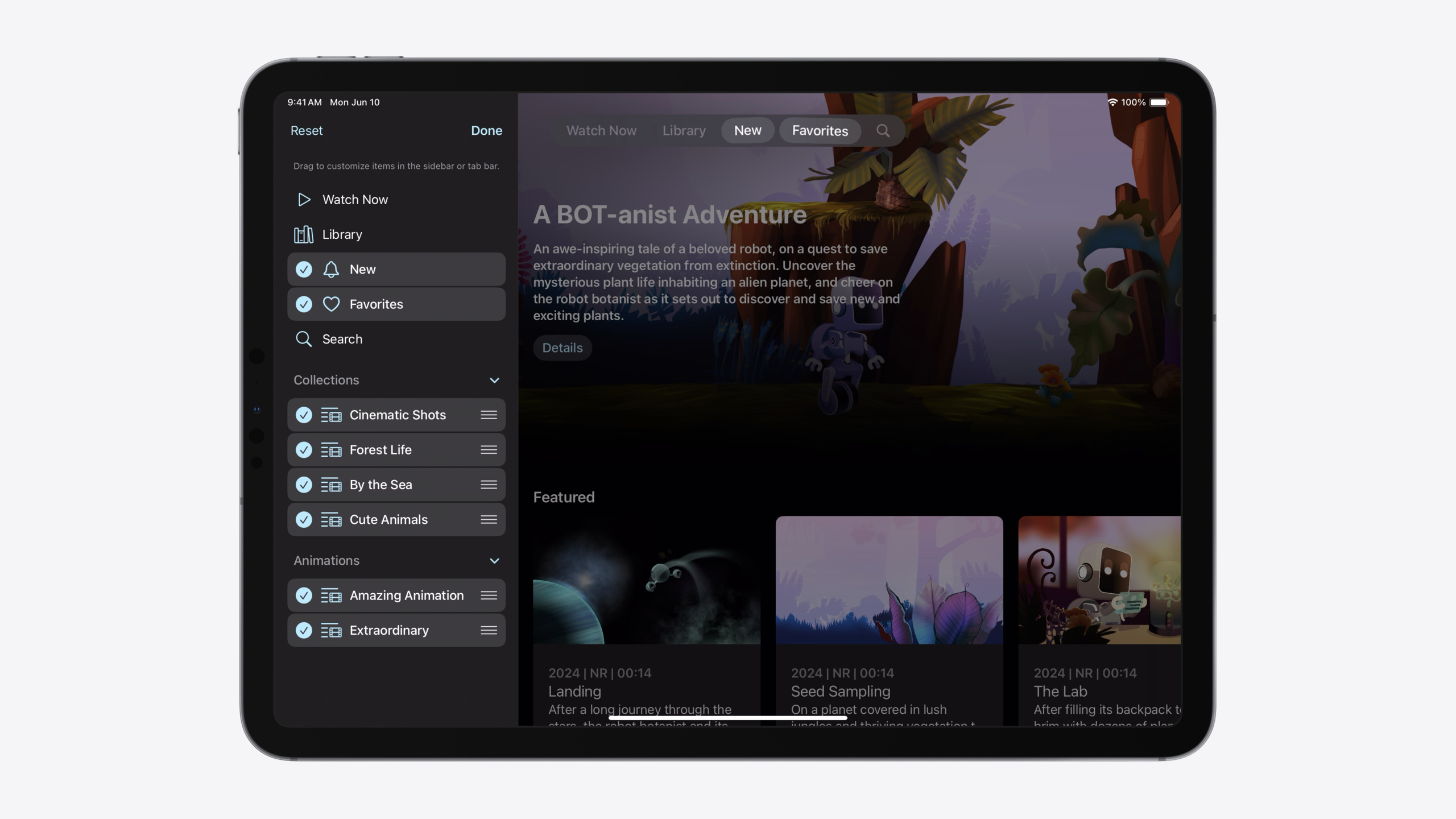
iPadOS 18 moves the Tab Bar to the top of the screen, sharing space with the navigation bar. The more compact design frees up room for content, and existing apps built with the iPadOS 18 SDK get the new look without code changes.
Core Content
The Tab Bar on iPad has existed since the beginning of iOS, but iPadOS 18 brings its first major redesign. The old Tab Bar sat at the bottom of the screen, consuming vertical space; the new design moves it to the top, sharing the same safe area as the navigation bar. This not only gives content more room, but also places tab controls closer to other navigation elements like the back button and title, making them easier to reach.
Another long-standing pain point was how Sidebars were built. In iPadOS 17 and earlier, developers had to use UISplitViewController with an Outline View to implement a Sidebar. That approach was cumbersome and unintuitive. iPadOS 18 offers a more direct solution: the same tab hierarchy description can be presented as either a Tab Bar or a Sidebar. When the user taps the expand button, the Tab Bar smoothly transitions into a Sidebar showing more hierarchical content (such as folders and playlists); collapsing it returns to the compact Tab Bar. Both forms share the same state data and switch seamlessly.
Personalization is another focus of this new navigation system. Users can drag tabs from the Sidebar to the Tab Bar to pin them, and hide tabs they do not need. The Tab Bar is divided into three zones: a fixed zone (not customizable), a customizable zone (drag to reorder), and a pinned zone (always visible at the end, such as Search). These customization behaviors are automatically persisted by the system and restored the next time the app opens.
To support these features, SwiftUI introduces Tab and TabSection syntax, and UIKit introduces UITab and UITabGroup. Both are used to describe the app’s navigation hierarchy in a unified way, rather than maintaining two separate navigation implementations.
Detailed Content
SwiftUI updated the TabView syntax in iOS 18. Instead of the old tag/selection pattern, you declare Tab structs directly. Each Tab includes a title, icon, and content view, with an optional selection value for programmatic control. The new syntax checks type consistency at compile time, avoiding runtime errors (04:27).
TabView {
    Tab("Watch Now", systemImage: "play") {
        WatchNowView()
    }
    Tab("Library", systemImage: "books.vertical") {
        LibraryView()
    }
    // ...
}
UIKit provides corresponding APIs. Create UITab instances to describe each top-level section, then assign them to tabBarController.tabs. Changes to UITab instances are reflected immediately in the UI (04:58).
tabBarController.tabs = [
    UITab(title: "Watch Now", image: UIImage(systemName: "play"), identifier: "Tabs.watchNow") { _ in
       WatchNowViewController()
    },
    UITab(title: "Library", image: UIImage(systemName: "books.vertical"), identifier: "Tabs.library") { _ in
       LibraryViewController()
    },
    // ...
]
Key points:
UITabis a lightweight description structure, not a view controlleridentifiertracks the tab’s unique identity, related to customization features- The
_parameter in the closure represents theUITabitself, available for later reference
Search is common across apps. SwiftUI provides Tab(role: .search) and UIKit provides UISearchTab. Using these dedicated APIs, the system automatically configures the default title, magnifying glass icon, and pins the search tab at the end of the Tab Bar (05:58).
// SwiftUI
Tab(role: .search) {
    SearchView()
}

// UIKit
let searchTab = UISearchTab {
    SearchViewController()
}
Key points:
- The search tab automatically gets a fixed position (pinned placement)
- No need to manually set icon and title — the system provides defaults
- Also appears in the Sidebar, following normal sort order
To enable the Sidebar, set tabViewStyle to .sidebarAdaptable in SwiftUI. Then use TabSection to group related tabs. In the Sidebar, TabSection appears as an expandable/collapsible group; in the Tab Bar, tabs within a group are displayed flat (06:41).
TabView {
    Tab("Watch Now", systemImage: "play") {
        // ...
    }
    Tab("Library", systemImage: "books.vertical") {
        // ...
    }
    // ...
    TabSection("Collections") {
        Tab("Cinematic Shots", systemImage: "list.and.film") {
            // ...
        }
        Tab("Forest Life", systemImage: "list.and.film") {
            // ...
        }
        // ...
    }
    TabSection("Animations") {
        // ...
    }
    Tab(role: .search) {
        // ...
    }
}
.tabViewStyle(.sidebarAdaptable)
Key points:
TabSectiondisplays as a group header in the Sidebar- Tabs are arranged in declaration order; Sections come after individual tabs
- The search tab’s position is unaffected by Sections — the system determines its fixed position
To enable the Sidebar in UIKit, set tabBarController.mode to .tabSidebar. Use UITabGroup for grouping; its children property can be updated dynamically (07:16).
let collectionsGroup = UITabGroup(
    title: "Collections",
    image: UIImage(systemName: "folder"),
    identifier: "Tabs.CollectionsGroup"
    children: self.collectionsTabs()) { _ in
        // ...
}

tabBarController.mode = .tabSidebar
tabBarController.tabs = [
    UITab(title: "Watch Now", ...) { _ in
        // ...
    },
    UITab(title: "Library", ...) { _ in
        // ...
    },
    // ...
    collectionsGroup,
    UITabGroup(title: "Animations", ...) { _ in
        // ...
    },
    UISearchTab { _ in
        // ...
    },
]
Key points:
UITabGroupis a mutable object; changingchildrenupdates the UI immediatelyidentifiertracks group identity, supporting customization features- The
modeproperty determines display mode and can be switched dynamically
The Sidebar also supports action buttons for groups, such as “New Station” in a podcast app. Use sectionActions in SwiftUI and sidebarActions in UIKit (07:45).
TabSection(...) {
    // ...
}
.sectionActions {
    Button("New Station", ...) {
        // action
    }
}

// UIKit
let tabGroup = UITabGroup(...)
tabGroup.sidebarActions = [
    UIAction(title: "New Station", ...) { _ in
        // action
    },
]
Key points:
- Action buttons appear to the right of the group header
- Clicking an action does not change the currently selected tab
- Different groups can have different actions
Tabs can also serve as drop destinations. In a Photos app, users can drag photos onto a collection tab to add them directly. Use the dropDestination modifier in SwiftUI, and implement two methods from UITabBarControllerDelegate in UIKit (08:12).
// SwiftUI
Tab(collection.name, image: collection.image) {
    CollectionDetailView(collection)
}
.dropDestination(for: Photo.self) { photos in
    // Add 'photos' to the specified collection
}

// UIKit
func tabBarController(
    _ tabBarController: UITabBarController,
    tab: UITab, operationForAcceptingItemsFrom dropSession: any UIDropSession
) -> UIDropOperation {
    session.canLoadObjects(ofClass: Photo.self) ? .copy : .cancel
}

func tabBarController(
    _ tabBarController: UITabBarController,
    tab: UITab, acceptItemsFrom dropSession: any UIDropSession) {
    session.loadObjects(ofClass: Photo.self) { photos in
        // Add 'photos' to the specified collection
    }
}
Key points:
- The first method determines whether drop content can be accepted
- The second method receives the actual data objects
- Drop operations work in both Tab Bar and Sidebar
User customization is a highlight of this update. To enable customization in SwiftUI, attach a TabViewCustomization to TabView and persist state with @AppStorage (10:45).
@AppStorage("MyTabViewCustomization")
private var customization: TabViewCustomization

TabView {
    Tab("Watch Now", systemImage: "play", value: .watchNow) {
        // ...
    }
    .customizationID("Tab.watchNow")
    // ...
    TabSection("Collections") {
        ForEach(MyCollectionsTab.allCases) { tab in
            Tab(...) {
                // ...
            }
            .customizationID(tab.customizationID)
        }
    }
    .customizationID("Tab.collections")
    // ...
}
.tabViewCustomization($customization)
Key points:
customizationIDis the unique identifier for a tab participating in customization@AppStorageensures customization state persists across app restarts- The
valueparameter enables programmatic selection of a tab
Some tabs should not be customizable, such as core feature entry points. Use customizationBehavior to disable customization (11:40).
Tab("Watch Now", systemImage: "play", value: .watchNow) {
    // ...
}
.customizationBehavior(.disabled, for: .sidebar, .tabBar)

Tab("Optional Tab", ...) {
    // ...
}
.customizationID("Tab.example.optional")
.defaultVisibility(.hidden, for: .tabBar)
Key points:
.disabledmeans the tab cannot be customized in sidebar/tabBar.defaultVisibility(.hidden)hides the tab by default but allows users to add it- Tabs that do not participate in customization do not need a
customizationID
To enable customization in UIKit, set allowsHiding and preferredPlacement (12:38).
let myTab = UITab(...)
myTab.allowsHiding = true
print(myTab.isHidden)

// .default, .optional, .movable, .pinned, .fixed, .sidebarOnly
myTab.preferredPlacement = .fixed

let myTabGroup = UITabGroup(...)
myTabGroup.allowsReordering = true
myTabGroup.displayOrderIdentifiers = [...]
Key points:
allowsHidingcontrols whether the user can hide the tabpreferredPlacementdetermines the tab’s default position and behaviordisplayOrderIdentifiersrecords the user-customized order
UIKit notifies customization changes through delegate methods (12:39).
func tabBarController(_ tabBarController: UITabBarController, visibilityDidChangeFor tabs: [UITab]) {
    // Read 'tab.isHidden' for the updated visibility.
}

func tabBarController(_ tabBarController: UITabBarController, displayOrderDidChangeFor group: UITabGroup) {
    // Read 'group.displayOrderIdentifiers' for the updated order.
}
Key points:
- The first method is called when tab visibility changes
- The second method is called when a group’s display order changes
- Use these methods to sync to other UI or data models
Regarding icon styles: the Tab Bar prefers filled glyphs, while the Sidebar prefers outline styles. When using SF Symbols, provide only the outline variant — the system automatically switches to the filled variant in the Tab Bar (05:25). This behavior is consistent across iPad, iPhone, and visionOS.
Core Takeaways
-
Verify appearance changes by building with the new SDK
- Why it’s worth doing: iPadOS 18 Tab Bar appearance changes take effect without code changes — building first is the fastest way to verify
- How to start: Set the project’s deployment target to iPadOS 18, build and run with Xcode 16, and observe the automatic Tab Bar upgrade
-
Use SF Symbols outline variants
- Why it’s worth doing: The system automatically handles icon differences between Tab Bar and Sidebar — no need to prepare two sets of images
- How to start: Use the
systemNameparameter inTaborUITab, choosing outline versions of symbols (such assquare.grid.2x2)
-
Use dedicated APIs for search
- Why it’s worth doing:
Tab(role: .search)andUISearchTabautomatically get a fixed position and default icon, matching user expectations for search placement - How to start: Replace existing search tabs with these dedicated APIs and remove manual icon and title settings
- Why it’s worth doing:
-
Control tab count and use Sidebar for more content
- Why it’s worth doing: Too many tabs in the Tab Bar makes them hard to find; the Sidebar can hold more hierarchy without feeling crowded
- How to start: Move secondary, categorized content into
TabSectionorUITabGroup, keeping the Tab Bar lean
-
Disable customization for important tabs
- Why it’s worth doing: Core feature entry points should always be visible, preventing users from accidentally hiding them
- How to start: Use
customizationBehavior(.disabled)orpreferredPlacement = .fixedto protect key tabs
Related Sessions
- What’s new in SwiftUI — New TabView syntax and appearance changes on iPadOS
- Enhance your UI animations and transitions — Explore animation transitions in navigation and presentations
- Create custom visual effects with SwiftUI — Learn how to create visual effects in SwiftUI
- Create custom hover effects in visionOS — Interaction design in visionOS
- Add personality to your app through UX writing — Shaping app personality through copy
Comments
GitHub Issues · utterances