
Highlight
TabView adds type-safe syntax and the
.sidebarAdaptablestyle—one codebase switches between tab bar and sidebar, and users can reorder and hide tabs freely.
Core Content
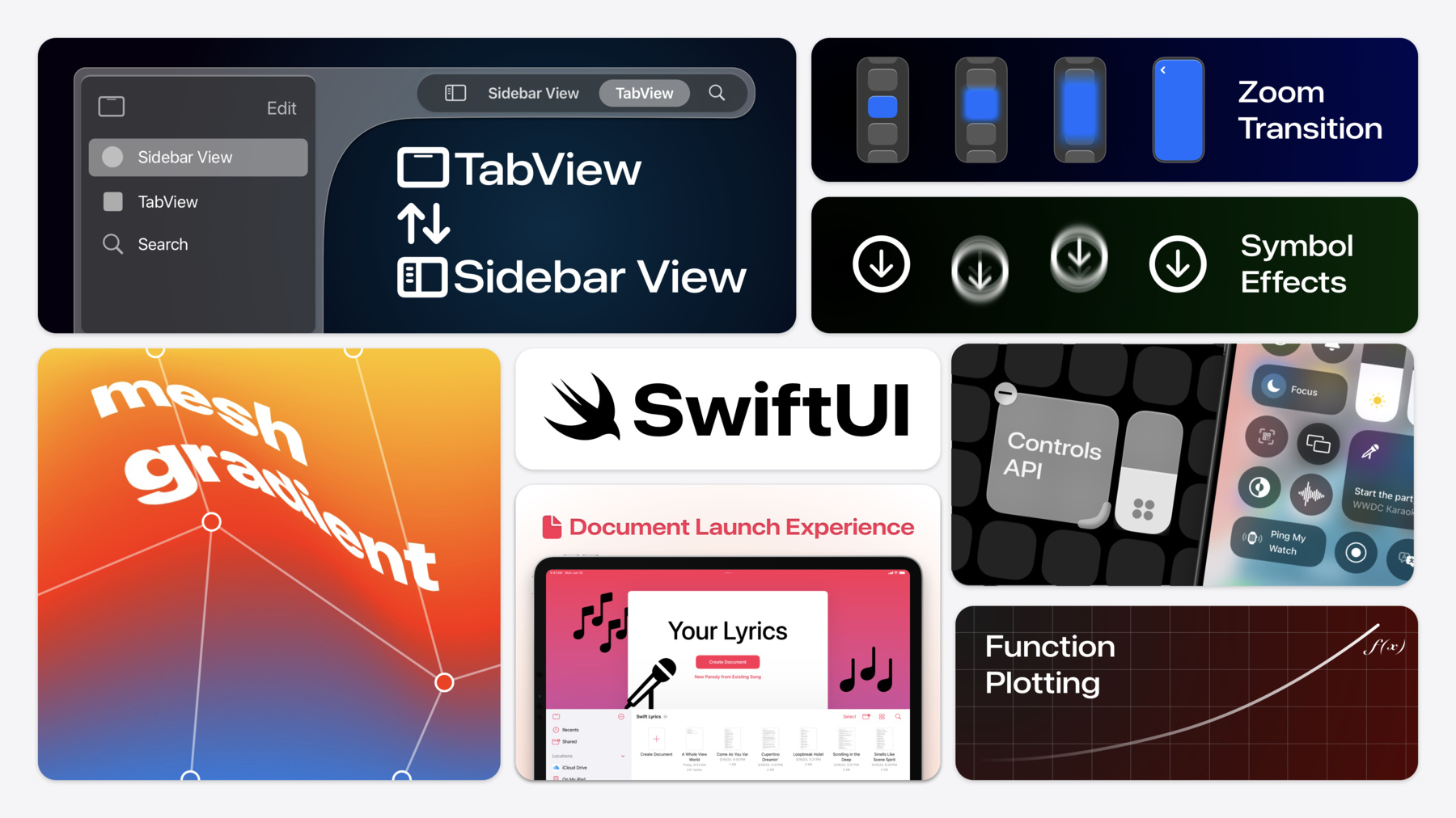
Sidebar apps on iPad have always had an awkward problem: sidebars work well with lots of content, but tab bars are more compact when screen space is limited. Previously developers had to simulate this switch with NavigationSplitView—complex code and inconsistent behavior. iOS 18 adds the .sidebarAdaptable style to TabView; one modifier lets users switch freely between tab bar and sidebar, with built-in tab reordering and hiding.
This SwiftUI update covers four areas. First, refreshing apps: new TabView syntax, Mesh Gradient, Swift Charts function plotting, dynamic Table columns, and Control Widgets. Second, platform adaptation: macOS window style customization (plain style, floating level, default placement), visionOS pushWindow and custom hover effects, and Apple Pencil Pro squeeze gestures. Third, framework foundations: custom containers (subviewOf), the @Entry macro, text selection APIs, onScrollGeometryChange, Swift 6 compatibility, and UIKit/AppKit animation bridging. Fourth, immersive experiences: volume baseplate visibility control, immersion space allowed levels, passthrough video effects, and custom TextRenderer.
Detailed Content
New TabView Syntax
TabView now has type-safe Tab initializers replacing the old string-based tabItem. Each Tab can take a customizationID, paired with TabViewCustomization state to persist user reordering and hiding preferences (01:38).
TabView {
    Tab("Parties", image: "party.popper") {
        PartiesView(parties: Party.all)
    }
    .customizationID("karaoke.tab.parties")

    Tab("Planning", image: "pencil.and.list.clipboard") {
        PlanningView()
    }
    .customizationID("karaoke.tab.planning")
}
.tabViewStyle(.sidebarAdaptable)
.tabViewCustomization($customization)
Key points:
Tab("Parties", image:...)replaces.tabItem { Label(...) }, catching tab configuration errors at compile time.sidebarAdaptablelets users switch between tab bar and sidebar with one tap- The
$customizationbinding saves user customization state, restored automatically on next launch
Unified Sheet Sizing + Zoom Transition
Sheet sizing finally has a cross-platform unified approach. .presentationSizing(.form) produces a compact form; .page produces a full page (02:28). Navigation transitions add a .zoom effect, paired with matchedTransitionSource and @Namespace for element scale transitions (02:39).
Control Widgets
The new ControlWidget protocol creates buttons or toggles for Control Center or the Lock Screen in just a few lines—and can bind to the Action Button (03:18).
struct StartPartyControl: ControlWidget {
    var body: some ControlWidgetConfiguration {
        StaticControlConfiguration(kind: "com.apple.karaoke_start_party") {
            ControlWidgetButton(action: StartPartyIntent()) {
                Label("Start the Party!", systemImage: "music.mic")
                Text(PartyManager.shared.nextParty.name)
            }
        }
    }
}
Key points:
ControlWidgetButton’s action takes anAppIntent, integrating with Shortcuts/App Intents- Controls can show dynamic content (such as the next party name)
Swift Charts Function Plotting + Dynamic Table Columns
LinePlot can plot mathematical functions directly (03:49). TableColumnForEach generates columns dynamically (04:18).
Mesh Gradient
Interpolate colors between grid points to create rich gradient effects (04:42).
MeshGradient(
    width: 3,
    height: 3,
    points: [
        .init(0, 0), .init(0.5, 0), .init(1, 0),
        .init(0, 0.5), .init(0.3, 0.5), .init(1, 0.5),
        .init(0, 1), .init(0.5, 1), .init(1, 1)
    ],
    colors: [
        .red, .purple, .indigo,
        .orange, .cyan, .blue,
        .yellow, .green, .mint
    ]
)
Key points:
- The
pointsarray defines grid coordinates (0–1 range); offset them for asymmetric gradients - The
colorsarray corresponds one-to-one with points; the system interpolates automatically
macOS Window Customization
Window scenes support .windowStyle(.plain) to remove default window decoration, .windowLevel(.floating) to stay on top, and defaultWindowPlacement for initial position (07:04). WindowDragGesture lets chromeless windows be dragged (07:30).
visionOS: pushWindow + Hover Effect
The pushWindow environment action opens a window while hiding the source window—ideal for focused workflows (08:18). The new closure-based hoverEffect precisely controls visual feedback like scale in hover state (08:47).
@Entry Macro + Custom Containers
The @Entry macro replaces an entire EnvironmentKey protocol implementation in one line, for EnvironmentValues, FocusValues, Transaction, and ContainerValues (13:52). ForEach(subviewOf:) iterates subviews to build custom containers (13:13).
extension EnvironmentValues {
    @Entry var karaokePartyColor: Color = .purple
}
Text Selection + Search Focus + Text Suggestions
TextField adds a selection binding for reading and writing selection ranges (15:06). The .searchFocused binding controls search field focus (15:29). .textInputSuggestions adds autocomplete to any text field (15:41).
New ScrollView APIs
onScrollGeometryChange efficiently responds to scroll offset changes (16:23); onScrollVisibilityChange detects views entering or leaving the screen due to scrolling (16:42); ScrollPosition.scrollTo(edge:) programmatically scrolls to an edge (16:54).
UIKit/AppKit Animation Bridging
UIView.animate(animation:) and NSAnimationContext.animate(animation:) let UIKit/AppKit property changes use SwiftUI spring animations; gesture-driven animations automatically preserve velocity (18:34).
visionOS Immersive Space Control
Volumes support .volumeBaseplateVisibility to control baseplate display (19:59); .onVolumeViewpointChange responds to viewing angle changes (20:15). Immersive space ImmersionStyle.progressive can now set minimum and initial immersion ratios (20:38); .preferredSurroundingsEffect(.colorMultiply(.purple)) applies a color filter overlay to passthrough video (21:00).
Custom TextRenderer
The TextRenderer protocol lets you overlay custom drawing on Text views, such as blur glow effects (21:33).
struct KaraokeRenderer: TextRenderer {
    func draw(layout: Text.Layout, in context: inout GraphicsContext) {
        for line in layout {
            for run in line {
                var glow = context
                glow.addFilter(.blur(radius: 8))
                glow.addFilter(purpleColorFilter)
                glow.draw(run)
                context.draw(run)
            }
        }
    }
}

Text("A Whole View World")
    .textRenderer(KaraokeRenderer())
Key points:
- Iterate
Text.Layoutlines and runs to draw each fragment individually - Draw a blurred copy first as a glow base, then the original text, for a glow effect
Core Takeaways
-
Add sidebar/tab switching to iPad apps: Projects simulating sidebar with
NavigationSplitViewcan migrate to.sidebarAdaptableTabView for less code, system-consistent behavior, and user-customizable tabs. How to start: replaceNavigationSplitViewwithTabView + Tab + .sidebarAdaptable, addcustomizationIDto each Tab. -
Use Control Widgets to put high-frequency actions on Lock Screen/Control Center: Users can trigger core features without opening the app (start recording, toggle state, quick photo). Integrated with App Intents, they can also be invoked from Shortcuts. How to start: create a
ControlWidgetimplementation, defineControlWidgetButtonorControlWidgetToggle, bind anAppIntent. -
Use
onScrollVisibilityChangefor lazy video playback: Videos in lists auto-play when entering the viewport and pause when leaving—power efficient and smooth. How to start: add.onScrollVisibilityChange(threshold: 0.2)callback onVideoPlayerto control play/pause. -
Use
UIView.animate(animation:)to unify UIKit and SwiftUI animations: In mixed projects, UIKit property animations can now use SwiftUI spring curves; gesture-driven animations automatically preserve inertia velocity without manual timing curve calculation. How to start: modify UIKit properties insideUIView.animate(SwiftUI.Animation.spring(duration: 0.8)).
Related Sessions
- Improve your tab and sidebar experience on iPad — Deep dive into TabView new syntax and sidebarAdaptable adaptation details
- Enhance your UI animations and transitions — Complete guide to zoom transitions and SwiftUI/UIKit animation bridging
- Demystify SwiftUI Containers — Principles and practice of subviewOf, custom containers, and ContainerValues
- Dive deep into volumes and immersive spaces — Detailed usage of volume baseplates, viewpoint changes, and immersion level control
- Create custom visual effects with SwiftUI — TextRenderer and custom visual effects development tutorial
Comments
GitHub Issues · utterances