
Highlight
Every app has its own personality, and that personality comes through in your words. Apple offers a three-layer framework: personality is the app’s overall character, voice is the consistent style that expresses brand values in writing, and tone is how that voice flexes across different situations.
Core Content
Many developers spend a lot of time on UI design but overlook that copy shapes an app’s personality just as much.
Apple’s human interface design team offers a three-layer framework for thinking about this. At the bottom is personality—the app’s overall character. In the middle is voice—the consistent style that expresses brand values in writing, the thing you need to keep steady whenever you write copy. At the top is tone—how that voice flexes across different situations.
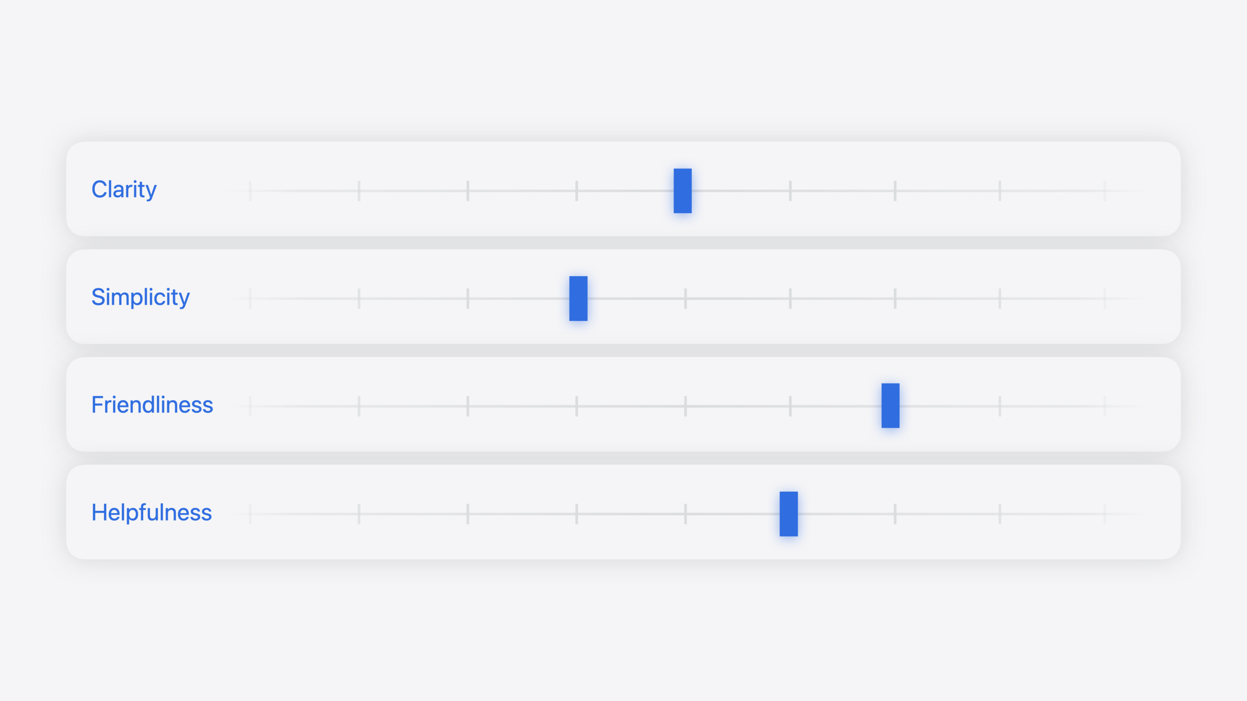
The presenter uses Apple itself as an example. Apple’s voice has four keywords: clarity, simplicity, friendliness, and helpfulness. But the weight of those four qualities shifts by scenario.
When a user completes their 100th Fitness+ workout, it’s a celebration moment. Friendliness goes to the max—“Don’t stop now!” with an exclamation mark, like a friend or coach cheering you on. This scene doesn’t need much helpfulness because the user already achieved something.
When notifying a user about an abnormal heart rate, the situation is completely different. Clarity and helpfulness dominate—“Your heart rate rose above 120 BPM while you seemed to be inactive for 10 minutes.” All numbers and information are given directly, without drama, so the user can make an informed decision.
Both examples fit Apple’s voice, but tone adjustments let them serve different scenarios.
Detailed Content
The session uses three exercises to help developers master this approach.
The first exercise is “imagine your app as a person.” The presenter uses an investing app as an example. She starts with adjectives like smart and serious, keeps adding more, and eventually groups them into two categories: one about being smart (smart, articulate, sharp) and one about being motivating. Those become the app’s voice.
She repeats the process for a kids’ savings app. This time she imagines a teacher or coach role and writes fun, positive, optimistic, then distills kind, fun, and encouraging as the three attributes.
Both apps help users reach financial goals, but the voice is completely different. The investing app targets young professionals and needs smart and motivating; the kids’ savings app targets children and needs kind, fun, and encouraging.
The second exercise is writing a welcome screen with a defined voice. The welcome screen is a great place to show app voice because it’s the user’s first interaction with the app.
The presenter shows the Apple Stocks app welcome screen. It starts with “Welcome,” then three bullet points describing features. The first bullet is “Market Data”—clear and concise, telling you exactly what the app is. The line below, “View stock quotes, interactive charts, and other financial metrics,” adds detail and reflects helpfulness.
Then she demonstrates writing copy with the investing app’s voice (smart + motivating). The initial idea was “Save your money,” but that doesn’t sound motivating or smart enough. Young professionals don’t want to save—they want to invest and grow their money. So she swaps “Save” for the more active “Customize,” then adds “your long-term investment strategy”—smarter and better aligned with the target audience.
The kids’ savings app example starts from the same “Save your money” but with a kind + fun + encouraging voice. The opening becomes “We’ll help you,” reflecting kind and encouraging. Then “save your money” becomes “save up to buy something you want”—more fun and gives kids a reason.
Both exercises show the same starting point (“Save your money”) but completely different final copy because the voice differs.
The third exercise is about adjusting tone. The presenter uses Apple’s four voice qualities as examples. Clarity, simplicity, friendliness, and helpfulness have some tension between them. If you increase friendliness, you may sacrifice a bit of simplicity—a few extra words make the tone warmer but reduce brevity. That balance is how you modulate tone.
Think of each quality as a knob you can turn up or down.
When celebrating a fitness achievement (15:50), friendliness goes to the max. Copy starts with “Three cheers!” and the headline states the reason directly: “You tripled your daily Move goal.” It doesn’t need to be overly simple—a few extra words add celebration. Helpfulness isn’t the priority because the user already hit the goal.
When the user has no network connection but needs to complete a task (17:00), clarity and helpfulness go to the max. The headline states it directly: “Cellular Data is Turned Off.” Then it clearly explains the fix: “Turn on cellular data or use Wi-Fi to access data.” Repeating “data” here is intentional—clarity is the top priority in this scenario.
When introducing a new feature (18:25), friendliness and helpfulness both matter. Using Work Focus as an example, the headline is the feature name, then a relatable example: “When you’re working on a project or your to-do list, get things done by silencing notifications or customizing your screens and apps.” A bit of simplicity is sacrificed to increase friendliness and helpfulness.
The presenter closes with a four-step practice method: 1) pick four qualities that describe your voice; 2) place them on a spectrum; 3) decide the balance for each scenario; 4) write copy in that tone.
Core Takeaways
-
Spend an afternoon defining your app voice. Grab sticky notes, imagine the app as a person, write every adjective you can think of, group them, and distill 2–3 core attributes. Post them in a shared team space. Every time you write UI copy, ask: “Does this match our voice?”
-
Audit existing app copy for consistency. Pay special attention to error messages and empty states—those are where copy most often breaks down. Changing “Operation failed” to “Didn’t succeed + specific reason + suggested action” immediately improves the experience.
-
Include voice definition in your design system during the design phase. Like color and typography, voice is part of the brand. Give designers and developers a voice guide so they have a reference whenever they write any copy.
Related Sessions
- Design great visionOS apps — Design principles for spatial computing apps, covering immersive experiences and eye-and-hand interaction design
- Say hello to the next generation of CarPlay design system — How the CarPlay design system lets automakers express vehicle personality and brand
- Design interactive experiences for visionOS — How to design compelling interactive narrative experiences for visionOS
- Evolve your document launch experience — Showcase your app’s unique personality through the document launch experience
- Explore game input in visionOS — How to design and implement great game input in visionOS
Comments
GitHub Issues · utterances