
Highlight
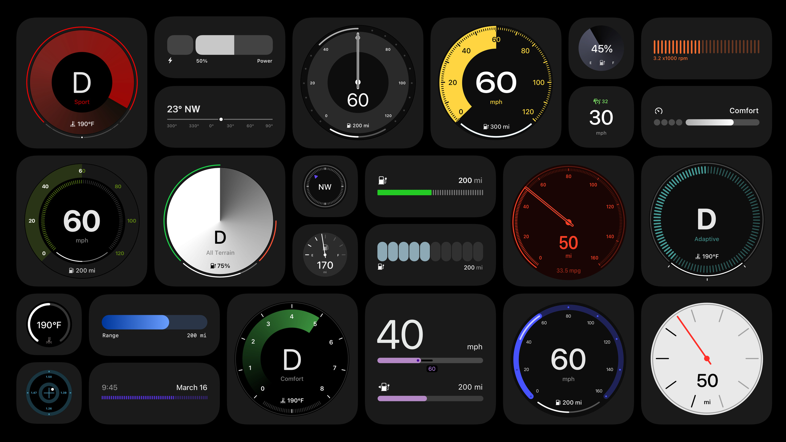
The core goal of the next generation of CarPlay is to cover every screen in the vehicle—not just the center display, but also the instrument cluster. Ben Crick from Apple’s design team introduces how this new design system lets automakers deeply customize visual style while keeping CarPlay functionality consistent.
Core Content
At WWDC 2022, Apple first showcased the concept of the next generation of CarPlay. Two years later, the challenge remains: vehicles have more and larger screens, traditional analog clusters are being replaced by digital displays, and every automaker has different feature sets, screen sizes, and brand identity—a fixed UI cannot fit every vehicle.
Apple’s answer is a parametric design system built from scratch. Rather than offering limited choices like “Theme A or Theme B,” it turns every visual property of a gauge—arc thickness, corner radius, arc angle, start and end positions, colors (solid and gradient), tick mark count and style—into continuously adjustable parameters. Combined with SF variable font’s continuous variation across weight, width, and corner softness, automakers can systematically tune a unique cluster style from their brand visual language.
The result Apple calls a “co-branded” experience: two brands fused in one interface, producing a unique visual language. Every vehicle’s next-generation CarPlay cluster will look different.
Detailed Content
Typography: Three-axis continuous adjustment with SF variable font
SF is the foundation of the entire design system. Traditional fonts offer discrete options like light, regular, and bold; SF variable font allows continuous adjustment across weight, width (from condensed to extended), and corner softness (03:41). Any value between two points can be selected, vastly expanding stylistic range.
The rest of the system follows the same parametric logic: gauge width, corners, arcs, start/end points, and colors are all continuously adjustable—no need to pick from preset configurations.
Gauge style customization
Ben Crick demonstrated customization with a progressive demo from “light and elegant” to “bold and rugged” (04:30):
- Arcs and geometry: Circular gauges can adjust arc angle and start/end points, even expand to full rings, while repositioning secondary gauges (such as fuel level) to fit (04:54).
- Color: Supports solid and multi-color combinations, plus gradients for depth and dimension (05:25). Extending stroke width toward the center can emphasize gradient effects, paying homage to classic needles (05:34).
- Needles and tick marks: The system supports traditional analog needle styles (05:56). Tick mark count, length, style, and position are all customizable; multiple tick mark sets can be layered for a technical look (06:02).
Gauge feature adaptation
Regardless of visual style, gauges adapt to all features (07:34). The session showed side-by-side comparisons of two styles—minimal linear light mode on the left, technical circular dark mode on the right:
- Cruise control: Target speed marked with a dot, set speed shown as text nearby. When adaptive cruise is active, a line connects current speed to target speed, indicating the system will return to target speed when conditions allow (08:13).
- Speed limiter: Represented by a line (distinct from cruise’s dot), with a different color (08:49).
- Road signs and speed units: Space reserved near current speed (08:58).
- Low fuel/battery warnings: Orange for low, red for critical; trigger thresholds defined by the automaker (09:07).
Gauges also adapt to different powertrain types:
- ICE vehicles: Tachometer + engine coolant temperature gauge, supporting current gear, redline, and shift recommendation arrows (09:20).
- EVs: Power gauge supporting drive mode and transmission state, plus boost and regenerative braking display (09:45).
- Hybrids: Hybrid gauge showing both power and tachometer; electric portion emphasized with thicker arcs, ICE portion displayed in a more compact format (10:00). Circular gauges can replace transmission state with brand imagery (10:17).
Modular layout system
Each gauge is a self-contained modular component that can be resized and freely combined (11:41). Current speed and fuel level are mandatory; other gauges (tachometer, power gauge, etc.) are fully optional. Components can be arranged from minimal to information-dense configurations (12:07). Layouts adapt to different screen shapes—wide, irregular, and even compact layouts not focused on the cluster (13:14).
Automakers can also add custom wallpapers across all screens; wallpaper paired with gauge style reinforces brand atmosphere (12:41).
Dynamic content area
Regardless of layout, the system reserves a “dynamic content” area (14:47). Some layouts can make dynamic content persistent—such as a large map or trip computer. Even in cluster-focused layouts, dynamic content can stack behind non-critical gauges, with the driver switching views via steering wheel controls (15:17).
Dynamic content is also the default location for notifications and alerts, supporting text + symbols, interactive dismissible content, and rich multi-state notifications with vehicle images. Two simultaneous notifications are supported (15:47).
Dynamic content on the cluster can include maps, now playing, trip computer, tire pressure, and ADAS (Advanced Driver Assistance Systems). Vehicle-visual content supports automaker-provided imagery reflecting color, configuration, and other attributes (16:14). Center and passenger screens offer even more content display space.
Core Takeaways
-
What to do: Build a parametric design token system for your in-vehicle HMI. Why it matters: The next generation of CarPlay proves that “continuous parameters” adapt better to diverse hardware and brand needs than “discrete themes”—from light and elegant to bold and rugged, just adjust parameters without rewriting components. How to start: Define brand tone with font weight and width, then keep gauge arc thickness and corner radius visually consistent with the font; manage all values with design tokens.
-
What to do: Adopt modular components + composable layout architecture for multiple screen form factors. Why it matters: In-vehicle screens vary greatly in size and shape—from wide to irregular to compact display areas; modular layouts let the same components flexibly combine without developing separate UIs for each screen. How to start: Encapsulate each information unit (speed, fuel, navigation, media) as a self-contained component with resizable and repositionable interfaces, then generate different layouts through composition.
-
What to do: Reserve a “dynamic content” area in cluster UI, letting drivers switch information views via steering wheel controls. Why it matters: Different driving scenarios call for different information—maps while navigating, media during commutes, trip data on long drives—a fixed information area cannot cover all needs. How to start: Define a stackable content slot in the layout system, include notifications and alerts in this slot’s management, ensuring urgent notifications always take visual priority regardless of current content.
Related Sessions
- Meet the next generation of CarPlay architecture — Technical architecture of the next generation of CarPlay; design/architecture dual perspective with this session
- Meet AccessorySetupKit — Also under System Services, covering new in-vehicle accessory pairing experiences
- Enhance your UI animations and transitions — Design session on UI transition animations, echoing CarPlay design system visual consistency
- Elevate your tab and sidebar experience in iPadOS — iPadOS 18 new navigation system, another Apple practice in adaptive layout across form factors
Comments
GitHub Issues · utterances