
Highlight
After a year of deep collaboration between Apple’s design team and many developers, three core directions emerged for great visionOS apps: find your Key Moment, embrace the immersion spectrum, and polish interaction comfort and detail.
Core Content
Many teams’ first instinct with Vision Pro is “port the iPad app.” Sarah (Apple Design Evangelist) opens by calling out the problem: it works, but it won’t feel like “only this platform can do this.” She offers a filter—Key Moment: every app should have one highlight experience optimized for spatial computing; the breathing flower in a mindfulness app is a system-level example.
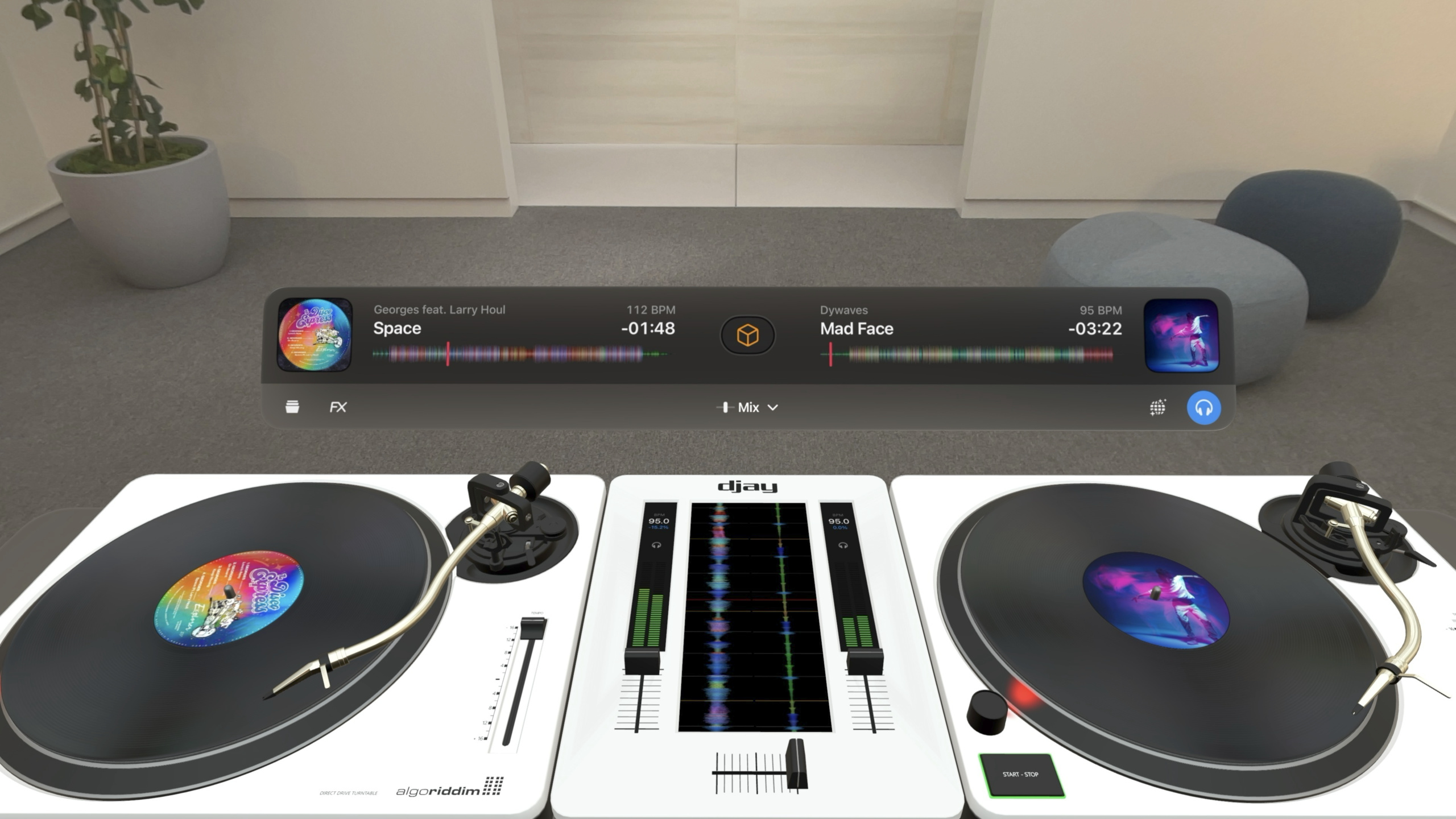
Around Key Moment, three directions unfold. First, design for the platform: Loona went from iOS relaxation videos to a 3D puzzle game; Lowe’s didn’t port the whole home-improvement app—they built only Kitchen Style Studio. Second, immersion is a spectrum: Full Immersion takes you to a virtual world (Sky Guide’s stars), Mixed Immersion blends virtual content into real space (Super Fruit Ninja juice on walls), and spatial audio is a third immersion lever (Blackbox sounds you interact with like instruments). Third, interaction comfort and polish: reduce unnecessary movement, use Glass to adapt to ambient light, hover effects for eye-driven feedback, and place interactive content within arm’s reach. DJay’s turntable is the polished case study—a gesture mimics a DJ lifting headphones to one ear, with extensive work to avoid false triggers.
Detailed Content
Finding the Key Moment (01:24)
Sarah encourages every team to answer: which experience in your app “only visionOS can do”? Three strategies:
- Make the impossible possible (01:56). JigSpace disassembles 3D assets to a degree impossible in the real world—piece by piece through a jet engine, inspect internal wiring, swap materials live. Assets must reach photoreal quality.
- Prototype heavily (02:52). Loona co-founder Sergey Gonchar says the team “was ready to prototype a lot.” An early 2D skateboard sketch “felt layered, like it wanted to be broken into pieces” and became a 3D meditation puzzle—standard gestures to select, hover, release; the scene comes alive when complete.
- Complement, don’t port everything (04:21). Lowe’s iPad app has inventory, store maps, calculators, and more. On Vision Pro they built only Style Studio: enter an immersive 3D kitchen and customize every element from backsplash to appliances. Style Board syncs across devices—back on phone you check stock and find nearby stores.
The immersion spectrum (05:44)
Three immersion levels for different app types:
- Full Immersion (05:53): Sky Guide puts you in a private planetarium; constellations come alive. Good environments need accurate depth and scale to feel believable. Sarah warns: custom environments aren’t for every app—don’t assume they’re the only way to immerse.
- Blend with real space (06:40): Super Fruit Ninja uses sensors to scan walls and surfaces; juice splashes on walls, fruit bounces in real space. Truffle pigs jump on your table and bed—details that make every session unique.
- Spatial audio as immersion (07:40): Sensors understand room size and materials; the system adds reverb so sound feels present in your space. Blackbox sound designer Gus Callahan says they let sound “stretch with interaction, like playing an instrument.”
Interaction comfort (09:26)
Vision Pro is head-mounted—you can’t predict the user’s space. Key principles:
- Reduce physical movement (09:36): Super Fruit Ninja draws a boundary on the floor so players know they don’t need to walk. JigSpace’s F1 car can display 1:1 or scaled down—users aren’t trapped when space is tight.
- Window design (10:33): Fewer windows, cohesive UI. Tab bar and toolbar can sit outside the window but must anchor to the view. “Spatial” doesn’t mean buttons floating randomly. PGA Tour is a good example: main window for live coverage and stats, adjacent Volume for course and replays—one whole without manual window juggling.
- Glass material and brand (12:01): visionOS has no Light/Dark Mode; Glass is system-rendered and adapts to ambient light. Red Bull TV: Glass behind scroll areas; brand blue only briefly while images load. Solid backgrounds block the real world, fight lighting, and feel uncomfortable.
- Hover Effect (13:40): every interactive element needs hover (eye-tracking highlight). Carrot Weather gets it right: hourly temps hover (tap for detail); sunrise/sunset info doesn’t (hover would confuse). Interactive hit targets at least 60pt—smaller targets feel like you need extreme precision.
- Interactive content up close (14:57): DJay places turntables within arm’s reach—scratch records, lift the arm, push faders. Spatial UX principle: we expect nearby objects to be interactive.
Polishing detail: DJay case study (14:39)
DJay is the deepest polish in the session:
- Gestures map to real behavior (16:10): DJs lift headphones to one ear to preview the next track. In DJay, raising a hand to your ear previews—no real headphones needed. But the gesture caused false triggers (fixing hair, adjusting the band); CEO Karim says extensive user testing ensured accuracy.
- Abstract complexity to lower the bar (17:21): Manual beatmatching on turntables is hard; Algoriddim asked “why do DJs still need to beatmatch manually?” in 3D—and automated it. Abstract complexity so people focus on creating.
- Animation guides attention (15:47): On launch, music icons pulse with outline animation toward the library. Humans are sensitive to motion—effective for guiding attention.
Core Takeaways
-
What to do: Find a Key Moment—a slice of experience “only spatial computing can do.” Why it’s worth it: Porting iPad UI to visionOS works but won’t be memorable; Key Moment is why users recommend your app. How to start: List core features and ask “does this still work without the spatial dimension?”—what fails is your candidate.
-
What to do: Use spatial audio instead of visual clutter. Why it’s worth it: visionOS audio auto-reverbs to room size and materials—“sound beside you” at zero extra cost; Blackbox shows audio can be core interaction. How to start: Add Spatial Audio entities in RealityKit, load with
AudioFileResource, tuneSpatialAudioComponentdirectivityandgain. -
What to do: If your app is huge, ship one complementary slice on visionOS. Why it’s worth it: Lowe’s proved a focused 3D kitchen beats full port—style in 3D, then shop on phone feels natural. How to start: Pick the feature best shown in 3D; use window + volume; sync via iCloud.
-
What to do: Hover on every interactive element; skip pure information. Why it’s worth it: Carrot Weather separates “tap” vs “look only”; 60pt targets plus hover build confidence. How to start: SwiftUI
.hoverEffect()on Button and NavigationLink; custom scenes see Session 10152.
Related Sessions
- Create custom environments for your immersive apps in visionOS — Build high-performance custom environments for Full Immersion
- Design interactive experiences for visionOS — Spatial interactive narrative from the Enclosure team
- Create custom hover effects in visionOS — Custom hover effects for sharper eye-tracking feedback
- Explore game input in visionOS — Game input on visionOS: system gestures, custom gestures, controllers
- Work with windows in SwiftUI — Multi-window app management and layout on visionOS
Comments
GitHub Issues · utterances