
Highlight
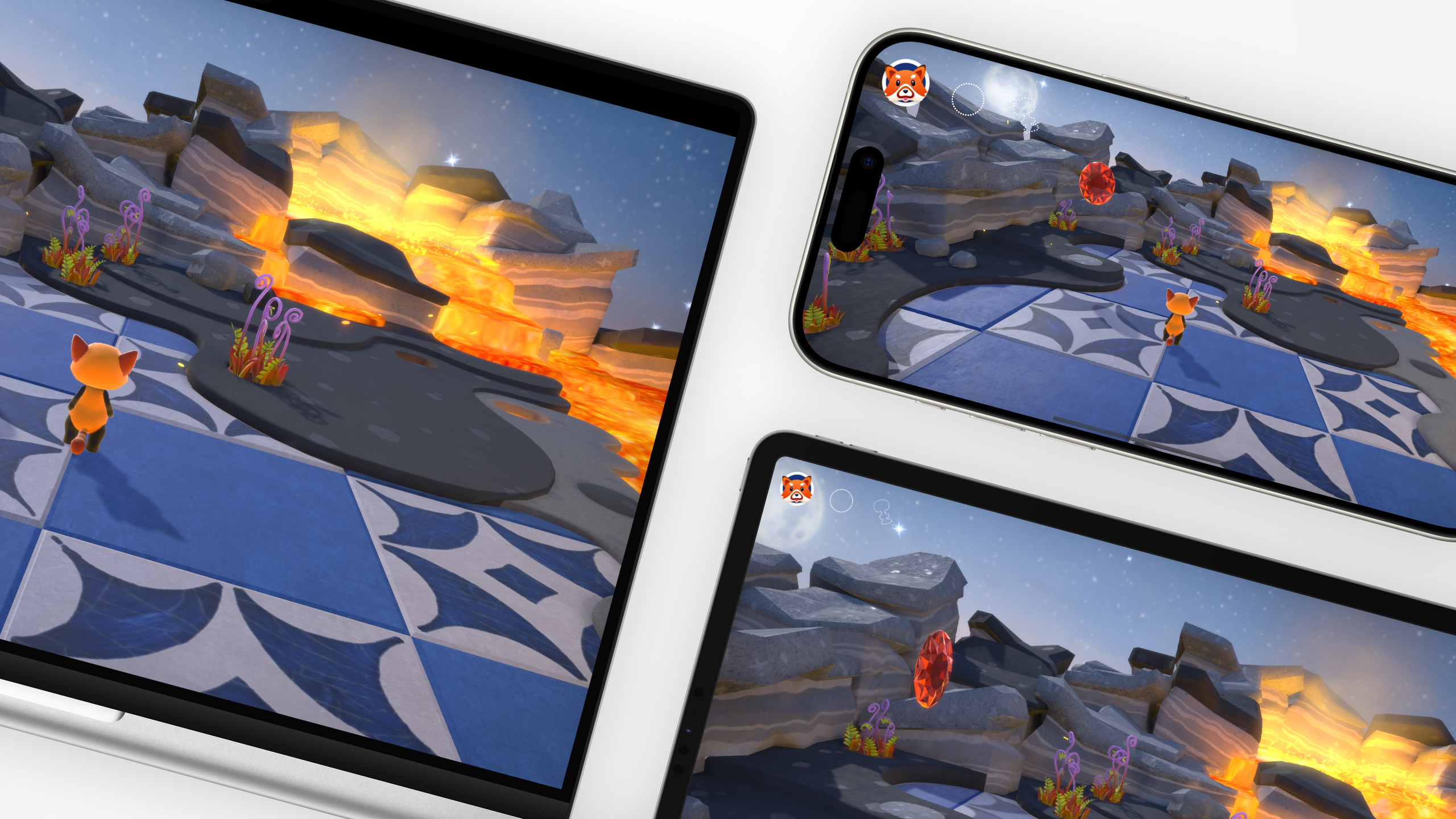
Apple’s unified game platform lets the same game run on Mac, iPad, and iPhone, but three screen sizes, three interaction models, and three performance tiers mean you need targeted design on every dimension.
Core Content
A player finishes downloading a 50GB blockbuster, taps the icon with excitement, and gets a message: “Please wait for additional content to download.” Apple designer Linda is blunt: on Apple platforms, that’s a strike against you. Apple users expect “install and play.” Any experience that makes them wait after launch hurts the first impression.
Her fix is concrete: pack the first 15 minutes of gameplay into the initial App Store download, then load later chapters in the background with On-Demand Resources (hosted on the App Store) or Background Assets (hosted on your own servers). Players perceive “install and play,” not “install and wait.”
But installation is only step one. Running the same game well on Mac, iPad, and iPhone means facing three design dimensions: should defaults auto-detect hardware or let players tune manually? Should UI layout scale as a whole or split by anchors? Can controls in the safe area still be tapped? Linda and Dylan break these down in the second half. Dylan’s touch design section is especially important—the touch surface is both input and output, so designing input is designing UI.
Detailed Content
First launch: hide the wait
Apple recommends including the first 15 minutes of playable content in the initial download (02:28). Background loading uses two frameworks:
- On-Demand Resources: assets hosted on the App Store, suited to content that doesn’t update often
- Background Assets: assets hosted on your own servers, suited to frequently updated content
Only show download progress in the UI if the player moves faster than loading—ideally in non-intrusive places like level select, while letting players replay already downloaded levels (03:07).
Defaults: auto-detect instead of manual choice
Device model, screen resolution, paired peripherals—the system can read all of this without asking the player (04:17). For controllers, Game Controller framework can auto-detect paired gamepads and fetch their profiles, mapping directly to UI (04:57).
Performance defaults should also follow device capability: higher quality on Mac, performance-first on iPhone. On mobile, compress many granular options into one “quality vs performance” master switch (05:44).
UI layout: anchor segments, don’t scale the whole UI
The simplest adaptation is scaling the entire UI, but Linda explicitly discourages it: scaling makes control placement imprecise, touch targets too large or small, and things look misaligned (06:48). The right approach splits UI into segments, each anchored to one screen edge. On different devices, each segment keeps consistent size and distance to its anchor (07:08).
Safe area and full-screen design
Safe Area is the safe region for placing UI on Apple devices (08:00):
- iPad/iPhone: avoid rounded corners, Home Indicator, Dynamic Island
- Mac: leave room at the top for rounded corners and the camera area
Apple Design Resources provides Safe Area templates; Xcode Simulator previews bezels and orientations. But Safe Area is only a reference for UI placement—the game view itself should fill the screen (09:18).
If game content is cropped by device aspect ratio, adjust camera focal length and angle first; for prerendered cutscenes, use letterboxing and fill black bars with black or custom art (09:55).
Text and control sizing
Moving from a big TV to small screens, text and control size is easy to overlook (10:25):
| Platform | Default text size | Minimum text size | Default touch target | Minimum touch target |
|---|---|---|---|---|
| iPhone/iPad | 17pt | 11pt | 44×44pt | 28pt |
| Mac | 13pt | 10pt | 28×28pt | 20pt |
If controls don’t fit, use ScrollView instead of shrinking text (12:58).
Controller glyphs and keyboard/mouse adaptation
Apple platforms support more controller types than most, and each has different button glyphs. Don’t hard-code icons into game assets—use GameController framework to get the correct icons for the current controller (15:02). SF Symbols app provides the full icon library. For keyboards, Apple keyboard modifier order differs from PC keyboards—verify and adjust shortcut mappings (15:27).
Code to detect controllers and fetch glyphs with GameController framework:
import GameController

// Listen for controller connection notifications
NotificationCenter.default.addObserver(
    forName: .GCControllerDidConnect,
    object: nil, queue: .main
) { notification in
    guard let controller = notification.object as? GCController else { return }

    // Get the controller's physical input profile
    if let gamepad = controller.extendedGamepad {
        // Get the correct button icons for the controller type
        let buttonAGlyph = gamepad.buttonA.sfSymbolName
        let buttonBGlyph = gamepad.buttonB.sfSymbolName
        let leftTriggerGlyph = gamepad.leftTrigger.sfSymbolName

        // Update the UI with the retrieved glyph names
        updateButtonIcons(a: buttonAGlyph, b: buttonBGlyph, lt: leftTriggerGlyph)
    }
}

// Start controller discovery
GCController.startWirelessControllerDiscovery {}
Key points:
GCControllerDidConnectfires when a controller pairs—no manual player setup neededcontroller.extendedGamepadprovides the full controller input profile, including all buttons and stickssfSymbolNamereturns the SF Symbols icon name for the current controller, so Xbox, PlayStation, and others show the right glyphsstartWirelessControllerDiscoverystarts Bluetooth controller discovery; pair with notifications for auto-detection
Touch input design (Dylan’s section)
Dylan’s core point: on touch screens, the input surface is the output surface—designing input is designing UI (16:22).
Movement and camera: use a virtual stick for the left thumb stick, but hide it when unused; don’t use a virtual stick for the right thumb—use direct touch drag for camera control, closer to mouse speed and precision than a stick (18:06). Make virtual stick input areas as large as possible—players can’t rely on tactile positioning like a physical stick (17:19). Sprint can integrate into the virtual stick—push to the edge to trigger, no extra button (17:58).
Control placement: avoid safe areas, movement/camera input zones, and character positions. In remaining space, put high-frequency actions near thumbs and low-frequency actions like menu buttons at the top (19:37). Watch left/right hand combos: L2 aim + R2 shoot feels natural on a controller, but on touch you can’t move and aim at once—put aim on the right side (20:10).
Dynamic behavior: use descriptive icons instead of controller button glyphs; remove controls when actions aren’t available in context rather than graying them out; reflect game state on controls (e.g., cooldowns) (20:46).
Feedback: touch has no physical feedback, so every button needs a pressed state (22:07). In busy scenes, visual feedback should extend beyond control bounds (e.g., glow) because fingers may cover the button. Add sound and haptics for responsiveness (22:37).
Core Takeaways
-
What to do: Implement a “first 15 minutes playable” install strategy. Why it’s worth it: Apple users strongly expect install-and-play; waiting after launch drives them away. How to start: Pack initial level data in the main bundle; load later chapters via On-Demand Resources or Background Assets in the background; show download progress only when the player reaches unloaded content.
-
What to do: Use anchor segments instead of whole-UI scaling for multi-screen adaptation. Why it’s worth it: Whole-UI scaling misplaces controls, makes touch targets wrong, and looks misaligned across devices. How to start: Split UI into segments anchored to screen edges, keeping consistent size and anchor distance; verify layout in Xcode Simulator across devices.
-
What to do: Design touch-specific input instead of copying controller mappings. Why it’s worth it: The touch surface is also the display—controller mappings block the view and feel awkward. How to start: Large hideable virtual stick for movement (sprint at max deflection), direct drag for camera; show/hide controls by context; pressed state + glow + haptics on every touch button.
-
What to do: Auto-detect hardware and set default graphics quality. Why it’s worth it: Players shouldn’t manually pick resolution and quality—the device already knows. How to start: Read device model and screen resolution for performance tiers; on mobile, collapse granular options into one quality vs performance switch; use Game Controller framework to auto-detect controllers and map buttons.
Related Sessions
- Port advanced games to Apple platforms — Technical guide to porting high-end games to Mac, iPad, and iPhone
- Bring your iOS or iPadOS game to visionOS — Transform iOS/iPadOS games into immersive visionOS experiences
- Explore game input in visionOS — Game input design on visionOS: system gestures and controller adaptation
- Meet TabletopKit for visionOS — Build a visionOS board game from scratch with TabletopKit
Comments
GitHub Issues · utterances