
Highlight
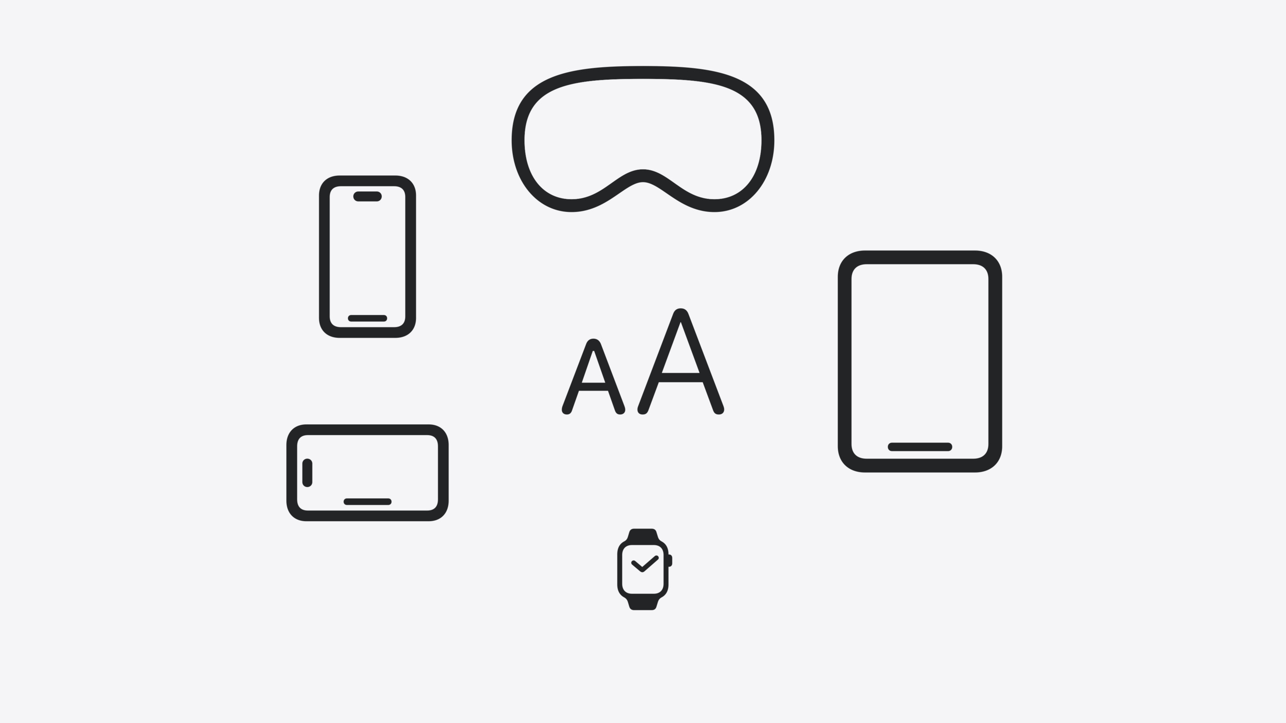
Dynamic Type is Apple’s platform-wide text scaling mechanism. Users can choose from 7 standard sizes and 5 larger accessibility sizes in Settings. Apps must adapt to all sizes. This session covers four layers of adaptation strategy: text scaling, layout adjustment, image and symbol handling, and Large Content Viewer as a fallback.
Core Content
You built an app with fixed 17pt text and an HStack horizontal layout. Most users didn’t complain—until one user set the system text size to the largest accessibility level. Your title was truncated, button text showed half a character, and four horizontally arranged icons squeezed into a clump. That user closed your app.
Dynamic Type is the mechanism that solves this. Users choose their preferred text size in Settings > Accessibility > Display & Text Size > Larger Text. The system offers 7 standard sizes, plus 5 larger options when Larger Accessibility Sizes is enabled. If your app uses system Text Styles, text scales automatically with the user’s choice; if you hard-code font sizes, user preferences are ignored entirely.
This session covers adaptation across four layers: first, replace hard-coded font sizes with system Text Styles; second, switch to vertical layout when horizontal arrangement no longer fits at large sizes; third, scaling strategies for images and SF Symbols at large sizes; fourth, use Large Content Viewer as a fallback for controls like Tab Bar that cannot scale with text size.
Detailed Content
1. Scaling text with system Text Styles
In SwiftUI, use the .font() modifier to specify a Text Style (03:53):
import SwiftUI

struct ContentView: View {
    var body: some View {
        Text("Hello, World!")
            .font(.title)
    }
}
Key points:
.font(.title)uses the system title text style and scales automatically with Dynamic Type- The system provides body, headline, title, and other styles, each maintaining visual hierarchy
In UIKit, use preferredFont(forTextStyle:) and set adjustsFontForContentSizeCategory (04:06):
import UIKit

class ViewController: UIViewController {
    override func viewDidLoad() {
        super.viewDidLoad()
        let label = UILabel(frame: .zero)
        setupConstraints()
        label.text = "Hello, World!"
        label.adjustsFontForContentSizeCategory = true
        label.font = .preferredFont(forTextStyle: .title1)
        label.numberOfLines = 0
        self.view.addSubview(label)
    }
}
Key points:
adjustsFontForContentSizeCategory = truelets the label update its font when system text size changesnumberOfLines = 0allows text to use any number of lines, avoiding truncationpreferredFont(forTextStyle:)returns the dynamic font for the corresponding style
Tools for detecting issues: In Xcode Preview, click the Variants button and select Dynamic Type Variants to preview all size variants at once. You can also override Dynamic Type settings in the Xcode debugger, or run accessibility audits to check for text truncation, clipping, and contrast issues (04:36).
2. Dynamic layout switching
When text size enters the accessibility range, horizontal layouts may no longer fit. SwiftUI uses the dynamicTypeSize environment variable with AnyLayout for dynamic switching (07:20):
import SwiftUI

struct FigureCell: View {
    @Environment(\.dynamicTypeSize)
    private var dynamicTypeSize: DynamicTypeSize

    var dynamicLayout: AnyLayout {
        dynamicTypeSize.isAccessibilitySize ?
        AnyLayout(HStackLayout()) : AnyLayout(VStackLayout())
    }

    let systemImageName: String
    let imageTitle: String

    var body: some View {
        dynamicLayout {
            FigureImage(systemImageName: systemImageName)
            FigureTitle(imageTitle: imageTitle)
        }
    }
}
Key points:
@Environment(\.dynamicTypeSize)reads the current text sizeisAccessibilitySizedetermines whether the size is an accessibility large sizeAnyLayoutallows switching between HStackLayout and VStackLayout at runtime- A single cell switches from vertical (VStack) to horizontal (HStack) layout at accessibility sizes
The outer container also needs to switch in sync (07:52):
import SwiftUI

struct FigureContentView: View {
    @Environment(\.dynamicTypeSize)
    private var dynamicTypeSize: DynamicTypeSize

    var dynamicLayout: AnyLayout {
        dynamicTypeSize.isAccessibilitySize ?
        AnyLayout(VStackLayout(alignment: .leading)) : AnyLayout(HStackLayout(alignment: .top))
    }

    var body: some View {
        dynamicLayout {
            FigureCell(systemImageName: "figure.stand", imageTitle: "Standing Figure")
            FigureCell(systemImageName: "figure.wave", imageTitle: "Waving Figure")
            FigureCell(systemImageName: "figure.walk", imageTitle: "Walking Figure")
            FigureCell(systemImageName: "figure.roll", imageTitle: "Rolling Figure")
        }
    }
}
Key points:
- The outer container switches from HStack to VStack at accessibility sizes so each cell fills the screen width
- The
alignmentparameter sets alignment differently for each layout
UIKit uses UIStackView (08:20):
import UIKit

class ViewController: UIViewController {
    private var mainStackView: UIStackView = UIStackView()

    required init?(coder: NSCoder) {
        super.init(coder: coder)
        NotificationCenter.default.addObserver(self, selector: #selector(textSizeDidChange(_:)), name: UIContentSizeCategory.didChangeNotification, object: nil)
    }

    override func viewDidLoad() {
        super.viewDidLoad()
        setupStackView()
    }

    @objc private func textSizeDidChange(_ notification: Notification?) {
        let isAccessibilityCategory = self.traitCollection.preferredContentSizeCategory.isAccessibilityCategory
        mainStackView.axis = isAccessibilityCategory ? .vertical : .horizontal
        setupConstraints()
    }
}
Key points:
- Listen for
UIContentSizeCategory.didChangeNotificationto respond to text size changes isAccessibilityCategorydetermines whether the size is an accessibility size- Changing
UIStackView.axisswitches between horizontal and vertical layout
3. Scaling strategies for images and SF Symbols
Decorative images should not scale up. Small icons to the left of each Settings list item stay at their original size at large text sizes, with text wrapping around them. SwiftUI’s List handles this wrapping automatically (10:12). UIKit uses NSAttributedString + NSTextAttachment for inline images, with text wrapping naturally (10:30).
If images need to scale (such as images containing text or key icons), SwiftUI uses @ScaledMetric (11:05):
import SwiftUI

struct ContentView: View {
    @ScaledMetric var imageWidth = 125.0
    var body: some View {
        VStack {
            Image("Spatula")
                .resizable()
                .aspectRatio(contentMode: .fit)
                .frame(width: imageWidth)
            Text("Grill Party!")
                .frame(alignment: .center)
        }
    }
}
Key points:
- The
@ScaledMetricproperty wrapper scales values automatically with Dynamic Type - Specify a base width of 125pt; the runtime adjusts based on text size
- SF Symbols do not need
@ScaledMetric—the system scales them automatically
UIKit uses UIImage.SymbolConfiguration with textStyle (11:38):
import UIKit

func imageWithBodyConfiguration(systemImageName: String) -> UIImage? {
    let imageConfiguration = UIImage.SymbolConfiguration(textStyle: .body)
    let configuredImage = UIImage(systemName: systemImageName, withConfiguration: imageConfiguration)
    return configuredImage
}
Key points:
SymbolConfiguration(textStyle: .body)scales SF Symbols in sync with the body style- Custom non-Symbol images require manual scaling with
UITraitCollection
4. Large Content Viewer fallback
Persistent controls like Tab Bar cannot scale with text size—at large sizes the Tab Bar would occupy a quarter of the screen. The system Tab Bar has Large Content Viewer built in. Custom controls need it added manually.
SwiftUI uses the .accessibilityShowsLargeContentViewer modifier (13:15):
import SwiftUI

struct FigureBar: View {
    @Binding var selectedFigure: Figure

    var body: some View {
        HStack {
            ForEach(Figure.allCases) { figure in
                FigureButton(figure: figure, isSelected: selectedFigure == figure)
                    .onTapGesture {
                        selectedFigure = figure
                    }
                    .accessibilityShowsLargeContentViewer {
                        Label(figure.imageTitle, systemImage: figure.systemImage)
                    }
            }
        }
    }
}
Key points:
.accessibilityShowsLargeContentVieweraccepts a closure returning the enlarged view shown on long press- Use
Labelinside the closure to provide both text and icon - On long press, an enlarged view appears centered; swiping switches to adjacent controls
UIKit uses UILargeContentViewerInteraction (13:45):
import UIKit

class FigureCell: UIStackView {
    var systemImageName: String!
    var imageTitle: String!

    init(systemImageName: String, imageTitle: String) {
        super.init(frame: .zero)
        self.systemImageName = systemImageName
        self.imageTitle = imageTitle
        setupFigureCell()
        self.addInteraction(UILargeContentViewerInteraction())
        self.showsLargeContentViewer = true
        self.largeContentImage = UIImage(systemName: systemImageName)
        self.scalesLargeContentImage = true
        self.largeContentTitle = imageTitle
    }
}
Key points:
addInteraction(UILargeContentViewerInteraction())adds the interactionshowsLargeContentViewer = trueenables the displaylargeContentImageandlargeContentTitleset the icon and text in the popupscalesLargeContentImage = trueenlarges the icon in the popup
Core Takeaways
-
What to do: Replace all hard-coded font sizes with system Text Styles. Why it’s worth it: This is the first step to supporting Dynamic Type—small change, big payoff; text immediately scales with user settings. How to start: In SwiftUI, replace
.font(.system(size: 17))with.font(.body)/.font(.title); in UIKit, replaceUIFont.systemFont(ofSize:)withpreferredFont(forTextStyle:)and setadjustsFontForContentSizeCategory = true. -
What to do: Design horizontal card layouts with the ability to switch to vertical. Why it’s worth it: At accessibility large sizes, horizontal space is insufficient and text gets truncated; vertical layout lets each item fill the width and remain readable. How to start: In SwiftUI, use
@Environment(\.dynamicTypeSize)+AnyLayoutand switch based onisAccessibilitySize; in UIKit, useUIStackViewand listen fordidChangeNotificationto switch axis. -
What to do: Add Large Content Viewer to custom Tab Bars and toolbars. Why it’s worth it: These controls cannot scale with text size—large-size users who long-press see no content labels, effectively losing navigation. How to start: In SwiftUI, add
.accessibilityShowsLargeContentViewer { Label(...) }; in UIKit, addUILargeContentViewerInteractionand setlargeContentTitleandlargeContentImage. -
What to do: Integrate accessibility audits in UI tests. Why it’s worth it: Every iteration automatically catches Dynamic Type issues like text truncation, clipping, and low contrast without manual page-by-page checks. How to start: Call accessibility audit APIs in XCTest and run tests with different Dynamic Type settings.
Related Sessions
- Catch up on accessibility in SwiftUI — Comprehensive SwiftUI accessibility introduction covering VoiceOver, Switch Control, and other assistive technologies
- Demystify SwiftUI containers — Understanding SwiftUI container view child management models helps design dynamic layouts
- What’s new in UIKit — UIKit new features, including text and input improvements
- Build multilingual-ready apps — Multilingual text display best practices that complement Dynamic Type adaptation
Comments
GitHub Issues · utterances