
Highlight
iOS 18 adds conditional accessibility modifiers, dynamic label builders, and App Intent actions to SwiftUI, letting assistive technologies operate Widgets and drag-and-drop interactions directly.
Core Content
Many developers assume built-in SwiftUI controls are accessible out of the box and need no extra work—but run VoiceOver once and you’ll find decorative graphics without labels, comment lists full of scattered buttons with unclear ownership, and hover overlays that require many steps for keyboard users. The gap is between “having support” and “having a good experience.”
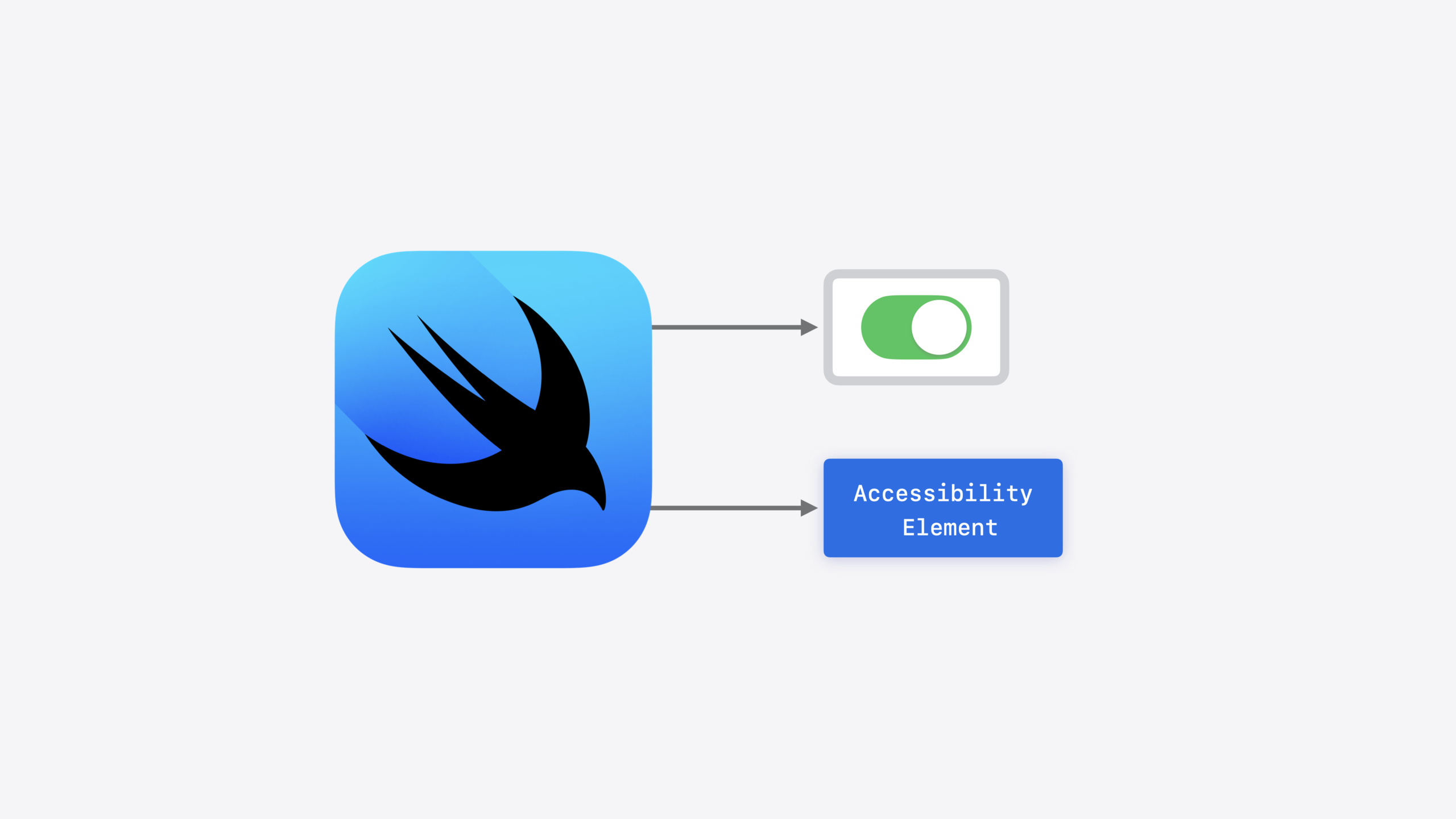
SwiftUI’s accessibility system centers on accessibility elements. Each element carries label, trait, and action information, and VoiceOver interacts with your app only through elements. Built-in controls generate elements automatically, but when you use custom views, shapes, or dynamic interactions, element information can be missing or incomplete.
This year iOS 18 fills several key gaps: the isEnabled parameter lets modifiers apply conditionally without overriding SwiftUI’s default labels; accessibilityLabel accepts a view builder so you can append dynamic content while preserving existing labels; accessibilityDropPoint provides semantic descriptions for multi-drop drag-and-drop scenarios; and accessibilityAction(named:intent:) lets custom actions in Widgets be triggered directly by VoiceOver. The common thread across these APIs is filling in what assistive technologies need without changing the visual layout.
Detailed Content
Auto-generated elements and the styling system
SwiftUI renders views declared in body into two outputs: on-screen visual content and an accessibility element. Take Toggle as an example—SwiftUI automatically merges the “Comments” text and switch state into one element with label “Comments”, traits including isToggle and isSelected, and a press action. When VoiceOver focuses, it reads “Comments, switch button off,” and a double-tap toggles it (03:16).
Key points: When you change visual styling with toggleStyle, the element’s label and traits are preserved. SwiftUI’s styling system keeps visual customization from breaking accessibility properties (04:04).
Adding labels to shapes and unlabeled views
Shape views (such as Circle) do not generate elements by default. After adding .accessibilityLabel(), SwiftUI creates an element and sets its label. When a view’s opacity becomes 0, the element is automatically hidden from assistive technologies (07:27).
struct UnreadIndicatorView: View {
    var isUnread: Bool

    var body: some View {
        Circle()
            .foregroundStyle(.blue)
            .accessibilityLabel("Unread")
            .opacity(isUnread ? 1 : 0)
    }
}Circle()is a purely decorative shape and produces no element by default.accessibilityLabel("Unread")does two things: creates an element and sets its label.opacity(isUnread ? 1 : 0)controls visibility; when opacity is 0, the element hides automatically
Reducing navigation steps with combine
Each comment in a list has an unread indicator, body text, favorite button, and reply button. By default VoiceOver reads each element one by one—many steps. Using .accessibilityElement(children: .combine) merges all child views in an HStack into a single element (08:02).
var body: some View {
    HStack {
        UnreadIndicatorView(isUnread: message.isUnread)
        MessageContentsView(message: message)
        Spacer()
        Button(action: favorite) { favoriteLabel }
        Button(action: reply) { replyLabel }
    }
    .accessibilityElement(children: .combine)
}- Labels from all four child views in the HStack are concatenated into one complete label
- Button actions automatically become custom actions; VoiceOver users swipe up to choose them
- Spacer does not participate in element generation—it only affects visual layout
Conditional modifiers: isEnabled
The favorite button uses a star.fill icon; super-favorite uses sparkles. Sparkles’ default label is “Sparkle” rather than “Super Favorite,” and adding .accessibilityLabel("Super Favorite") directly would also override the correct star label for regular favorites. iOS 18’s isEnabled parameter solves this (10:37).
var body: some View {
    Button(action: favorite) {
        Image(systemName: isSuperFavorite ? "sparkles" : "star.fill")
    }
    .accessibilityLabel("Super Favorite", isEnabled: isSuperFavorite)
}
isEnabled: isSuperFavoriteapplies the label only when true- When false, SwiftUI falls back to the default label for
star.fill - Avoids manual
if isSuperFavorite { ... } else { ... }branching
Turning hover overlays into custom actions
On macOS, attachments appear on hover—fast for mouse users, but VoiceOver needs four steps: focus the main view, trigger hover, navigate to overlay children, then return to the main view. .accessibilityActions extracts overlay controls as custom actions attached directly to the main view (13:38).
var body: some View {
    TripView(trip: trip)
        .onHover { showAttachments = $0 }
        .overlay {
            MessageAttachments(attachments: trip.attachments)
                .opacity(showAttachments ? 1 : 0)
        }
        .accessibilityActions {
             MessageAttachments(attachments: trip.attachments)
        }
}.accessibilityActionsaccepts the same view as the overlay and converts its controls into custom actions- The overlay handles visual presentation; accessibilityActions handles assistive technology interaction—sharing the same view logic
- VoiceOver does not need to trigger hover; attachments are operated directly through the action menu
Dynamic label builder
Ratings may or may not be present—they cannot be hard-coded. The new accessibilityLabel builder accepts a closure whose parameter is the element’s existing label; you can prepend or append content (15:16).
var body: some View {
  TripView(trip: trip)
      .accessibilityLabel { label in
         if let rating = trip.rating {
            Text(rating)
         }
         label
      }
}- Closure parameter
labelis SwiftUI’s existing label content Text(rating)comes first, thenlabel—VoiceOver reads the rating before the body- When
ratingis nil, nothing is appended and the original label remains
Accessibility support for drag and drop
When a custom drop delegate supports multiple drop points, VoiceOver does not know where items can be placed. .accessibilityDropPoint provides a description for each drop point (17:42).
var body: some View {
    CommentAlertView(contact: contact)
        .onDrop(of: [.audio], delegate: delegate)
        .accessibilityDropPoint(.leading, description: "Set Sound 1")
        .accessibilityDropPoint(.center, description: "Set Sound 2")
        .accessibilityDropPoint(.trailing, description: "Set Sound 3")
}- Three
.accessibilityDropPointmodifiers describe the position and meaning of each drop point - During VoiceOver drag-and-drop, each point is read aloud: “Set Sound 1,” “Set Sound 2,” “Set Sound 3”
- Without this modifier, VoiceOver only knows “drop ready” but not the semantic meaning of each drop point
App Intent actions in Widgets
Widget views do not update in real time, so the closure form of accessibilityAction cannot be used. iOS 18 adds an overload that accepts an App Intent—VoiceOver triggers the intent directly when the action runs (19:45).
var body: some View {
    ForEach(beaches) { beach in
        BeachView(beach)
            .accessibilityAction(
                named: "Favorite",
                intent: ToggleRatingIntent(beach: beach, rating: .fullStar))
            .accessibilityAction(
                .magicTap,
                intent: ComposeIntent(type: .photo))
    }
}
named: "Favorite"defines a custom action shown as “Favorite” in VoiceOver’s action menuintent: ToggleRatingIntent(...)specifies the App Intent executed on double-tap; the Widget refreshes automatically.magicTapis VoiceOver’s two-finger double-tap gesture, mapped to ComposeIntent for taking a photo
Core Takeaways
-
What to do: Add
.accessibilityLabel()to custom shapes and decorative icons. Why it’s worth it: Shapes and purely decorative Images do not generate elements by default—VoiceOver users cannot perceive this information at all. How to start: Search globally forCircle(),RoundedRectangle(), andImage(systemName:), and check each one for whether it needs a label. -
What to do: Use
.accessibilityElement(children: .combine)to merge list rows. Why it’s worth it: After merging, VoiceOver users hear complete information in one pass, and buttons automatically become custom actions—navigation efficiency doubles. How to start: Find HStack/VStack list items, add.accessibilityElement(children: .combine)on the outermost container, and verify with VoiceOver. -
What to do: Expose hover overlays and dynamic content to assistive technologies with
.accessibilityActionsand dynamicaccessibilityLabel. Why it’s worth it: Hover interactions are smooth for mouse users but require four or five steps for keyboard and VoiceOver users; extracting overlay content as actions or appending it to labels completes the task in one step. How to start: Find all.onHoverand conditionally shown overlays, and add the corresponding accessibility modifiers. -
What to do: Add
accessibilityAction(named:intent:)to Widgets. Why it’s worth it: Widgets do not support closure actions, but App Intent actions let VoiceOver users execute key operations directly and refresh the interface. How to start: In the Widget’s ForEach loop, add.accessibilityAction(named:intent:)for primary actions, and consider binding.magicTapto the most common operation.
Related Sessions
- What’s new in SwiftUI — Overview of new views, controls, and APIs in SwiftUI this year
- Explore SwiftUI containers — Deep dive into how SwiftUI container views work
- Extend your app’s controls across the system — Extending app controls to the system level
- Bring expression to your app with Genmoji — Integrating Genmoji expression features in your app
- Evolve your document launch experience — Optimizing the launch experience for document-based apps
Comments
GitHub Issues · utterances