
Highlight
TipKit in iOS 17 solved “how to show tips,” but in practice you find multiple tips can appear at once, the same tip structure cannot be reused for different content, and tip state resets when you switch devices. This year’s updates target those pain points directly.
Core Content
You added three new features to your app, each with a tip. The user opens the app for the first time and all three tips pop up at once, overlapping each other—the user dismisses them all and your onboarding strategy fails immediately. This was TipKit’s most criticized scenario last year: multiple tips lacked orchestration, with no guarantee of order.
This year Apple added TipGroup to TipKit. You can put a set of related tips in the same group, specify .ordered priority, and show the next tip only after the previous one is invalidated. Or use .firstAvailable to show whichever tip meets display conditions first. At most one tip is shown at a time, making the experience immediately controllable.
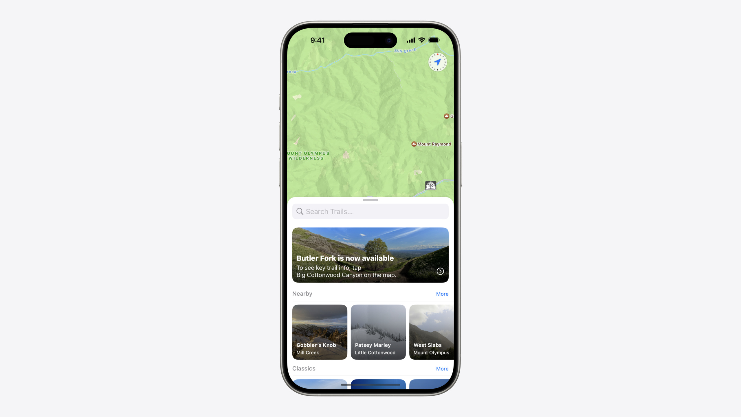
But TipGroup only solves the “order” problem. Another common pain point: you have 10 new pieces of content (say, 10 new trails) and want to show a tip for each—do you really write 10 tip structs? Custom identifiers solve this. Override the id property in one tip struct, bind it to a specific content identifier, and the same struct can be instantiated repeatedly with independent display state per content item. Add TipViewStyle for full control over tip appearance and CloudKit sync for consistent state across devices—together, these four capabilities upgrade TipKit from “can display” to “can orchestrate.”
Detailed Content
TipGroup: Controlling Display Order for Multiple Tips
Attach two popoverTip modifiers to the same control and they may appear simultaneously. With TipGroup, only the next tip appears after the current one is invalidated (02:41):
struct MapCompassControl: View {
    @State
    var compassTips: TipGroup(.ordered) {
        ShowLocationTip()
        RotateMapTip()
    }

    var body: some View {
        CompassDial()
            .popoverTip(compassTips.currentTip)
            .onTapGesture {
                showCurrentLocation()
            }
            .onLongPressGesture(minimumDuration: 0.1) {
                reorientMapHeading()
            }
    }
}
Key points:
TipGroup(.ordered)shows tips in declaration order;.firstAvailableshows the first tip that satisfies its rulescompassTips.currentTipreturns the tip that should currently be shown in the group- In
.orderedmode, the previous tip must be invalidated before the next one can appear - If different tips need to attach to different controls, use
currentTip as? ShowLocationTipfor type casting (03:15) - After the user actually uses a feature, manually call
invalidate(reason: .actionPerformed)to dismiss the current tip; the group automatically advances to the next (03:50)
Custom Identifier: Reusing One Tip Struct for Different Content
By default, a tip’s identifier is its type name. That means one tip type can only have one display record. If you have dynamic content (new articles, new trails, new feature items), each item needs independent display state. Override the id property (06:45):
struct NewTrailTip: Tip {
    let newTrail: Trail

    var title: Text {
        Text("\(newTrail.name) is now available")
    }

    var message: Text? {
        Text("To see key trail info, tap \(newTrail.region) on the map.")
    }

    var actions: [Action] {
        Action(title: "Go there now")
    }

    var id: String {
        "NewTrailTip-\(newTrail.id)"
    }

    var rules: [Rule] {
        #Rule(newTrail.region.didVisitEvent) {
            $0.donations.count > 3
        }
    }
}
Key points:
idis built fromnewTrail.id; each trail gets an independent identifier- Different identifiers mean independent display state—a tip dismissed for trail A can still show for trail B
rulesalso bind tonewTrail.region, tying each tip’s display conditions to its content- IDs should be based on stable concrete values (user ID, content ID), not volatile values
TipViewStyle: Fully Custom Tip Appearance
The default tip style is a standard system card. If your app has brand visual requirements, use TipViewStyle for custom layout (08:55):
struct NewTrailTipViewStyle: TipViewStyle {
    func makeBody(configuration: Configuration) -> some View {
        let tip = configuration.tip as! NewTrailTip
        let highlightTrailAction = configuration.actions.first!

        TrailImage(imageName: tip.newTrail.heroImage)
            .frame(maxHeight: 150)
            .onTapGesture { highlightTrailAction.handler() }
            .overlay {
                VStack {
                    configuration.title.font(.title)
                    HStack {
                        configuration.message.font(.subheadline)
                        Spacer()
                        Image(systemName: "chevron.forward.circle")
                            .foregroundStyle(.white)
                    }
                }
            }
    }
}
Key points:
- Cast
configuration.tipto your concrete tip type to access custom properties (such asnewTrail.heroImage) - Use
configuration.titleandconfiguration.messagerather thantip.titleso modifiers added externally to TipView still take effect configuration.actionsprovides Actions defined in the tip; callhandler()to trigger callbacks in the TipView closure- Apply the style with
.tipViewStyle(NewTrailTipViewStyle())(09:20) - UIKit/AppKit apps can set style via the
viewStyleproperty
CloudKit Sync: Sharing Tip State Across Devices
A user dismisses a tip on iPhone and sees the same tip again on iPad—a poor experience. With CloudKit sync configured, tip display state, event donations, and display counts sync across devices (11:38):
@main
struct TipKitTrails: App {
    var body: some Scene {
        WindowGroup {
            ContentView()
                .task {
                    await configureTips()
                }
        }
    }

    func configureTips() async {
        do {
            try Tips.configure([
                .cloudKitContainer(.named("iCloud.com.apple.TipKitTrails.tips")),
                .displayFrequency(.weekly)
            ])
        }
        catch {
            print("Unable to configure tips: \(error)")
        }
    }
}
Key points:
- Enable iCloud capability in the Xcode project, add CloudKit service, and create a container
- Also enable Remote Notifications in Background Modes so TipKit can process remote changes in the background
- Pass
.cloudKitContainer(.named(...))inTips.configure()to enable sync - Synced content includes: tip display state, events and parameter values, display count and duration
- For tips that should be independent per platform (show once on iPhone and once on iPad), build platform-specific IDs with
UIDevice - During testing,
resetDatastore()clears both local data and CloudKit records
Core Takeaways
-
What to build: Use TipGroup to orchestrate feature onboarding. Group first-time tips with
.orderedand show the next step only after the user completes the previous one, avoiding information overload. Why it’s worth doing: When users see multiple tips at once, they usually dismiss all of them; showing one at a time significantly improves completion rates. How to start: Find places in your app where multiplepopoverTipmodifiers attach to the same screen and switch toTipGroup(.ordered)+currentTip. -
What to build: Use custom identifiers to make content-driven tips reusable. New products in e-commerce, new articles in reading apps, new trails in map apps—any “same structure, different content” tip scenario fits overriding
idto reuse one tip struct. Why it’s worth doing: Avoid writing a separate tip type for each new content item; code volume and maintenance cost drop sharply. How to start: Pick a module where you currently write separate tips per content type, merge into one generic tip withlet content: ContentTypeandvar id: String { "Tip-\(content.id)" }. -
What to build: Use TipViewStyle to turn tips into branded content cards. If your tips carry rich content (images, links, quick actions), the default style cannot support them; a custom style can turn a tip into an interactive content recommendation card. Why it’s worth doing: Tips are not just system alert boxes—they can be part of your app’s content distribution, blending onboarding with content experience. How to start: Implement
makeBodyin theTipViewStyleprotocol, useconfiguration.tipfor custom properties to render layout, and useconfiguration.actionsfor interaction. -
What to build: Enable CloudKit sync on day one for multi-device apps. Inconsistent tip state across devices is one of users’ most common complaints; adding sync later requires handling conflicts with existing local state. Why it’s worth doing: Enable sync from day one so users do not see tips on iPad that they already dismissed on iPhone; event donations accumulate across devices for more accurate rule evaluation. How to start: Add iCloud + CloudKit container + Background Modes Remote Notifications in the Xcode project, and add the
.cloudKitContaineroption inTips.configure.
Related Sessions
- Make features discoverable with TipKit — Last year’s TipKit intro session on creating tips, setting display rules, and controlling frequency
- What’s new in SwiftData — TipKit persistence is built on SwiftData; understanding SwiftData updates helps explain TipKit storage
- Use CloudKit Console to monitor and optimize database activity — After enabling CloudKit sync, use Console to monitor and optimize database activity
- Bring your app’s core features to users with App Intents — Both App Intents and TipKit serve feature discovery; the former exposes system-level entry points, the latter handles in-app guidance
Comments
GitHub Issues · utterances