
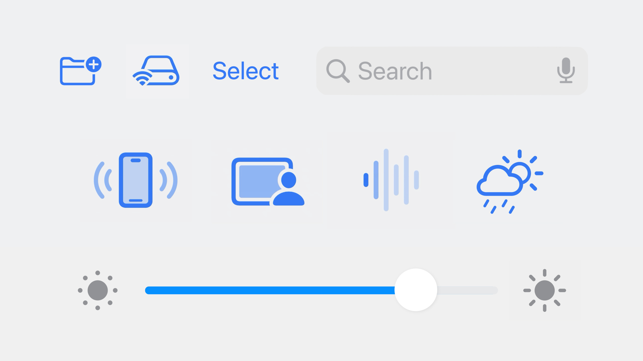
Highlight
iOS 17 and macOS Sonoma introduce the Symbols framework, which provides a unified animation API for all SF Symbols, including custom symbols. Developer passes
.symbolEffect()Modifiers and dot-separated effect names can be used to add animation effects such as Bounce, Pulse, and Variable Color in SwiftUI, UIKit, and AppKit.
Core Content
Four behaviors of symbol animation
In the past, if I wanted to make the icon move, I needed to write it by hand.UIView.animateorwithAnimation, you have to calculate the keyframes yourself. The Symbols framework simplifies this: you only need to declare what effect you want, and the system takes care of the animation details.
All effects can be classified into four behaviors (04:25):
| Behavior | Description | Representative Effect |
|---|---|---|
| Discrete (discrete) | One-time animation, automatically ends after playing | Bounce |
| Indefinite (persistent) | Change symbol status and maintain it, need to be removed explicitly | Scale, Variable Color |
| Transition | Control the display and hiding of symbols | Appear, Disappear |
| Content Transition | Switch between two symbols | Replace |
Each behavior corresponds to a Swift protocol. Effects declare which behaviors they support by following these protocols. For example, Variable Color supports both Indefinite and Discrete. The specific behavior depends on how you use the API.
Dot-separated effect names
A design highlight of the Symbols framework is the dot-delimited syntax for effect names (02:03):
.bounce
.variableColor.iterative.reversing
.scale.up
These are real Swift code, not strings. Xcode will automatically complete each part, and configuration errors will be reported during compilation. You can preview the effect in the Animation tab of the SF Symbols app, and then copy the effect name directly into the code.
Used in SwiftUI
SwiftUI addedsymbolEffectModifier (05:11). The simplest usage is directly inImageAdd effects on:
Image(systemName: "wifi.router")
    .symbolEffect(.variableColor.iterative.reversing)
    .symbolEffect(.scale.up)
Effects can be stacked. The above code applies both the Variable Color animation and the magnification effect.
Used in UIKit/AppKit
UIKit and AppKitUIImageView/NSImageViewAddedaddSymbolEffectMethod (05:30):
let imageView: UIImageView = ...
imageView.addSymbolEffect(.variableColor.iterative.reversing)
imageView.addSymbolEffect(.scale.up)
Detailed Content
Indefinite effect: control the start and stop of animation
Indefinite effects continue to play until removed. SwiftUI viaisActiveParameter control (06:49):
struct ContentView: View {
    @State var isConnectingToInternet: Bool = true

    var body: some View {
        Image(systemName: "wifi.router")
            .symbolEffect(
                .variableColor.iterative.reversing,
                isActive: isConnectingToInternet
            )
    }
}
Key points:
isActivefortrueanimation starts playing -isActivebecomefalseThe animation ends smoothly- Suitable for indicating “in progress” status, such as network connection and file upload
In UIKit/AppKit, useremoveSymbolEffect(ofType:)Stop animation (07:09):
imageView.addSymbolEffect(.variableColor.iterative.reversing)
// Stop the animation after the connection succeeds
imageView.removeSymbolEffect(ofType: .variableColor)
Discrete effect: one-time animation in response to events
The Discrete effect fires once when the value changes. Bounce is a typical Discrete effect (08:26):
struct ContentView: View {
    @State var bounceValue: Int = 0

    var body: some View {
        VStack {
            Image(systemName: "antenna.radiowaves.left.and.right")
                .symbolEffect(
                    .bounce,
                    options: .repeat(2),
                    value: bounceValue
                )

            Button("Animate") {
                bounceValue += 1
            }
        }
    }
}
Key points:
valueTrigger animation when parameters change -options: .repeat(2)Make the animation repeat 2 times- Suitable for responding to user operations, such as feedback after clicking a button
Pulse and Variable Color also support Discrete behavior. When usedvalueWhen triggered, they play a one-time animation sequence.
Replace effect: symbol switching animation
The Replace effect allows an animated transition between two symbols (09:40):
struct ContentView: View {
    @State var isPaused: Bool = false

    var body: some View {
        Button {
            isPaused.toggle()
        } label: {
            Image(systemName: isPaused ? "pause.fill" : "play.fill")
                .contentTransition(.symbolEffect(.replace.offUp))
        }
    }
}
Key points:
contentTransition(.symbolEffect(.replace.offUp))Make symbols switch with a replacement animation that flies upwards -.offUp、.offDownOther options control the replacement direction- Suitable for play/pause, collection/cancel collection and other state switching scenarios
Used in UIKitsetSymbolImage(_:contentTransition:)Achieve the same effect (09:57):
let pauseImage = UIImage(systemName: "pause.fill")!
imageView.setSymbolImage(pauseImage, contentTransition: .replace.offUp)
Appear and Disappear: two ways to use it
Appear and Disappear support two behavior modes (10:15):
Method 1: Indefinite behavior (does not change layout)
Symbols disappear or appear in place, leaving the layout of surrounding views unchanged:
Image(systemName: "moon.stars")
    .symbolEffect(.disappear, isActive: isMoonHidden)
Method 2: Transition behavior (change layout)
Symbols are inserted or removed from the view hierarchy and surrounding views are rearranged:
if !isMoonHidden {
    Image(systemName: "moon.stars")
        .transition(.symbolEffect(.disappear.down))
}
Key points:
- Indefinite mode is suitable for displaying and hiding badges and status marks
- Transition mode is suitable for conditionally rendered views
-
.automaticTransition effects automatically select the most appropriate animation
In UIKit, you can use the completion handler to remove the view after the animation ends (12:59):
imageView.addSymbolEffect(.disappear) { context in
    if let imageView = context.sender as? UIImageView, context.isFinished {
        imageView.removeFromSuperview()
    }
}
Effect propagation and disabling
SwiftUI insymbolEffectModifiers are propagated downward (14:19):
VStack {
    Image(systemName: "figure.walk")
        .symbolEffectsRemoved()
    Image(systemName: "car")
    Image(systemName: "tram")
}
.symbolEffect(.pulse)
Key points:
- on the parent view
.symbolEffect(.pulse)will cause symbols in all subviews to pulse -.symbolEffectsRemoved()You can prevent specific views from inheriting effects - Suitable for unified control of animations in lists or toolbars
No animation application effect
Sometimes you need to have a symbol initially in an effect state, but not animate the transition. Used in SwiftUITransactionDisable animation (14:55):
Image(systemName: "iphone.radiowaves.left.and.right")
    .symbolEffect(.scale.up, isActive: isScaledUp)
    .onAppear {
        var transaction = Transaction()
        transaction.disablesAnimations = true
        withTransaction(transaction) {
            isScaledUp = true
        }
    }
Used directly in UIKit/AppKitanimated: falseparameter:
imageView.addSymbolEffect(.disappear, animated: false)Smooth transition of Variable Value
Variable Value introduced in iOS 16 supports automatic animation in iOS 17 (15:44):
struct ContentView: View {
    @State var signalLevel: Double = 0.5

    var body: some View {
        Image(systemName: "wifi", variableValue: signalLevel)
    }
}
SwiftUI invariableValueCrossfade animation will be automatically generated when changing. Used in UIKitsetSymbolImage(_:contentTransition: .automatic)achieve the same effect.
Built-in animations for UIKit controls
Some UIKit controls in iOS 17 have built-in symbol animations (13:47):
UISliderThe slider will bounce when it reaches both ends -UIBarButtonItemsupportaddSymbolEffectUIControlandUIBarButtonItemNewisSymbolAnimationEnabledProperty controls whether to play animation
Core Takeaways
Add Variable Color animation to the network status indicator
- What: Place a Wi-Fi or router icon in the navigation bar or toolbar and play a Variable Color animation when connected
- Why it’s worth doing: This is a classic scene of the Discrete + Indefinite effect. It continues to play during the connection and stops smoothly after the connection is successful.
- How to start: Use
.symbolEffect(.variableColor.iterative.reversing, isActive: isConnecting)
Optimize playback control buttons with Replace effect
- What to do: Add Replace animation to the play/pause button icon switch
- Why it’s worth doing: The Replace effect makes the switching between two symbols have a sense of direction, which is more textured than directly replacing pictures.
- How to start: Use
.contentTransition(.symbolEffect(.replace.offUp))
Add Bounce feedback to list operations
- What: When the user clicks the favorite, delete, etc. buttons, the icon bounces once
- Why it’s worth doing: Bounce is a Discrete effect, which is naturally suitable for operation feedback and is more vivid than static highlighting.
- How to start: Use
.symbolEffect(.bounce, value: tapCount), increasing with each clicktapCount
Use Disappear transition to make conditional view
- What to do: Conditionally displayed icons are used
.transition(.symbolEffect(.disappear))Add appearance/disappearance animation - Why is it worth doing: Transition behavior will change the layout, suitable for displaying and hiding badges and prompt marks.
- How to start: In
ifAdd to the Image in the condition.transition(.symbolEffect(.automatic))
Related Sessions
- Create animated symbols — Create and preview animated symbols in the SF Symbols app
- What’s new in SF Symbols 5 — Overview of new features in SF Symbols 5
- Animate with springs — The underlying principle of SwiftUI spring animation
Comments
GitHub Issues · utterances