
Highlight
Xcode 15 brings Documentation Preview real-time preview editor, extended symbol documentation, grid layout, Tab navigator, video embedding, custom themes and other capabilities to Swift-DocC, allowing developers to create rich documents consistent with the style of the product website.
Core Content
Documentation of extended symbols
Swift’s extensions are a powerful language feature, but previously DocC would not generate documentation pages for symbols that extend external types. This means that you give SwiftUIImageA convenience constructor has been added, but I can’t find it in the documentation.
(06:21) Xcode 15 solves this problem. Extended symbols now appear in the “Extended Modules” area of the document, alongside other symbols in the project. This feature is driven entirely by community contributions and involves coordinated changes to Swift-DocC and the Swift compiler.
Documentation Preview Editor
(08:05) This is the most eye-catching document feature of Xcode 15. In the source code editor, open the live preview panel via Editor > Assistant > Documentation Preview. Every time you enter a character, the preview updates instantly to show the final rendering of the document.
The preview panel remains active as you switch between Swift source files, Objective-C header files, and Markdown document files, allowing you to view them as you write throughout your project.
Rich page layout instructions
(16:18) DocC has added a series of Markdown commands to make document layout more flexible:
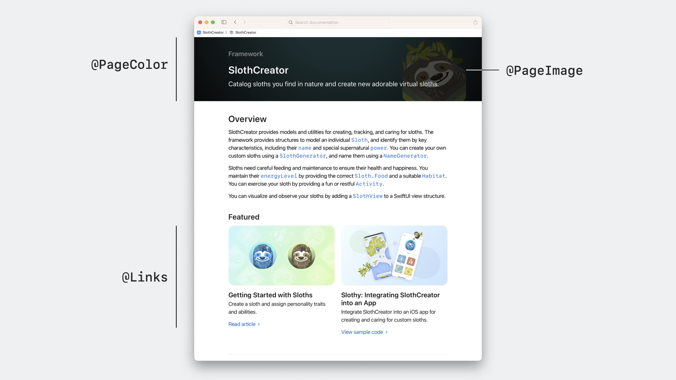
@Row+@Column: Grid layout, pictures and texts side by side -@TabNavigator+@Tab:Tab switcher, saving vertical space -@Video: Embed video to enhance interactivity -@Links: Display relevant links in the form of a card grid -@CallToAction: Add eye-catching action buttons to the page -@PageKind(sampleCode): Mark the page as a sample code type -@PageImage/@PageColor: Customize page icons and theme colors
Custom theme
(25:22) By placingtheme-settings.json, you can customize colors and fonts for web-based documents to maintain visual consistency between the document website and the product website. Custom themes only affect web page deployment, documents within Xcode still use Xcode themes.
Quick Navigation
(31:02) All Swift-DocC websites built with Xcode 15 support Quick Navigation. Press Shift-Command-O to open, enter the page name to jump quickly, similar to Xcode’s Open Quickly function.
Detailed Content
Write documentation comments for extensions
(08:52) for SwiftUIImageExtension to add documentation:
import SwiftUI
/// An extension that facilitates the display of sloths in user interfaces.
public extension Image {
/// Create an image from the given sloth.
///
/// Use this initializer to display an image representation of a
/// given sloth.
///
///
```swift
/// let iceSloth = Sloth(name: "Super Sloth", color: .blue, power: .ice)
///
/// var body: some View {
/// Image(iceSloth)
/// .resizable()
/// .aspectRatio(contentMode: .fit)
/// Text(iceSloth.name)
/// }
///
```
///
/// 
///
/// This initializer is useful for displaying static sloth images.
/// To create an interactive view containing a sloth, use ``SlothView``.
init(_ sloth: Sloth) {
self.init("\(sloth.power)-sloth")
}
}Key points:
- triple slash
///The beginning indicates a documentation comment - The first line is the summary, which appears in the symbol list
- The following paragraphs form the Discussion section
- Use Markdown code blocks to show usage examples
-
Reference images from the Documentation Catalog `SlothView`Create links to other symbols- DocC automatically matches the light/dark mode version of the image
Grid layout
(16:31) Use@Rowand@ColumnCreate a side-by-side layout of images and text:
@Row {
@Column(size: 2) {
First, you customize your sloth by picking its
``Sloth/power-swift.property``. The power of your sloth influences
its abilities and how well they cope in their environment. The app
displays a picker view that showcases the available powers and
previews your sloth for the selected power.
}
@Column {

}
}
@Row {
@Column {

}
@Column(size: 2) {
Once you've customized your sloth, it's ready to ready to thrive.
You'll find that sloths will happily munch on a leaf, but may not be as
receptive to working out. Use the activity picker to send some
encouragement.
}
}Key points:
@RowDefine a line containing multiple@Column@Column(size: 2)Make the column occupy 2 widths (default 1)- The total width of the grid is 4 columns, so
size: 2half - The order of pictures and texts can be flexibly adjusted (text on the left, picture on the right or picture on the left, text on the right)
Tab Navigator
(18:16) Use@TabNavigatorCollapse multi-language screenshots:
@TabNavigator {
@Tab("English") {

}
@Tab("Chinese") {

}
@Tab("Spanish") {

}
}Key points:
@TabNavigatorWrap all Tab- each
@Tab("Title")Define a tab page - Suitable for displaying different variations of the same content (language, theme, platform)
- Significantly save vertical space and avoid long page scrolling
Embed video
(19:07)
@Video(poster: "slothy-hero-poster", source: "slothy-hero", alt: "An animated video showing two screens in the Slothy app.")Key points:
posterIt is the video cover image, displayed before playing -sourceis a video file -altProvide an accessibility description- Video files are placed in Documentation Catalog
Page metadata
(19:50) Use@MetadataAdd page-level configuration:
@Metadata {
    @CallToAction(purpose: link, url: "https://example.com/slothy-repository")
    @PageKind(sampleCode)
    @PageImage(purpose: card, source: "slothy-card", alt: "Two screenshots showing the Slothy app.")
    @PageImage(purpose: icon, source: "slothCreator-icon", alt: "A technology icon representing the SlothCreator framework.")
    @PageColor(green)
}
Key points:
@CallToActionAdd action buttons at the top of the page,purpose: linkrepresents a link,purpose: downloadmeans download -@PageKind(sampleCode)Mark the page as sample code, display special title and icon -@PageImage(purpose: card)Set the picture when the card is displayed -@PageImage(purpose: icon)Set the icons for the navigation bar and page introduction area -@PageColorSet the page theme color (supports standard colors such as green, yellow, purple, orange, etc.)
Featured content link
(21:55) Use@LinksFeatured content at the top of the page:
@Links(visualStyle: detailedGrid) {
    - <doc:GettingStarted>
    - <doc:SlothySample>
}
Key points:
visualStylesupportlist(simple list) anddetailedGrid(detailed card grid)- Links to other pages in the document directory
- If the linked page is set
@PageImage(purpose: card), the card image will be displayed
Custom theme
(27:04) Created in Documentation Catalogtheme-settings.json:
{
    "theme": {
        "color": {
            "standard-green": "#83ac38"
        },
        "typography": {
            "html-font": "serif"
        }
    }
}
Key points:
- The filename must be
theme-settings.json colorArea coverage standard color variables -typographyZone control font settings- Only affects web page deployment, documents in Xcode are not affected
- For more customization options, please refer to Swift-DocC official documentation
Core Takeaways
-
Create a product-level documentation website for open source frameworks
- What to do: Use Swift-DocC to create a documentation site for your Swift Package that is consistent with the official website style
- Why it’s worth doing: Documentation Preview makes the writing process efficient and enjoyable, custom themes allow documents to integrate into the brand vision, and publishing to GitHub Pages costs zero.
- How to start: Add Documentation Catalog to Package, write Markdown articles, and use
xcodebuild docbuildBuild and deploy
-
Create a browsable API reference for the team’s internal framework
- What: Allow team members to quickly find API usage and examples of internal frameworks
- Why it’s worth doing: DocC automatically generates API references from documentation comments, and Quick Navigation supports fast jumps, which is much more efficient than translating source code.
- How to start: Write triple-slash documentation comments for public APIs, using
@Rowand@ColumnOrganize conceptual content and deploy it to the intranet after construction
-
Create a Getting Started Guide with Interactive Tutorials
- What to do: Create a step-by-step “zero to one” tutorial for new users, with introduction, code, and expected results for each step
- Why it’s worth doing: DocC’s tutorial format is naturally suitable for guided learning and is easier to understand than static README.
- How to get started: Create in Documentation Catalog
.tutorialfile, use@TutorialInstructions define steps, each step uses@Stepsand@CodeShow code evolution
-
Write detailed instructions with side-by-side graphics and text for complex APIs
- What to do: Use grid layout to display text descriptions and interface screenshots in the document at the same time
- Why it’s worth doing:
@Row+@ColumnMake the relationship between pictures and text clearer and easier to read than vertically stacked typesetting - How to get started: Use in Markdown documents
@Rowpack@Column,AdjustmentsizeParameter controls column width ratio
Related Sessions
- Meet DocC documentation in Xcode — Getting started with Swift-DocC and understanding the basic document writing process
- Elevate your DocC documentation in Xcode — Advanced techniques to improve the quality of DocC documentation
- Build interactive tutorials using DocC — Build interactive step-by-step tutorials using DocC
Comments
GitHub Issues · utterances