
Highlight
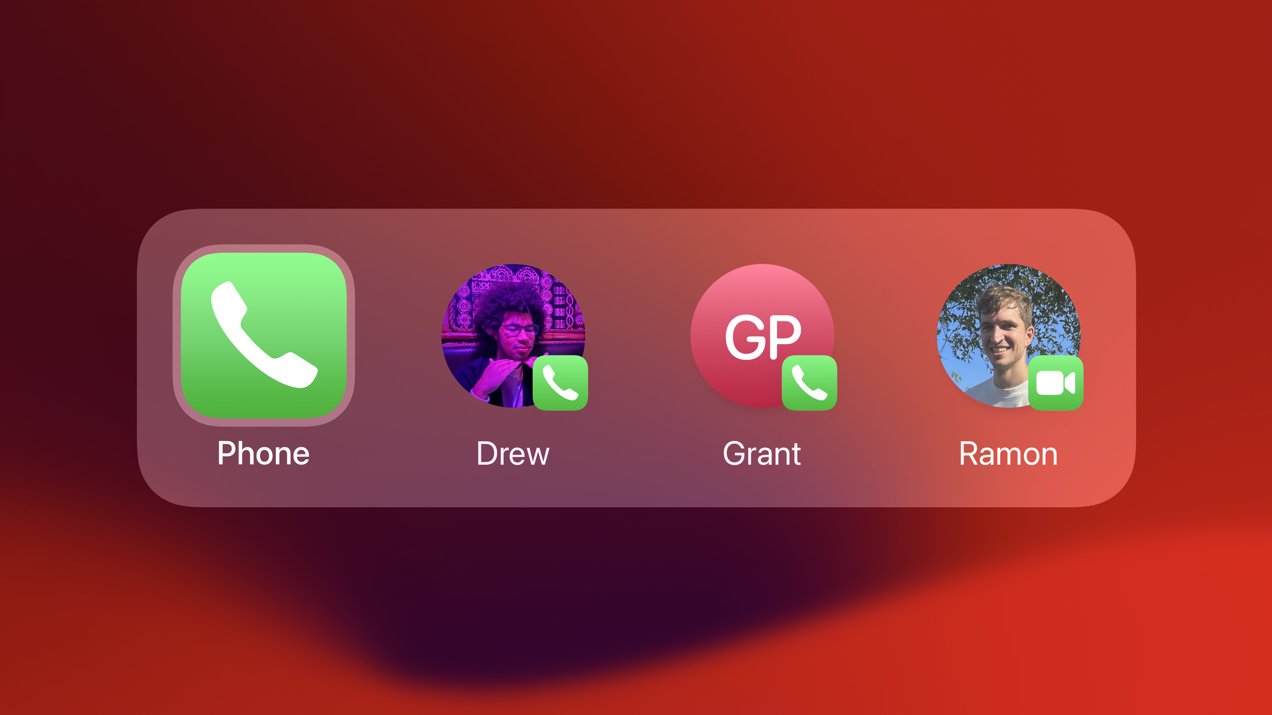
In iOS 17, App Shortcuts will appear in the Top Hit area of Spotlight, and users can directly see and perform shortcut operations when searching for apps. Through this new visual language, Apple allows developers to bring the core functions of their applications directly to users’ fingertips.
Core Content
From search to execution, complete in one step
In the past, if users wanted to perform a common operation, they needed to: find the application icon, open the application, find the corresponding function, and click to execute. Although Spotlight can search for applications, it has to go one more level after searching.
iOS 17 changes this process. When users search for an app in Spotlight, the shortcut operations corresponding to the app will appear directly in the Top Hit card. Just click to execute, no need to open the app.
Wider on iPad, can display up to 5 shortcuts.
Three principles for designing quick operations
Focus on core habits
The Clock app has only two shortcut operations: setting a timer and adding an alarm. There is no “Add world clock city” because it is not a high-frequency habitual action. You don’t need to fill all the slots, just one or two high-quality shortcuts will suffice.
Execute directly, don’t just do navigation
Do not map the application’s Tab Bar directly to shortcut operations. Users already know how to navigate. The shortcut operation on Phone is “call a favorite contact”, not “open the address book”.
Predictable and Personalized
Podcasts displays the programs users are listening to and programs with new episodes, and does not recommend popular podcasts that users have not listened to. Notes shortcut operations are arranged in reverse chronological order, consistent with the app; pinned notes are listed at the top, consistent with the app.
Visual design: Make icons recognizable at a glance
Each shortcut action consists of an Action or Entity. Action is displayed in a circle using SF Symbol. Entity also uses SF Symbol by default, but it is best to provide custom icons.
The icon shape should be consistent with the corresponding concept within the application. The list of Reminders is circular in the app, and the shortcut operation icons are also circular. The Photos album is square in the app, and the shortcut icons are also square.
In terms of color, the default is neutral tones. If your app icon has a strong brand color (like Notes’ yellow), you can inject the color into the cards in Spotlight’s Top Hit and Shortcuts apps. Darker brands are also available with secondary tint, giving SF Symbol a two-tone effect.
Three behavioral modes
A shortcut operation can have three behaviors after being triggered:
- App Launch: Open the application to a specific page. The simplest, and often the right choice.
- Live Activity: Start live activity or background audio. Suitable for actions that do not require further operations, such as making a phone call and starting a timer.
- Snippet: Display a small question or piece of information. For more complex tasks, it is recommended to open the app directly.
Improve discoverability
The words used by the user in their search may be different from the shortcut name. For example, search for “File Scanner” to find “Scan Document”. You can solve this problem by adding synonyms.
If your app has multiple names, provide a synonym for the App Name as well. For example, the Music Recognition app provides “Shazam” as a synonym.
Detailed Content
Structure of shortcut operations
(04:12) Each App Shortcut consists of Action or Entity:
- Action: verb, perform an action. Such as “New Board in Freeform”
- Entity: noun, pointing to an object. Such as “My Big Idea board”
In the UI:
- Action always appears as SF Symbol inside a circle
- Entity also uses SF Symbol by default, but it is recommended to provide custom icons
Title design specifications
(04:46)
- The title can be wrapped to the second line, but try to keep it concise
- Do not include the app name, it is already shown in the UI
- Find a balance between simplicity and clarity
Key points of icon design
(05:06)
- Shape matching: the Reminders list is circular, and the shortcut operation icons are also round; the Photos album is square, and the shortcut operation icons are also square.
- Details continued: There is a small heart in the corner of the Favorites album, and the shortcut operation icon also retains this element
- These visual cues maximize users’ familiarity with quick operations
Subtitle enhanced information
(05:47) When users directly search for shortcut operations, subtitles can be displayed. Photos displays the number of collected photos in the subtitle, consistent with the app.
Color configuration
(06:06)
The default look is suitable for multi-colored or neutral app icons. If your app icon has a strong gradient or solid color (like Notes’ yellow), you can inject color into the cards for Spotlight Top Hit and Shortcuts apps.
When deciding on a color palette, imagine stripping away the graphics from your app icon to create a gradient or solid color.
The default SF Symbol is a monochrome appearance. For dark brand colors, you can set a secondary tint to create a two-tone effect.
Synonym configuration
(08:23)
Phrase is a natural language description of a quick action, including the name of the app and what the user says to Siri. Multiple synonym variations should be provided.
App Name synonyms are useful when an app has multiple names. For example, Music Recognition provides “Shazam” as a synonym.
Core Takeaways
Create quick entry for high-frequency operations
- What to do: Analyze the 3-5 most frequently used actions in your app and create App Shortcuts for them
- Why it’s worth doing: Users save several clicks every day, and cumulatively the experience is significantly improved.
- How to get started: Using the App Intents framework definition
AppShortcut,set upshortcutsProvider
Bringing personalized data to Spotlight
- What to do: Display the user’s recent use, favorites, pins and other personal data as quick operations
- Why is it worth doing: More valuable than static shortcut operations. What users see is content related to them.
- How to start: In
AppEntityImplement dynamic query in and return different shortcut operations based on user data
Use color to strengthen brand recognition
- What to do: Configure quick actions with colors consistent with your app’s branding
- Why it’s worth it: Colored cards in Top Hit are more eye-catching than the default gray, making your brand more recognizable.
- How to start: Set in App Shortcut configuration
tintColorandsecondaryTintColor
Optimized for Siri and natural language search
- What: Add multiple synonyms for each shortcut action
- Why it’s worth doing: Users may use different words to describe the same feature, covering more terms means higher discoverability
- How to start: In
AppShortcutofparameterPresentationMedium configurationsynonyms
Related Sessions
- Bring your app’s core features to users with App Intents — Technical implementation details of the App Intents framework
- Design dynamic Live Activities — Design guide for quick operations combined with real-time activities
- Build a great Lock Screen experience — Co-design of lock screen widgets and shortcut operations
Comments
GitHub Issues · utterances