
Highlight
SwiftUI new in iOS 17, iPadOS 17 and macOS Sonoma
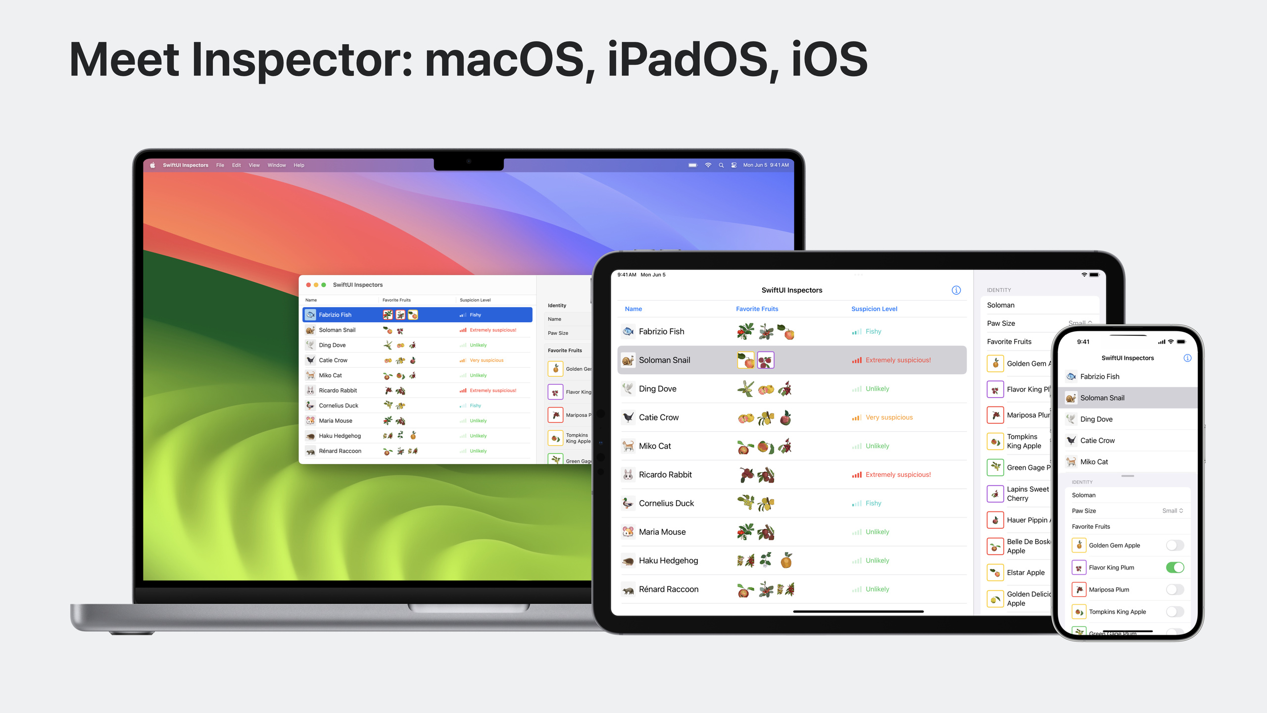
inspectorModifier allows developers to add an adaptive details panel to the application with one line of code: it is displayed as a right sidebar in wide screen, automatically converted to a resizable Sheet in compact size, and supports programmatic control of column width and display status.
Core Content
What is Inspector?
You must have seen the right panel in Keynote: select a shape, and format settings will pop up on the right. In Shortcuts, the library of available actions is displayed on the right. These are the Inspectors.
(00:31)
In the past, developers had to use it themselvesNavigationSplitViewOr manually manage Sheets to achieve similar effects. Not only is the code complicated, but you also have to handle the adaptation of different sizes yourself. Starting with iOS 17, SwiftUI provides nativeinspectorModifier, all done in one line of code.
(01:51)
Placement determines appearance
The behavior of the Inspector depends on its position in the view hierarchy. put onNavigationStackWhen placed internally, it appears below the navigation bar; when placed externally, it takes up the entire column height.
(06:01)
The location of the Toolbar is also particular. The toolbar declared in the Inspector’s view builder will be displayed in the toolbar area above the Inspector; the toolbar declared externally will be displayed in the toolbar of the main content. When the Inspector is presented in Sheet form, the toolbar declared internally will follow into the Sheet.
(06:44)
Sheet display customization
The Sheet custom modifier introduced in iOS 16.4 can be used in combination with the Inspector. You can set background materials, define multiple height levels, and control the interaction of background content.
(09:37)
For example, if you want the Inspector to be presented as a Sheet in compact mode, the small height will not block the background content, but the mask will be displayed after it is expanded to a medium height. This can be achieved with just two modifiers.
(11:58)
Detailed Content
Basic usage
struct ContentView: View {
    @State private var state = AppState()
    @State private var presented = true

    var body: some View {
        AnimalTable(state: $state)
            .inspector(isPresented: $presented) {
                AnimalInspectorForm(animal: $state.binding())
                    .inspectorColumnWidth(
                        min: 200, ideal: 300, max: 400)
                    .toolbar {
                        Spacer()
                        Button {
                            presented.toggle()
                        } label: {
                            Label("Toggle Inspector", systemImage: "info.circle")
                        }
                    }
            }
    }
}(03:54)
Key points:
.inspector(isPresented:)receive aBinding<Bool>Control display status- The contents of the Inspector are defined in the trailing closure
-
.inspectorColumnWidth(min:ideal:max:)Set column width range,idealIt is the width when it is first started. It will be persistent after the user adjusts it. - Declared internally by Inspector
.toolbarwill be displayed in the toolbar area above the Inspector - Inspector uses grouped form style by default, no need to set it manually
Used internally in NavigationStack
struct Example1: View {
    @State private var state = AppState()

    var body: some View {
        NavigationStack {
            AnimalTable(state: $state)
                .inspector(isPresented: $state.inspectorPresented) {
                    AnimalInspectorForm(animal: $state.binding())
                }
                .toolbar {
                    Button {
                        state.inspectorPresented.toggle()
                    } label: {
                        Label("Toggle Inspector", systemImage: "info.circle")
                    }
                }
        }
    }
}(07:14)
Key points:
- Inspector places
NavigationStackWhen inside, displayed below the navigation bar (under toolbar style) - Toolbar is declared on the main content and displayed in the toolbar of the navigation stack
- In compact size, the Inspector is rendered as a Sheet and the toolbar button remains on the main content toolbar
Used outside NavigationStack
struct Example2: View {
    @State private var state = AppState()

    var body: some View {
        NavigationStack {
            AnimalTable(state: $state)
        }
        .inspector(isPresented: $state.inspectorPresented) {
            AnimalInspectorForm(animal: $state.binding())
                .toolbar {
                    ToolbarItem(placement: .principal) {
                        HStack {
                            Button {
                            } label: {
                                Image(systemName: "rectangle.and.pencil.and.ellipsis")
                            }
                            Button {
                            } label: {
                                Image(systemName: "pawprint.circle")
                            }
                        }
                    }
                }
        }
    }
}(07:55)
Key points:
- Inspector places
NavigationStackWhen external, occupy the entire column height (full height style) - Toolbar is declared in the Inspector’s view builder and displayed in the dedicated toolbar area above the Inspector
- When presented as Sheet in compact size, toolbar content will follow into Sheet
Usage in NavigationSplitView
// Option 1: place it inside the detail column
NavigationSplitView {
    Sidebar()
} detail: {
    AnimalTable()
        .inspector(presented: $isPresented) {
            AnimalInspectorForm()
        }
}

// Option 2: place it outside NavigationSplitView
NavigationSplitView {
    Sidebar()
} detail: {
    AnimalTable()
}
.inspector(presented: $isPresented) {
    AnimalInspectorForm()
}(08:56)
Key points:
- exist
NavigationSplitView, the Inspector can be placed inside the detail column or outside the entire split view - Both placement methods are valid, the choice depends on which level of the navigation structure you want the Inspector to be associated with
Combined with Sheet to display customization
.sheet(item: $nibbledFruit) { fruit in
    FruitNibbleBulletin(fruit: fruit)
        .presentationBackground(.thinMaterial)
        .presentationDetents([.height(200), .medium, .large])
        .presentationBackgroundInteraction(.enabled(upThrough: .height(200)))
}(09:49)
Key points:
.presentationBackground(.thinMaterial)Set the Sheet background to a translucent material so that the underlying content can be faintly revealed -.presentationDetents([.height(200), .medium, .large])Define three height levels -.presentationBackgroundInteraction(.enabled(upThrough: .height(200)))Allows interaction with background content at a height of 200, above which the mask is displayed
These modifiers also apply to the Inspector’s Sheet rendering at compact sizes:
.inspector(presented: $state.inspectorPresented) {
    AnimalInspectorForm(animal: $state.binding())
        .presentationDetents([.height(200), .medium, .large])
        .presentationBackgroundInteraction(.enabled(upThrough: .height(200)))
}(11:58)
Core Takeaways
1. Add Inspector to any selection interface
If your app has a table, list, or grid, and the user needs to view or edit details after selecting a row, use.inspectorReplaces manually managed Sheets or Split Views. It automatically adapts to iPhone, iPad and Mac without writing platform judgment code. The entrance is added on the selected view.inspector(isPresented:)modifier.
2. Use Inspector as auxiliary panel
Like Shortcuts, the Inspector can display a tool gallery or properties panel related to the main content. For example, in a code editor, the main area is the code, and the Inspector displays the file outline or property inspector. The entrance is to put the tool content in.inspectorIn the trailing closure, useinspectorColumnWidthControls the default width.
3. Combine Sheets to customize layered interaction
On iPhone, the Inspector is presented as a Sheet. you can use.presentationDetentsand.presentationBackgroundInteractionRealize hierarchical interaction: users can continue to operate the main content when the height is small, and then enter the focused editing mode after expanding. The entry point is to add the presentation modifier to the Inspector content.
4. Use toolbar position control button ownership
Inspector-related operation buttons (such as close, more options) are declared in the Inspector’s view builder, so that they will appear in the Sheet’s toolbar in Sheet mode. The action buttons of the main content are declared on the main view. The entrance is carefully planned.toolbarThe position of the modifier.
Related Sessions
- SwiftUI essentials — SwiftUI infrastructure API overview
- Build programmatic UI with Xcode Previews — New Preview API supports UIKit and AppKit
- What’s new in SwiftUI — SwiftUI annual new feature summary
- Meet SwiftUI for spatial computing — SwiftUI adaptation on visionOS
Comments
GitHub Issues · utterances