
Highlight
SwiftUI introduces five new APIs for ScrollView in iOS 17:
safeAreaPaddingandcontentMarginsPrecisely control margins,scrollTargetBehaviorCustom scroll alignment,containerRelativeFrameContainer-based size calculation,scrollPositionProgrammatic scrolling control that replaces ScrollViewReader, andscrollTransitionVisual transition effects based on scroll position.
Core Content
Basics of ScrollView
Harry started from the SwiftUI team and first reviewed the basic concepts of ScrollView:
- ScrollView has axes to define the scroll direction
- When the content exceeds the size of the ScrollView, it will be cropped and the user needs to scroll to view it.
- ScrollView parses the safe area into the margins of content
- By default ScrollView will calculate all contents immediately, you can use lazy stack to change this behavior
- The precise position of the content in ScrollView is called content offset
Safe Area and Content Margins
(02:29) When adding margins to ScrollView, use directly.padding()will cause the content to be cropped. The correct approach is to use.safeAreaPadding():
ScrollView(.horizontal) {
    LazyHStack(spacing: hSpacing) {
        ForEach(palettes) { palette in
            GalleryHeroView(palette: palette)
        }
    }
}
.safeAreaPadding(.horizontal, hMargin)
Key points:
.safeAreaPadding()Add padding to the safe area and make the ScrollView fill the width- Content has margins, but the next element can “peep” out
- Scroll indicator will also be placed correctly
(04:00) If you need to control the margins of the content and scroll indicator separately, usecontentMargins:
ScrollView(.horizontal) {
    LazyHStack(spacing: hSpacing) {
        ForEach(palettes) { palette in
            GalleryHeroView(palette: palette)
        }
    }
}
.contentMargins(.horizontal, hMargin)
Key points:
contentMarginsCan individually inset content or scroll indicators- Solved the problem that safe area cannot configure different insets for different content
Scroll Target Behavior
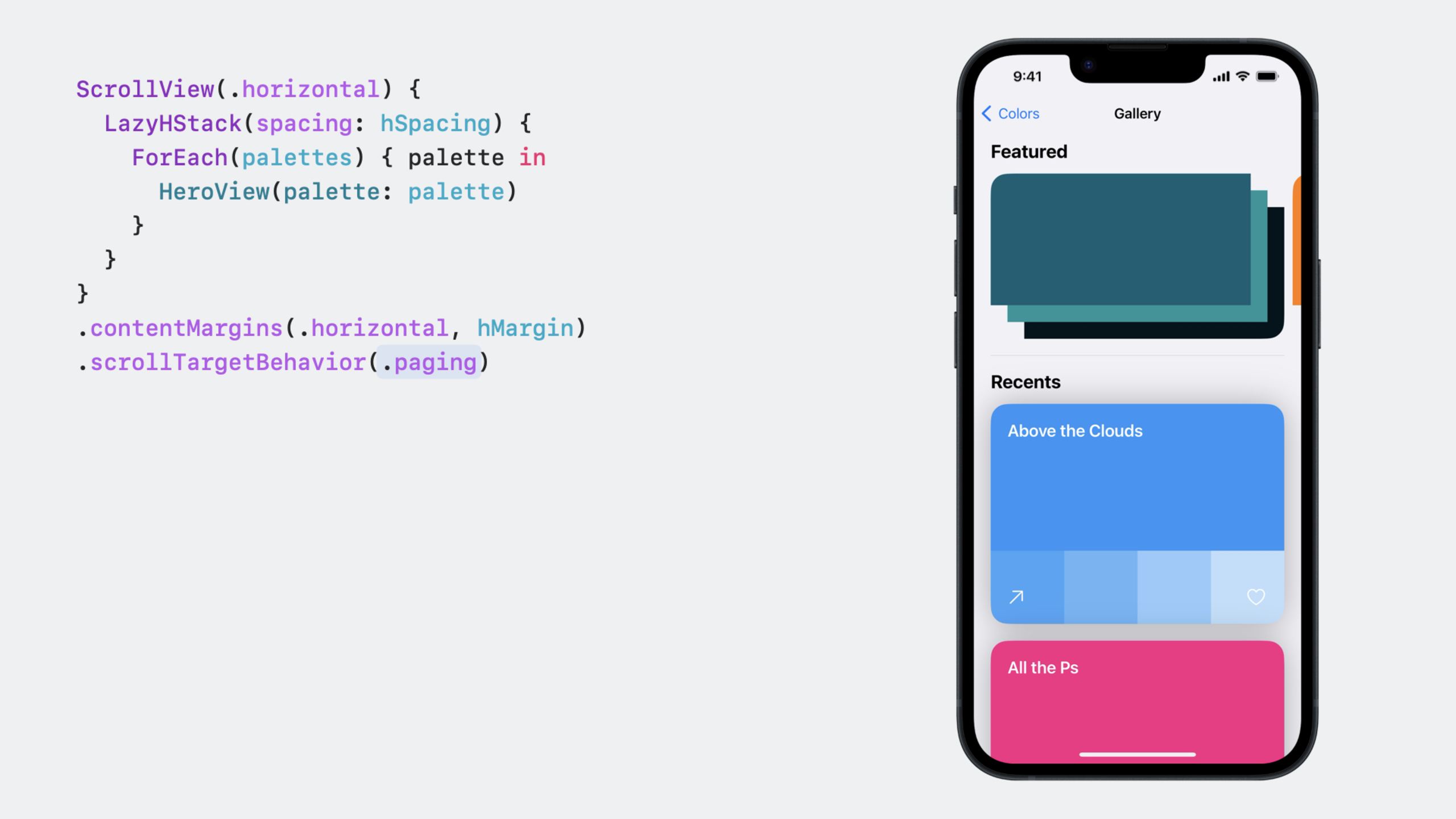
(04:46) By default, ScrollView uses the standard deceleration rate to calculate the scroll stop position. New APIs can change this behavior:
ScrollView(.horizontal) {
    LazyHStack(spacing: hSpacing) {
        ForEach(palettes) { palette in
            GalleryHeroView(palette: palette)
        }
    }
    .scrollTargetLayout()
}
.contentMargins(.horizontal, hMargin)
.scrollTargetBehavior(.viewAligned)
Key points:
.paging: Full page flip, based on the container size of ScrollView -.viewAligned: Aligned to subview, needs to be matched.scrollTargetLayout()use -.scrollTargetLayout()Mark each subview in the Lazy Stack as a scroll target- on iPad
.viewAlignedCompare.pagingMore suitable because the page won’t be too big
CustomizeScrollTargetBehavior:
struct MyScrollTargetBehavior: ScrollTargetBehavior {
    func updateTarget(_ target: inout ScrollTarget, context: TargetContext) {
        if target.rect.minY < 50 && context.velocity.dy > 0 {
            target.rect.origin.y = 0
        }
    }
}
Key points:
- Realize
updateTargetMethod to modify scroll target - SwiftUI calls this method when calculating the scroll stop position
- Also suitable for other scenarios such as ScrollView size changes
Container Relative Frame
(07:42).containerRelativeFrameMake the view size based on the nearest container:
GalleryHeroView(palette: palette)
    .aspectRatio(heroRatio, contentMode: .fit)
    .containerRelativeFrame(
        [.horizontal], count: columns, spacing: hSpacing
    )
Key points:
- The container can be a ScrollView, a column of NavigationSplitView, or a window
-
countandspacingParameters to create grid layout - When the width of the container changes, the view automatically updates the size
-
horizontalSizeClassEnvironment properties are now available on all platforms
Scroll Position
(09:46)scrollPositionReplaces ScrollViewReader and provides simpler programmatic scrolling control:
struct GalleryHeroContent: View {
    var palettes: [Palette]
    @Binding var mainID: Palette.ID?

    var body: some View {
        ScrollView(.horizontal) {
            LazyHStack(spacing: hSpacing) {
                ForEach(palettes) { palette in
                    GalleryHeroView(palette: palette)
                }
            }
            .scrollTargetLayout()
        }
        .contentMargins(.horizontal, hMargin)
        .scrollTargetBehavior(.viewAligned)
        .scrollPosition(id: $mainID)
        .scrollIndicators(.never)
    }
}
Key points:
scrollPositionReceives a binding to an optional ID- When writing binding, ScrollView scrolls to the view corresponding to the ID
- When scrolling, the binding is automatically updated to the current frontmost view ID
- Requires cooperation
.scrollTargetLayout()use
Add page turning buttons for mouse users on macOS:
private func scrollToNextID() {
    guard let id = mainID, id != palettes.last?.id,
          let index = palettes.firstIndex(where: { $0.id == id })
    else { return }

    withAnimation {
        mainID = palettes[index + 1].id
    }
}
Key points:
-ModifymainIDStatus can trigger scrolling
- Can be wrapped in
withAnimationAchieve smooth scrolling in
Scroll Transitions
(12:34)scrollTransitionApply visual changes based on the view’s visible position in the ScrollView:
GalleryHeroView(palette: palette)
    .scrollTransition(axis: .horizontal) { content, phase in
        content
            .scaleEffect(
                x: phase.isIdentity ? 1.0 : 0.80,
                y: phase.isIdentity ? 1.0 : 0.80)
    }
Key points:
phaseThere are three states:identity(in the center),topLeading(close to the edge),bottomTrailing(off the edge)- only supports
VisualEffectModifiers in the protocol (scaleEffect, rotation, offset, etc.) - Modifiers that change the content size (such as font) are not supported because this will affect the layout of the ScrollView
- Defaults to identity phase when the view is in the center of the visible area
Detailed Content
Basic structure of ScrollView
(00:46) A basic ScrollView structure:
struct Item: Identifiable {
    var id: Int
}

struct ContentView: View {
    @State var items: [Item] = (0 ..< 25).map { Item(id: $0) }

    var body: some View {
        ScrollView(.vertical) {
            LazyVStack {
                ForEach(items) { item in
                    ItemView(item: item)
                }
            }
        }
    }
}

struct ItemView: View {
    var item: Item

    var body: some View {
        Text(item, format: .number)
            .padding(.vertical)
            .frame(maxWidth: .infinity)
    }
}
Key points:
LazyVStackDelay the creation of invisible content -ScrollViewThe axes parameter specifies the scroll direction- Automatically enable scrolling when content exceeds range
Complete gallery implementation
(02:29) A complete gallery implementation showing the combined use of all new APIs:
struct ContentView: View {
    @State var palettes: [Palette] = [
        .init(id: UUID(), name: "Example One"),
        .init(id: UUID(), name: "Example Two"),
        .init(id: UUID(), name: "Example Three"),
    ]

    var body: some View {
        ScrollView {
            GalleryHeroSection(palettes: palettes)
        }
    }
}

struct GalleryHeroSection: View {
    var palettes: [Palette]
    @State var mainID: Palette.ID? = nil

    var body: some View {
        GallerySection(edge: .top) {
            GalleryHeroContent(palettes: palettes, mainID: $mainID)
        } label: {
            GalleryHeroHeader(palettes: palettes, mainID: $mainID)
        }
    }
}

struct GalleryHeroContent: View {
    var palettes: [Palette]
    @Binding var mainID: Palette.ID?

    var body: some View {
        ScrollView(.horizontal) {
            LazyHStack(spacing: hSpacing) {
                ForEach(palettes) { palette in
                    GalleryHeroView(palette: palette)
                }
            }
            .scrollTargetLayout()
        }
        .contentMargins(.horizontal, hMargin)
        .scrollTargetBehavior(.viewAligned)
        .scrollPosition(id: $mainID)
        .scrollIndicators(.never)
    }
}

struct GalleryHeroView: View {
    var palette: Palette
    @Environment(\.horizontalSizeClass) private var sizeClass

    var body: some View {
        colorStack
            .aspectRatio(heroRatio, contentMode: .fit)
            .containerRelativeFrame(
                [.horizontal], count: columns, spacing: hSpacing
            )
            .clipShape(.rect(cornerRadius: 20.0))
            .scrollTransition(axis: .horizontal) { content, phase in
                content
                    .scaleEffect(
                        x: phase.isIdentity ? 1.0 : 0.80,
                        y: phase.isIdentity ? 1.0 : 0.80)
            }
    }

    private var columns: Int {
        sizeClass == .compact ? 1 : regularCount
    }
}
Key points:
GalleryHeroViewusecontainerRelativeFrameAutomatically calculate dimensions based on container width -columnsaccording tohorizontalSizeClassShows 1 column on iPhone, 2 columns on iPad -scrollTransitionMake the off-center view shrink to 80% to create a focus effect -scrollPositionLet the buttons in the header control scrolling
Smart behavior for scroll indicators
(08:54)scrollIndicators(.hidden)The default behavior is to hide the indicator when using multi-touch input such as a trackpad, and show the indicator when a mouse is connected. This is because it is difficult for mouse users to perform swipe gestures.
If you really need to hide the indicator at all times (while providing an alternative scrolling method), use.scrollIndicators(.never)。
Core Takeaways
-
Card style carousel
- What to do: Implement a carousel that can slide left and right and automatically align to a single card
- Why it’s worth doing:
.scrollTargetBehavior(.viewAligned)Cooperate.scrollTargetLayout()Let the carousel chart implementation change from “manual calculation” to “declarative configuration” - How to start: Use
LazyHStackpackage card, add.scrollTargetLayout()and.scrollTargetBehavior(.viewAligned)
-
Cross-device adaptive grid
- What to do: A layout that displays a grid of 1 column on iPhone and 2-3 columns on iPad
- Why it’s worth doing:
containerRelativeFrameCooperatehorizontalSizeClassAchieve responsive layout without GeometryReader - How to start: Use
.containerRelativeFrame([.horizontal], count: columns, spacing: spacing),according tohorizontalSizeClassset upcolumns
-
Scroll-driven visual feedback
- What it does: Cards in the list zoom in when scrolling to the center of the screen and shrink when scrolled away
- Why it’s worth doing:
scrollTransitionMake this effect a few lines of code, no need to manually track content offset - How to start: Add on list item view
.scrollTransition(axis: .vertical) { content, phase in content.scaleEffect(phase.isIdentity ? 1.0 : 0.9) }
-
Programmed scroll navigation
- What to do: Click the “Previous”/“Next” buttons to control the horizontal scroll view
- Why it’s worth doing:
scrollPositionSimpler than ScrollViewReader and supports two-way binding - How to start: Definition
@State var currentID: Item.ID?, bound to.scrollPosition(id: $currentID), button modificationcurrentIDThat’s it
-
Customized scroll adsorption behavior
- What to do: Make the ScrollView automatically snap to the top when it is close to the top
- Why it’s worth doing:
ScrollTargetBehaviorProtocols make customizing scrolling behavior easy - How to get started: Create a follow
ScrollTargetBehaviorThe structure ofupdateTargetModified according to speed and target positiontarget.rect
Related Sessions
- Explore SwiftUI animation — SwiftUI animation basics
- Animate with springs — Spring animation
- Wind your way through advanced animations in SwiftUI — Keyframe animations can be used for scrolling transitions
- SwiftUI essentials — SwiftUI basic concepts
Comments
GitHub Issues · utterances