
Highlight
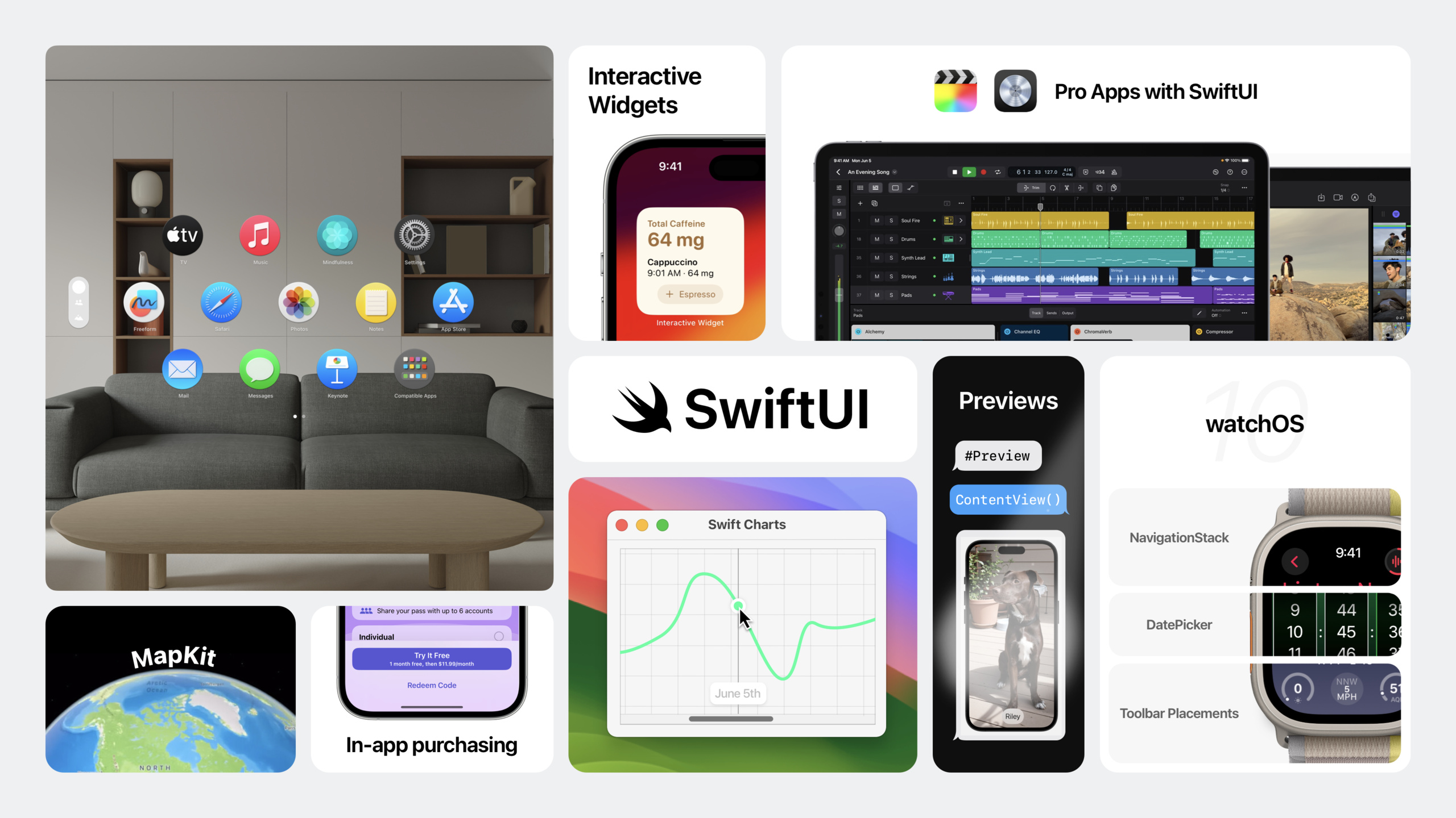
SwiftUI gained cross-platform capability expansion at WWDC23: new visionOS scene types (WindowGroup, Volume, ImmersiveSpace), @Observable macro instead of ObservableObject, SwiftData native integration, KeyframeAnimator and PhaseAnimator animation APIs, and ScrollView’s scrolling transition and alignment capabilities.
Core Content
SwiftUI enters the era of spatial computing
Previously, developing 3D interfaces required learning a whole new framework. After the release of visionOS, this threshold was broken.
(01:55) SwiftUI supports three scene types on visionOS.WindowGroupRendered as a 2D window, the control comes with depth-sensitive 3D effects.WindowGroupYou can use it as usualNavigationSplitView、TabViewetc. containers.
(02:26) declares the scene as.volumetricstyle, you get a Volume. Volume displays 3D content, such as board games or architectural models, in a limited space, side by side with other applications. useModel3DTo display a static model, useRealityViewDisplay dynamic models with lighting and interactivity.
(02:59)ImmersiveSpaceThe scene type defines the immersive space experience and supports two immersion styles: mixed and full. The mixed style overlays virtual content onto the real environment, while the full style allows the application to completely take over the user’s field of vision.
A new design for watchOS 10
(04:08) watchOS 10 features a full-screen color design.NavigationSplitViewandNavigationStackGet a new transition animation,TabViewAdded vertical paging style driven by Digital Crown.
(04:53)containerBackgroundModifier configures subtle background gradients for navigation and tab views, with animated transitions on push and pop.containerBackgroundAlso supportsTabView。
Widgets enter more scenes
(05:54) Widgets appear in more places: on the lock screen in iPadOS 17, in Standby mode on iPhone, on the desktop in macOS Sonoma. More importantly, widgets now support interactive controls.
(06:32)ToggleandButtonIn-app code can be triggered through App Intents, and widgets can be animated using SwiftUI’s transition and animation modifiers.
Data flow revolution: @Observable and SwiftData
(10:44)@ObservableMacros are the biggest upgrade to SwiftUI data flow. Add to class@Observable, no need to mark@Published, SwiftUI automatically tracks the read properties and only refreshes the view when the properties actually used change.
(13:16) SwiftData is a new data modeling and management framework. Bundle@ObservableReplace with@ModelMacro, the model gains persistence capabilities while retaining all the benefits of Observable. useQueryThe property wrapper gets data from the database, and the view automatically updates when the data changes.
Detailed Content
visionOS scene type
(01:55) on visionOSWindowGroupThe same way as on iOS:
@main
struct MyApp: App {
    var body: some Scene {
        WindowGroup {
            ContentView()
        }
    }
}
Key points:
WindowGroupRendered as a 2D flat window on visionOS- Controls within the window automatically get depth-sensitive 3D effects
- Containers such as
NavigationSplitView、TabViewCan be used directly
Volume needs to be setvolumetricstyle:
@main
struct MyApp: App {
    var body: some Scene {
        WindowGroup {
            ContentView()
        }
        .windowStyle(.volumetric)
    }
}
Key points:
.windowStyle(.volumetric)Turn window into 3D volume- use
Model3DLoad static USDZ model - use
RealityViewCreate dynamic 3D scenes with lighting, physics, and interactivity
How ImmersiveSpace is declared:
@main
struct MyApp: App {
    var body: some Scene {
        ImmersiveSpace(id: "space") {
            ImmersiveView()
        }
        .immersionStyle(selection: .constant(.mixed), in: .mixed, .full)
    }
}
Key points:
ImmersiveSpaceis an independent scene type -.immersionStyleSpecify supported immersion modes- mixed mode superimposes content onto the real environment
- full mode completely takes over the user’s field of view
@Observable macro
(10:44) used beforeObservableObjectEach attribute needs to be added@Published:
class DogModel: ObservableObject {
    @Published var dogs: [Dog] = []
    @Published var isFavorite: Bool = false
}
Now just one line:
@Observable class DogModel {
    var dogs: [Dog] = []
    var isFavorite: Bool = false
}
No property wrapper is required when used in a view:
struct DogCard: View {
    let model: DogModel

    var body: some View {
        VStack {
            Text(model.dogs.first?.name ?? "")
            Toggle("Favorite", isOn: $model.isFavorite)
        }
    }
}
Key points:
@ObservableMacros automatically expand to observable types- No need
@Published, all stored properties are observable by default - Read properties directly in the view, no need
@ObservedObject- SwiftUI only tracks the properties that are actually read, and unread property changes will not trigger a refresh. - No unnecessary updates will be triggered when passing intermediate views
SwiftData integration
(13:16) put@ObservableReplace with@Model, the model is persisted:
import SwiftData

@Model
class Dog {
    var name: String
    var breed: String
    var spottedDate: Date

    init(name: String, breed: String, spottedDate: Date = .now) {
        self.name = name
        self.breed = breed
        self.spottedDate = spottedDate
    }
}
Set up the model container in the App:
@main
struct DogWatcherApp: App {
    var body: some Scene {
        WindowGroup {
            ContentView()
        }
        .modelContainer(for: Dog.self)
    }
}
Query data in the view:
import SwiftData

struct DogList: View {
    @Query(sort: \Dog.spottedDate, order: .reverse) private var dogs: [Dog]

    var body: some View {
        List(dogs) { dog in
            Text(dog.name)
        }
    }
}
Key points:
@ModelMacros provide both Observable and persistence capabilities -.modelContainer(for:)Set up the storage stack at the scene level -@QueryAutomatically obtain data from the database and refresh the view when the data changes -sortParameters specify sorting rules- Supports advanced queries such as filtering and paging
Keyframe Animator animation
(19:07)KeyframeAnimatorSupports multi-attribute parallel animation:
struct LogoAnimation: View {
    @State private var trigger = false

    var body: some View {
        KeyframeAnimator(
            initialValue: AnimationValues(),
            trigger: trigger
        ) { values in
            Image("logo")
                .offset(y: values.verticalTranslation)
                .rotationEffect(values.rotation)
        } keyframes: { _ in
            KeyframeTrack(\.verticalTranslation) {
                SpringKeyframe(30, duration: 0.25, spring: .smooth)
                CubicKeyframe(-50, duration: 0.3)
                SpringKeyframe(0, spring: .bouncy)
            }
            KeyframeTrack(\.rotation) {
                LinearKeyframe(.degrees(0), duration: 0.25)
                CubicKeyframe(.degrees(360), duration: 0.55)
            }
        }
    }
}

struct AnimationValues {
    var verticalTranslation: CGFloat = 0
    var rotation: Angle = .zero
}
Key points:
initialValueContains all animatable properties -triggerIs an Equatable state, triggering animation when changing- The first closure builds the view with animated values
- The second closure defines the trajectory of each attribute over time
-
KeyframeTracksupportSpringKeyframe、CubicKeyframe、LinearKeyframe- Multiple tracks are executed in parallel
Phase Animator animation
(20:29)PhaseAnimatorExecute a series of animation stages in sequence:
struct WatchButton: View {
    @State private var sightingCount = 0

    var body: some View {
        Button {
            sightingCount += 1
        } label: {
            Image("dog-icon")
                .phaseAnimator(
                    [AnimationPhase.idle, .rotate, .grow, .settle],
                    trigger: sightingCount
                ) { content, phase in
                    content
                        .rotationEffect(phase.rotation)
                        .scaleEffect(phase.scale)
                } animation: { phase in
                    switch phase {
                    case .idle: .default
                    case .rotate: .spring(.snappy)
                    case .grow: .spring(duration: 0.3, bounce: 0.5)
                    case .settle: .spring(.bouncy)
                    }
                }
        }
    }
}

enum AnimationPhase: CaseIterable {
    case idle, rotate, grow, settle

    var rotation: Angle {
        switch self {
        case .idle: .zero
        case .rotate: .degrees(15)
        case .grow, .settle: .zero
        }
    }

    var scale: CGFloat {
        switch self {
        case .idle, .rotate: 1.0
        case .grow: 1.3
        case .settle: 1.0
        }
    }
}
Key points:
PhaseAnimatorExecute stages in sequence, starting the next stage only after the previous stage is completed -triggerExecute all phases from scratch on change- Different animation curves can be defined for each stage
- New spring animation support
durationandbounceparameters -.snappy、.bouncy、.smoothIs the default spring configuration
ScrollView improvements
(27:53)scrollTransitionAdd visual effects to scroll items:
ScrollView {
    LazyVStack {
        ForEach(dogs) { dog in
            DogCard(dog: dog)
                .scrollTransition { content, phase in
                    content
                        .opacity(phase.isIdentity ? 1 : 0.5)
                        .scaleEffect(phase.isIdentity ? 1 : 0.8)
                }
        }
    }
}
Key points:
scrollTransitionApply effects when items enter/leave the visible area -phaseInclude.topLeading、.identity、.bottomTrailingthree states- No need
GeometryReader
Pagination and alignment:
ScrollView(.horizontal) {
    LazyHStack {
        ForEach(parks) { park in
            ParkCard(park: park)
                .containerRelativeFrame(.horizontal, count: 3, span: 1, spacing: 16)
        }
    }
    .scrollTargetLayout()
}
.scrollTargetBehavior(.viewAligned)
Key points:
containerRelativeFrameMake subview size relative to container -countDivide the screen into several parts,spanSpecify how many shares to occupy -scrollTargetLayoutMark the layout that needs to be aligned -scrollTargetBehavior(.viewAligned)Align to view bounds when scrolling stops- also supports
.pagingBehavior
Tactile feedback
(22:03) newsensoryFeedbackModifier:
Button("Record Sighting") {
    sightingCount += 1
}
.sensoryFeedback(.success, trigger: sightingCount)
Key points:
.success、.warning、.errorWait for predefined feedback types -triggerPlay haptic feedback when changing- Supports all platforms with haptic feedback
SF Symbol animation effect
(24:55)symbolEffectModifiers add animation to SF Symbol:
Image(systemName: "slider.horizontal.3")
    .symbolEffect(.bounce, options: .repeat(1))
Key points:
.pulse、.variableColoris a continuous animation -.scale、.appear、.disappear、.replaceIs a state change animation -.bounceIt is an event notification animation- Can be applied to a single symbol or the entire view hierarchy
Core Takeaways
-
Make a visionOS 3D display application
- use
WindowGroup+.volumetricStyle showcase product 3D model - use
Model3DLoad the USDZ file, the user can use gestures to rotate and view - Entrance:
Model3D(named: "product")and.windowStyle(.volumetric)
- use
-
Add interactive widgets to existing applications
- Upgrade the existing Today Widget to an interactive version
- use
ToggleandButton+ App Intents allow users to operate directly on widgets - Entrance:
#Preview(as: .systemSmall)preview widget,AppIntentDefine operations
-
Reconstruct the data layer using @Observable
- put existing
ObservableObject+@PublishedThe model is replaced by@Observable- Delete large amounts@ObservedObjectand@EnvironmentObjectcode - Entrance: Put
class Model: ObservableObjectChange to@Observable class Model
- put existing
-
Make an onboarding process with animation
- use
PhaseAnimatorCreate step-by-step animations - Different symbol animations and view transitions are triggered when each step switches
- Entrance:
PhaseAnimator(phases, trigger: step)+symbolEffect
- use
-
Make a ScrollView driven gallery
- Horizontal scrolling display of images, each item takes up 80% of the screen width
- use
scrollTransitionMake edge items shrink and become transparent - use
scrollTargetBehavior(.viewAligned)Achieve card adsorption effect - Entrance:
containerRelativeFrame(.horizontal, count: 5, span: 4)
Related Sessions
- Discover Observation in SwiftUI — Deep understanding of how the @Observable macro works
- Build an app with SwiftData — Build an app from scratch with SwiftData
- Wind your way through advanced animations in SwiftUI — A complete guide to KeyframeAnimator and PhaseAnimator
- Beyond scroll views — ScrollView scroll transition, alignment and custom behavior
- Meet SwiftUI for spatial computing — 3D capabilities of SwiftUI on visionOS
Comments
GitHub Issues · utterances