
Highlight
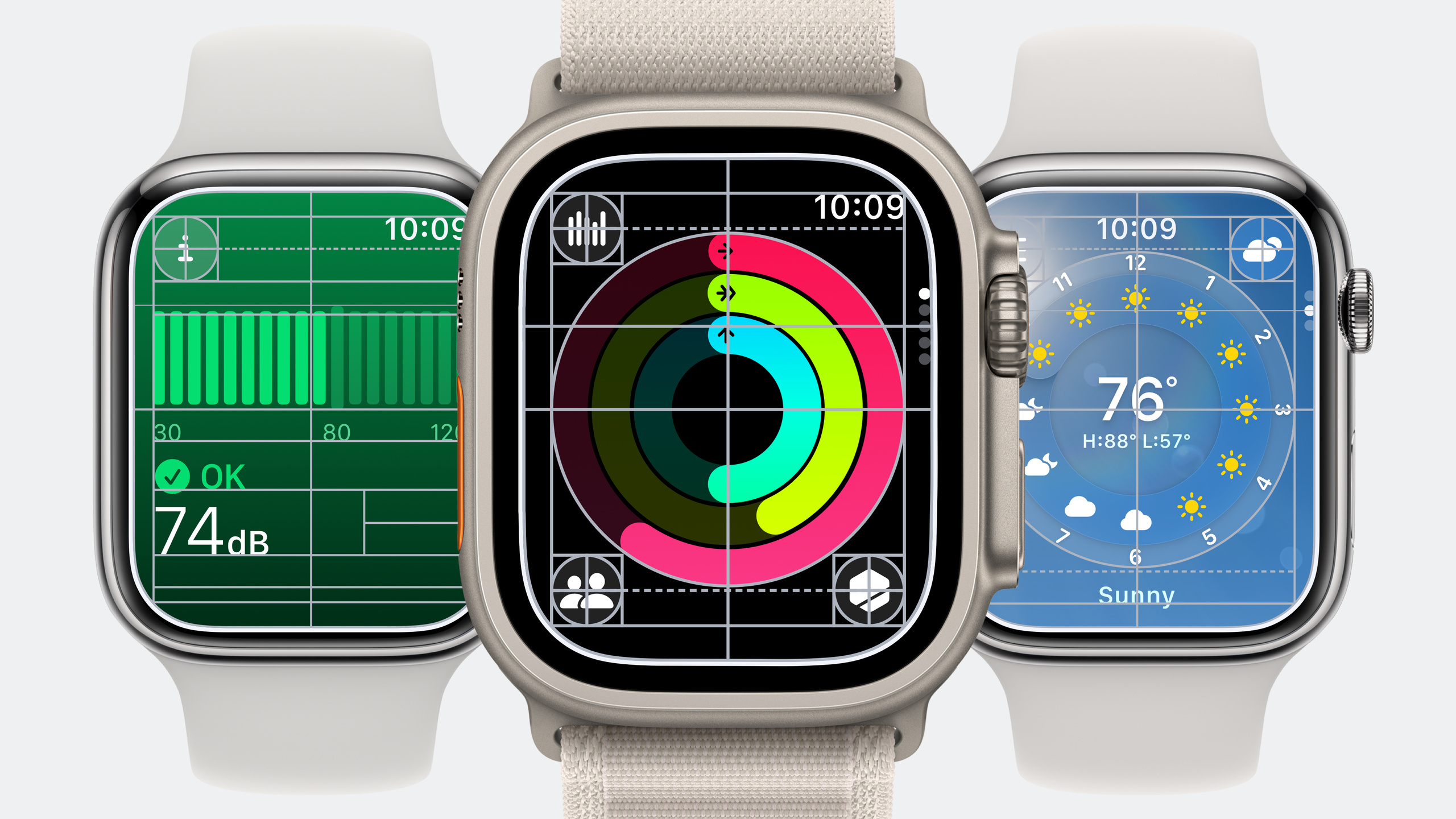
watchOS 10 redesigns the Apple Watch interface, with SwiftUI as the core, introducing two new navigation paradigms, NavigationSplitView and TabView vertical page turning, combined with full-screen background materials, vibrant filling and text labels, allowing applications to present the most focused information on the smallest screen.
Core Content
Ten second rule
Apple Watch users lift their wrist and that only gives you ten seconds. Open the Weather app to directly display the local weather for the day. Turn the Digital Crown to see the next few hours, and then turn to the next few days. News on the iPhone is a multi-tab, multi-level rich content. Only five headlines are displayed on the watch, which will be expanded inline after being clicked.
This design idea is called “Apple Watch Moment”: What information is most relevant the moment the user raises their wrist? Heart Rate first displays the current heart rate value, and then uses full-screen animation to display the trend. Activities break complex data into a single focused view. When designing a watch app, ask yourself: What would I show if I only had ten seconds?
Digital Crown Prioritized Navigation
When the Apple Watch was released in 2014, the Digital Crown was defined as a precision input device that didn’t obscure the screen. watchOS 10 takes this idea to the extreme: scrolling, paging, and precise adjustments are all anchored to the crown, with touch as backup.
Smart Stack is the embodiment of this idea. Turn the Digital Crown and the smartly sorted widgets appear one after another. When designing an application, first think about which information is most suitable for Smart Stack widgets, and then build the application architecture around these “now relevant” experiences.
Three navigation paradigms
NavigationSplitView hides the source list below the details view, making it accessible with one click. Weather Directly enter the weather details of the day, click the list icon to switch cities. Source lists don’t require titles, close buttons, or navigation controls, and use shorter navigation bars to display more contrasting data.
TabView adds a new vertical page turning style, and a single tab can be expanded to accommodate scrolling content. Each of the three exercise rings of Activity is a tab, and scrolling to the end is the exercise history list. Supports matchedGeometryEffect animation when tab switching, and the Activity ring scales from TabView to the upper left corner.
NavigationStack is reserved for deep levels such as Workout, Calendar, Music. The push animation is updated to highlight and move the selected item to express the navigation relationship more clearly.
Detailed Content
NavigationSplitView implementation
(05:56)
NavigationSplitView {
    List(cities, selection: $selectedCity) { city in
        Text(city.name)
    }
} detail: {
    WeatherDetailView(city: selectedCity)
}
Key points:
- API is consistent with other platforms, but on watchOS the source list is hidden below the details view
selectedCitymust be initialized to a default value, and the application will directly enter the details view when it is started.- The details view does not need a title, the information itself must be clear at a glance
- The source list does not require a close button, click the list icon or slide to switch
TabView vertical page turning and expansion
(07:53)
TabView {
    MoveRingView()
    ExerciseRingView()
    StandRingView()
    RecentWorkoutsList() // Automatically detects scrolling content and expands
}
.tabViewStyle(.verticalPage(transitionStyle: .blur))
.containerBackground(.green.gradient, for: .navigation)
Key points:
.verticalPageis a new tab view style added in watchOS 10.blurtransition creates a blurry switching effect between tabscontainerBackgroundAdd full screen gradient background to navigation container- TabView automatically detects scrolling content such as
Listand expands it to accommodate
Matched Geometry Effect driven animation
(09:12)
@Namespace private var animationNamespace
@State private var selectedTab = 0

TabView(selection: $selectedTab) {
    MoveRingView()
        .matchedGeometryEffect(id: "rings", in: animationNamespace)
}
.toolbar {
    ToolbarItem(placement: .topBarLeading) {
        ActivityRingsView()
            .matchedGeometryEffect(id: "rings", in: animationNamespace)
            .opacity(selectedTab == 0 ? 0 : 1)
    }
}
Key points:
matchedGeometryEffectconnects two views, and SwiftUI automatically handles position animation- When scrolling to Move tab, the ring scales from the toolbar to the position in the TabView
- Control the display/hide of the target view through
opacityto avoid repeated rendering - This animation anchors interactions to the Digital Crown while keeping key information visible at all times
Dial-based layout
(13:26)
struct DialBasedView: View {
    var body: some View {
        ZStack {
            Rectangle()
                .foregroundStyle(Color.clear)

            Circle()
                .foregroundStyle(Color.red)
                .scenePadding(.horizontal)
        }
        .edgesIgnoringSafeArea(.vertical)
    }
}
Key points:
scenePadding(.horizontal)Calculate correct margins based on dial layout gridedgesIgnoringSafeArea(.vertical)Let the view extend to the bottom safe area to center the dial- Transparent Rectangle allows ZStack to fill up the available width so that Circle can be positioned correctly
- Dial layout is suitable for dense information display, and control buttons can be added to the four corners
Toolbar new placement location
(13:30)
.toolbar {
    ToolbarItem(placement: .topBarTrailing) {
        Button(action: {}) {
            Image(systemName: "ellipsis")
        }
    }
    ToolbarItem(placement: .bottomBar) {
        Button(action: {}) {
            Image(systemName: "pause.fill")
        }
        .controlSize(.large)
    }
}
Key points:
.topBarTrailingPlace the button in the upper right corner and the time will automatically be centered..topBarLeadingPlace the upper left button.bottomBarPlace the bottom control buttons and SwiftUI automatically aligns them according to the layout grid.controlSize(.large)Make the buttons larger and more prominent, suitable for main operations
Full screen background material
(17:01)
.containerBackground(.green.gradient, for: .navigation)Key points:
containerBackgroundis a new modifier for watchOS 10- Supports
.ultraThinMaterial,.thinMaterial,.regularMaterial,.thickMaterial - Also supports color gradients, such as
.green.gradient - System pop-ups use full-screen thin material by default to provide hierarchical context
Vibrant foreground style
(16:22)
Text("Decibels")
    .foregroundStyle(.secondary)

Text("85 dB")
    .foregroundStyle(.primary)

Chart { ... }
    .foregroundStyle(.secondary) // Unfilled portion
Key points:
.primary,.secondary,.tertiary,.quaternaryprovide four levels of information hierarchy- These styles have a vibrancy effect, allowing the background color to show through
- System colors are also available in vibrant versions to ensure readability on full screen backgrounds
- List content and controls have been updated to display well on material backgrounds
Core Takeaways
-
Weather app available at the lift of your wrist
- What to build: Make a minimalist watch weather application, open it to directly display the weather at the current location, turn to the Digital Crown to view hour by hour, and then turn to view the next five days
- Why it’s worth doing: NavigationSplitView makes the city list accessible with one click, without the need for a return button, maximizing information density
- How to start: Built with
NavigationSplitView, the detail view uses Dial layout to display temperature and wind speed, and the source list usesList(selection:)
-
Sports Data Dashboard
- What to build: Use TabView to turn pages vertically to display three indicators: heart rate, steps, and calories. Each tab is distinguished by a full-screen gradient background.
- Why it’s worth doing:
matchedGeometryEffectallows key indicators to maintain visual continuity when switching tabs,.verticalPageallows navigation to be fully driven by Digital Crown - How to start: Define
@Namespace, place the samematchedGeometryEffectview in TabView and toolbar, and usecontainerBackgroundto set different gradients
-
Focus Timer
- What to build: Pomodoro application, the full-screen background color changes with the timing status - calming blue when focusing, soft green when resting, bright orange when finished
- Why it’s worth doing: watchOS 10’s full-screen background material and vibrant text make status changes clear at a glance, and you don’t need to look at the numbers to know the current stage.
- How to start: Use
containerBackgroundto set dynamic color,.primary/.secondaryto control text level, and Digital Crown to adjust timing length
-
Smart stacking widgets
- What to build: Design watchOS Smart Stack widgets for existing iOS apps to display the most relevant real-time data
- Why it’s worth doing: Smart Stack is the core entrance of watchOS 10. Users can see it by turning the Digital Crown, which is faster than opening the application.
- How to start: Refer to the “Design widgets for the Smart Stack” session and use WidgetKit to create
accessoryRectangularoraccessoryCircularstyle widgets
Related Sessions
- Meet watchOS 10 — Overview of all new features in watchOS 10
- Design widgets for the Smart Stack on Apple Watch — Detailed explanation of Smart Stack widget design
- Update your app for watchOS 10 — A complete guide to migrating existing apps to watchOS 10
Comments
GitHub Issues · utterances