
Highlight
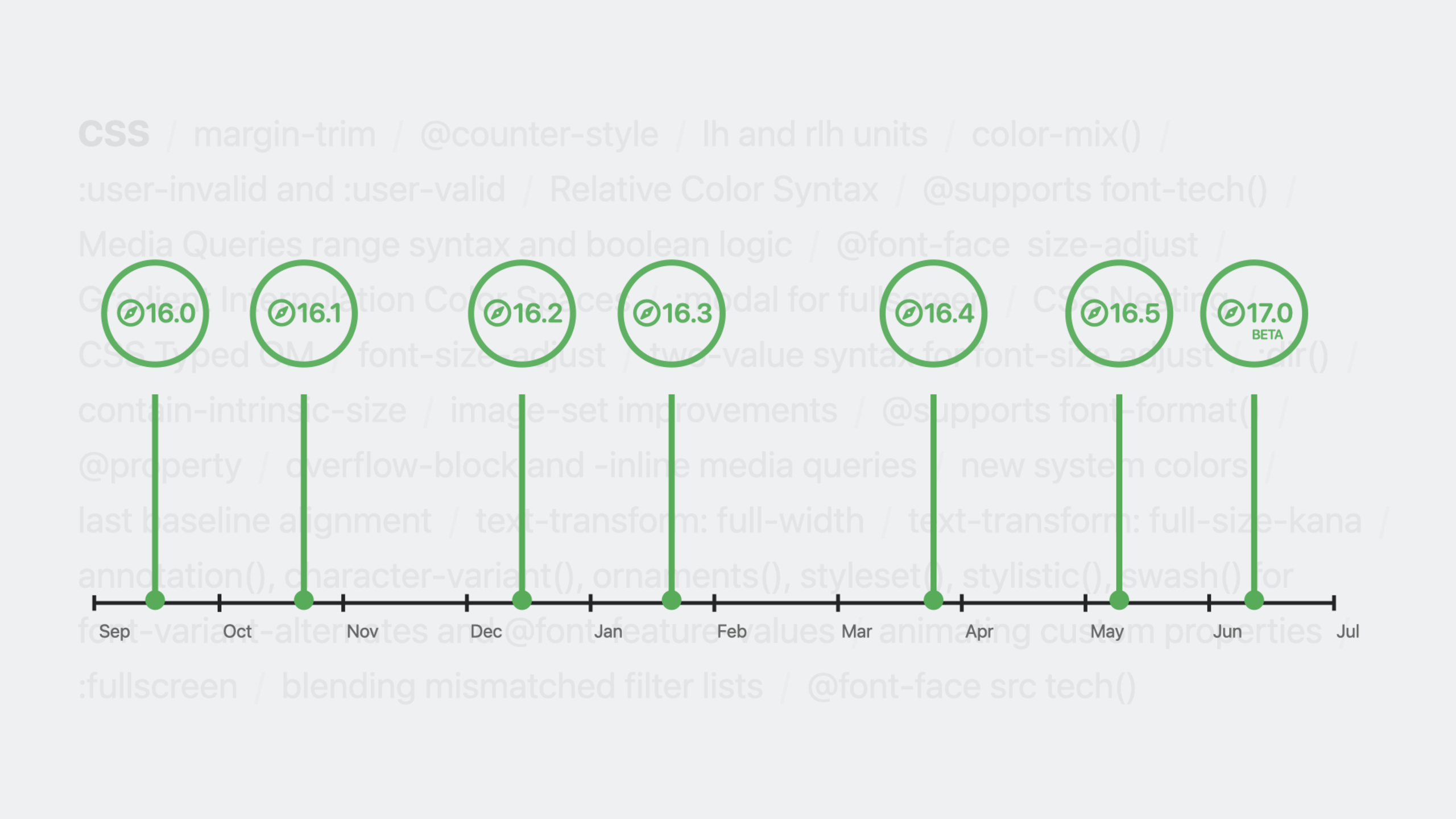
Safari adds Masonry layout preview, margin-trim, OKLCH/LCH/OKLAB/LAB color functions, color-mix(), relative color syntax, :user-valid/:user-invalid pseudo-classes, font-size-adjust, lh/rlh units, and @counter-style this year—making layouts simpler, colors richer, forms friendlier, and typography more precise.
Core Content
Layout: Masonry and margin-trim
Masonry layouts are common on the web, especially for content cards of varying height. Previously you either used CSS Multicolumn (content flows vertically down columns) or a JavaScript library. Multicolumn orders content vertically, which rarely matches design intent; JavaScript solutions are slower and more fragile than CSS.
Safari Technology Preview previews Masonry Layout as an extension of CSS Grid. A single line—grid-template-rows: masonry—packs items tightly in the row direction while keeping column definitions.
(01:15)
Unlike JavaScript libraries, combining Masonry with Grid lets you use Masonry in one dimension and Grid’s full power in the other: fr units, minmax(), fixed-width columns, and more.
margin-trim solves another common pain point. Child elements inside a container often have vertical margins that stack with the container’s padding, making top and bottom spacing larger than expected. The old fix was manually removing the first child’s top margin and the last child’s bottom margin—fragile when content changes.
margin-trim: block trims margins that touch the container edge. Safari 16.4 supports it; use margin-trim: inline for horizontal trimming.
(03:58)
Color: Beyond sRGB
The sRGB gamut represents only part of human-visible color. Display P3 shows 50% more colors; Apple has supported P3 in hardware and software since the 2015 iMac.
CSS adds four color functions to go beyond sRGB:
- LCH and OKLCH: based on Lightness, Chroma, Hue
- LAB and OKLAB: based on Lightness, green-red axis (A), blue-yellow axis (B)
These models are perceptually uniform and can represent any gamut, including Display P3 and future gamuts. Safari 15.0/15.4 supports them; Chrome, Edge, and Firefox joined Interop 2023 this year.
(06:51)
Relative Color Syntax derives new colors from existing ones:
/* 70% opacity version of blue */
rgb(from blue r g b / 0.7)

/* Half the lightness of a LAB color */
lab(from var(--brand-color) calc(l / 2) a b)

/* One-third the chroma of an OKLCH color */
oklch(from var(--accent) l calc(c / 3) h)
The color-mix() function blends two colors in a specified color space, default 50/50 or custom ratios:
color-mix(in oklab, white, blue)
color-mix(in oklch, white 30%, blue 30%) /* result has 60% opacity */
Gradients and color animations can specify color spaces too. The same white-to-blue gradient looks purple-ish in sRGB, bluer in OKLAB, and passes through yellow-green-cyan in OKLCH. The choice depends on the design effect.
(10:23)
Pseudo-classes: Smarter Form Validation
:valid and :invalid have a long-standing problem: empty fields are invalid on page load, showing errors before the user types.
:user-valid and :user-invalid use smarter algorithms for when to show validation state. Errors appear after the user leaves a field, not while they are still typing. Supported since Safari 16.5.
(16:55)
:has() also improved this year, supporting more pseudo-class combinations: :has(:lang()) styles based on whether specific languages appear on the page; :has() supports media pseudo-classes for conditional styling based on audio/video playback state.
The :dir() pseudo-class fills a gap in language direction support. Combined with logical properties (such as margin-inline-start), you can write CSS that works for both LTR and RTL.
(18:14)
Typography: Precise Font Control
lh and rlh units: 1lh equals the current element’s line height; 1rlh equals the root element’s line height. Spacing in layouts can stay in integer multiples of line height for vertical rhythm.
(20:18)
font-size-adjust: At the same font-size, different fonts can look very different in visual size. font-size-adjust adjusts visual size based on x-height ratio so fallback fonts in a stack look consistent.
Safari 16.4 supports basic usage (font-size-adjust: 0.47); Safari 17 adds the from-font value (auto-calculated) and two-value syntax (choose cap-height, ch-width, ic-width, or ic-height as the adjustment basis).
(22:25)
text-box-trim (preview): trims extra space fonts reserve in the text box, fixing imprecise vertical centering. Still evolving—the property was renamed from leading-trim to text-box-trim and details may change.
(26:42)
@counter-style: custom counter styles. Define any counting system—Serbo-Croatian letters, binary, cycling emoji, and more. W3C provides hundreds of ready-made counter styles to copy.
(28:53)
Detailed Content
Combining Masonry Layout with Grid
/* Basic masonry: auto-fill columns */
main {
  display: grid;
  grid-template-columns: repeat(auto-fill, minmax(14rem, 1fr));
  grid-template-rows: masonry;
  gap: 1rem;
}

/* Columns of different widths */
main {
  display: grid;
  grid-template-columns: 1fr 2fr 3fr;
  grid-template-rows: masonry;
  gap: 1rem;
}

/* Fixed + flexible + minmax combination */
main {
  display: grid;
  grid-template-columns: 10rem 1fr minmax(100px, 300px);
  grid-template-rows: masonry;
  gap: 1rem;
}
Key points:
grid-template-rows: masonryenables masonry mode (row-direction packing)grid-template-columnsdefines columns with full Grid capabilities- Items pack in row direction, each placed in the column that minimizes overall height
- Currently available only in Safari Technology Preview
- Part of the CSS Grid spec, not a separate layout mechanism
margin-trim Fixes Edge Margin Collapse
/* Old approach: manually remove edge margins */
.card > :first-child { margin-top: 0; }
.card > :last-child { margin-bottom: 0; }

/* New approach: one line auto-trims */
.card {
  background-color: #fcf5e7;
  padding: 2rlh;
  margin-trim: block;
}

.card h2, .card p {
  margin: 1rlh 0;
}
Key points:
margin-trim: blocktrims vertical (block-axis) margins touching the container edgemargin-trim: inlinetrims horizontal (inline-axis) margins- No need to know first/last child element types
- Adapts automatically when content changes
- Supported since Safari 16.4
Wide-Gamut Color Definitions
/* sRGB colors (traditional) */
.brand-red {
  color: #ff0000;
  color: rgb(255, 0, 0);
  color: hsl(0, 100%, 50%);
}

/* Display P3 colors */
.brand-red-p3 {
  color: color(display-p3 1 0 0);
}

/* OKLCH: perceptually uniform color model */
.brand-red-oklch {
  color: oklch(62.8% 0.257 29.2);
}

/* Conditionally apply P3 colors */
@media (color-gamut: p3) {
  .brand-red {
    color: color(display-p3 1 0 0);
  }
}
Key points:
color(display-p3 1 0 0)defines pure red, richer than sRGB red on P3 displaysoklch(62.8% 0.257 29.2)defines color with a perceptually uniform model@media (color-gamut: p3)detects P3 gamut support- Progressive enhancement: sRGB devices see standard colors, P3 devices see richer colors
Relative Color Syntax
:root {
  --brand-blue: oklch(50% 0.2 250);
}

/* Variants from brand color */
.brand-blue-light {
  color: oklch(from var(--brand-blue) calc(l + 20%) c h);
}

.brand-blue-dark {
  color: oklch(from var(--brand-blue) calc(l - 15%) c h);
}

.brand-blue-transparent {
  color: oklch(from var(--brand-blue) l c h / 0.5);
}

/* Mix current text color */
a:hover {
  color: color-mix(in oklab, currentColor 60%, white);
}
Key points:
from var(--brand-blue)specifies the base colorcalc(l + 20%)adjusts lightness for a lighter variantcandhunchanged inherit chroma and hue from the original/ 0.5sets opacitycolor-mix(in oklab, currentColor 60%, white)blends current text color with white
Gradient Color Space Comparison
/* sRGB gradient: purple-ish transition */
.gradient-srgb {
  background: linear-gradient(in srgb, white, blue);
}

/* OKLAB gradient: more natural blue transition */
.gradient-oklab {
  background: linear-gradient(in oklab, white, blue);
}

/* OKLCH gradient: passes through yellow-green-cyan */
.gradient-oklch {
  background: linear-gradient(in oklch, white, blue);
}

/* LCH gradient: similar to OKLCH but slightly different */
.gradient-lch {
  background: linear-gradient(in lch, white, blue);
}
Key points:
in srgbexplicitly computes the gradient in sRGB color spacein oklabcomputes in OKLAB space for more natural transitions- Different color spaces produce different intermediate colors—no absolute right or wrong
- Choice depends on design needs and expected visual effect
Form Validation Pseudo-classes
/* Old approach: :invalid shows errors on page load */
.form-group:has(input:invalid) label::before {
  content: "✗ ";
  color: red;
}

/* New approach: :user-invalid shows errors only after interaction */
.form-group:has(input:user-invalid) label::before {
  content: "✗ ";
  color: red;
}

.form-group:has(input:user-valid) label::before {
  content: "✓ ";
  color: green;
}

/* Complete form styling with :has() */
input:user-invalid {
  border-color: #dc2626;
  background-color: #fef2f2;
}

input:user-valid {
  border-color: #16a34a;
  background-color: #f0fdf4;
}
Key points:
:user-invalidtriggers after the user leaves a field with invalid content:user-validtriggers after correct input- No errors on page load or while the user is still typing
- Combine with
:has()to style parent elements containing invalid inputs - Supported since Safari 16.5
font-size-adjust for Uniform Visual Size
/* Basic usage: specify x-height ratio */
article {
  font-family: "Iowan Old Style", Georgia, serif;
  font-size-adjust: 0.47;
}

article code {
  font-family: "SF Mono", Courier, monospace;
  /* Browser auto-adjusts so x-height matches 0.47 */
}

/* Safari 17: from-font auto-calculates */
article {
  font-size-adjust: from-font;
}

/* Safari 17: two-value syntax using cap-height */
article {
  font-size-adjust: cap-height from-font;
}
Key points:
font-size-adjust: 0.47makes all fonts’ x-height equal 47% of the specified font-sizefrom-fontlets the browser auto-calculate the primary font’s ratio- Two-value syntax can choose
ex-height(default),cap-height,ch-width,ic-width, oric-height - Fixes inconsistent visual size among fallback fonts in a stack
- Safari 16.4 supports basic usage; Safari 17 supports advanced usage
@counter-style Custom Counters
/* Serbo-Croatian alphabetic counter */
@counter-style serbo-croatian {
  system: alphabetic;
  symbols: "A" "B" "V" "G" "D" "Đ" "E" "Ž" "Z" "I" "J" "K" "L" "Lj" "M" "N" "Nj" "O" "P" "R" "S" "T" "Ć" "U" "F" "H" "C" "Č" "Dž" "Š";
}

ol.serbian {
  list-style: serbo-croatian;
}

/* Binary counter */
@counter-style binary {
  system: numeric;
  symbols: "0" "1";
  pad: 4 "0";
}

ol.binary {
  list-style: binary;
}

/* Cycling emoji */
@counter-style emoji-cycle {
  system: cyclic;
  symbols: "🐶" "🐱" "🐰";
}

ol.pets {
  list-style: emoji-cycle;
}

/* For heading numbering */
@counter-style section-number {
  system: numeric;
  symbols: "0" "1" "2" "3" "4" "5" "6" "7" "8" "9" "10";
}

h2 {
  counter-increment: section;
}
h2::before {
  content: counter(section, section-number) ". ";
}
Key points:
@counter-styledefines custom counter stylessystemspecifies counter type:alphabetic,numeric,cyclic, etc.symbolslists symbols used for countingpadsets minimum digits and pad character- Usable in
list-styleand thecounter()function - W3C provides hundreds of ready-made counter styles
Core Takeaways
1. Replace manual edge margin cleanup with margin-trim
- What to do: Use
margin-trim: blockin cards, article containers, and similar components to auto-trim edge margins - Why it matters: Eliminates maintenance of manual
:first-child/:last-childrules; adapts when content changes - How to start: Find all CSS that manually cleans edge margins and replace with
margin-trim: blockormargin-trim: inline
2. Build design system palettes with OKLCH
- What to do: Migrate design system colors from HEX/HSL to OKLCH; generate variants with Relative Color Syntax
- Why it matters: OKLCH is perceptually uniform—lightness adjustments (
calc(l + 20%)) produce consistent visual changes across hues; dark mode adaptation is more natural - How to start: Define base OKLCH colors, generate light/dark/transparent variants with
oklch(from ...), use@media (color-gamut: p3)for richer colors on supported devices
3. Improve forms with :user-invalid
- What to do: Migrate form validation styling from
:invalidto:user-invalid - Why it matters: Users do not see errors before they start typing—errors show only after leaving a field with invalid content
- How to start: Search globally for
:invalidand replace with:user-invalidin form contexts; style parents with:has(input:user-invalid)
4. Unify code block visual size with font-size-adjust
- What to do: Add
font-size-adjustto areas containing monospace fonts so code matches body text visually - Why it matters: Monospace fonts often look smaller than body text, making code appear “indented”
- How to start: Add
font-size-adjust: from-font(Safari 17) oncode,pre, or parent elements containing code, or manually calculate a suitable ratio
5. Localize list numbering with @counter-style
- What to do: Define counter styles for content in different languages
- Why it matters: Default Western Arabic numerals are not appropriate for all languages; custom counters match local conventions
- How to start: Copy needed styles from W3C Ready-made Counter Styles, add with
@counter-style, apply to lists in the corresponding language
Related Sessions
- What’s new in Web Inspector — New debugging features in Safari Web Inspector
- Rediscover Safari developer features — Comprehensive update to Safari developer features
- What’s new in web apps — New Web App capabilities on macOS and iOS
- What’s new in Safari extensions — New Safari extension APIs and capabilities
- Explore media formats for the web — New image formats and video technologies in Safari and WebKit
Comments
GitHub Issues · utterances