
Highlight
iPad and iPhone apps run on visionOS by default, but adding hover effects, tuning custom controls, and reviewing camera assumptions makes them feel native in the Shared Space.
Core Content
You spent years polishing your iPad app. Card layouts, custom players, refined button styles—everything works great on iPad. Now users will open your app in the Shared Space on visionOS, interacting with look and finger tap. Your existing touch logic won’t automatically translate into a spatial interaction experience.
visionOS introduces entirely new natural input. Users look at a button, then tap with a finger to interact. System controls (Button, Slider, etc.) automatically get hover effects that highlight on gaze. But if your interface uses custom VStack + onTapGesture combinations or custom-shaped buttons, you need to add these interaction feedback cues manually.
Another easily overlooked issue is media handling. visionOS has multiple cameras, but most aren’t available to apps. Querying front and back cameras directly gives different results than on iPhone. Apps must use discovery sessions to detect available hardware.
This session systematically covers adaptation points from interaction and visuals to media, helping developers turn iPad apps that “just run” into visionOS apps that “feel right.”
Interaction adaptation: hover effect
On visionOS, hover effect is the core mechanism for interaction feedback. When users look at an interactive element, the system highlights it to confirm focus.
System controls handle hover effects automatically. If you only use standard controls, no changes are needed here. Custom controls need explicit addition.
(02:26) The presenter shows a card app. Each card is a VStack containing an image, title, time, and menu button. The menu button is a system Button with automatic hover effect. But the entire card uses .onTapGesture for tapping with no hover effect. When users look at the card, they can’t tell it’s tappable.
(03:02) The solution is adding the .hoverEffect() modifier to the VStack. The entire card then gets highlight feedback on gaze.
Hover effects for custom shapes
Many custom video players expand the tap area so users don’t need to precisely tap small buttons. On iPad, the skip button’s actual tap area may be much larger than the icon.
(03:49) On visionOS, the hover effect covers the entire tap area, exposing a huge highlight block that looks visually jarring.
(04:09) The fix is using .contentShape(.hoverEffect, shape) to limit the hover effect to a smaller region while keeping the larger tap area. Users see a highlight matching the button icon, but the tap range stays generous.
Custom ButtonStyle and hover effect
When using .buttonStyle for custom button styles, hover effect is disabled. You need to add it back manually.
(05:14) The presenter shows a custom button with a rainbow stripe background. In the custom ButtonStyle implementation, append .hoverEffect() to the returned view chain.
Media handling considerations
visionOS camera configuration differs from iPhone. Apps cannot assume both front and back cameras are available.
(09:48) When querying microphones, the system returns a .front position microphone. When querying cameras, there are two results: the .back camera returns a black screen (with a no-camera icon)—a non-functional placeholder camera for compatibility with apps that assume a rear camera exists; the .front camera is a composite camera that won’t return frames unless a spatial persona is set.
(10:42) AVRoutePickerView and Picture in Picture are unavailable on visionOS. Custom players need to check availability of both controls before deciding whether to display them.
(10:55) The device locks when removed. Apps using background audio should note that after locking, background mode is no longer granted and the app is fully suspended.
Detailed Content
Adding hover effect to VStack cards
struct TappableCard: View {
   var imageName = "BearsInWater"
   var headline = "Bear Fishing"
   var timeAgo = "42 Minutes ago"

   var body: some View {
      VStack {
         VStack(alignment: .leading) {
            Image(imageName)
               .resizable()
               .clipped()
               .aspectRatio(contentMode: .fill)
               .frame(width: 300, height: 250, alignment: .center)
            Text(headline)
               .padding([.leading])
               .font(.title2)
               .foregroundColor(.black)
         }
         Divider()
         HStack {
            HStack {
               Text(timeAgo)
                  .frame(alignment: .leading)
                  .foregroundColor(.black)
            }
            .padding([.leading])
            Spacer()
            VStack(alignment: .trailing) {
               Button { print("Present menu options") } label: {
                  Image(systemName: "ellipsis")
                     .foregroundColor(.black)
               }
            }
         }
         .padding(EdgeInsets(top: 5, leading: 5, bottom: 5, trailing: 5))
      }
      .frame(width: 300, height: 350, alignment: .top)
      .hoverEffect()  // Give the entire card hover feedback
      .background(.white)
      .overlay(
         RoundedRectangle(cornerRadius: 10)
            .stroke(Color(.sRGB, red: 150/255, green: 150/255, blue: 150/255, opacity: 0.1), lineWidth: 3.0)
      )
      .cornerRadius(10)
      .onTapGesture {
         print("Present card detail")
      }
   }
}
Key points:
.hoverEffect()on the VStack highlights the entire card on gaze- System Button (menu button) has automatic hover effect; no extra handling needed
.onTapGesturestays on the VStack; tap behavior unchanged
Custom hover effect regions
struct ContentView: View {
   var body: some View {
      VStack {
         HStack {
            Button { print("Going back 10 seconds") } label: {
               Image(systemName: "gobackward.10")
                  .padding(.trailing)
                  .contentShape(.hoverEffect, CustomizedRectShape(
                     customRect: CGRect(x: -75, y: -40, width: 100, height: 100)
                  ))
                  .foregroundStyle(.white)
                  .frame(width: 500, height: 834, alignment: .trailing)
            }
            Button { print("Play") } label: {
               Image(systemName: "play.fill")
                  .font(.title)
                  .foregroundStyle(.white)
                  .frame(width: 100, height: 100, alignment: .center)
            }
            .padding()
            Button { print("Going into the future 10 seconds") } label: {
               Image(systemName: "goforward.10")
                  .padding(.leading)
                  .contentShape(.hoverEffect, CustomizedRectShape(
                     customRect: CGRect(x: 0, y: -40, width: 100, height: 100)
                  ))
                  .foregroundStyle(.white)
                  .frame(width: 500, height: 834, alignment: .leading)
            }
         }
         .frame(minWidth: 0, maxWidth: .infinity, minHeight: 0, maxHeight: .infinity, alignment: .center)
      }
      .frame(minWidth: 0, maxWidth: .infinity, minHeight: 0, maxHeight: .infinity, alignment: .topLeading)
      .background(.black)
   }
}

struct CustomizedRectShape: Shape {
   var customRect: CGRect

   func path(in rect: CGRect) -> Path {
      var path = Path()
      path.move(to: CGPoint(x: customRect.minX, y: customRect.minY))
      path.addLine(to: CGPoint(x: customRect.maxX, y: customRect.minY))
      path.addLine(to: CGPoint(x: customRect.maxX, y: customRect.maxY))
      path.addLine(to: CGPoint(x: customRect.minX, y: customRect.maxY))
      path.addLine(to: CGPoint(x: customRect.minX, y: customRect.minY))
      return path
   }
}
Key points:
.contentShape(.hoverEffect, shape)limits hover effect to a custom shape- Button
frameremains large, preserving generous tap area CustomizedRectShapedefines the visible boundary of the hover effect
Re-enabling hover effect with custom ButtonStyle
struct ContentView: View {
    var body: some View {
        VStack {
         Button("Howdy y'all") { print("🤠") }
            .buttonStyle(SixColorButton())
        }
        .padding()
    }
}

struct SixColorButton: ButtonStyle {
   func makeBody(configuration: Configuration) -> some View {
      configuration.label
         .padding()
         .font(.title)
         .foregroundStyle(.white)
         .bold()
         .background {
            ZStack {
               Color.black
               HStack(spacing: 0) {
                  Rectangle()
                     .foregroundStyle(Color(red: 125/255, green: 186/255, blue: 66/255))
                     .frame(width: 16)
                  Rectangle()
                     .foregroundStyle(Color(red: 240/255, green: 187/255, blue: 64/255))
                     .frame(width: 16)
                  Rectangle()
                     .foregroundStyle(Color(red: 225/255, green: 137/255, blue: 50/255))
                     .frame(width: 16)
                  Rectangle()
                     .foregroundStyle(Color(red: 200/255, green: 73/255, blue: 65/255))
                     .frame(width: 16)
                  Rectangle()
                     .foregroundStyle(Color(red: 134/255, green: 64/255, blue: 151/255))
                     .frame(width: 16)
                  Rectangle()
                     .foregroundStyle(Color(red: 75/255, green: 154/255, blue: 218/255))
                     .frame(width: 16, height: 500)
               }
               .opacity(0.7)
               .rotationEffect(.degrees(35))
            }
         }
         .cornerRadius(10)
         .hoverEffect()  // Manually add after custom style
   }
}
Key points:
- Custom
ButtonStyledisables the system default hover effect - Add
.hoverEffect()at the end of the view chain returned bymakeBodyto restore feedback
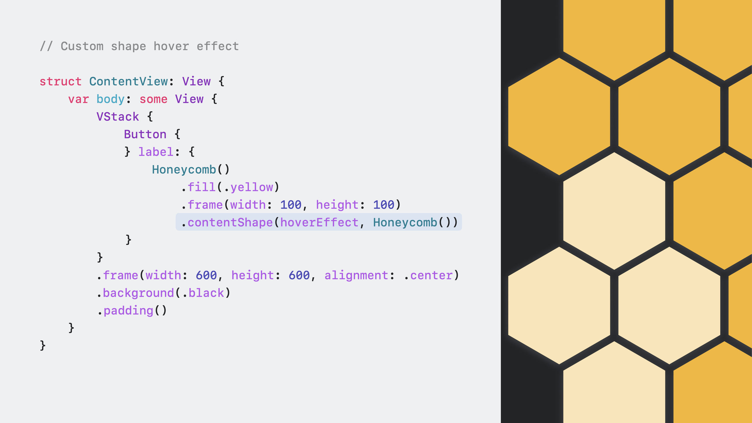
Hover effect for custom shape buttons
struct ContentView: View {
    var body: some View {
      VStack {
         Button { print("🐝") } label: {
            HoneyComb()
               .fill(.yellow)
               .frame(width: 300, height: 300)
               .contentShape(.hoverEffect, HoneyComb())
            }
         }
         .frame(width: 400, height: 400, alignment: .center)
         .background(.black)
         .padding()
      }
    }
}

struct HoneyComb: Shape {
   func path(in rect: CGRect) -> Path {
      var path = Path()
      path.move(to: CGPoint(x: rect.minX + (rect.width * 0.25), y: rect.minY))
      path.addLine(to: CGPoint(x: rect.maxX - (rect.maxX * 0.25), y: rect.minY))
      path.addLine(to: CGPoint(x: rect.maxX, y: rect.midY))
      path.addLine(to: CGPoint(x: rect.maxX - (rect.maxX * 0.25), y: rect.maxY))
      path.addLine(to: CGPoint(x: rect.minX + (rect.width * 0.25), y: rect.maxY))
      path.addLine(to: CGPoint(x: rect.minX, y: rect.midY))
      path.addLine(to: CGPoint(x: rect.minX + (rect.width * 0.25), y: rect.minY))
      return path
   }
}
Key points:
.contentShape(.hoverEffect, HoneyComb())makes hover effect follow the hexagon boundary- Without this modifier, hover effect covers the entire frame rectangle
- The custom Shape’s
path(in:)method defines the hover effect clipping boundary
Core Takeaways
1. Add hover effects to all custom interactive elements
If your app uses custom views with onTapGesture, DragGesture, or other gesture modifiers, check whether .hoverEffect() is added. Spatial interaction without visual feedback confuses users. Entry point: add .hoverEffect() to the root container of custom views.
2. Optimize hardware detection for media-related features
If your app involves photo capture, video recording, scanning, or audio recording, replace hardcoded camera/microphone queries with AVCaptureDevice.DiscoverySession. visionOS camera configuration is completely different from iPhone; assuming front and back cameras are available causes broken functionality. Entry point: enumerate available devices with a discovery session and provide alternatives when no device is available (document picker, iCloud).
3. Add controller support for games
visionOS look-and-tap interaction suits slow-paced operations, but games often need fast, concurrent input. Add GCSupportsControllerUserInteraction to Info.plist and enable the Game Controller capability. This displays a controller support badge on the App Store product page, helping players discover your game. Entry point: GameController framework + Info.plist configuration.
4. Review background audio assumptions
visionOS devices lock when removed; background audio mode no longer works. If your app depends on background playback (music player, podcast app), reconsider the user experience. Entry point: save playback state when entering background and restore when returning to foreground.
Related Sessions
- Build great games for spatial computing — Learn about input options for visionOS game development, including controllers, gestures, and look-and-tap
- Explore rendering for spatial computing — Deep dive into RealityKit rendering, lighting, and shadows to blend 3D content into the real environment
- Meet RealityKit Trace — Analyze and optimize spatial computing app performance with the RealityKit Trace template in Instruments
Comments
GitHub Issues · utterances