
Highlight
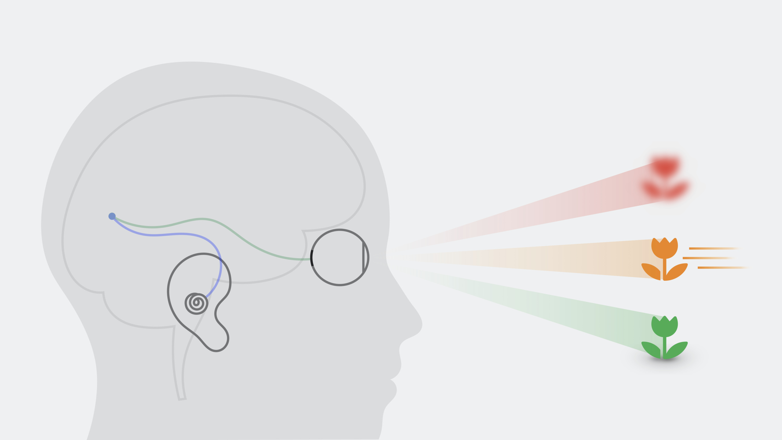
Based on the science of the human visual system and vestibular system, Apple’s Vision Science team provides visionOS developers with design guidelines for visual comfort and motion comfort. The core requirements are: consistent depth cues, reduced eye strain, and avoiding motion sickness caused by sensory conflict.
Core Content
Why depth cues go wrong
The brain perceives depth through multiple sensory systems. When depth cues in content are missing, conflicting, or misleading, the eyes cannot converge correctly, leading to double vision or eye strain (01:44).
Common problem scenarios:
- Sparse scenes: A single lemon floating in empty space gives the brain no basis for judging depth
- Conflicting cues: A large object appears in front but a smaller object occludes it—relative size and occlusion contradict each other
- Repeating textures: The left and right eyes lock onto different elements of a repeating pattern, producing incorrect depth perception
Fixing depth cues
Give the brain correct depth information (02:32):
- Use familiar size cues (a green lemon slice suggests a lime; the brain infers depth from known sizes)
- Add blur to indicate distance
- Use relative size (larger appears closer)
- Include background, lighting, occlusion, and texture density
- Avoid large areas of repeating texture, or break them into smaller pieces
Content parameters: distance, size, contrast
Content that requires prolonged viewing (such as reading) should be placed beyond arm’s reach (06:13). Allow users to adjust content depth so they can choose the most comfortable position.
Reserve the nearest space for brief interactions or direct hand interaction. In other cases, use transparency or blur to guide visual attention farther away.
Use high contrast for reading text; use low contrast or transparency for background elements. Text size and window dimensions should let users read comfortably without turning their head.
Eye strain
Looking down and side to side is most comfortable; looking up and diagonally is most tiring (08:15). Place long-reading content slightly below center in the field of view. If the eyes must look at extreme angles, design for brief interactions, or move content to the center of the field of view.
Design natural rest points in the experience so users can pause and rest their eyes.
Motion comfort
The vestibular system (inner ear) perceives body motion; the visual system perceives external motion. When the two are inconsistent, motion sickness occurs (09:36).
Virtual object motion: When large objects move, the brain may mistakenly think it is moving. Making moving objects semi-transparent so passthrough content remains visible can alleviate this (10:47).
Head-locked content: Avoid content that follows head movement whenever possible. If you must do this, use a small window placed far away at the center of gaze. A better approach is world-locked views or lazy-follow animation (11:18).
Motion within windows: Keep content’s horizon aligned with the real-world horizon. When moving the camera, make focus-of-expansion motion slow and predictable, and keep it within the field of view. Avoid fast turns or pure rotational motion (12:27).
Oscillating motion: Avoid sustained oscillation whenever possible, especially at around 0.2 Hz (once every 5 seconds). If unavoidable, reduce amplitude and make content semi-transparent. Provide alternatives through the Reduce Motion accessibility feature (13:46).
Detailed Content
Brightness adaptation
When most of the field of view is dark, slow the transition when switching to a bright scene to give the eyes time to adapt to brightness (07:43).
Manual rendering of stereoscopic content
If you choose to manually render stereoscopic video, ensure disparity is exactly correct for each eye. Incorrect disparity causes severe visual conflict and extreme discomfort (05:34).
Motion comfort alternatives
Alternative to fast rotation: instantly change direction during a quick fade-out (13:11).
Alternative to large objects sweeping past at close range: keep objects small and farther away; use low-brightness-contrast textures to make motion less noticeable (13:27).
Core Takeaways
-
What to do: Develop a 3D art gallery app that lets users browse paintings in space.
-
Why it matters: Paintings can be placed beyond arm’s reach for comfortable viewing. Natural rest points between paintings give users breaks.
-
How to start: Place paintings at world-locked positions, keep them aligned with the real environment’s horizon, and avoid paintings following head movement.
-
What to do: Build a meditation/relaxation app using slowly moving natural scenes for atmosphere.
-
Why it matters: Slow natural scene motion follows motion comfort principles; transparency effects keep passthrough content visible.
-
How to start: Use semi-transparent particle effects with slow, predictable motion, and provide Reduce Motion alternatives.
-
What to do: Design a spatial reading app that supports adjusting text depth and size.
-
Why it matters: Long reading sessions need comfortable distance; letting users customize depth reduces eye strain.
-
How to start: Place text beyond arm’s reach by default, provide gestures to adjust depth, and use high contrast for readability.
-
What to do: Develop an education app that displays molecular structures with 3D models.
-
Why it matters: Molecular models need correct depth cues (occlusion, lighting, relative size) for comfortable viewing.
-
How to start: Ensure all depth cues are consistent, avoid repeating textures, keep model rotation slow, and provide a pause button as a natural rest point.
Related Sessions
- Design for spatial user interfaces — visionOS UI fundamentals: glass material, typography, and components
- Build spatial experiences with RealityKit — Build 3D spatial experiences with RealityKit
- Principles of spatial design — Overview of spatial design principles
- Go beyond the window with SwiftUI — SwiftUI immersive spaces and scene types
Comments
GitHub Issues · utterances