
Highlight
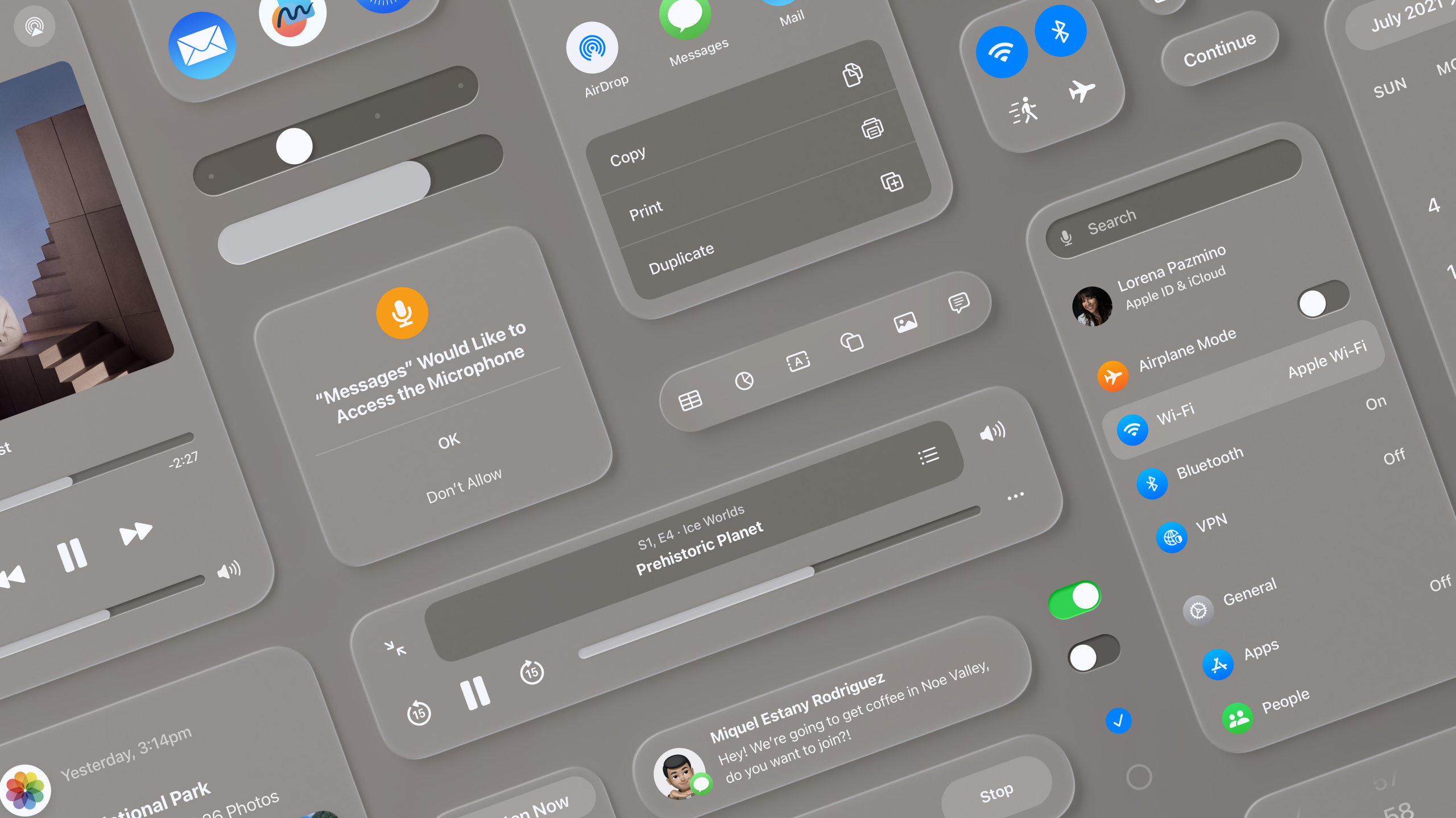
Apple established a spatial UI visual language for visionOS: three-layer 3D icons, glass-material windows, dynamic Vibrancy effects, and adjusted font weights and typography for spatial environments—letting iOS developers carry their knowledge to the spatial computing platform.
Core Content
3D icon design
visionOS icons are three-dimensional objects. When users look at an icon, it expands slightly and the system automatically adds highlights and shadows to reinforce depth between layers (01:25).
The approach is simple: provide up to three 1024×1024 square images. The background layer is a solid square; the two foreground layers use transparent backgrounds. The system crops to a circle and adds glass effects automatically. Center graphics and avoid edges—otherwise expansion looks offset.
Glass material
visionOS does not have traditional light/dark mode. Windows use system-defined glass material that dynamically adjusts contrast and color balance based on ambient light (03:15).
Glass material has several properties:
- Lets environmental light and virtual content show through
- Highlights and shadows reinforce position and scale in space
- Keeps content behind subtly visible, reducing a sense of obstruction
Avoid solid-color backgrounds on windows. Too many opaque windows feel oppressive. Use deeper material to separate regions; use lighter material to emphasize interactive elements.
Typography adjustments
To stay readable in spatial environments, visionOS adjusts font weights (05:56):
- iOS Body uses Regular; visionOS uses Medium
- iOS titles use Semibold; visionOS uses Bold
- Tracking is slightly increased
Two new extra-large title styles (Extra Large Title) suit wide editorial layouts in space.
Vibrancy effects
Vibrancy is the key mechanism for readability. It extracts light and color from the background so foreground content (text, symbols, fills) stands out (06:57).
There are three modes:
- Primary: standard text
- Secondary: descriptive text, footnotes, subtitles
- Tertiary: lower-tier information
Because glass material shows colors behind it, colorful elements can be swallowed by the background. In most cases use white text and symbols to stay clearly visible.
Detailed Content
Ergonomic layout
On visionOS users mainly interact with eyes and hands, so design must consider physical comfort (09:25).
Neck rotation range is greater left-right than up-down. For large canvases, choose wide aspect ratios over tall ones. Freeform’s canvas extends horizontally.
Place the most important information in the center of the field of view. Avoid content placed too high or too low.
Target area sizing
Interactive elements need at least a 60pt hit area (10:36). Visual size can be smaller—for example, standard buttons are 44pt—but need at least 8pt of surrounding space.
When stacking buttons, use standard system buttons with at least 16pt spacing. Large buttons need less surrounding space.
Focus feedback
System components include focus feedback: when users look at an element, it brightens slightly (12:04). This tells users which parts are interactive.
When designing lists or menus, leave at least 4pt between items so focus feedback does not overlap. Custom interactive areas need defined shapes so the system can show hover effects correctly.
Concentric corner radii
Nested elements should keep concentric corners. The formula is simple: inner corner radius + spacing between inner and outer = outer corner radius (13:37). Use continuous corners for smooth curves.
Tab Bar and Sidebar
The visionOS Tab Bar is vertical and fixed on the left side of the window (16:32). It expands to show labels when looked at and collapses when gaze moves away. Keep it lightweight—no more than six items.
Sidebar and Tab Bar coexist in the window for secondary navigation.
Ornaments
Ornament is a new presentation style on visionOS that places controls in a separate glass container in front of the window (17:34).
Suited for toolbars and persistent controls. When placed at the bottom of a window, overlap the bottom edge by 20pt so it blends with the main window. Ornaments can appear/disappear or expand to show more content.
Menus, popovers, and sheets
On visionOS, menus and popovers can extend beyond window bounds and are centered by default (19:54).
After a button triggers a popover, the button enters a selected state: black text on white background. This is a system pattern—do not use white-background buttons for normal state.
Sheets appear as modal views at the same Z position as the parent window; the parent recedes and dims. A secondary sheet pushes one layer further forward.
Core Takeaways
-
What to do: Adapt an existing iOS music player to visionOS, using glass material and ornaments for Now Playing controls.
-
Why it matters: The Music app already shows ornament best practices—persistent playback controls do not block content yet stay accessible.
-
How to start: Use
.glassBackgroundEffect()for control backgrounds and place playback controls as an ornament at the bottom of the window. -
What to do: Design a spatial photo album app using Extra Large Title for year headings to create immersion.
-
Why it matters: Extra-large title styles suit wide spatial layouts; combined with glass material, photos become the focus.
-
How to start: Use
.font(.extraLargeTitle)and.font(.extraLargeTitle2)with Vibrancy effects so text stays clear on any background. -
What to do: Develop a 3D product showcase app using a volumetric window for product models.
-
Why it matters: Volumetric windows let users view 3D models from any angle; glass material keeps UI from stealing attention from the model.
-
How to start: Create a volumetric window with
WindowGroup+.windowStyle(.volumetric)and load USDZ models withModel3Dinside. -
What to do: Build a spatial whiteboard app supporting multi-person collaboration.
-
Why it matters: Wide layouts suit horizontally extended canvases; Focus Feedback shows users which elements are interactive.
-
How to start: Use a wide-aspect window, keep interactive elements at 60pt target areas, and design tool panels with concentric corner radii.
Related Sessions
- Design spatial SharePlay experiences — SharePlay and Spatial Persona design on visionOS
- Design considerations for vision and motion — Visual and motion comfort design in spatial computing
- Build spatial experiences with RealityKit — Build 3D spatial experiences with RealityKit
- Principles of spatial design — Overview of spatial design principles
Comments
GitHub Issues · utterances