
Highlight
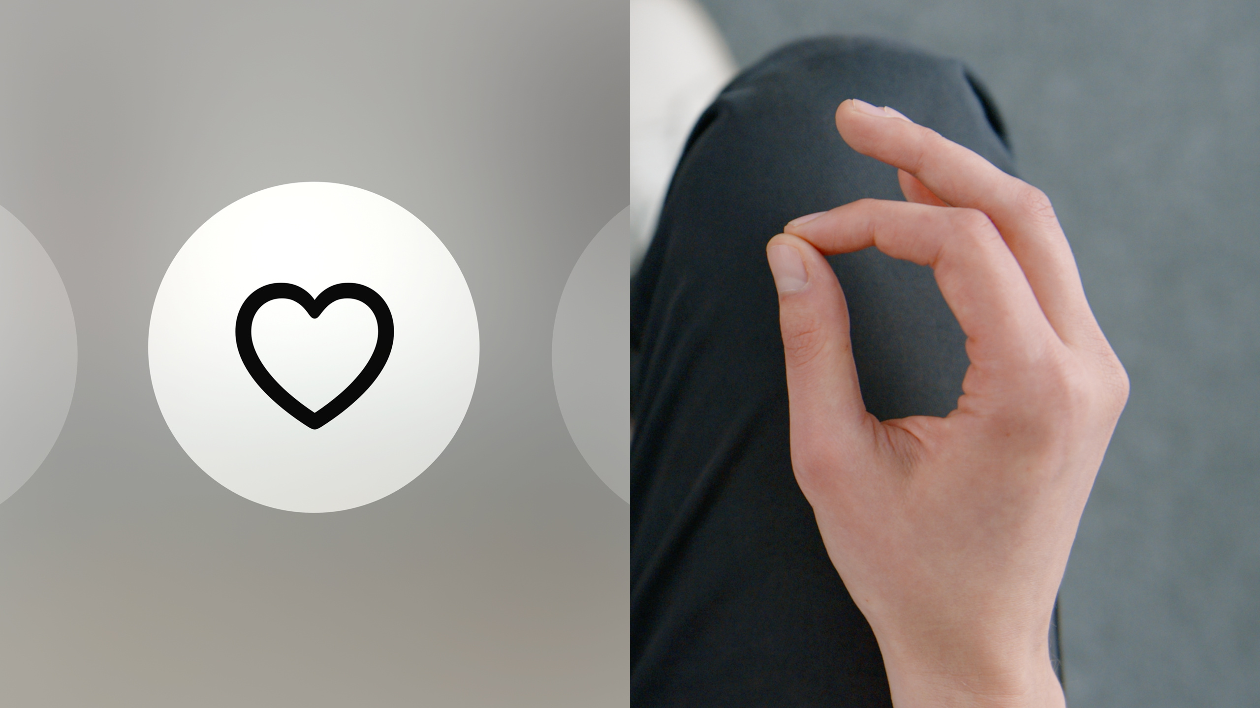
Apple’s design team systematically laid out core principles for visionOS eye and hand interaction: eyes as the primary aiming mechanism require circular elements, a 60pt minimum target area, and dynamic scaling; hand interaction should favor indirect pinch (hands resting on the lap), with direct touch reserved for core experiences; Eye Intent gives simple interactions magically precise results.
Core Content
Five spatial input modalities
visionOS supports multiple input methods:
- Eye + hand (most central): look at a button, pinch to select, hands can rest on your lap
- Voice: speak instead of typing when searching
- Keyboard + trackpad: efficient input for productivity scenarios
- Game controller: for gaming scenarios
- Direct touch: touch virtual interfaces with your finger
This session focuses on the two most central new input methods: eyes and hands.
Eyes: the primary aiming mechanism
(02:21) Eyes are the primary aiming mechanism in spatial experiences. All system interfaces respond to where the user is looking. You can aim at any element effortlessly, no matter how far away.
Field-of-view comfort:
(03:06) Despite an infinite canvas, users can only see content within their field of view. The center is most comfortable; the edges fatigue easily. Place main content in the center of the field of view; use edges for secondary actions like toolbars.
Depth management:
(04:00) Human eyes can focus on only one distance at a time. Frequent depth changes cause eye fatigue. Keep interactive content at the same depth and use small Z-axis shifts to express hierarchy. For example, when a modal appears, the main view recedes while the modal stays at the original distance.
Target area:
(06:06) The minimum target area for eye aiming is 60 points. Elements can be smaller than 60pt if spacing makes up the difference. Standard controls already include appropriate sizing.
Shape design:
(05:18) Use circles, capsules, and rounded rectangles. Avoid sharp corners—eyes focus on edges rather than centers. Keep shapes flat and avoid thick borders. Center text and icons with generous padding.
Dynamic scaling:
(07:13) System windows use dynamic scaling—they grow when farther away and shrink when closer, keeping the target area size constant. Fixed scaling makes distant interfaces hard to aim at. Custom UI should use dynamic scaling too.
Orientation:
(08:14) System windows always face the user. Custom windows should also keep UI facing the viewer; tilted interfaces are hard to read and operate.
Hover effects
(08:51) All interactive elements need hover effects—subtle highlight feedback when the user looks at an element. Keep effects subtle because eye movement is fast. System controls support hover automatically; custom elements need it added manually.
Privacy protection:
(09:40) Eye-tracking data is extremely sensitive. Hover effects render outside the app process—the app only knows which element is focused, not the exact eye position. The app receives focus information only when a gesture triggers interaction.
Eye Intent
(10:04) Looking at an element for an extended time signals interest. The system uses this to show extra information: button tooltips, tab bar labels that expand, and voice search triggers in search fields.
Accessibility:
(11:04) Dwell Control lets users select content with eyes alone—after focusing on a button for a period, it is selected automatically without a gesture.
Hand interaction
(12:22) Combined with eye aiming, pinching fingers is the primary confirmation method. The system supports multiple gestures:
- Light pinch: select (equivalent to tap)
- Pinch and drag: scroll
- Two-hand gestures: zoom, rotate
Gesture logic is similar to Multi-Touch, so users do not need to learn anew.
Precise eye + hand interaction:
(14:29) When zooming an image, the zoom origin is determined by where the eyes are looking—whatever you look at is magnified and centered. In Markup, the brush cursor follows the hand, but look at another part of the canvas and pinch, and the cursor jumps to where you are looking.
Direct touch
(15:52) Reach out and touch virtual interfaces with your finger. Suitable for close-up work but tiring over time. Good fits include:
- Experiences that require close observation or manipulation of objects
- Interactions based on real-world muscle memory (such as a virtual keyboard)
- Scenarios where physical activity is core to the experience
Compensating for missing haptic feedback:
(16:51) Virtual keyboard keys float above a base; as fingers approach, hover state and highlight appear, and on contact the state changes quickly with spatial audio. These visual and auditory cues compensate for missing tactile information.
Detailed Content
Custom gesture design principles
(13:17) When standard gestures are not enough, you can design custom gestures. Follow these principles:
- Easy to explain and perform; users learn quickly
- Clearly distinct from system gestures to avoid conflicts
- Repeatable without fatigue
- Low accidental trigger rate
- Compatible with assistive technology users
- Gesture meaning does not cause misunderstanding across cultures
- Provide UI fallbacks
Eye-friendly layout practices
import SwiftUI

struct EyeFriendlyLayout: View {
    var body: some View {
        VStack(spacing: 20) {
            // Main content is centered in the field of view
            MainContentView()
                .frame(maxWidth: 600)

            // Secondary actions are at the bottom
            HStack(spacing: 24) {
                SecondaryButton(icon: "gear", action: {})
                SecondaryButton(icon: "share", action: {})
            }
        }
        .padding(40)
    }
}

struct SecondaryButton: View {
    let icon: String
    let action: () -> Void

    var body: some View {
        Button(action: action) {
            Image(systemName: icon)
                .font(.title2)
                .frame(width: 60, height: 60)
        }
        .buttonStyle(.borderless)
        // Circular shapes are easier to target
        .clipShape(Circle())
    }
}
Key points:
- Use larger sizes for main content; keep secondary actions at the 60pt minimum area
- Generous spacing (24pt+) between elements to avoid mis-taps
- Use circular/rounded shapes to guide eyes toward the center
- Avoid sharp corners and thick borders
Hover effect implementation
import SwiftUI

struct HoverButton: View {
    let title: String
    let action: () -> Void
    @State private var isHovered = false

    var body: some View {
        Button(action: action) {
            Text(title)
                .padding(.horizontal, 24)
                .padding(.vertical, 12)
        }
        .buttonStyle(.borderedProminent)
        .hoverEffect(.lift)
        // Custom hover effect
        .background(
            RoundedRectangle(cornerRadius: 12)
                .fill(isHovered ? Color.blue.opacity(0.3) : Color.clear)
        )
        .onHover { hovering in
            isHovered = hovering
        }
    }
}
Key points:
- Use
.hoverEffect()for system-level hover feedback - Keep custom effects subtle so they do not interfere with reading content
- All interactive elements must have hover feedback
Depth hierarchy design
import SwiftUI
import RealityKit

struct DepthHierarchyView: View {
    var body: some View {
        ZStack {
            // Background content (slightly farther away)
            ContentView()
                .zOffset(-20)

            // Main content (standard distance)
            MainView()
                .zOffset(0)

            // Tab Bar (slightly closer to express hierarchy)
            TabBar()
                .zOffset(10)
        }
    }
}
Key points:
- Keep interactive content at the same depth to reduce focus switching
- Use small Z offsets (10–20pt) for hierarchy, not large jumps
- Keep modal views at the same Z position as the triggering element
Feedback compensation for direct touch
import SwiftUI

struct DirectTouchButton: View {
    let title: String
    @State private var isPressed = false
    @State private var proximity: CGFloat = 0

    var body: some View {
        Text(title)
            .padding(.horizontal, 32)
            .padding(.vertical, 16)
            .background(
                RoundedRectangle(cornerRadius: 16)
                    .fill(isPressed ? Color.blue : Color.blue.opacity(0.3 + proximity * 0.4))
            )
            .scaleEffect(isPressed ? 0.95 : 1.0)
            .animation(.easeInOut(duration: 0.1), value: isPressed)
            .gesture(
                DragGesture(minimumDistance: 0)
                    .onChanged { _ in
                        isPressed = true
                        // Play a spatial sound effect
                        playSpatialSound()
                    }
                    .onEnded { _ in
                        isPressed = false
                    }
            )
    }

    func playSpatialSound() {
        // Use Spatial Audio API to play tactile feedback sound effects
    }
}
Key points:
- Show hover state on approach (brightness gradient)
- Respond quickly on contact (within 0.1s)
- Reinforce feedback with spatial audio
- Scale effect provides visual confirmation
Core Takeaways
-
Redesign interaction flows for existing apps
- What to do: Change tap interactions in existing iOS apps to eye aiming + hand confirmation
- Why it matters: visionOS eye aiming is more precise than finger taps and more comfortable at a distance
- How to start: Make buttons circular/rounded, ensure 60pt target areas, add
.hoverEffect()
-
Use Eye Intent to optimize information display
- What to do: When users look at an element for a long time, automatically show related details
- Why it matters: Reduces interface clutter; information appears only when needed
- How to start: Use
onHoverwith a timer—expand a tooltip or detail panel after 1 second of gaze
-
Design gesture-first 3D content manipulation
- What to do: Add two-hand zoom/rotate gestures to 3D model viewers, using eyes to set the operation center
- Why it matters: Eyes setting the operation origin is more natural than manual selection; two-hand gestures feel intuitive
- How to start: Use RealityKit gesture recognition and set the zoom origin to the model surface point the eyes are looking at
-
Optimize direct touch feedback for virtual keyboards
- What to do: Implement proximity sensing, contact response, and spatial audio in custom input interfaces
- Why it matters: Direct touch without haptics needs multi-sensory compensation to feel reliable
- How to start: Floating button design + proximity highlight + contact scale + spatial audio combined
-
Add Dwell Control support
- What to do: Ensure all interactive elements support selection by gaze alone (no gesture required)
- Why it matters: Users with motor impairments rely on Dwell Control—this is an accessibility compliance requirement
- How to start: Standard SwiftUI controls get support automatically; for custom controls, ensure a clear focused state
Related Sessions
- Principles of spatial design — Design principles for the spatial computing platform
- Design for spatial user interfaces — Spatial UI design practices
- Create accessible spatial experiences — Accessibility design for the spatial computing platform
Comments
GitHub Issues · utterances